Home of the Scrapbook Campus › Forums › Showroom › Bootcamp – January 2020
Tagged: Day 5
- This topic has 332 replies, 32 voices, and was last updated 4 years, 10 months ago by
Liese Strupp.
-
AuthorPosts
-
January 15, 2020 at 8:31 pm #37524
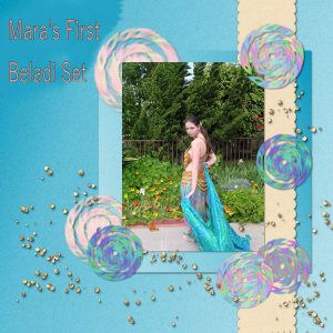
I had jumped the gun with this before , but made a change or two before reposting thisphoto is around ten years old now and this is the first hand beaded beladi set my daughter Mara made
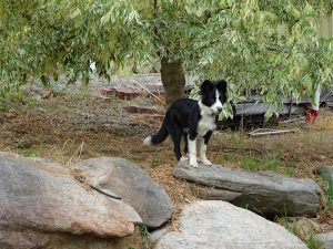
January 15, 2020 at 8:32 pm #37526Hi, Lyn from Australia. Very new to this so still trying to find my way around. Photo of my dog Jimmy
January 15, 2020 at 8:44 pm #37528Hi Friends,
Carole, thank you for your email. Your instructions are so clear and detailed… thanks a million!
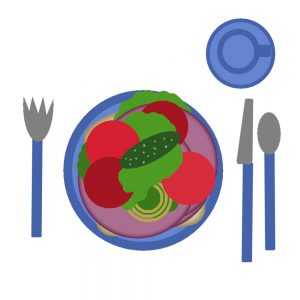
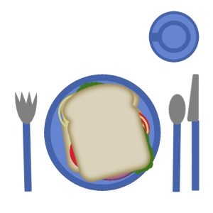
My sandwich is open faced with a pickle on top! Trying to watch my carbs.
Today was a sketching day. I go to the Garden of the Gods Colorado Springs, CO and practice sketching,
Had a nice hike as well since the weather was good.
January 15, 2020 at 11:49 pm #37529Dorothy, I am not 100% sure what you are referring to when you mentioned but is it possible that you had the “Home” tab active? That is what opens by default. If you want to skip that page in the future and go to the Edit tab, you can go to File > Preferences > General Program Preferences and on the left, click on Tabs, then on the right pane, click the button for Set Edit as Default. From this point on, whenever you start your PSP, you will go to the Edit tab. As for your lunch, it is interesting that you added a side order of fries. That is quite tempting!
Henry, trial and error is a great way to explore PSP and its functionalities. I have discovered a lot through trial and error! And you ended up with a great sandwich. I hope you had fun too.
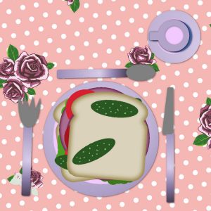
Gwen, it looks like you changed the color of the dishes. That is great!
Cindy, you are more than welcome. I have built this whole site to help PSP users, and if I can help you, that is all I want. And thank you for your compliments and rose. And “Pour Cindy” is French from Jnet meaning “For Cindy”.
Welcome Lydia. Looking forward to seeing all of your projects. On your first layout, have you considered using black shadows instead of white? It will probably give more of a 3D effect.
Jnet, I think you might have used a shadow offset a bit too large for the string. It should be flat on the paper (except on the ends if you wanted) so the offset should be little (max of 10). See if that can be adjusted?
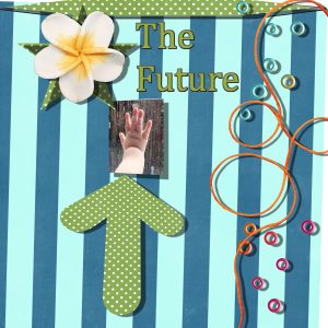
Inam, your shadows are good. However, if you look at the layering of your elements, would it really make sense to have a string on top of a flower? Without changing anything else, you can just rearrange the layers to “move” the string (and its shadow) under the flowers. Because of the obvious pattern of the background, you might want to have the title in a thicker font, so it would be easier to read (same for the text under the photo). But it is up to you to know how it looks in full size (since we only have a resized version). It might look different.
Karon, that is a fun layout. Since the letters of the title and the background are similar in color, you might want to consider a more obvious shadow to make the title stand out. Glad to see that you already showcased the photo you had chosen right from the start.
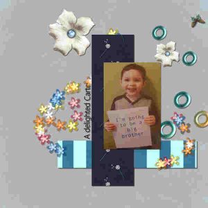
Sally, looking forward to seeing your grandson’s photo on a full page! Good looking sandwich!
Aletha, if you don’t like green, not a problem. After all, you are the artist when creating those pages. I see you added shadows to all the elements, but you also added a bevel to some elements that didn’t really need any even though it gives a different look. I find that the bevel on the flowers makes them look like sugar (OK maybe I am hungry!).
Peggy, lovely photo. I love those embellishments. Did you use a kit? Do you have the reference to what kit it is? If you were to use a dark solid color for the title, it would be easier to read (no need to have a stroke around it).
Hi Lyn. Welcome to the Bootcamp. You mention you are from Australia. I hope you are safe from all those forest fires?
Liese, you are welcome. I agree with you that an open sandwich can be good. I tend to take my hot chicken sandwiches like that too. When you mention sketching, are you talking about drawing? If so, will you show us some of your sketches?
Still waiting for more lurkers to post something 🙂
January 16, 2020 at 12:28 am #37531Bootcamp Day 3:
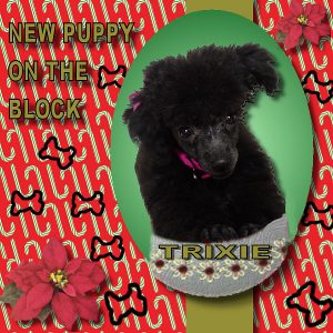
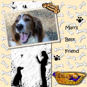
I had done this first one last week in PSP 9 . Puppy picture was when we bought her in September. The nest one is for our Christmas 2019 scrapbook . I did this one in PSP2020. Quite a big change in vector text and took me more than one look at your video to figure it out.
Thanks for explaining what was wrong with day 1 setting up. I will do as you suggested first thing tomorrow.
I am tied up with doctors tomorrow. You all have a better day than I will.
January 16, 2020 at 1:18 am #37536Hi Cindy here, Hey All
Hey Sweetest Teacher around, how you doing? if no one told you today, You Rock.
you fixed my tab problem, and I am going to fix my file problem hopefully tonight. Got my lesson done, my sister Sunshines first Grandson. Future U.S.A Marine.
January 16, 2020 at 2:44 am #37539Sandwich made. I don’t like pickles so left them out and I like my lettuce next to the top layer of bread to stop the bread from going soggy! Loving the tutorials.
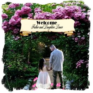
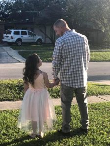
January 16, 2020 at 6:34 am #37541This page is made from an image of my eldest grandson and his new step-daughter going to her first “Father and Daughter’sDance.” I isolated them from a driveway background and placed them in a more appropriate location for such an auspicious ocasion. I darkened up the background to make it appear later as the dance was in the evening and strew rose petals along the path. I didn’t know how to depict the sparkle in her eye. I love this photo!
I
January 16, 2020 at 7:32 am #37543Lesson 2, hope you are hungry.
January 16, 2020 at 8:47 am #37545Toch een opfrissing van de mogelijkheden van PSP na een cursus in België enkele jaren geleden!
Again learning (remembering …) the trics and short cuts in PSP.
* duplicate text before converting to raster
* rotate perfectly 90° your layer
* EXIT: repait the last commando
THANK YOU !!!
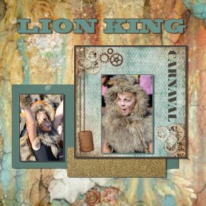
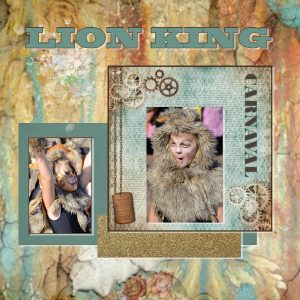
I used first white for the shadows and the second time black, as you said.
Buth my preference is white, because black is not in contrast with the brown around the foto of the ‘lion-girl’ on the right. Doesn’t black makes the lay-out heavy … ?
January 16, 2020 at 9:22 am #37548Back to school Day 3 lesson done and (at least partially) absorbed.
needed a quick pic to post to make my friends jealous of my recent Caribbean cruise!
Next is to try to set up my own website to post my projects onto – much better than just having millions of pics sitting on my hard drive.See you all next time
Graham
January 16, 2020 at 12:05 pm #37549I have already changed the title on my own full sized layout but think posting the same layout three times with minor changes would be way too.much. I did not use a kit I made the paper and the scalloped edge a while back though I added texture now and turned the scallop.hanky into a ribbon, the round elements are a brush I made on the fly, from the v rake brush with rotation and color and step variances to make it wheel, the beads are a single ball on a transparent background used as a pattern with a brush with a scatter variance and color variance based off your snow variance settings, sorry to go.on so.long.
January 16, 2020 at 12:52 pm #37551Dorothy, that is lovely to have two pages already about your dog. Many people have so many photos of their pets; they deserve their own albums! I noticed that the shadows on the red page seem to be quite large. At least, much larger than the other page. It does make small elements like the title look like they are floating over the page. On the other hand, that type of shadow is perfect for a flower, which is, by definition, much thicker than paper, therefore would have a wider shadow. Is it possible that you just reused the same settings without noticing the difference?
Cindy, your shadows are also a bit large, making small elements (like the string and the beads) look like they are coming off the page. Also, I think you rearranged the layers and moved the star layer below its own shadow. That is an easy mistake when you have shadows on separate layers and you move things around. At least, it is a super simple fix.
Lyn, very good idea to move the lettuce by the bread. I guess others just ate their sandwich too fast to let the bread get soggy! 😉
Diana, that is a lovely presentation for the photo. I am curious how you did the edges. Are you usin a frame from PSP? Also, just so I can keep track of assignments, is this your interpretation of the Project 1? If so, it will count toward the entries for the draw.
Helen, I think you like warm milk instead of coffee? Yes, the sandwich looks good.
Lydia, I see what you mean when you mention the background and I don’t find the black shadows to be too heavy at all. In fact, black shadows are normal shadows. Look around, in your room, on your desk, etc. Shadows are always black. They might look like other colors because the shadows are blurred so it will show the colors underneath. In general, if you have a darker (or busy) background, you migt make the shadow a little bit more prominent, but by adjusting the blur, it will make it less “harsh”. But adding a white shadow CAN be a trick to make text stand out, but it has to be discrete enough that it does not LOOK like a shadow. Check out the Blog; on several images, you can see that white shadow, except that it is not meant to be a real shadow.
Graham, yes, you can make anyone jaleous with those photos! And go ahead. You are allowed! I am curious if the background image is meant to be “faded” or not. I think it looks great as faded so the focus is on the ship photo, but *IF* you wanted it bright and it CAME faded, you can adjust it. If you need/want to, let me know and I’ll give you some steps.
Peggy, that is great that you did your elements yourself. Don’t hesitate to say so when you use your own supplies! And I agree, no need to repost small edits. You CAN if you want, but you don’t have to. 🙂
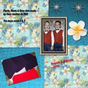
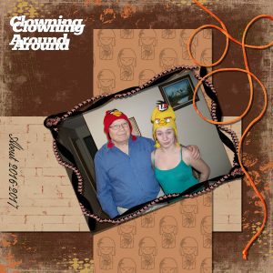
January 16, 2020 at 1:49 pm #37553Hello, As I look at some of the submissions, I am not sure of my work but I am trying. As I mentioned, I was planning to do a scrapbook featuring my wife’s craft in wool. Today’s actually dates back fifty-two years. She is the crafty one in our family.Henry
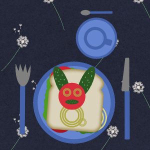
January 16, 2020 at 3:06 pm #37555As a teacher in primary school many years ago I always sayd to my ‘children’: do make all off your homework!
So, here my result for the first exercise: making eating sandwiches plesant for little children.
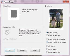
January 16, 2020 at 5:18 pm #37558Thank you so much and if this gets me in the drawing, I am thrilled. (S) The frame is in this edition of PSP, I went to image/frame/edge rough 1. I had this frame in PSP7 too and it was always my favorite. If they had to add just a few frames I think this was one of the best. I have included a copy of the original image and then a snapshot of adding the frame, choosing OUTSIDE options for the placement.
Just an aside, the bottom portion of Addy’s dress is sheer and green grass showed through as I separated it from the background and looked strange. With some experimentation, I selected just that area and decreased the transparency and it worked.. I was so pleased, it did the job.
January 16, 2020 at 5:31 pm #37560Hi all, here is my go at day 3… I used some bits of a scrap kit I had saved… I had fun with this.
January 16, 2020 at 5:37 pm #37561Trudy, that is soo cool! I love the way you did this page, especially the silhouette. Good work!
January 16, 2020 at 8:31 pm #37565January 16, 2020 at 11:09 pm #37566Henry, what makes you doubt your work? Everyone’s style is different, even if you all follow the same tutorial, you will have different photos, different stories and different preferences. You can start that scrapbook now, or just “practice” first and get into the full project later. It is up to you. As for your layout, I would only suggest to reduce the offset of the shadows on the text which would make it a bit easier to read.
Lydia, that is such a fun sandwich! I am sure any child would love to eat it!
Diana, that is what I thought that it was one of those frames. I don’t tend to use them, but maybe I should. I have to say that the contrast is stunning between the “original” photo and the end result you got with the work. Very inspiring.
Trudie, that is a fun project. I see that you used “shadows” in different directions, but in your layout, it does work because even though it is the “Drop shadow” command, it does not look like it is meant as a shadow, but more as an emphasis. That is good!
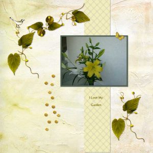
Gwen, great arrangement for that layout! Have you added some shadows on the plants? I think it would add some dimension but make sure you don’t have a large offset as they are still supposed to be flat on the paper!
Look forward to the next project tomorrow! And don’t worry if you are a little late; with two days between projects, it should help you catch up.
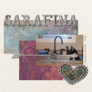
January 17, 2020 at 11:07 am #37581January 17, 2020 at 12:40 pm #37584Bootcamp Day 4. Sticking with cat theme; this is Sarafina. All of my daughter’s cats love playing in the sink and in water. The kit I used is “We’re All a Little Crazy” by Kimeric Kreations.
January 17, 2020 at 3:31 pm #37606The baby is Lemon my first grand daughter, she is now almost 5 months old and the pictures are piling up!
Thankfully my daughter in law is good at taking lots of wonderful pictures because they live far away.
January 17, 2020 at 3:50 pm #37607Having a little trouble with lesson 3, I downloaded the picture of Lemon into PSP and resized it. When I tried to download the paper from the addon freebie and tried to use PSP to open it, I got a warning on my PSP page:
Unable to open the file,
Please verify that the file is valid.
So Lemon is ready, just no paper to stick her on! HELP
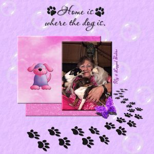
January 17, 2020 at 4:00 pm #37609Day 4 Lesson:
I used My pic. of My 4 Legged Babies & free Items off google sites, I get a lot off cleanpng.com
3D My Layers, No Sugar cookie Flowers, I like the depth 3D look, I agree I did my flowers a bit too much, to much shine, I do my Banners like that got into the habit of it. lol
Dropped shadow on all.
Resize to 600 pixels
How many Lessons do we have?
I have learn different things I didn’t know, Enjoying the Lessons.
Thank you 🙂
January 17, 2020 at 4:50 pm #37612Sorry I decided the current scraps were a bit too girly for me so I pulled some aircraft pics and practised with the “shortcuts” for cutting/pasting etc.
May go back to flowery themes and try again using background papers etc later
Keep up the good stuff – learning loads about post production to enhance my photos
See you all tomorrow
Graham
January 17, 2020 at 4:52 pm #37614Sorry I decided the current scraps were a bit too girly for me so I pulled some aircraft pics and practised with the “shortcuts” for cutting/pasting etc.
May go back to flowery themes and try again using background papers etc later
Keep up the good stuff – learning loads about post production to enhance my photos
See you all tomorrow
Graham
January 17, 2020 at 6:31 pm #37620Hello Cassel
Day 4 Project done. I backed off on featuring my wife’s craft and presented something different. It is fun doing this but I keep making mistakes and sometimes my project seems to have changed and I don’t know how to continue. I think I pressed the wrong button, anyway here it is.
Henry
January 17, 2020 at 6:47 pm #37622I’ve tried to make a Cover Page with today’s assignment while keeping the theme of The Fourth Generation, which you will see in one of the following pages.
Do you think it’s too fussy?
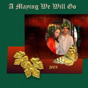
January 17, 2020 at 7:35 pm #37624This is my day four, Shaun and Mara being the Queen and King of the May at a birthday party in 2008. I am trying to put together a time line of pages for them as they married in September. no kit though I think the leaves were made in superbladepro from a tube my butterfly photo and papers all done in psp.
-
AuthorPosts
- The topic ‘Bootcamp – January 2020’ is closed to new replies.


