Home of the Scrapbook Campus › Forums › Challenges › August Tut/Tech Challenge – FANCY FONTS
- This topic has 21 replies, 5 voices, and was last updated 7 years, 3 months ago by
Cristina.
-
AuthorPosts
-
August 26, 2017 at 8:31 pm #14659

The Campus is the perfect place to learn more about photo editing, various techniques, or PSP in general.
This challenge will give you an opportunity to practice some of those techniques or use some tools.
This month’s Tut/Tech Challenge is the Use of Fancy Fonts. This is a technique that some have already been trying, so now is another chance to show off your work, or try it if you didn’t try it yet. You can read the tutorial HERE.
What will you create? Scrapbook pages? Invitations? Posters? Show us below. We want to be inspired.
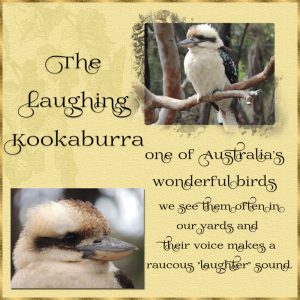
August 29, 2017 at 12:22 am #14719The font I have used is a Fancy Font called Prida02calt by gluk. Even though I had opened the character map in PSP I didn’t use it. This is the way it typed on the page. I have done this page up mainly so you can see what this font looks like. I quite like the font so it is one I will probably use often . These fancy fonts are great and can make a card or scrapbook page etc. look special. The photos are from Pixabay. The mask on the top photo is one I made a few weeks ago. Also the Kookaburra is one of my favourites and I love to hear and see them in our yard.
Dawn.
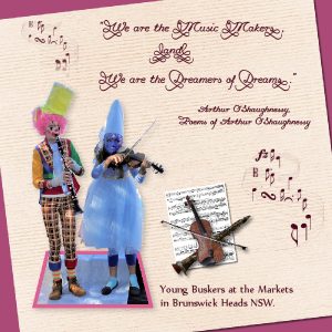
August 29, 2017 at 1:04 am #14721I like that font too Dawn, it looks great on your page. Gluk has a number of fancy fonts, I have been going mad and downloading heaps! I did a Fancy Font on the “What I Did in August” forum but have been having so much fun I thought I would do another one for here. The font I used is Promocyja096, also from Gluk. I used a couple of free music brushes for the flowing notes and clip art for the instruments. I made the sheet music from another music brush, the quote I found online and thought it was appropriate for the two young buskers. I was dubious about taking their photo, rules about photographing kids can be strict, but they actually had a sign saying it was alright and they were happy to pose for me. They were very good musicians too.
August 29, 2017 at 5:34 pm #14729Dawn and Marlene, very nice choice and use of the Fancy Fonts technique. They really stand out on a page. Nice work!
Dawn, I was curious about the sound of this bird, so I went online to check it out and found many videos on YouTube. Lovely bird and interesting and unique sound. 🙂
I couldn’t come up with anything yet for this challenge… I will take a look at some photos at Pixabay and maybe I will be inspired to do something.
August 30, 2017 at 12:39 am #14731Marlene, You chose a great idea for you page…it is very nice!… the font you have used looks good. I also have downloaded a few lately . I really like all the elements and what a terrific idea to make your own sheet music. The photo you took of the buskers turned out great they are very colourful in their costumes.
Dawn.
August 30, 2017 at 12:49 am #14732Cristina, Thanks so much for your kind comments on my page. I am glad you were able to find a video on youtube that let you hear the Kookaburra. They are a family orientated bird and we often see a few sitting on the poles together and when they all start their chorus we just love it.
Dawn.
August 31, 2017 at 2:48 am #14738Thank you Cristina and Dawn for the comments. I was surprised Cristina that you hadn’t heard a Kookaburra, I suppose us Aussies are so used to seeing and hearing them we don’t realise other people don’t know them. You might want to check on the Blue-Winged Kookaburra, which is native to northern Australia – it can’t quite get the full laugh going so sounds very frustrated!
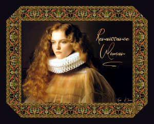
August 31, 2017 at 4:53 am #14740I am always trying different fonts. I have almost 3,000 fonts and I’ve only paid for eight of them. There are so many resources for free fonts; I think I’m addicted. Here’s a very pretty one that came with additional swashes. It’s called William Kidmon and I think it’s simply lovely.
The ribbon started out as a small sample I saw. I erased the background, duplicated it until I had enough so I could line them up for a full ribbon. Merged them to one layer and duplicated it all around to frame the pic. I played around with erasing parts of the different layers until I got the effect I liked.
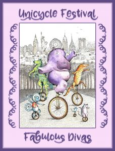
August 31, 2017 at 4:55 am #14742For this I used a really fun font that I recently purchased for $1. It’s called Zooky Squash and picking out which alternate characters to use was a lot of fun. And the swashes along the sides also came with it.
August 31, 2017 at 5:05 am #14744AprilDawn, I watch a lot of nature shows and I simply adore the kookaburra. Your project definitely does it justice and I’ve already downloaded the font!
Marlene, your project is such fun. I don’t think I have any music brushes, but, if you didn’t already guess it, I downloaded the font.
<3
August 31, 2017 at 5:02 pm #14746Marlene, I watched a few videos of the Blue-Winged Kookaburra and it is a very impressive and lovely bird too. Its color is beautiful. It can’t really laugh like a Kookaburra, but it can get loud. 🙂 Thank you, was a great tip!
August 31, 2017 at 5:13 pm #14747micfin, both your projects are lovely, and what a great choice of fonts The ribbon is a perfect match to the beautiful photo. Nice work as always!
August 31, 2017 at 6:02 pm #14748micfin Two absolutely gorgeous pages, totally different in style but both backgrounds so well suited to the photos. The ribbon on the first one was very well done. Once again we have provided reasons why digital scrapbooking is a great alternative to traditional scrapbooking. I have a friend who has spent many years collecting papers, elements etc, all stored in the garage where she also conducted lessons and so on. When I said I was doing digital scrapbooking she said “Oh that …” in a very dismissive way. I know we can’t do the 3D fancy stuff by boy can we create some fantastic pages and we don’t need a whole room for our stock!!
August 31, 2017 at 7:11 pm #14749micfin, your pages are really lovely, the fonts are very nice and you have chosen great photos to display them. Your ribbon looks great …. Thank you for your comment on my page ….. Look forward to seeing more of your projects.
Dawn
September 1, 2017 at 8:38 am #14753Thanks for all the kind words, ladies.
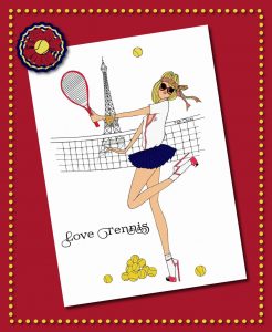
Here’s last night’s project. I had to share it just to show what a scrapbooker you’re all turning me into! <3
Cass, I used your Word Frame script for this one; I was hoping it would look like tennis balls. I often use the script without actually putting any text in it. And AprilDawn, does the font look familiar? Thanks for turning me onto it ~ Prida02calt by gluk.
Marlene, your friend seems a wee bit close-minded. Ask her to try the digital method and see how dismissive she is then. 🙂
September 1, 2017 at 2:54 pm #14755micfin, another lovely project! Really great work!
September 1, 2017 at 7:33 pm #14757micfin, your page is really great and I am glad you also liked the font .. it looks good on your page and suits your theme. Your page would look terrific on a card for someone who loves tennis. Well done!
Dawn.
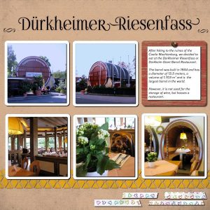
September 2, 2017 at 1:50 pm #14759I was finally able to come up with something for this challenge.
The background is a solid color > texturizer plugin (canvas) > grunge overlay (45% opacity)
I added elements that I made based on 3 Cassel’s tutorials of THE LAB 07 Module 8:
Triangle pattern, Random pattern (hearts) and Painted Wood (Journaling). The hearts tapes were made with cass-AdhesiveTapeB Script.
The journaling font is Bariol Bold. For the title, I used the FoglihtenN007 font from Gluk that was mentioned in the “Using Fancy Fonts in your PSP” post. I used the special characters for the letters D-r–R-s
I also used cass-ScrewHead Picture Tube.September 2, 2017 at 5:53 pm #14764Great work Cristina, the Foglihten font really suits the subject and I love the colour scheme. Sounds like a fascinating place to visit, hope the food lived up to surroundings!
September 2, 2017 at 7:15 pm #14765Hi Cristina, a very nice project ! ..looks like and interesting restaurant for people to go and see on their travels. … all your elements go well together and the triangle pattern stands out ..very effective. . The Foglihten font really suits your page, I have downloaded that one but as yet have not used it. I am sure these fancy fonts will continue to be used in many other challenge projects as they add that something special to the page. Thanks for sharing, it is always great to see other places.
Dawn.
September 2, 2017 at 11:48 pm #14773I say we all get together and go to that restaurant, Cristina. You presented it in such a lovely way, how can we resist?
September 3, 2017 at 10:36 am #14775Marlene, Dawn, and micfin, thank you so much for your comments on my page. I do appreciate! <3
Marlene, the food was good, what here is called bürgerliches Essen… maybe “good plain food” would be a translation that comes close, nothing fancy, typical from this state, Rhineland-Palatinate.
Dawn, I also like very much seeing photos from Australia and other places that are posted here.
micfin, let’s all go there then! 😀
-
AuthorPosts
- The forum ‘Challenges’ is closed to new topics and replies.
