While creating your scrapbook project, you want something that looks good. You want a balanced design to provide a sense of visual harmony. There are several different ways to use this design principle in your projects. Let's go over some of the most popular methods.
Symmetrical Balance
This is one of the most common types of balance used in scrapbooking. It involves arranging elements in the same way on both halves of the page. You can see a pairing of elements or photos. It creates a sense of order and stability. It’s often used to create a focal point on the scrapbook page. It is probably the most obvious way to balance your page.
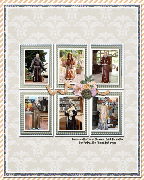
As you can see, the halves can be vertical or horizontal. Symmetry is so often eye-pleasing that we will easily use it without thinking much about it.
Asymmetrical Balance
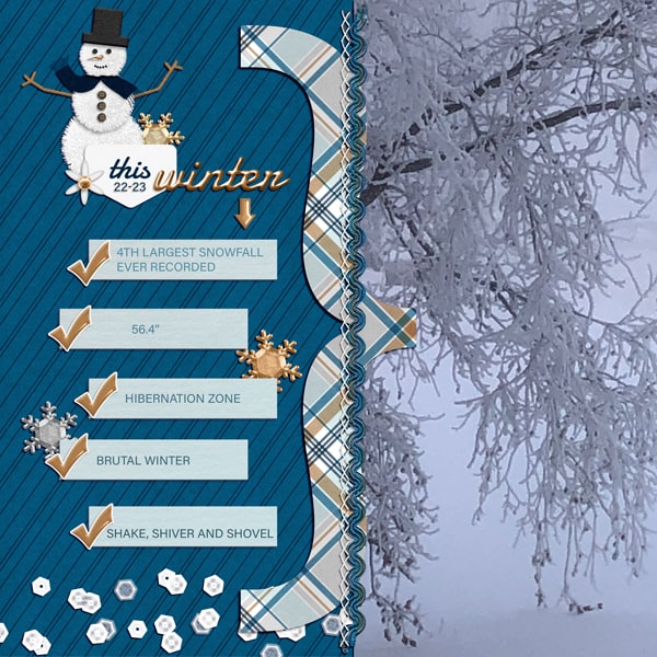
Asymmetrical balance is another popular way to design a scrapbook page. For this type of balance, you can arrange elements of different sizes and shapes on two sections of the page, rather than having equal elements on both sides. That will create a dynamic and interesting scrapbook page.
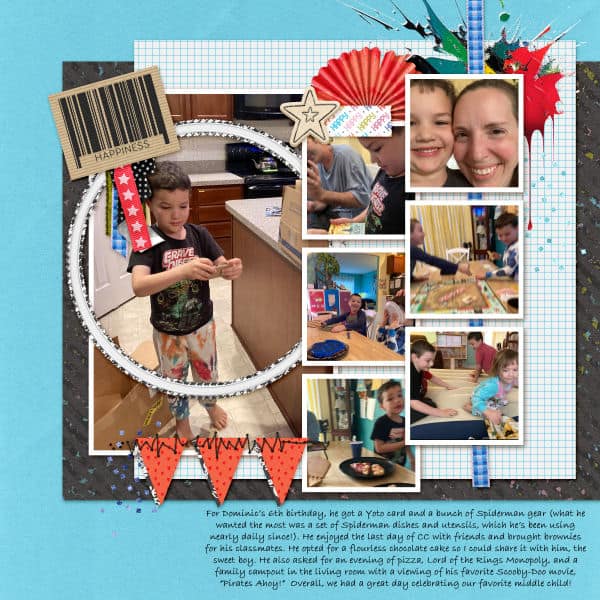
Often, a similar area is covered, while the size and number of elements of photos will differ. This could involve a large image on one half of the page, and several smaller images and embellishments on the other side.
Another way to achieve balance in an asymmetric way is to have something clearly different on two halves of the page. In this case, it can be a photo versus text.
Radial Balance
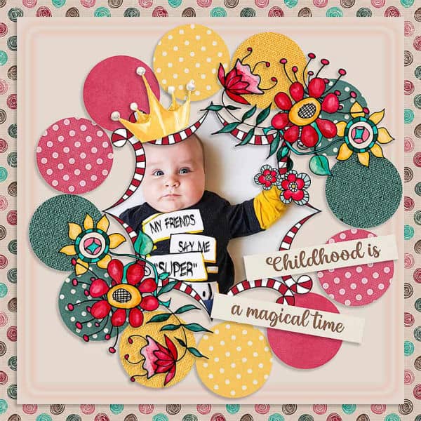
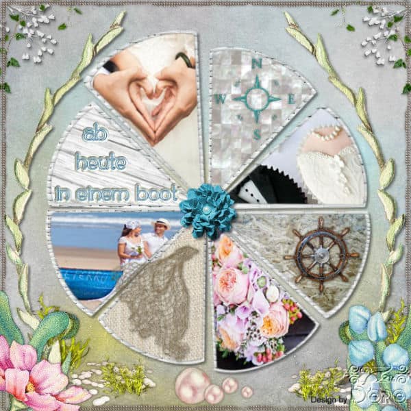
You create radial balance by arranging elements in a circular pattern around a central point. This creates a sense of movement in a scrapbook page, as the eye is naturally drawn to the center of the page.
Color Balance
Color balance involves using colors to make the different sections as even as possible. You can achieve that by layering, aligning, or distributing papers and elements of certain colors.
To get a color-balanced design, you can alternate colors in layering your papers or elements.
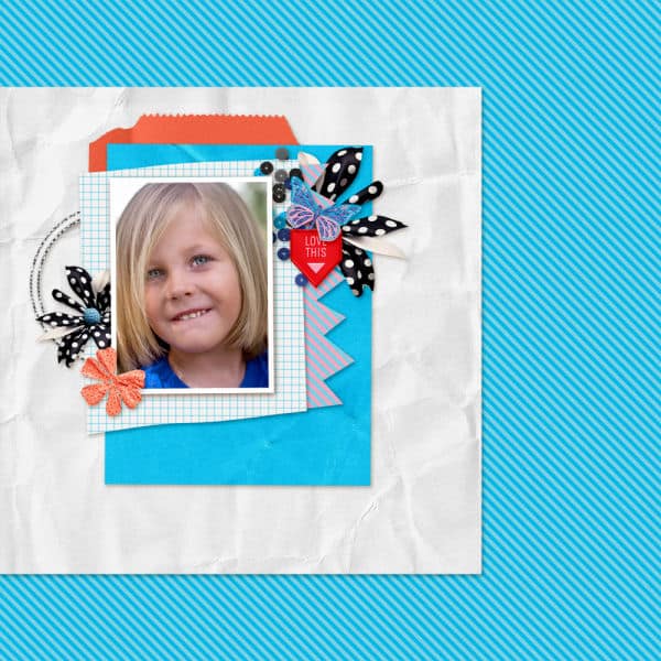
Another way would be to invert colors in two different sections of your page.
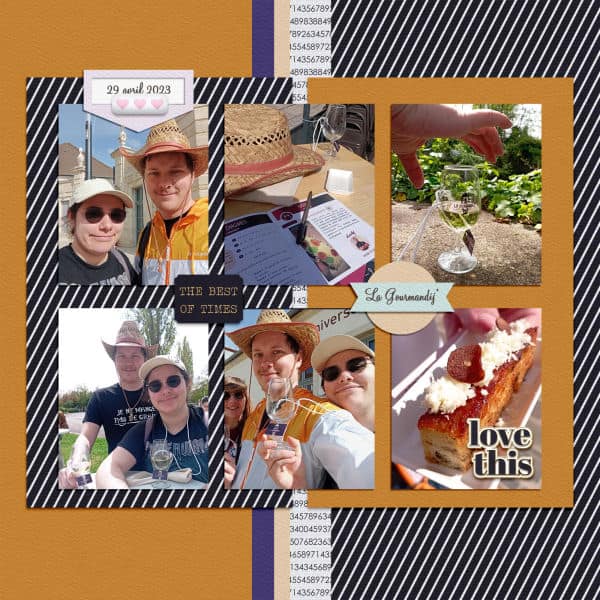
Balance is a concept a bit less obvious than alignment or repetition. Yet, it does influence your project. You might use a balanced design without even realizing it. Have a look at your favorite projects and see if you did use this concept spontaneously. And for your next pages, just try to observe how you are choosing, aligning, and layering your components. Maybe you will just add a few tweaks to make it even better.


