
At this point, you should already have your project "almost" done. With the photos fixed, and the papers chosen, layered, and arranged. It is time to add some journaling and a title. Although a picture is worth a thousand words, it does not always convey all the information YOU know about it, so anyone else looking at it won't get the whole story if you don't write it.
The details
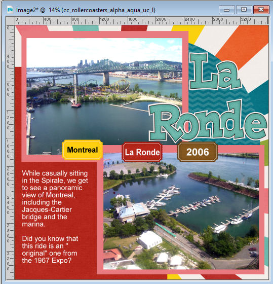
At the very least, include some specific details like the location and the date of the photo or the event. Think of Who, Where, When, What. Short information can be added with simple tags on your project or they can also be placed directly onto the photo itself. If you have several photos, you don't need to repeat that information on each of them, unless there is a reason if the date is different or the location is different.
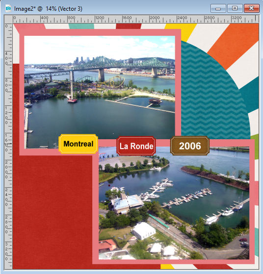
In this kit I am using, there are individual tickets that can easily be used for those details. I added the text to each ticket and merged the text layer with the ticket layer. This will allow me the option to move and rotate the tickets as needed.
The journaling
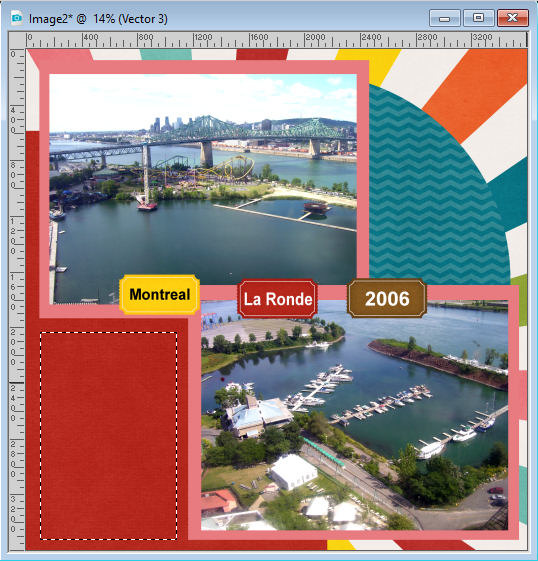
The next step would be to add some stories about this. There is that area on the bottom left that is perfect for some text. If you have PaintShop Pro version X8 and up, you can use the Text Wrapping feature. If you have an older version, you will have to tweak the text manually. That means adding line breaks on your own. It is not that hard, but just inconvenient if you ever have to change your text.
In the first segment of this series, you were to group all the photos, and papers, and some elements you wanted to use. I also said that it would be great to have some details in writing, even if it is not formatted. That is when you might refer to those notes you added.
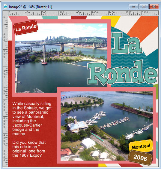
Since I am using PSP2019 on this project, I will make a rectangular selection in the area where I want the journaling to go.
Activating the Text tool, I click inside that selection, and the cursor will automatically appear on the top left corner (if you are aligning left).
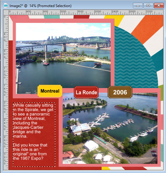
I added the text in white because when I tried in black (which is my usual color to use), it didn't look that great on the red. Once I am happy with this text, I can deselect.
The title
Most projects can benefit from a title. That can be a super simple title, or it can be more elaborate. In this layout, I will use something simple: the name of the park. Since the kit has an alphabet, I will use the Open as Layer script to open and place all the letters I need for my title.
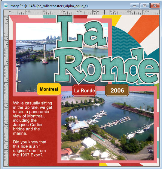
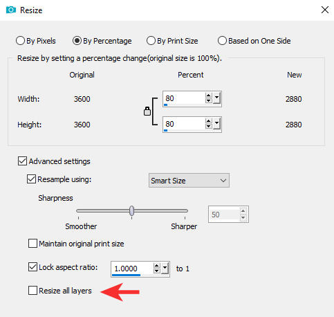
Placing the letters to read the title, I find they are too large and would cover too much of my photo, even if I overlap the letters. Let's resize the letters individually. Using the Resize command, I will choose to resize to 80%. If you do that, make sure that you don't resize all the layers, as you only want the letters resized.
Repeat for each letter.
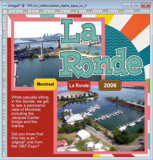
That is still a bit large to my taste, so let's repeat to resize another 80%.
That seems to suit me better.
Let's now just arrange the tickets so they are part of the layout.
Our layout is really starting to look like a completed page. If we want, there are a couple of steps still to cover before our project is ready for posting or for printing. Stay with me for those last steps.
Time to add some embellishments.