
PaintShop Pro has one command that is used very often, and it is the Drop Shadow. Typically, a user will take advantage of this command to add depth and volume to a project, to show the thickness of an element or make it look like it is coming off the surface. But it can also be used for other purposes. Let's look further into this command.
Drop shadow
It is quite obvious that the main (and most intuitive) purpose of the Drop Shadow command will be to add a drop shadow to an element. Otherwise, why would it be called that? So we can all agree that if one wants to add a drop shadow, that is the command to use.
Fake shadow
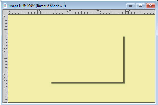
When two elements are very close in color (or identical), a "fake shadow"is what will make the two surfaces distinct from each other. This is not an official term and you will not find it anywhere else. I just call it that way because, although it is using the Drop Shadow command, it has a different purpose.
Look at this image. If I simply add a regular Drop Shadow on this element, two sides have no differentiation from the bottom surface.
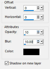
In order to have some definition on those "invisible" sides, we can apply the Drop Shadow command but with a very faint setting with a 0 offset. However, to make it show up, we will be playing with the Blur setting. In this example, I used the 0 offsets, and a 10 for the Blur, but notice that the Opacity is very low. In fact, I don't want it to LOOK like a drop shadow because it will then compete with the REAL one and give an odd result.
And this is the end result for this "fake shadow".
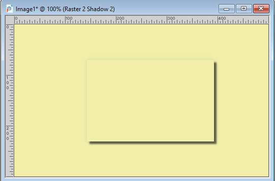
Of course, you don't have to use these exact settings, but you can see how this command has now added a little detail that makes the top rectangle stand from the background, even though it is exactly the same color.
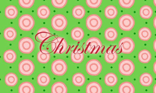
Text on a background
If you are doing digital scrapbooking and are using letters that could be cut out of paper or cardboard, you should add a normal drop shadow as those elements would have a certain thickness. However, writing that is supposed to be done with a pen, a pencil or a crayon would not have any thickness so you should never add a "real" shadow. Let's look at this text:
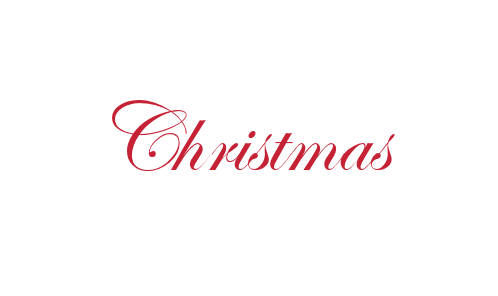
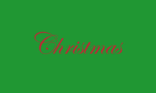
While the text has a color that is very contrasting from the background, you should not add anything to it. It is clear, crisp and easy to read. However, if the same text was on a different color background, you might need some additional effects to make it easier to read.
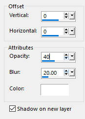
You could add a "drop shadow", using these settings:
And this will yield this result:
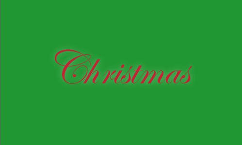
Notice that in this case, I used white color. If the color of the text and the background were lighter, a black shadow might have been more appropriate. You will have to experiment to see what will achieve the result of making your text easier to read based on its color and the background it is on.
In the example below, the background is much busier so the same settings as in the previous image didn't do much as far as legibility, so I had to increase the opacity to 100%, yet, you can see that it does not look like a drop shadow.
Could you use a black shadow? probably but you will have to adjust the settings so it won't give the impression of a big black blob on your project like this:
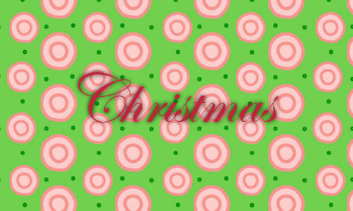
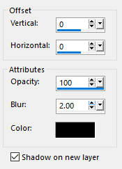
In fact, this does not help with legibility at all, but if we change the settings to reduce the Blur:
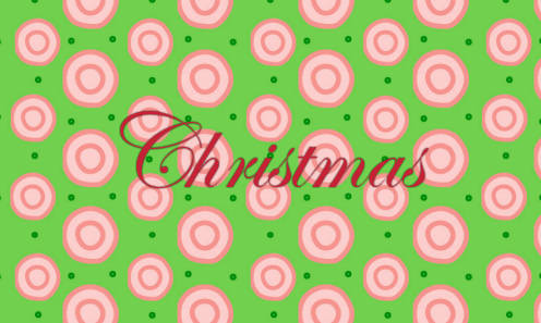
We get something better where the "shadow" simply emphasizes the text:
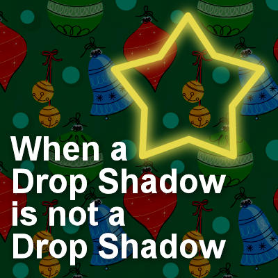
Glow
Another fun use of the Drop Shadow command is to create a glow around shapes, elements, and text. Let's see how we can achieve this result starting with this star on a dark background (you can use other background colors, but the effect is more obvious on darker ones).

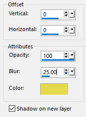
We can add a "shadow" with no offset (since we want it even all over), and a large enough Blur setting to see the glow. The Opacity will likely need to be at 100 to compensate for the fact that the Blur itself will reduce the opacity. Notice that the chosen color is the same as the drawing. Although it does not have to be, it just makes sense if my shape is supposed to be neon for example as it will cast a yellow light.
And this is what you will get:
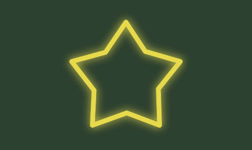
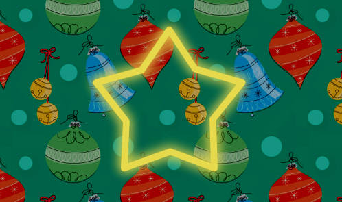
And if you want that glow to be more obvious, or if it is on a busy background, you can duplicate that "drop shadow" layer to get something more visible.
In summary
While the command is called Drop Shadow and will mainly be used to replicate an actual drop shadow for elements that have some thickness, it can also be used for other purposes. Explore that command and its settings and see what else you can do. Just make sure you don't add a REAL drop shadow in a funky way!


3 thoughts on “When a Drop Shadow is not a Drop Shadow”
thankyou Cassel
I just love things that ‘glow’
I have had Paint Shop Pro for a while but haven’t really done anything with it much successfully
so I have decided to learn doing happy little ideas and these are just right for me. Thankyou again
This is great, Carole. I’ve used some of these methods myself, but your tips really helped clarify how to do them successfully. Thanks much.
Hello Cassel,
This lesson on the “fake shadow” blog helped me greatly to highlight the numbers and other elements that should have no shadow.