Are you collecting a lot of cute and fun fonts only to realize that you are getting overwhelmed by the sheer number of fonts you have accumulated over time? And when you want to use one font, do you tend to revolve around the same ones all the time? You can't spend hours sifting through everything you have, right? It is time to clean up.
Use a font viewer
There are different font viewers available to you, depending on your system and your preferences. I still like to use TheFontThing, and it still works for me. I use Windows 10 and it is now VERY slow, but it still works. This font viewer (and others) allows you to view what a font looks like. That way, you can decide if you want to keep it and if so, in what category. Trying to sort by name only is like ordering parts for your car based on inventory numbers alone. Just not convenient!
Choose major categories
Although my system is by no mean the only one, I found that starting with three categories could be a good start. Those categories are Dingbats fonts, Themed fonts, Foreign fonts, and Regular fonts. You would recognize them in this way:
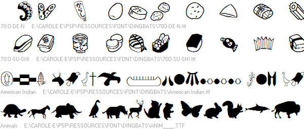
Dingbat fonts are simply designs and don't resemble any actual alphanumerical characters:
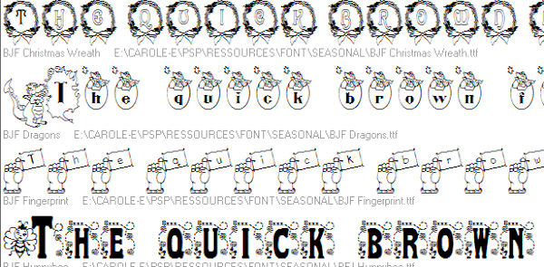
Themed fonts are actual letters but decorated or embellished to fit a particular theme, whether it is Halloween, flowers, Christmas, etc.
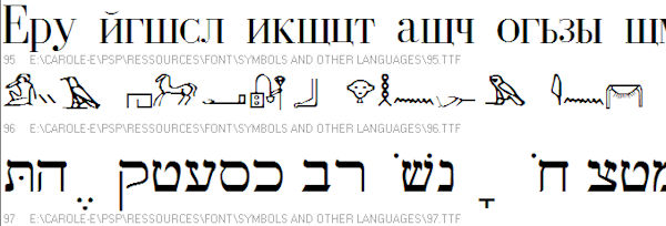
Foreign fonts might or might not be relevant for you, but they would include fonts for foreign languages like Arabic, Chinese, etc.
Regular fonts are, well.... the rest of the ordinary fonts.
Create sub-categories
Here is where you will have even more flexibility and it will depend on various factors like what you have collected over time, what type of work you will do using those fonts, and so on. Among the possible sub-categories, you can use these:
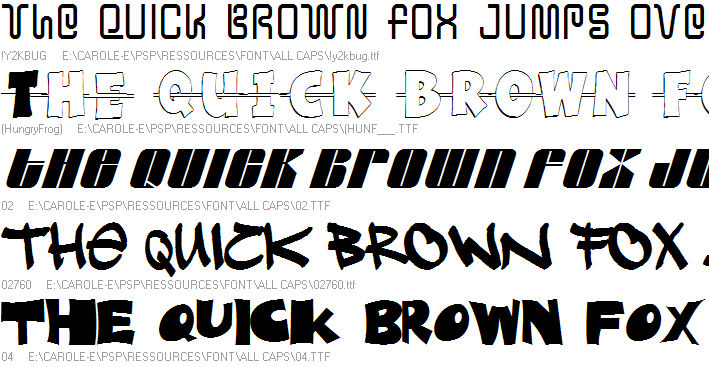
All caps, which are fonts that have only uppercases. Any lowercase will either appear as uppercase or be missing completely. Those fonts are still useful if you want to create titles or alphas.
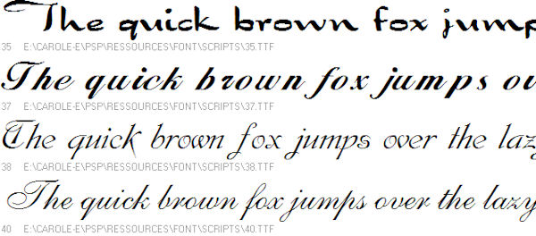
Script fonts could be those that simulate handwriting fonts, where the letters are attached to each other.
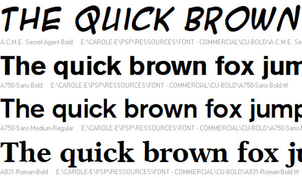
Bold fonts might be interesting to have on their own as you might want to use those "fat" fonts to incorporate papers or even photos. The thicker the font is, the easier it is to view a photo.
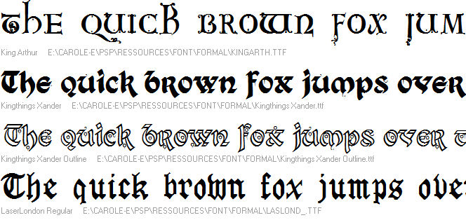
Formal fonts might be used for more elaborate projects, like wedding invitations. They are typically not used in day to day projects so keeping them in their own folder will make fewer for you to browse through.
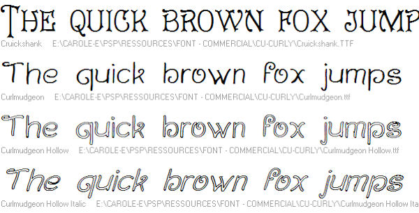
Curly fonts could be all caps, or not, they are a little fancy or fun but not formal.
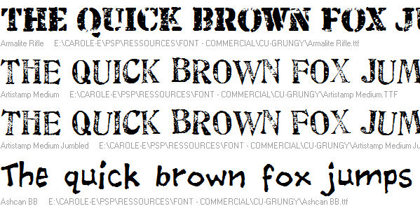
Grungy fonts are those that seem to show wear and tear. They can be graffiti-like or just worn out.
Of course, these are only a few types of sub-categories you can consider but you can think of others depending on what you tend to look for. If you are sometimes looking for particularly thin or narrow fonts, you can set a sub-category for Narrow. Or if you need accented characters, you might want to make a particular category for those.
Sort by usage
Depending on what you will be using the fonts for, you might need to know which ones are allowed for commercial use. This could be another category altogether. Of course, this label should be identified as soon as you download the font as you will have a hard time finding out the terms of use once they are collected in your massive folder!
If you don't use any font for commercial use (creating alphas for scrapbooking, or posters for Fiverr), this might not be as necessary but you might want to be safer by still sorting that way. Who knows if you are not asked to do a paid job later on and then you would be stuck having to figure out if you are allowed to use this or that font.
Delete
You might have a thousand fonts, but are they really that different and unique? Sometimes, some fonts are very similar. Do you have any particular reason to keep them all? Remember that it means more fonts to browse through. When I once purchased a bundle of 1000+ fonts, I realized that close to half of them were repeats or almost-repeats of other fonts. Go on. Delete. You are unlikely to use all of the 500 remaining fonts so why add an extra 500? I know, it is hard to delete. If you really can't hit the Delete button, you can always make a separate folder for "To Delete" or "Useless", or something like that. If you really insist!
Of course, sorting hundreds or thousands of fonts is not a quick task. It will take several days or even weeks. But work on it a little at the time and you won't feel too overwhelmed. And if you are just starting to collect those fun fonts left and right, now is the time to start a system. Believe me; you will need one!


9 thoughts on “Sort your fonts”
I have been using Font base successfully on both my laptop and desktop using Win 10 and more recently Win 11. I install the font using Affinity Photo or the latest Affinity suite and they automatically also install into Font Base without me doing anything else. I am using the free version of Font Base. I have just checked and I have over a 1000 installed.
Well it seems The Font Thing will not run on Windows 10. 🙁
Anyone have any suggestions on one that will run on Windows 10 AND pick up ALL my fonts??
patti
I just tried using both FontBase and NexusFont. Neither picked up all my fonts! Going to try The Font Thing next!
In the article listing 5 free font viewers, Nexus font and AMP viewer are supposed to work fine with Windows 10. Did you try AMP Viewer?
In Windows 10 you can see what your fonts will look like in print form. Click on the gear for Settings, Personalization, and then Fonts on the left side – you will see them all in their true form in the middle.
Hi all, blog is timely – but a bit out of date! the link to free font viewers is about 5 years old 😉 A couple of the best around now are FontBase and NexusFont.
Yes, the article on Font Viewers is older but some of them are still around. I might do another one with fresher links. Thanks.
I loved the “Font Thing” but since I now run a Windows 10 machine I haven’t been able to find a workable manager I like. So I now have thousands of Fonts I never look at. LOL I use to be on a Font mailing list and got at leas a 100 a month as well when Two Cows offered their whole collection for download when they dropped fonts I took it, with no font manager they just sit there.
I have been struggling with this for sometime. Thank you, Carole! So far I have folders for Favorites, Bold-Fat-thick, Brush, Curly, Dingbat, Foreign, Formal, Graphic/Themed, Grunge, Holidays, Script, Thin-Skinny. I also have a lot of fonts I am not sure where to put…maybe another category.