Home of the Scrapbook Campus › Forums › Showroom › What are you working on (in June 2019)
- This topic has 114 replies, 14 voices, and was last updated 5 years, 5 months ago by
Sharon Wilke.
-
AuthorPosts
-
June 1, 2019 at 8:52 am #29554

It is a new month and new projects.
Show off what you are working on in June, be it a scrapbook page, a tutorial, or anything else you want.
We are curious and want to see, learn and get inspired.
These threads are quickly becoming a fantastic source of inspiration, support, and friendship. Keep them coming!
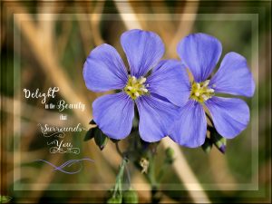
June 1, 2019 at 9:14 am #29556Saskatchewan hasn’t had any rain this year. These past two years we’ve had very little in the way snow, for moisture. The Anemones were hit by frost last week, so the only colour I have in the flower beds so far are the wild flax flowers. Over the years I have taken thousands of flower photos, so I won’t be short of material for projects. To create this background paper, I used the adjustment layers, and the character map to create fancy text. The paper will go into the pending group folder along with some elements, ready to be made into an ecard for a friend.
June 1, 2019 at 12:56 pm #29562Sue, the photo is beautiful and the project is amazing! Great work!
June 1, 2019 at 8:01 pm #29582Thank you Cristina, you know only to well, how I like frames. 🙂
June 1, 2019 at 9:01 pm #29583Sue, this is delightfully simple and effective. Gorgeous photo my friend. <3
June 2, 2019 at 1:52 am #29586Sue your project is beautiful and will make a wonderful ecard for your friend.
best wishes,
Dawn.
June 2, 2019 at 5:46 am #29602Very nice tutorial among others of this month. I had fun to divert it.
June 2, 2019 at 7:35 am #29606Yes Sue it is really a beautiful photo and pretty idea to use it as an ecard. I am used to take my little digicam with me, (easier to put in the bag as the panasonic) ready to take pics along my way. Flowers, animals, clouds and architectural details are my favourites. I am interested in the way you created the background and want to try it. Using the character map for the fancy text was certainly much work …
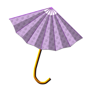
Bonjour Mireille, bien réussi, very funny umbrella. Which tutorial is it?
June 2, 2019 at 8:15 am #29608Bonjour Libera,
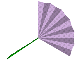
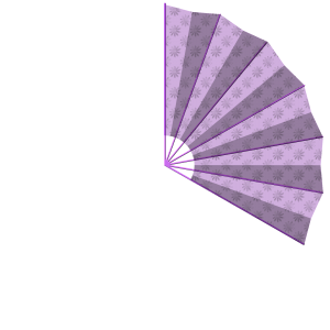
Voir The Lab9-06 vidéo paper fan, j’ai retourné le template avec le motif et ajouté le manche créé avec Pen tool taille 22 + texture bois + inner bevel + luminosité et contraste pour assombrir ou éclaircir selon le rendu de la couleur. Voilà !
Bonne journée.
For English speakers :
See The Lab9-06 video paper fan, I returned the template with the pattern and added the handle created with Pen tool size 22 + wood texture + inner Bevel + brightness and contrast to darken or brighten depending on the color rendering. Voilà !
June 2, 2019 at 8:42 am #29612Thank you for the lovely comments on the very simple but effective layout on the flower ecard. Many of you will know that I’m not one for making a busy layout. Libera the adjustment layers are very easy to use, and even after you have completed the project you can go back and change those layers in the psp file, as long you don’t merge them down. Firstly locate the adjustment layer tool. I can be found at the very bottom of the layers pallet, the second icon from the left, hover your mouse over the icons and it and it will tell you what each tool is. Now to begin, using the selection tool, select all. With the main photo selected, click on the adjustment layer, and select brightness and contrast, adjust the brightness, to your liking, and click ok. Now contact the selection to your liking, and hit the delete key, while the adjustment layer is selected. Now go back to the main photo, and contract the selection again, select adjustment layer, brightness and contrast, and click ok. Contract again, and hit the delete key. Go back to the main photo, and repeat. You can also start from the inside, and expand, or use circles, or any shape in the selection tool box. I save then as a psp images, leaving the layers in tact. For the outside border, I selected all, contract, invert, and use a small inner bevel, to emphasise a small frame, neat frame. I hope you are able to follow these instruction. Myself and I’m sure others would like to see one of your adjustment layer projects.
June 2, 2019 at 8:49 am #29613Hello Sue Thomas,
Oops, I see I forgot to file a comment on your very nice photo. Very good rendered and sober as I like them except, of course, when there is a challenge where you have to put all the requested elements. Have a nice day.
June 2, 2019 at 8:52 am #29614https://scrapbookcampus.com/2017/08/using-fancy-fonts-in-your-psp-projects/ Here is the link for the fancy text.
June 2, 2019 at 9:42 am #29615Mireille I agree, I am not a fussy frilly sort of person, I’m very much a minimalist when it come to my projects. Thank you for your kind comment.
June 2, 2019 at 10:22 am #29616Wow Sue thank you, I just thought about asking you if you used PSP pictures frames and changed the opacity because I forgot it in my former comment. Did not expect to have such a quick and long description and the link. I feel spoiled (hope its the right word). I already looked for the adjustment Iayers before after having read this above your photo. Oh la la, new challenge, the french girl needs to work it out :-)!
Super, merci Mireille, je ne suis pas encore abonnée au Lab mais tes explications sont très intéressantes et précieuses pour appliquer ces fonctions pour d’autres travaux.
It’s funny to write in both languages. I’m not yet a member of the Lab but Mireille’s good description too is an additional incentive to try it.
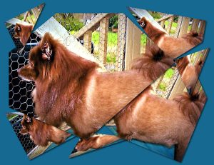
June 3, 2019 at 7:36 am #29626I was present at the presentation this afternoon, and as I previously said, I have the shattered glass, and slats script. Now I know how to do them manually, excellent presentation!
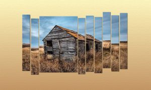
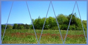
June 3, 2019 at 8:01 am #29628Working my way through the presentation, cut the scissors. This time slats. Once you know how, it’s not that difficult to do. So many of my questions being answered. As I often wonder how does the script to that, now I know. I also leant several new techniques, using the shift and alt keys. This presentation has to go to the top of my list of favourite master classes. Thank your Carole, you are awesome!
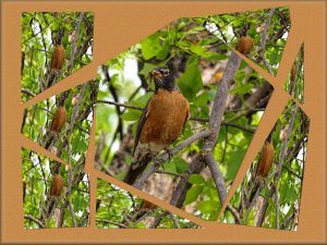
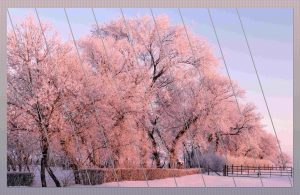
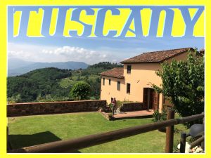
June 3, 2019 at 8:57 am #29630Here’s my take on the first exercise that Carole did in yesterday’s presentation. I’m going to enjoy showcasing my photos this way. I did edit this photo, I used Topaz detail plugin.
June 3, 2019 at 2:22 pm #29633Sue, the Get the Scissors was really a great class… I love your photos, I think they are amazing! And they look great with this technique.
June 3, 2019 at 3:33 pm #29635Thank you Cristina, it really was a great class. Here’s my last technique.
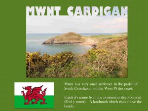
June 3, 2019 at 8:13 pm #29638June 3, 2019 at 10:36 pm #29639Lovely work Raymond. I’ve been to Cypress, many, many years ago.
June 4, 2019 at 12:32 am #29640Mireille very nice fan created from the tutorial.
Sue your 4 projects look great with the techniques from the class …. the photo in the cold day jan 2019 is beautiful.
Raymond nice photos for this technique and great result achieved.
Dawn.
June 4, 2019 at 12:39 am #29643The background eraser is your friend.
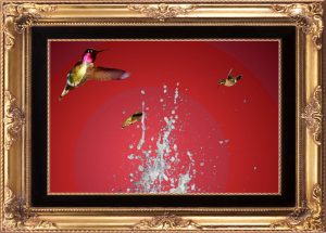
Why would a person take an image with water blobs from a fountain with a blue sky background, replace the sky with a red circular gradient, and toss in a few humming birds? The background eraser made me do it….
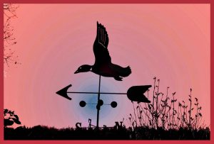
The weather vane image had a blue sky with clouds. Working with Tolerance and Brush size, the natural sky was obliterated.
The background eraser made me do it….June 4, 2019 at 12:52 am #29645Dennis… yes the background eraser is a useful tool….. you have achieved nice results on both your images but i particularly like the one where you have added the humming birds… a very creative idea to do that.
Dawn.
June 4, 2019 at 8:59 am #29652Sue, Ray, Dennis: what atmospheric pictures and successful works with the new class and the eraser tool!
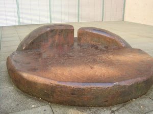
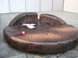
I also tested the eraser tool too recently and was really surprised how good it can function but I need practicing too. The following is just a quick work with this tutorial I discovered last week: https://scrapbookcampus.com/tips-tricks/magic-fill-pspx7/
I went to a museum festival sunday and took a photo outside of a stone bench just to try this tutorial. This one was easy but it depends on the photo material. I hope the results this time will be uploaded in the right order and if not you guess easily :-).
June 5, 2019 at 1:47 am #29679I attended the live presentation and I enjoyed it thoroughly. I learned so much! I only had to replay it once when I got confused. PSP is an amazing software. I never realized that there was so much diversity in the tools. I’m so glad that these tutorials are available.
Sue, I love your e-card! The flax flower is beautiful. In nature there aren’t many flowers that are blue. That makes them so special.
Ray, those are gorgeous photos! I’ve always wanted to go overseas and see the beautiful landscapes there.
Hey Dennis, I’ve become a big fan of the background eraser tool too!
June 5, 2019 at 8:25 am #29687I love all the results from the webinar that Scrapbook Campers are exhibiting. It was a really cool session and very inspirational. Congrats to all who attended and for the lovely work displayed above. <3
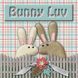
June 5, 2019 at 1:05 pm #29692I took a little time off to play around with some adorable graphics that I was gifted with. They are so cute!!! One was from Cassel and the other was from Pixelscrapper. You guys are the best!!!
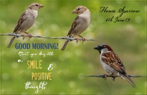
June 6, 2019 at 9:26 pm #29715It’s morning somewhere! Took some photos of a male and female sparrow this morning, and created this, this evening. For the background paper, I selected an area from one of the photos, seamless tiling, and flood filled. Used a mask which I made some time ago. The female sparrow is the same bird different posture, matched the fence to make it look like two birds on a fence. For the text I used the lock tool to change the colours, after changing the text from a vector to a raster.
June 7, 2019 at 1:21 am #29720libera.. nice result with the magic fill tutorial….
Sharon .. nice results from that live presentation.and your Bunny Luv page is so cute.
Sue.. nice photos of the sparrows and the good morning quote is a good one.
best wishes to everyone,
Dawn.
-
AuthorPosts
- The forum ‘Showroom’ is closed to new topics and replies.


