In working with graphic projects, we have to create the illusion of realism on our own, but in order to accomplish that, we have to initially observe and understand what nature shows us, every single day. Shadows are one of those elements that we don't usually notice unless it is wrong or odd, or until we have to replicate it manually.
What is a shadow?
It might sound like a very basic question but it is an important one. A shadow is defined as "a dark area or shape produced by a body coming between rays of light and a surface". So basically, it means that if you have an object placed between a light source and a surface, that object will cast a shadow.
Different types of shadows
Shadows are created with three elements: a light source, a surface, and something blocking the light. The resulting shadow will depend on where the object is placed based on the light source and the surface. Here is a little demonstration.
If your object is closer to the surface, you will see a clear shadow.
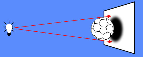
That is a common type of shadow that we see every day. In fact, photographers have long been taking pictures of such defined shadows, like this:

Of course, the subject is much closer to the surface (the road) than the light source (the sun), which is why we can see that definite and familiar shadow.
If the object is further from the surface, some light seem to bounce from the surface and will contribute to a more diffuse shadow.
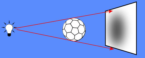
Even though we see those kinds of shadows every single day, we usually don't pay too much attention to them, do we? But when we see a picture, we immediately know what the shadows mean, even without realizing it. In this picture, for example, we can see two types of shadows: some clearer and darker, and some fainter and more blurred.
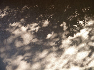
What do we understand from looking at those shadows? We know that some branches are closer to the wall, giving the more defined shadows, while there are other branches further, giving the lighter shadows. Do you see that?
The same thing applies to everything around us. Look at your desk, at your walls, at your floor. Even without going outside we see shadows. We understand shadows.
Everything has a shadow?
Based on the definition of a shadow, yes, everything has a shadow, however, that shadow is only visible on the surface the shadow is cast on. This means that if Venus passes in front of the Sun, it will cast a shadow in the universe, but we won't see that shadow because the surface on the Earth is too far. In a closer example, you might have a tall antenna that casts a shadow on the ground, but the tip of the antenna might be so far that the shadow is no longer visible. It does not mean it does not exist. It just means that the surface is too far to show it. If you had a wall close to that antenna, you would see that shadow!
Do we need to add shadows to everything?
Yes and no. The fact that EVERYTHING has a shadow should mean that you need to add shadows to every element on a project, but that will depend on one important variable: where is the surface? Like in our antenna example, if the surface is too far, you won't see a shadow, and that is normal. Similarly, ink will cast a shadow on its surface, however, the ink is actually covering its own shadow, so you would not see it, would you? (unless you paint on glass and see the shadow on a different surface) Other than that, yes, we need to add shadows if the element does not come with one already.
Big or small shadows?
If we are considering flat project, like a collage, a scrapbook page, or similar designs, the shadow size will depend on the distance between the object and the surface since normally, the light source is not changing place. The closer the object is to the surface, the smaller the shadow will be. But that is not all. A close object will have a smaller shadow but also a more defined shadow and furthermore, a darker shadow. Those three elements go together. On the other hand, when the object is further, the shadow will be larger, lighter, and more blurred.
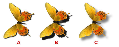
On these butterflies, Image A shows that the butterfly is flat on the surface. You can see the dark, small and well defined shadow. On the other hand, Image C shows a larger, lighter and more blurred shadow, telling the viewer that the butterfly is away from the surface.
What about Image B? It has the characteristics of both positions (close and far) and it is just not obvious to the viewer what it should mean as those characteristics seem to say different things: the large shadow should mean the butterfly is away from the surface, but the dark well defined shadow says otherwise. So it is confusing to the viewer.
In a project, if only one element has a confused shadow, it might not be too bad but if several elements have such inconsistent shadows, the whole project will have an odd feeling, even though we might not really know what it is.
Let's be logical
In the case of a butterfly, it would be understandable that its shadow would say it is away from the surface. After all, butterflies don't stay flat on anything in real life. But what about a ribbon? or a photo? or a button?

Let's look at those buttons. Which image seems more logical to you? Can this button logically be floating off the surface like a butterfly? I don't think so, which means that Image C that was perfect for a butterfly, is no longer appropriate for the button. How about Image B? Although the dark shadow means that the button is close to the surface, that shadow is quite big, which would be possible if the button was, itself, very thick, which I don't think is the case. So it means that Image A would be more logical for this particular element.
Why not have clear settings for shadows?
I am sure a lot of people would love to have presets they can use with all their projects. The problem is that although there are some basic rules in determining the shadows needed for an element, those will still vary depending of various factors. If you have a 100 pixels button, the shadow will have to be smaller than if the same button is 500 pixels. If you work on a larger project, the settings will be larger (especially the size, obviously). Also, the same element might be placed in a different way, therefore would need different settings for its shadows. A ribbon is usually flat on a surface, but it might also be curled, or attached to another element instead of the base paper. That would require different shadows.
What are the basic rules to remember?
The rules are simple to remember, even though you will still need some tweaking to make them as realistic as possible.
Closer to the surface
- small size (small offset)
- high opacity (darker)
- low blur (well defined)
Further from the surface
- larger size (larger offset)
- lower opacity (lighter)
- high blur (less defined)
Easy enough? Hopefully it will help get a good start, however, there are still a few other details, like the direction of the shadow and its consistency with other elements, but that would be for a more advanced explanation. Give these a try and have a closer look at your shadows. You might be surprised.





6 thoughts on “Everything needs a shadow… almost”
The little I known about shadows is thankful to your wonderful tutorials. I still have a lot more to learn. Great post.
Back in 2011 you did a Master Class on Shadows, perhaps you could revisit this and expand on it. I find shadows can be difficult, especially when you have layered elements.
Thank you for this Cassel, your clear explanation made perfect and logical sense. I find myself looking more at where shadows lay naturally these days and try to use this when placing shadows. They still scare me and as you have pointed out, their placement etc makes all the difference with making things look right or not. This would be a great subject for a seminar topic as i know you have only touched very lightly on it here in the blog.
If there is enough demand, I can surely hold one class on the topic. Thanks for the suggestion!
Great tip. I find shadows so challenging. This is very helpful.
Hoping it does help. I know how shadows can be challenging, because we don’t think about them when we look at things around us. And I have seen so many layouts with “odd” shadows!