When you need to use an image for a project, it is unlikely that you will be able to use it just like that, without resizing it. New cameras take huge images and most of the time, that is just too large for what we need. What do we need to do? Simple: resize them. But this has had me cringe several times when looking at graphic projects since the resizing can be done wrongly. Here are some pointers.
Enlarging is dangerous
If you have a small image, it has a fixed number of pixels. If you enlarge it, the program can't add details that are not there. This means that the whole image would get blurred.
Here is an example of what a segment of an image would look like if you enlarge it. First, here is the original size image:
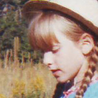
The quality was not the best like many older photos we have. The image is quite small; about 200x200 pixels. That is really too small for a scrapbook page that is typically 3600x3600 pixels. So maybe I'll want to enlarge it to a more usable size of 800x800 pixels. Here is what it would look like:
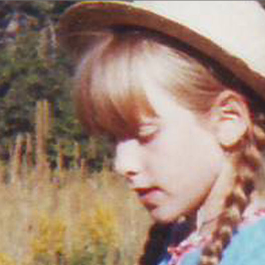
Notice that the details are grainy and blurred. If I REALLY needed to use this photo in a larger format, I would have to accept this lower-quality image.
If you need to enlarge an image a little bit, the distortion might be minimal, but if you double or triple the original size, you will lose a lot of quality.
UPDATE: if you have PSP2021, there is a new option in the Resize dialog window that offers AI Resizing. This option allows you to size up with much less distortion on your image. A great tool at your fingertips.
Sizing down without distortion
If sizing up is risky, sizing down is no problem. Of course, you will lose some details, but that will just be the limitation of the medium you are using (print versus monitor display). If you are taking very large pictures with your photo or your camera, you have the choice of how much smaller you can resize your photo. The main issue with resizing is how you do so. Some tools will give great results, others will make you cringe.
If you can use the Resize function in any program, it should be done correctly.
In PaintShop Pro (and other programs), there is a tool that will let you manually adjust the size of an element or an image. This is where disaster can happen. In PSP, the most common tool used to resize is the Pick tool. This tool will place handles around your image, and you can move those handles to resize it. However, you have to be careful about which handle you are moving and what Mode you are using.
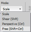
You will surely want to use the Scale mode, otherwise, you will distort your image. The Scale mode will place 9 handles on your image: 4 on the corners, 4 on the sides and 1 in the center.
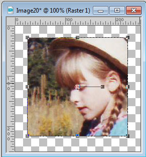
Even though the mode is set to Scale, it does not mean that all the handles will resize the image correctly. If I use one handle from the side (top, bottom, left or right), and move it, it will change the proportion of the image.
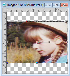
This is obviously NOT a good way to resize. It will make the subject look squished or stretched, depending on which handle you moved and in which direction. Instead, you need to use the CORNER handles.
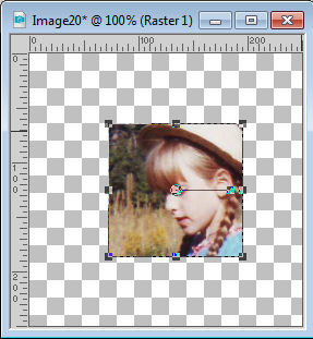
This will ensure that the resizing is proportional.
Resizing to fit
Here is one very common mistake when manipulating digital images, whether they are photos or graphics. Sometimes, you might want to place an image or an element inside a specific area, but that space is not in the same proportion as the starting graphic. There is the temptation to adjust the height OR the width of the element while disregarding the proportion. I have seen that often with logos, and it really makes me cringe.
For example, the logo for the Campus is this one (this is a 250x242 pixels image):

Let's say I wanted to place it on a banner for an advertisement. But I am asked to provide a banner that is only 200x150. If I change the logo to fit that size, exactly, it will look like this:

As you can see, it immediately looks different. If I need to fit a square image into a more rectangular space, I would have to resize based on the smallest side, which would be 150 pixels in our example, and fill in the rest with white (or any other color).
Cropping
The same issue can be seen with a photo if you are using a template or a frame that is of different proportions as your photo, and you are tempted to match the size. If the photo is vertical like this one:

and you want to fit it into a square frame, don't squish it!

Instead, you have two options. Either you resize proportionally and get some extra on the sides or you can simply crop it and cut off the excess. Often, cropping is a better solution as there is no distortion and furthermore, it allows even more focus on the subject.

Doesn't that look much better?
Don't destroy the pictures you have by incorrectly resizing them. It will give a weird result that will make the viewers cringe. Your photos are worth the time to adjust their size correctly.
If you want a list of more common digital mistakes, check out this blog post:
10 common mistakes in digital scrapbooking





6 thoughts on “Resizing images the right way”
It’s also helpful to mention that you should save original photos as PNG, vs jpeg. My Nikon P900 Coolpix only takes jpeg images. Once I download them I save them as PNG, so there will be no more loss of pixels. When working with any photo, make a copy to work from and close the original IMMEDIATELY. I always leave my originals whole and uncropped as I never know how I may want to use it the next time.
Carole’s advise to copy and close the original image, before it asks if you want to ‘save the changes’ is spot on.
ANY time a jpeg image of ANY kind (including digiscrap papers) is used and Saved As – it will compress every-so-slightly. Over a period of time, it will lose much of it’s original detail. I learned that lesson the hard way, when I was new to digital photography, and cropped a few original photos. Now some of them are passable on social media – as thumbnails – but enlarge or print them and they are horrendous.
Carole, have you tried the new AI in PSP2021 that is supposed to allow us to enlarge images without pixel distortion? For that feature alone, I’m considering an upgrade if it really works.
Yes, I have and I have been impressed by it. I should probably edit this post because that new AI is quite effective in sizing up an image with much less distortion than previous tools. Thanks for pointing that out.
Your so Awesome, love being in your Class I am learning how to do this psp2020 I bought myself. Thank you
All good and very helpful!
Thank you for this Cassel