Last week, I posted 10 mistakes that were commonly seen while digital scrapbooking, and several scrappers added a few more to the list. So here is a follow-up with more mistakes one can see in digital layouts.
1- Missing Shadows
This can either be a beginner’s error or a slip of the mind. Beginners might either not know the importance of shadows or never noticed they are to be added manually, unlike paper scrapping. Veteran scrappers might, on the other hand, have been working on various elements or clusters and either just skipped shadowing one element among their many, many layers, or were working on some sections and temporarily turned off one or some shadows only to forget to turn them on again.
Can you spot the forgotten shadow layers?
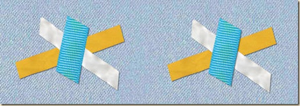
2- Between the element and its shadow
This is another error that is less frequent and mostly due to inattention. When your software allows creating shadows on a separate layer, it also gives you the opportunity to slip another element in the wrong order.
This is obviously an easy fix, as long as it is caught before publishing since it is only a matter of rearranging the layers.
3- Flat shadows on fantasy or 3D elements
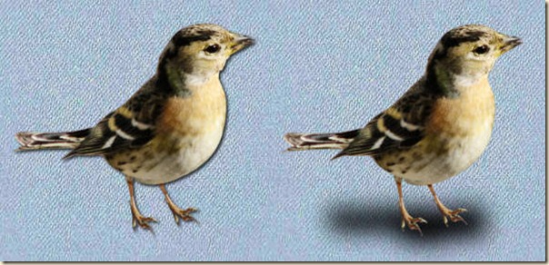
Our eyes are expecting to see a shadow that is consistent with the element itself. The shadow of a sticker on a paper will be different than the shadow of a straight pin if it is “standing up”. The same principle applies if you have a fantasy layout that will look more like a painting of a scene and you have a flat shadow like a sticker.
Flat shadows and 3D shadows are fine, as long as they match the element they are associated with. In the above example, the left bird looks like it is an image, while the one on the right looks like it is standing on a surface, as expected with the realism of the element.
4- Light spot in different directions
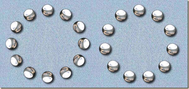
Just like having obvious shadows in different direction is usually not “normal”, the same applies to the light spots. This mistake is often seen when one uses the MuRa’s Meister filter to place a single element in a circle or in a wave shape. Notice that in this case, the filter will rotate the element, changing the light spot every time. The best way to avoid these oddities is to use that filter with elements without light spots (or shadows). Instead, if you use PSP, grab the Vector Tube script from Gary Barton and place the elements along a vector line. That way, all the elements will be placed correctly.
See the difference between the two options. On the left, the filter was used, turning the bead in all directions, while the circle on the right is made using Gary’s script.
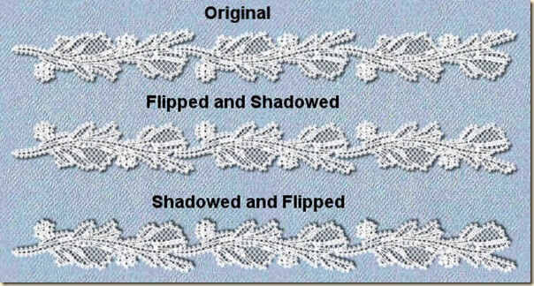
5- Flip and Mirror with light spot or shadows
This error is pretty similar to the previous one, and will often happen when a scrapper wants to add another copy of an element and has already added a shadow to it on the same layer. Commonly seen in photo corners, it is also present when trying to add some symmetry, and a ribbon, lace, or other linear element is duplicated and flipped or mirrored.
The best way to avoid this is to add your shadows at the very end of your layout. Flip, mirror or rotate first and then shadow. Not the other way around.
6- Proportions
Some elements are small, some are large, some are in-between. Designers are often creating oversized elements so that the users can size them down to match their project without losing quality (which would be a problem if they were to size up). However, this can also lead to some mismatch in the proportions of elements in a single layout. Two-inch long staples are not that common in reality. Three-inch buttons either. Just make sure that the elements are reasonably sized, but also consistent with the elements beside them.
Which one makes more sense to your eye?
7- Floating fasteners
Although floating elements are common when you have flat pieces and could, with a little imagination, be mounted on something to make them really hover, fasteners, by definition, should fasten the element. Common errors include adding a shadow to a staple and the shadow is not even touching the ends of the staple. Same mistake often applies to pins, straight or safety.
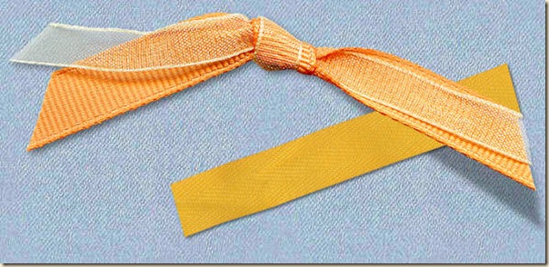
Which staple will hold your photo the best?
8- Cut off elements
Although it is totally possible to have an element like a paper or a tag or even a photo being trimmed on the side, other elements might simply look odd if they are cut off. Buttons and flowers are the most obvious. Try to move those elements away from the edge so that if the page is trimmed during printing, you won’t be missing half of the button.
You can see on the left that the location of the button gives kind of an odd look. At times, it might be fine to leave it like that, but it might make some viewers cringe.
9- No inside shadow
Shadows should be present everywhere, whether it is in a cluster or on single elements. To go a little faster, it is tempting to create a cluster of elements, merge them and then add a shadow to the overall product. However, this will definitely create an odd look as your brain is expecting something that is only half there. This is an important detail both for designers and scrappers. Designers should make sure they place a logical shadow on the “inside” elements since the scrapper will not be able to add any there, but scrappers should also be very aware of those: if there are no shadows within a cluster, they can either take on the tedious task of adding it themselves (really not recommended), or only choose to get clusters that will include such a shadow. Also, beware of the direction of the shadow before adding it to your project.
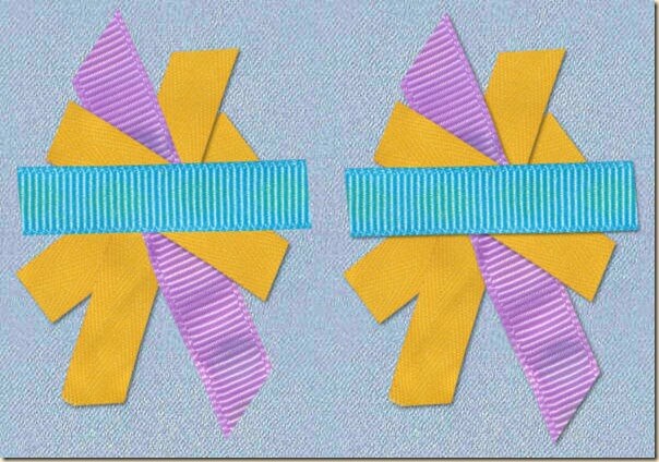
Do you see how, on the left, the whole cluster was not shadowed, but the shadow was added only to the overall arrangement? You can see that the expected shadow is present on the ends, but not where it overlaps, unlike the right side example.
10- Mismatched perspective
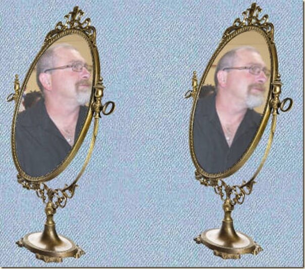
Last week, we mentioned how the proportions of a photo can be totally off when it is resized the wrong way. The same applies when you specifically want to have a photo inside a frame that has already a perspective to it.
Whether it is to add in a frame, a mirror or on a fantasy wall, placing a totally flat photo will not look consistent. You will then need to know how to modify the perspective of the photo to match the support.
Digital scrapbooking definitely allows you total freedom with what you do. You can add shadows, trim elements or distort anything you want. Some very artistic layouts are made using very unconventional tools and effects, and it is usually fine especially if the overall project immediately tells the viewer not to expect realism. On the other hand, if you are aiming for a realistic layout, you will want to avoid those mistakes as they will often give that overall impression that something is off, even if the viewer might not be able to pinpoint the culprit.
Check out the Realistic Shadows in Digital Scrapbooking webinar with tips on how to avoid some of those shadow mistakes.
Can you think of other kinds of digital scrapbooking mistakes? Any error you have seen or even made yourself? Tell us in the comments below.










3 thoughts on “10 more Common Mistakes in Digital Scrapbooking”
These are all excellent guides. I would like to mention however, in regard to “4- Light spot in different directions,” that as a long-time user of Mura’s filters, the “encircle” tool allows you to rotate the image avoiding the problem you mention here. ?
That is good to know. I would guess that most people don’t use that option as I have seen so many inconsistent light spots!
I’m sure you’re right in that assumption. ?