Whatever program is used for digital scrapbooking, the scrapper is responsible for doing everything. That means sizing, shadowing to writing to texturing, while paper scrappers do not usually have to worry about it. Unfortunately, a lot of details escape the mind of the user and the resulting layout will make one raise eyebrows. Sometimes, we will look at a layout and immediately spot the error. Other times, it is more subtle and although we might not pinpoint the problem, we have the feeling that there is something wrong. Let’s look at some common mistakes we can see in digital scrapbooking.
1- Shadows in different directions
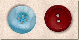
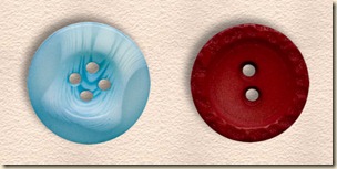
Although in real life, you can have multiple light sources, they always shed the same light on all the elements of a page. It is the same, whether it is the thin ribbon, the thick button or the flower. Consistency is a key factor as shadows are what our brain needs to interpret the information it gathers: is this element thick or thin? Is this element stuck on the page or lifted?
Notice the difference between the set up on the left where the shadows are going in two different directions and the one on the right where they go in the same direction.
2- Shadows and light on the same side
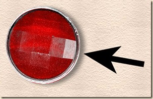
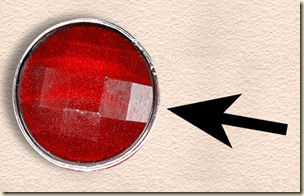
Shadows are created by a light source. This means that each element will have one side (facing the source) that will be somewhat lighter, or have a bright spot. The opposite side will have a darker edge, and a shadow. Some elements in kits will have a very obvious “light source”, therefore, the shadow has to go on the other side to be realistic.
See how, on the left example, the light is coming from the bottom left (indicated by the bright light spot on the gem) and the shadow is on the same side. It does not make sense, while on the right, the shadow is on the opposite side of the light spot, as expected.
3- Shadow on writing
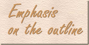
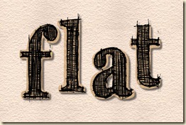
Unless you are using thick paint, the text has no thickness, and if it has no thickness, it cannot have a shadow, can it? It is possible, and well thought, to add a slight shadow effect on some text, especially if the color is not very contrasting, simply to help with readability, however, those shadows are not actual shadows, but more an emphasis of the outline.
On the left, the text, apparently handwritten, is floating above the paper, from what the obvious shadow tells us, while on the right, the shadow is not even seen as a shadow, but just as an accent, which would be “realistically” acceptable.
4- Writing on an element
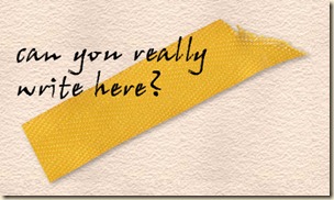
Would you be able to write across a button if you had it glued to your paper? Of course, digitally, anything is possible, but it is not very realistic. This is often a simple mistake where the scrapper might have moved either the text or the element without realizing that they end up in the wrong order.
Do you really think it is very realistic if writing goes from the paper to the top of an element? Of course, it would be somewhat different if it were an alpha since the individual letters CAN be layered on top of another element, as long as it is flat, and not thick like a flower!
5- Uneven resizing
This is a very common mistake and definitely will detract the attention from the overall layout. This is frequently the result of one trying to fit a photo in a set shape, like a frame, although, it is not always the case.
The best way to avoid this mistake is to learn how to resize PROPORTIONALLY any image or element. Usually, one resize function will include “handles” around the element and it is tempting to use the side handles to tweak a little here and a little there and end up squishing Uncle Frank in the process.
6- Floating shadows
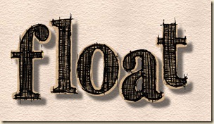
Shadows have a meaning when we look at them. If they are sharp, it tells us the light source is bright, while if they are blurred, we know the light source is diffuse. Also, if the shadow is small, the element is close to the surface where the shadow is, while a large shadow will be produced if the surface is further away. In digital scrapbooking, although large shadows might look interesting, they might not be realistic, especially for an element that should be, logically, directly on the paper.
On the left, you see a huge shadow that lets you imagine the letters all floating over the paper, while on the right, you can picture that the letters are glued to the paper, even if they are probably a certain thickness which shows with the shadow.
7- Fasteners on lifted elements
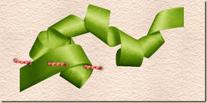
This mistake is common when a scrapper uses a great curly ribbon, or an element that is lifted on one end. But when you think of it, if you put tape or a staple to attach an element, you would expect that element to be, … attached!
Do you think that the stitching is in the right place? The ribbon is obviously off the paper, while the stitching should, in reality, hold it tight to the paper. This is an inconsistence that makes the arrangement look odd. For a curly ribbon or a lifted element, the fastener should simply be put in another location to “make sense”.
8- Colorized shadow
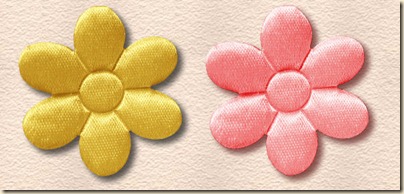
This is a very common mistake when one is new to digital scrapping, or when in a hurry. Shadows on an element will be usually a shade of grey. If the element is colorized as a whole, the shadow will also be colorized.
You can see the pink shadow on the right flower. It was a duplicate of the yellow one, but colorized as one whole. To avoid this, make sure you colorize the element before adding a shadow. Basically, it would be easier to avoid colorizing any element that already has a shadow.
9- Shadows on doodles
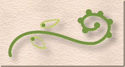
Normally, doodles are drawing, and as such, are just ink on a surface. This means that, just like handwriting, doodles have no thickness, and if there is no thickness, there is no shadow.
Does this look like a doodle on paper? As a rule of thumb, anything made in writing (doodles, drawings, text, etc.) should have no shadow.
10- Impossible layering
This mistake is often caused by a simple overlook of the layer orders. You can hardly have a flat photo on top of a thick element, at least not with the “normal” shadowing.
On the left example, the photo is on the rose, which is unrealistic, especially since the shadow on the flower indicates that it is thick. It would be different if the rose was flattened, and had a thin shadow, but not here. On the right, the order of the layers was changed, and in one little change, the result is much more pleasing.
Digital scrapbooking allows the user to do many things that are impossible in paper scrapping or in real life. Blending, perspective, colorizing are just a few effects that are exclusive to the digital medium. However, if a scrapper wants to create an eye-pleasing layout for the viewers, many common mistakes need to be avoided. We know the result is digital. We know it can do the impossible. But our brain has learned from the real world for years, and it will still continue to decipher the images in the same way. This is why sometimes, your brain tells you that something is not “normal” in a layout. It will leave you with a vague feeling of “oddity”. Did you ever create a layout that left you with that kind of feeling? Check to see if one of those common mistakes might be the cause. Although at first, it is a challenge to catch all those errors, with practice, it will become faster and easier. Trust me!
If you think those are the only mistakes made in digital scrapbooking, read the next post on "10 more mistakes in digital scrapbooking".












10 thoughts on “10 Common Mistakes in Digital Scrapbooking”
This is very well explain, thank you very much!
Thank you, very interest notes on the commons mistakes that of course I did and hope after this I will not…meaning pay more attention!
I know how you feel. I usually end up punching a bunch of buttons until everything freezes up and I have to start all over from the beginning. Fortunately it is usually before I get far enough to feel ashamed because I didn’t keep saving everything.
I agree completely with these guides but must admit I’ve probably made such mistakes from time to time. ?
Haven’t we all? It is not always intuitive and we need to look more closely to understand all those subtleties!
This is a keeper. Thanks for sharing 🙂
Thank you for the reminders of these basic principles. Very good information. I too sometime think “out side the box”, but when sharing knowledge with others this is wonderful for those who are “newbies” or a bit “mentally chalenged” to have on hand,; and to bring me back to the basics when needed. (I really love the chisel tool for text.) Keep up the wonderful work! Hugs, Arlien, Emmett, Idaho
Since I was never a paper scrapper, I don’t conform my digi-scrapping to what is “real” in paper scrapping.
Your comments are very useful for those who want to make their pages conform to paper scrapping, but for those of us who don’t mind “scrapping out of the box” most are moot points.
I’ve even gone so far as to make shadows go in different directions because, for me, the shadows weren’t about light sources – they were about making the item stand out in a certain way.
I like to think of digi-scrapping as it’s own entity – not a by-product of paper scrapping.
True, and for anyone wanting to make digiscrapping a 100% graphic project, there are no rule. The mistakes mentioned here are more for those trying to replicate realism, which should have been in the title actually. And when a project is purely graphic, it shows and the viewer is able to see it. However, our eyes have been trained to look at things a certain way, “based” on realism, so it is not always easy to appreciate the “non-realism” at times.
Very useful!