PaintShop Pro comes with a few neat tools to align elements. Guides and Grids are among them. Although they work similarly, they also have some obvious differences. When do you need to use one or the other? Let's have an overview of both tools.
Where are they?
You can find the options for the Guides and Grids under the View menu.
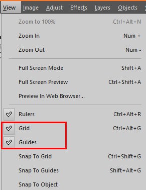
Even though you can enable/disable the Guides and Grids in that menu, there is more to it. The Grids will appear as soon as you enable it, but the Guides are hiding "under" the Rulers. That means that you also have to enable the Rulers, in the same menu, to get the Guides.
Setting the Guides
Once you have the Rulers visible around your image and the Guides checked in the View menu, click on the Ruler and "pull" the Guides, one by one. If you want a horizontal guide, pull it from the top Ruler. If you want a vertical guide, pull it from the left Ruler.
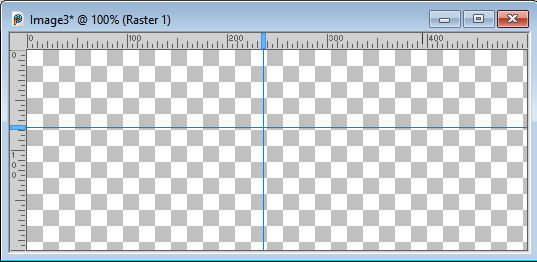
You can pull the guides as far as you want, and you can use the rulers to know where you are placing them. However, if you want to be more precise, notice a little rectangle in the Ruler, at the end of each guide.
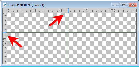
Right-click on that rectangle, and you will get this dialog window where you can set the placement very precisely.
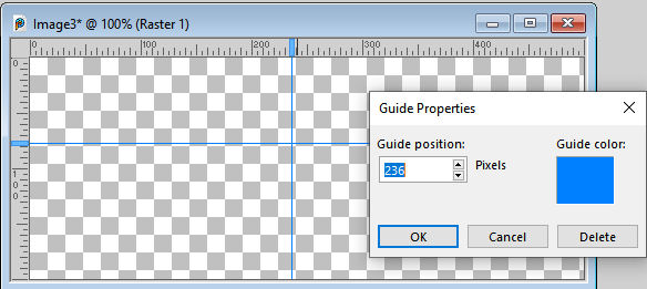
With this dialog window, you can also delete the guide, or change the default color. You can add as many or as few guides as you want, and only on the image you are working on.
Getting the Grid
Unlike the Guides, when you set the Grid, it will cover your image with grey lines. In addition, the grid will be on every image you have on your workspace. This can be a little annoying but that is the normal behavior.
Adjusting the Grid
There are different settings you can change for both the Guides and the Grid. Double-click on the Ruler (either one) and you will get this dialog window.
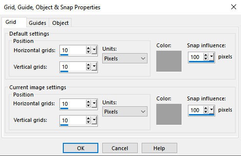
The first tab relates to the Grid. You can choose the Default settings, which would apply to all the open images. Then, you can change the settings for the current image, the one you are working on. That is how you can have different settings for different images.
The Snap influence will relate to how far an element/cursor would be for the grid line to "pull" it. A smaller value means that you have to be much closer to the grid line for it to take effect. Consider it like a magnet: a stronger magnet will pull the element from a bigger distance, while a weak magnet needs to be very close to the element to work.
Adjusting the Guides
If you look at the second tab, it relates to the Guides.
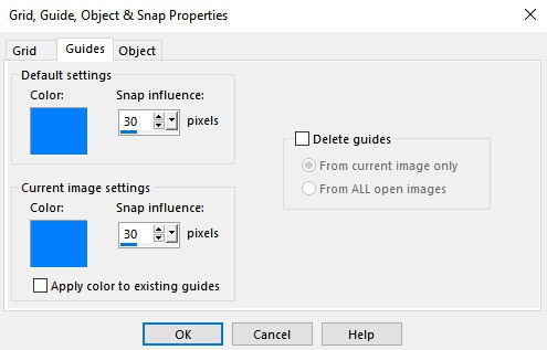
In this case, you can't set the placement of the guides since you add them manually, one image at a time, unlike the grid. But you can still change the colors and the Snap influence setting.
Snap to it
The guides and the grid can be used with or without the snap. If you need to be precise, you will want to use the snap. To enable or disable it, you will have to add/remove a checkmark in the View menu.
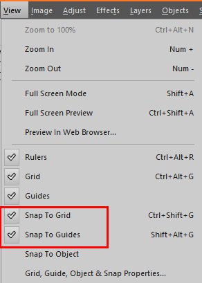
One detail to remember: if the Grid is unchecked, the Snap To Grid can't be checked/unchecked. Furthermore, if the Grid is unchecked, there is obviously no possible snap so that setting is just ignored. The same applies to the Guides.
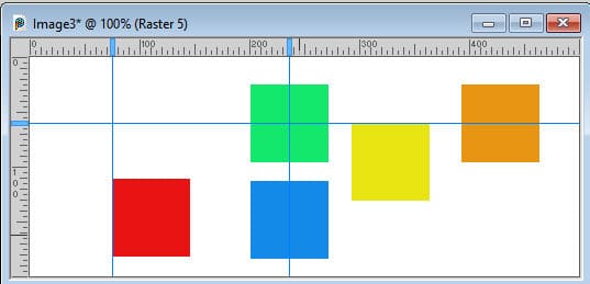
When you have a guide or a grid line, any element will snap either on its edge or its center.
How to use the Guides?
Typically, you will place the guides where you want to snap your elements, whether on their edges or in their center. You can place them in the center of your image or on its very edges. Or you can place them at regular intervals. You can also use the guides to draw straight lines, since the Brush tool, the Pen tool, and the Picture tubes tool would snap to the guides.
You can also place the Guides at irregular intervals, if you want to create color blocking for example. With irregular guides both vertically and horizontally, you can get a variety of rectangles in different size and shape.
If you want to place many guides, you could use a script like Guide it lines. It can place a specific number of guides vertically and horizontally, either regularly or irregularly.
How to use the Grid?
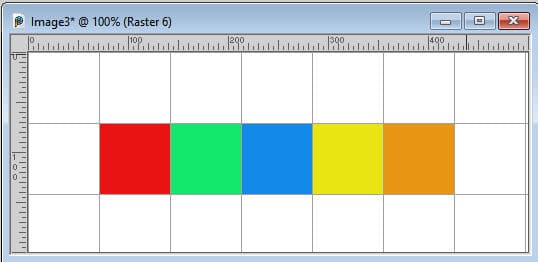
One difference between the Guides and the Grids is that once you set the horizontal and vertical grids, is that the spacing will be even all over the image, starting at position 0. You can choose to have the horizontal and vertical spacing equal or different.
If you want a collage of square image, you can set the same value horizontally and vertically.
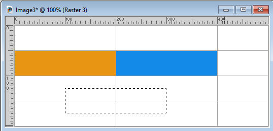
However, you can also use different settings, vertically and horizontally, to create regular rectangles. From there, you can make a selection that will snap to the lines, and even move that selection and get it to snap in the middle.
Pros and cons of the Guides and Grid
As you saw, the Guides and Grid have similarities but differences too. Which one you will choose depends on what you are trying to achieve.
Advantages of the Guides:
- they can be placed anywhere on your image, regularly or not
- Guides will appear only on the image you add them manually
Inconvenients of the Guides:
- if you need many guides, it can be tedious to place
- if you want precise and even spacing, you have to place them manually and possibly do some math
Advantages of the Grid :
- every line will be spaced equally without any calculation
- it will always start at position 0, horizontally and vertically
Inconvenients of the Grid:
- it always starts at position 0, which might be inconvenient if you want the alignment away from the edges
- Grids will appear on ALL your images, whether you need them or not (can be annoying as it impact the visibility)
What can you do?
If you are looking for some projects using Guides and Grid, you can check out the Scrap in Grid Master Class.


