Are you looking to add a creative touch to your designs? Postmarks can be used either with a postage stamp or just as is, a bit like you would get on a passport. There are different kinds to that you can create, and you have so many choices. We'll look at the process of creating a traditional postmark and then some variations.
Get started
We'll open a blank image, 500 by 500. You can work on something smaller if you want, but this would make a postmark a bit under 2 inches in diameter so it is realistic.
Start by drawing a vector circle almost the whole size of your image. Select a Stroke color (foreground) and no Fill (Background), a solid Styled Line and a thickness of 5. Draw that circle giving you some space around it.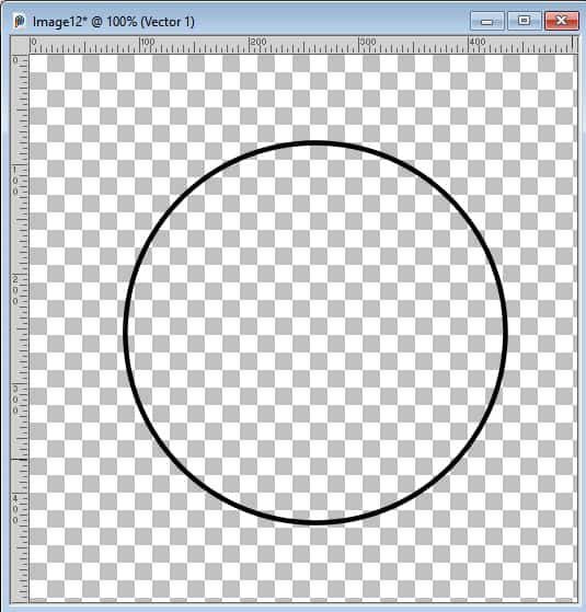
I want to use text in different directions. For that reason, I will need a duplicate of that path. I right-click > Duplicate. Hide one of those Vector layers.
Add the clockwise text
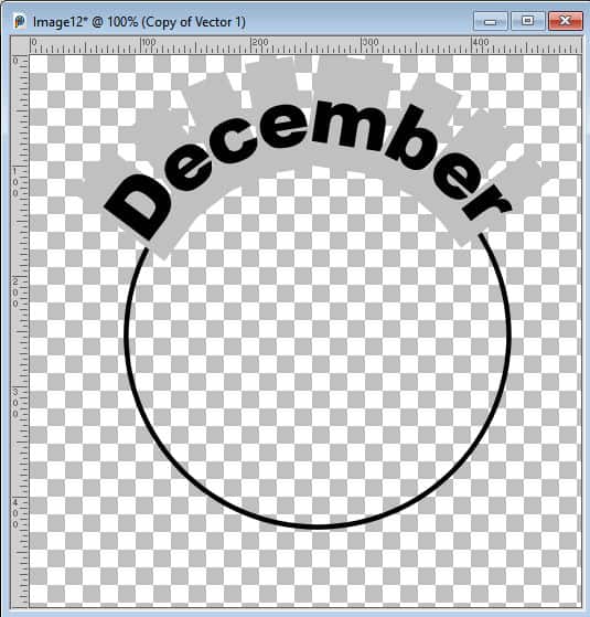
Although you can add a whole phrase, we will just use a date in this example. I want to write the month of December.
Let's activate the Text tool with the basic settings:
- Font: I like Arial as it is easy to read (but you can choose something else)
- Size: 100 pixels is good for this
- Color: I choose a black Fill and no outline
- Alignment: Center
Click on the top of the circle and type the word or text. It should now follow the path.
Add the counterclockwise text
If I repeat the same steps on the bottom, the text will stay clockwise, so it will be "upside down". We need the path to go in the other direction. That is why I created a duplicate of the circle.
Let's unhide and activate the other vector layer with the path.
To get your text counterclockwise, you need two steps:
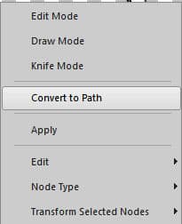
1- with the Pen tool active, right-click on the path and "Convert to path"
right-click > Edit > Reverse path
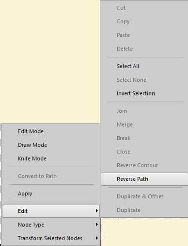
Those two steps are essential but not intuitive. That is why many PSP users get stumped with the counterclockwise text.
Now, let's click on the bottom of the circle and write our text. I will put the year and use the same settings as for the top part.
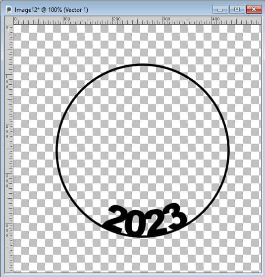
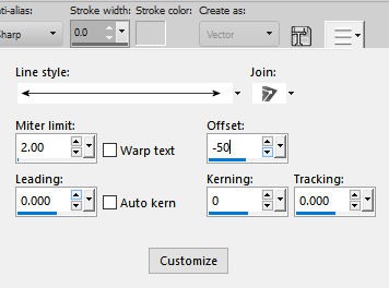
Although the text is in the correct direction, you can see that it is INSIDE the circle and that does not match the top text. In fact, this is the default behavior: the text is ON the path. In order to match the top text, I need the text to be BELOW the path. Let's highlight the text and under More Options... let's change the Offset to -50.
Now, the text should be on the outside of the path, just like the top text.
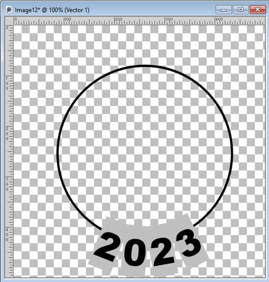
If you find that the letters are spread apart too much, you can adjust the Kerning. It is a common adjustment to make.
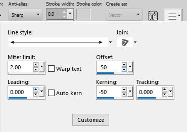
This should move the individual characters close enough to be eye-pleasing.

Add the center
Now that the text "along the path", it is time to add the central element. In this example, I add the date in the middle. I use a different font, just to add some variety. I also can use a much larger font size since there is enough space.
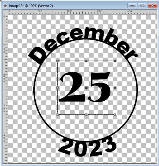
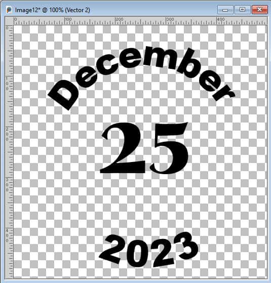
Once all my components are ready, it is time to HIDE the paths. Do NOT delete them! Although I could keep those paths, they were too close to the text.
Add decorative lines
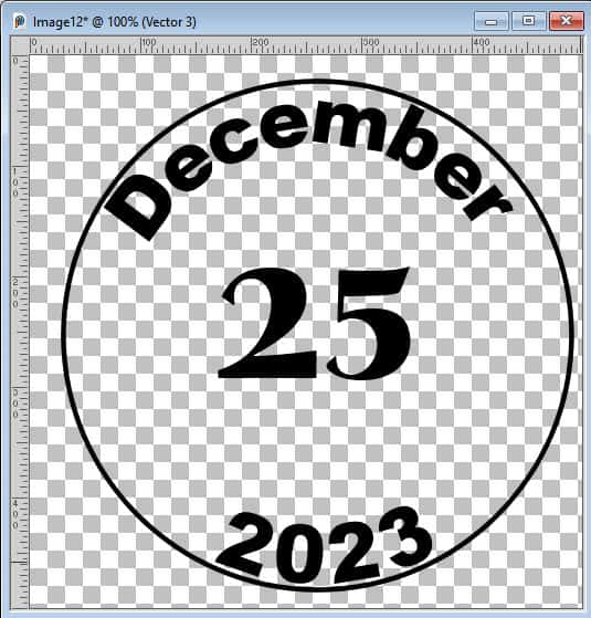
A postmark will often have an outline, so we can create one with a similar circle. You can choose the thickness, and even the styled line if you want something a little atypical.
Add another one, inside, is also a common design.
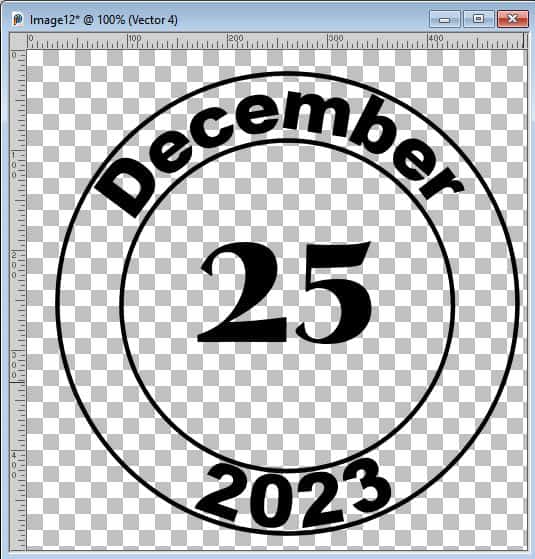
Of course, you can also have double lines, add some with different thickness, etc. You can be as creative as you want.
Add texture
If you want to simulate a grungy texture, you can use the Eraser brush for that. However, it can only be applied to a raster layer, while most of our current layers are Vectors. What you can do is merge all the visible layers. If you have a recent version, you can "merge visible to a new layer", and then hide all the original layers. Once you have that merged layer, it will be in raster format.
I'll use a grungy brush tip called Spotted 100 (it is a default brush from the Creative Content in PSP2023). Then, I just "dab" the eraser all around my design to erase irregularly around the postmark.
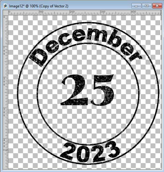
A different design
If you have the information you need in the text along the path, you can replace the central date with something else, like an icon, a brush imprint, or even a line pattern.
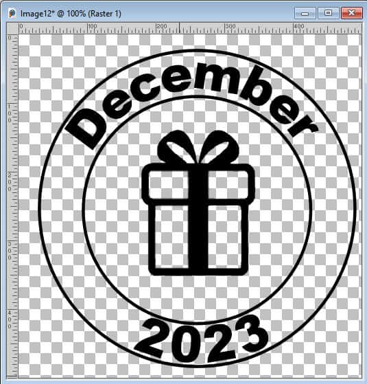
Although we used a circle as a base shape for the paths, you could use any other shape you want: ellipse, diamond, square, rectangle, half-circle, etc.
Conclusion
By following the steps outlined in this tutorial, you can unleash your creativity and produce unique postmarks that stand out in any project. Experiment with different text styles, alignments, and effects to personalize your designs and make them truly your own. Don't be afraid to push the boundaries of conventional design and let your imagination run wild. Start creating your custom postmarks today and watch your designs come to life!


3 thoughts on “How to create a postmark”
Good
thanks for this…..I am definitely going to try this…..love the things you share with us. Thank you.
Good to read again about in- and outside the circle, I always forget how to do it.
But I think I am going to put 2024 in the postmark 🙂