While creating scrapbook layouts, another design principle that you can identify is Flow. It means how your eye goes from one element to another while exploring the content of the page. Some key considerations to achieve a good flow would include eye movement, logical sequencing, grouping and clustering, and visual transitions. Flow will give a sense of continuity and connection throughout the page.
Eye movement
Flow involves guiding the viewer's eye smoothly through the layout, ensuring that it doesn't get stuck or jump around abruptly. You can achieve this by using directional elements like lines, curves, or implied movement created by the arrangement of photos, papers, or embellishments.
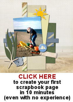
You can arrange elements in a diagonal pattern across the layout, leading the viewer's eye from one corner to another. This creates a dynamic visual movement that naturally guides the viewer's gaze.
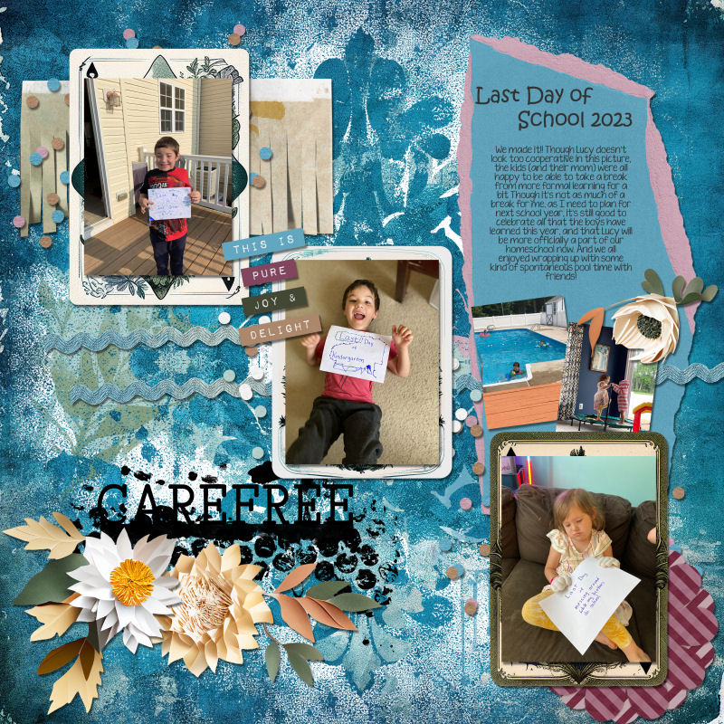
You can also incorporate lines, either real or implied, that lead the viewer's eye toward a specific element or area of the layout. You can use elements like arrows, decorative lines, or even the direction of a person's gaze in a photo to create a sense of movement.
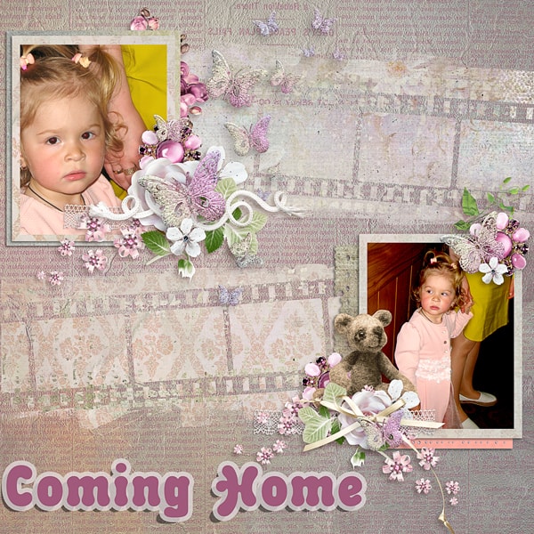
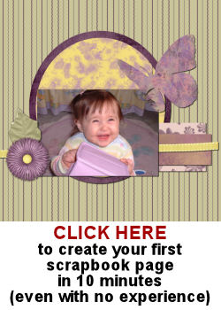
Arranging elements in a curved or circular manner can create a smooth flow. Circular arrangement naturally encourages the viewer's eye to move in a circular motion around the layout, exploring the different elements.
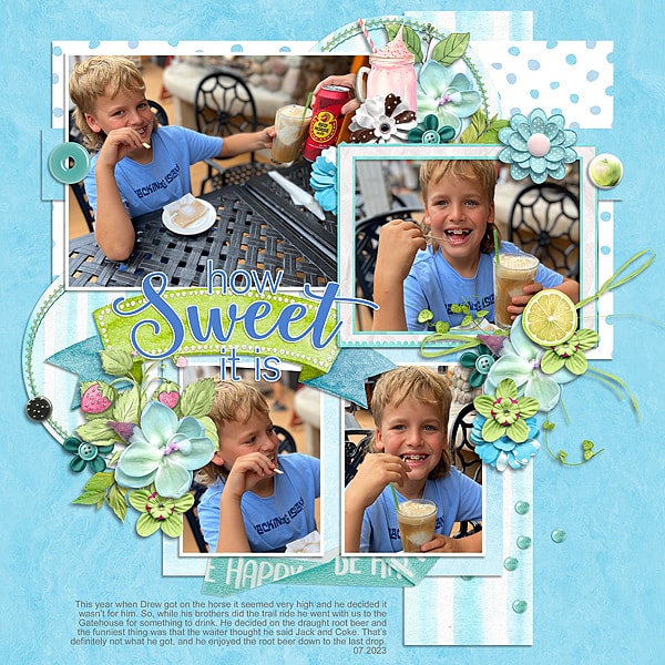
Place larger or more prominent elements strategically to capture attention first and then lead the eye towards smaller or supporting elements. This hierarchy of elements creates a natural progression and flow within the design.
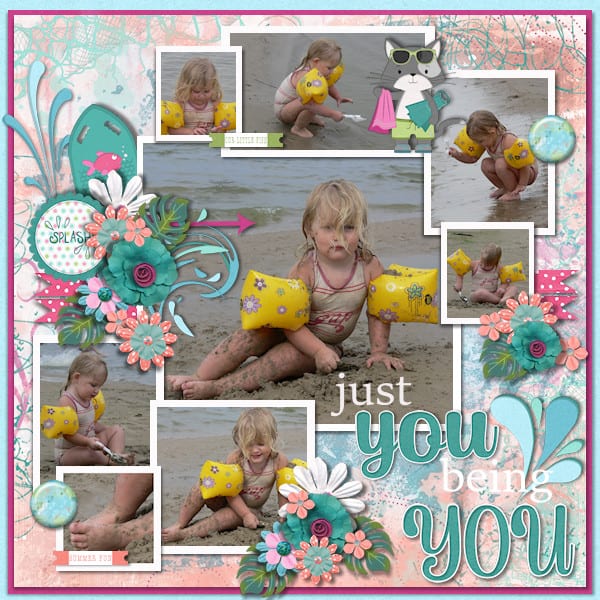

Logical sequencing
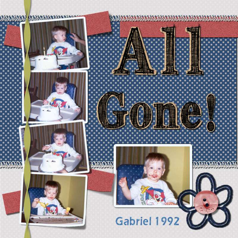
If your scrapbook layout tells a story or documents a series of events, arranging your elements in chronological order helps create a natural flow. Place photos, journaling, and other relevant elements in the order they occurred, allowing the viewer to follow the narrative easily.

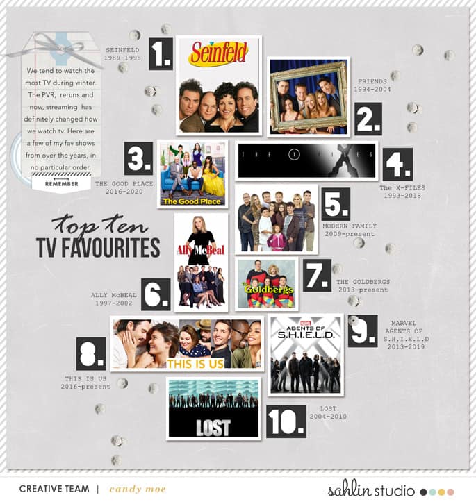
To help with the flow, you can also incorporate numbers or labels within your layout to indicate the order of elements. You can add small tags, labels, or captions with numbers or dates alongside photos or journaling blocks to create a visual sequence. This helps viewers understand the logical progression and encourages them to follow the order. This is more important if the numbering is not in an obvious straight line.

Visual transitions
You can make sure that the transitions between different elements or sections of your layout are seamless. You can achieve this by using overlapping techniques, creating visual bridges with complementary colors or patterns, or using gradual changes in scale or intensity.
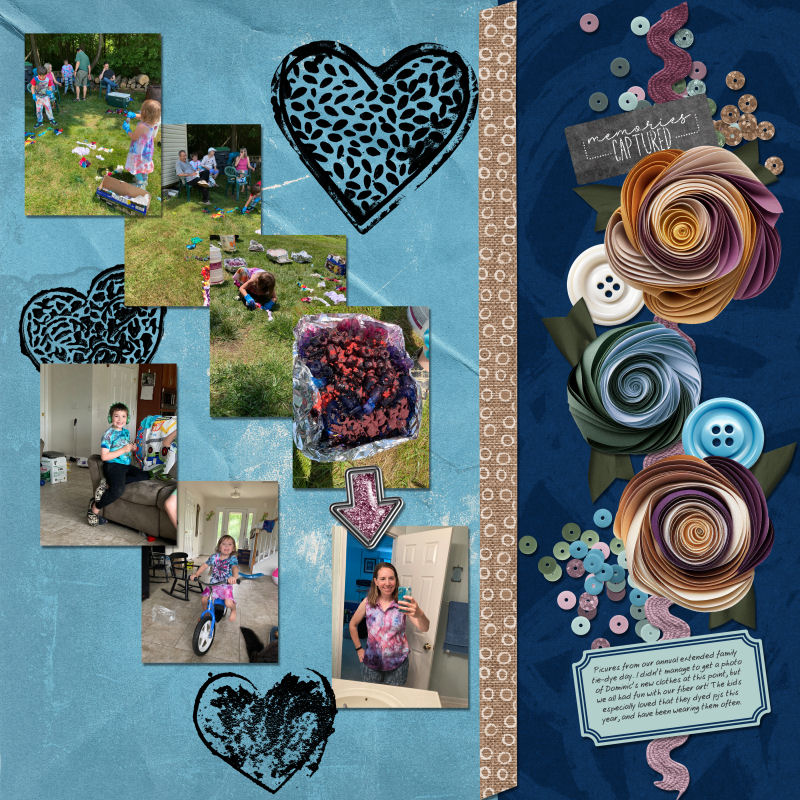
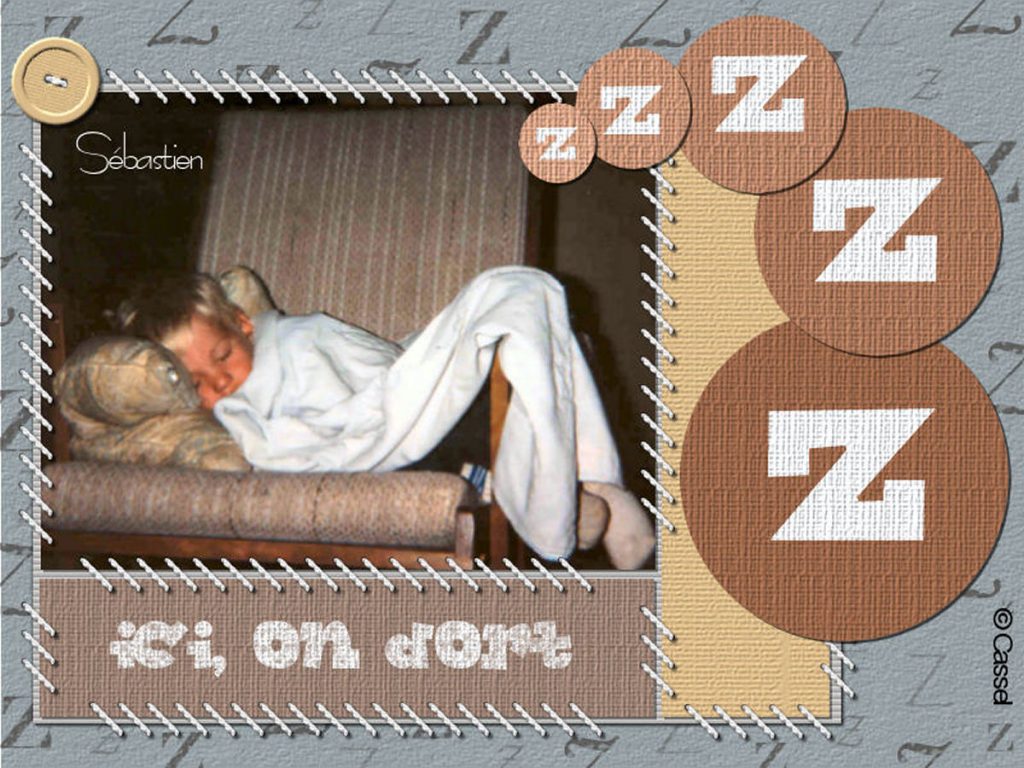
Here is an example of arranging elements in a gradual progression of size, either increasing or decreasing. You could use images, but also elements like flowers, buttons, or tags.
Grouping and clustering
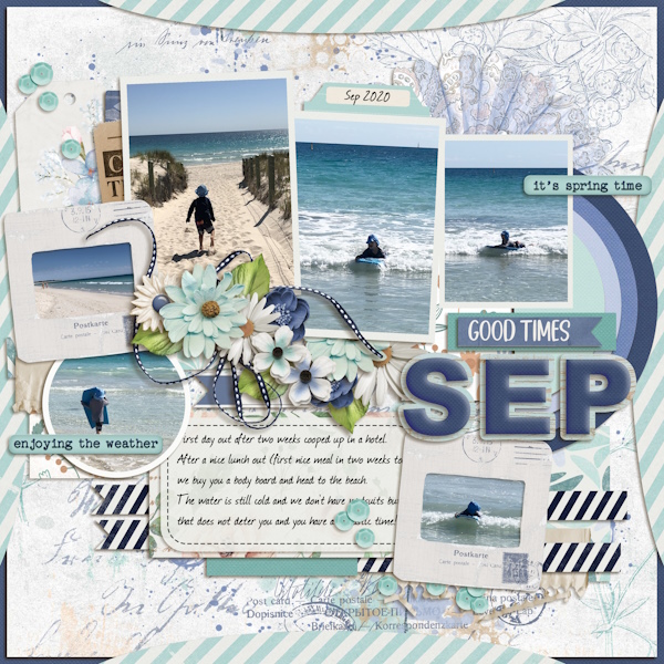
When you cluster elements or photos, it will draw the eye to that section. It can then give a starting point and a direction to the eye. It will then flow through the other elements of the layout.
Another way to group elements together can be by attaching them together or placing them on a common mat or surface.
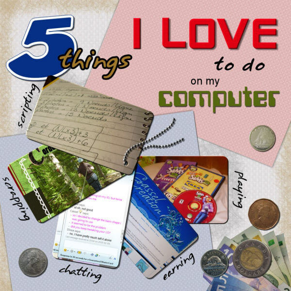
There are many ways to establish a clear visual flow to enhance the overall design and storytelling impact of your layout. You can add color coordination and directional clues like arrows and leading lines. The arrangement of the photos, texts, and elements will also play a role in how the viewer will enjoy all the details of your layout.
Have a look through your favorite gallery and see how certain layouts will give you that sense of smooth flow. Observe how your eyes will go from one element to another, from one photo to the next. You will likely pay more attention to details than you did before!


