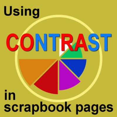

We have already looked at a few principles to design your scrapbook pages and create a pleasing project. Today, we will look at how you can use contrast. Although we might like unity, sometimes, adding contrast will just turn a project from monotonous to interesting.
Color contrast
In most scrapbook projects, colors are important. Although we can create a monochrome page, we will typically use many colors. The contrast will be quite obvious if you are using complimentary colors. Those colors will be opposite to each other in the color wheel, like
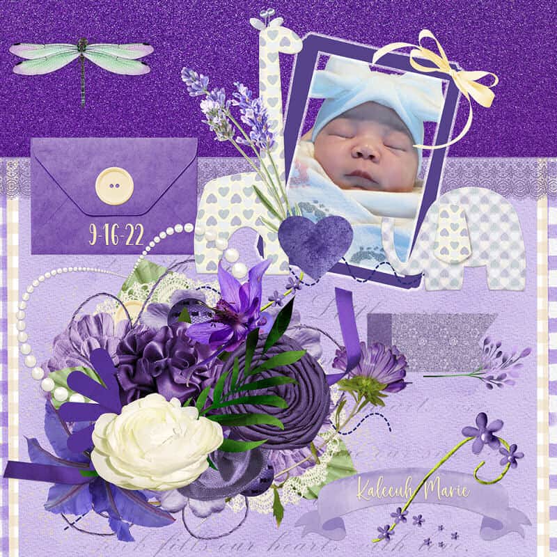
Sometimes, even a fairly monochrome project can use contrast in display light and dark shades of a color.
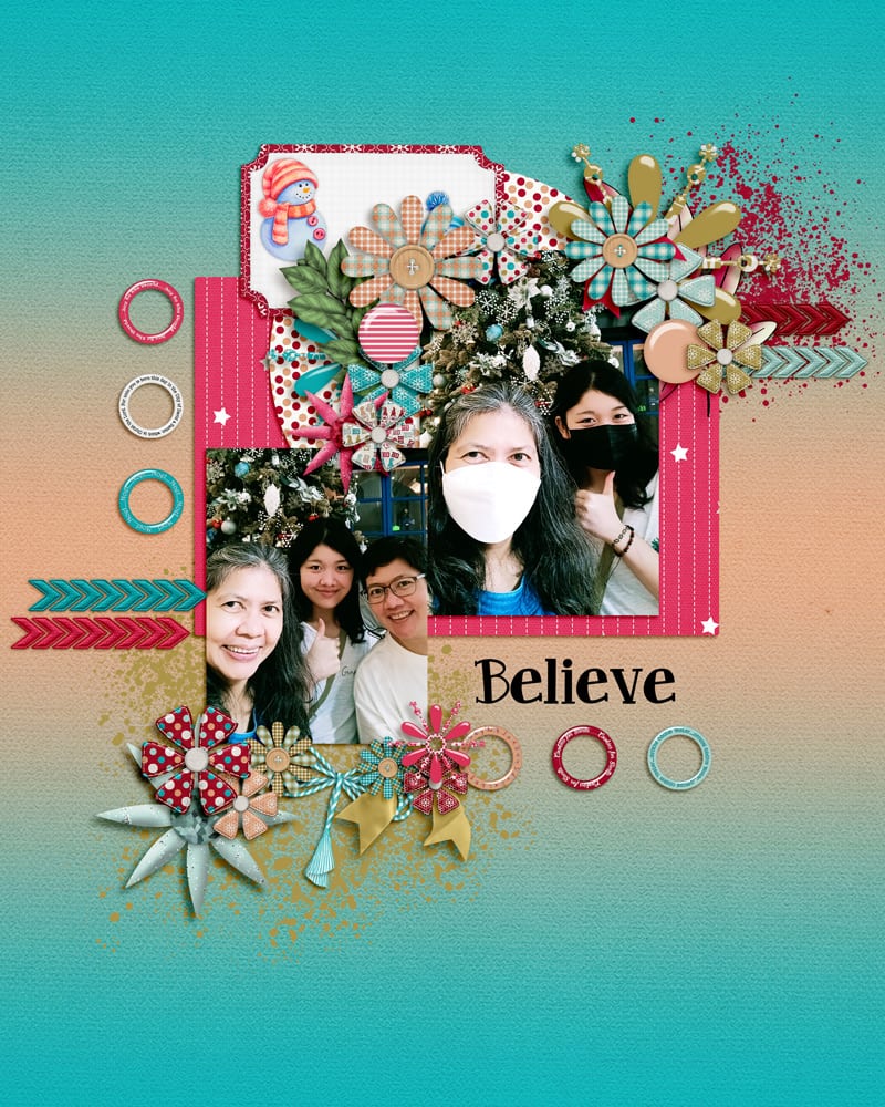
Although it could seem like complimentary colors, you can also see the contrast between warm (reds and orange) and cold (blues and greens) colors. Those can create a pleasant contrast.

And why not contract from a black and white photo with a colorful page? That is another way to contrast using colors.
Pattern contrast
Although you can play around with colors, when creating a scrapbook page, you will often use several layers of paper. You can create contrast with a variety of designs available to you.
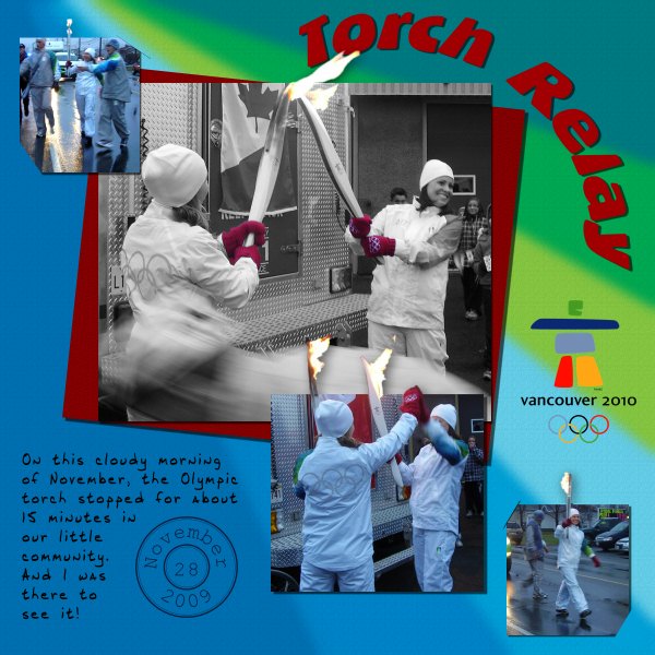
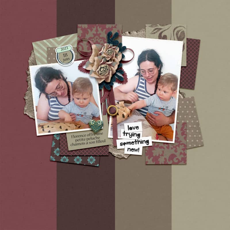
You can alternate solid and patterned papers when you are layering them. However, instead of alternating them, you can also group them as in this layout where all the solid papers are used in the background, and the patterned papers serve as a frame for the cluster of photos.
Patterns come in different sizes and combining large and small ones is another way to use some contrast.
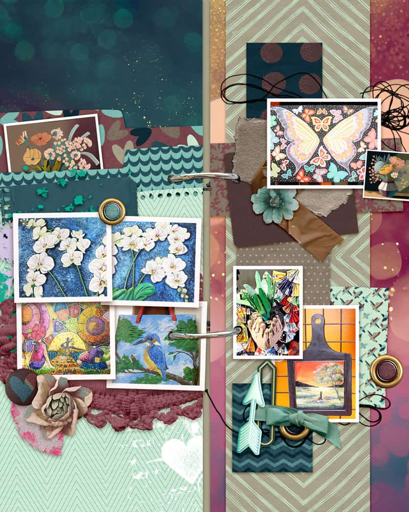
And while you might consider the contrast between two elements, it could be more. You can combine different-size patterns, with solids too.
For a larger effect, you can also contrast different shapes for your layout. It could be the shape of the elements or the photos. Again, it makes the layout visually interesting.
What kind of contrast do you tend to use? Colors? Pattern? Shape? Maybe even something else we didn't look into? Now, look at some of your favorite layouts and see if you can identify the use of contrast as a design principle.