Emphasis is a design technique that can be used to draw attention to a particular element on a page. You might want to put focus on a photo, a piece of text, or memorabilia. The use of the emphasis principle can make a design more dynamic and interesting. It can also help to guide the viewer’s eye through a design and to create a sense of priority. When used correctly, the emphasis principle can add visual interest and impact to a design. Let's look at a few different ways that you can go about adding emphasis to your scrapbook pages.
Using contrast
Contrast means that something stands out against other elements based on shape, color, texture, etc.
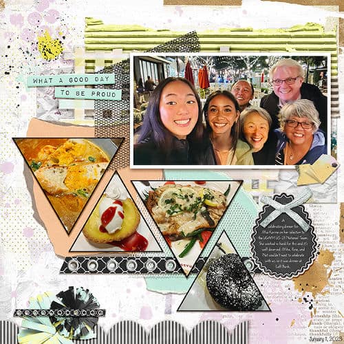
In this layout, the family photo is a rectangle among triangles, so it stands out. It is also larger which draws attention to it.

On this page, the large round picture contrasts with the smaller rectangular ones. How can you not be attracted to that central photo?
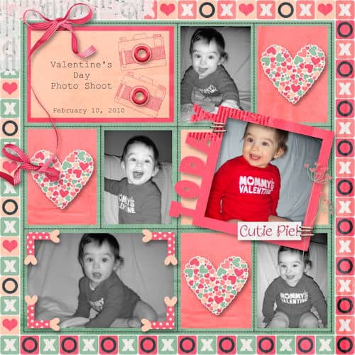
With all those black and white photos, the one in full color contrasts with the others. This is another way to put emphasis on that photo.

A single color can offer a contrast with the rest of the page. In this layout, the title is drawing attention because it is simple and separate from the busy photos below.
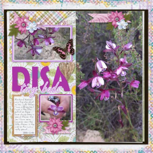
The size of the photos will also determine which one is getting emphasis. In this layout, the large photo on the right definitely calls the viewer's attention to it. The smaller photos on the other half balance the layout.
Using embellishment
Sometimes, you can use specific elements to draw attention to an element of the page. That section of the page can be a photo, a title, memorabilia, or a piece of journaling. [add a frame, a brad, a paperclip]
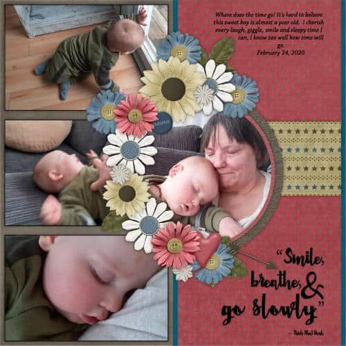
You can use embellishments to frame the section you want to emphasize. As you can see, the first part of the photo our eye is drawn to is the middle photo because of those flowers framing it.
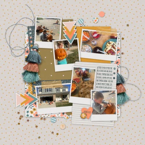
In this layout, you can see the arrows are pointing toward a couple of photos, and those arrows are directing the viewer's attention to those specific photos.
Using placement
Are you familiar with the Rule of Thirds? This general composition rule is a set of imaginary lines that divide a project into three rows and three columns. The lines and their intersection are areas that naturally pull the viewer's attention. Placing photos or elements in those locations create a sense of balance.
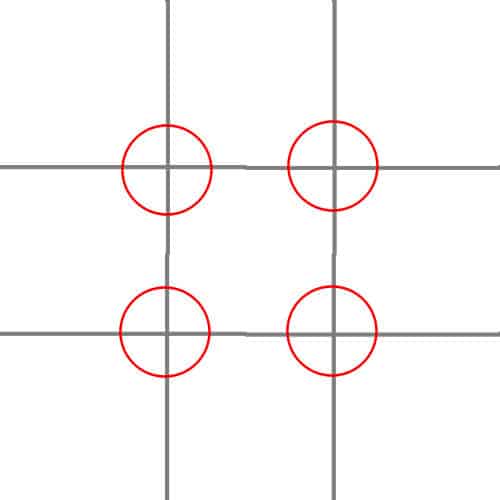
Let's see how it applies to a scrapbook page.
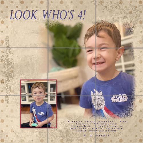
Having overlaid those imaginary lines, notice how the face is placed at a strong point, and the small photo is at the opposite intersection.
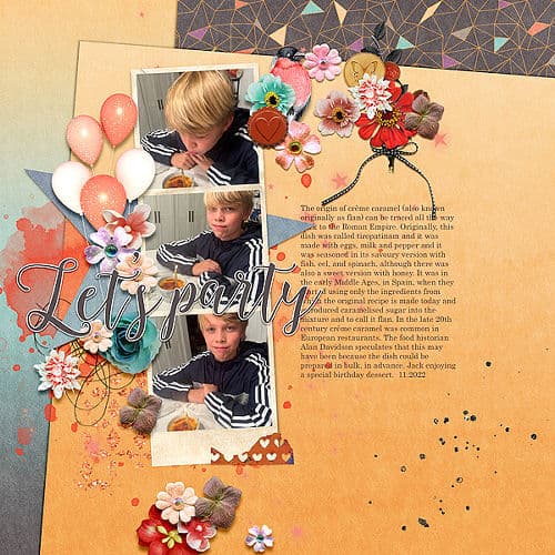
For this layout, the focus is not just on one intersecting point. It has the placement of a series of images along one of the imaginary lines. The journaling balances the photos on the right.
Using strong content
Some sorts of images tend to grab the viewer's attention without any additional features. Close-ups of faces, eyes, and other important images can be just what you need. If you don't have a close-up, you can always crop photos to create one.
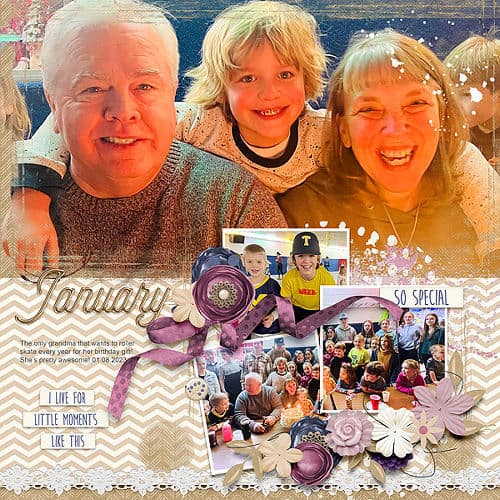
In this example, see how the large photo of a smiling family can't leave you indifferent! Emphasis is created by the size but also the content of the image.
You can notice that often, more than one type of emphasis is at play. For example, in the last image, the emphasis is with strong content, but also in size contrast. It will be common that a project will use emphasis in more than one way.
Emphasis is a great design tool for scrapbookers! By placing important elements in strategic positions and using color and scale to create visual interest, you can create pages that are both eye-catching and memorable. So next time you're stuck on a layout, try using emphasis to make your page pop!
For a summary of the 6 basic design principles, check out this article.

