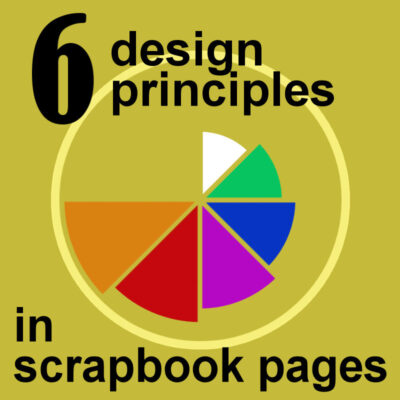

Design principles are important for scrapbook pages because they provide a framework for creating a visually appealing and well-designed layout. The six design principles that will be mentioned in this article are emphasis, repetition, alignment, balance, contrast, and flow.
Even though we might not consciously think of those principles, they will play a role in whether we like the overall design, or not. When creating a scrapbook page, we can keep these design principles in mind in order to create a visually appealing layout.
Balance refers to the distribution of elements on the page and can be either symmetrical or asymmetrical. Rhythm refers to the repetition of elements on the page, which can create a sense of movement.
Proportion refers to the size of the elements on the page in relation to each other. Unity refers to the overall cohesiveness of the page, and how the elements work together to create a unified design. Variety refers to the use of different elements on the page, such as color, texture, and pattern.
By keeping these design principles in mind, you can create scrapbook pages that are not only visually appealing but also well-designed.
1. Emphasis
Emphasis refers to the use of one or more elements to draw the eye to a particular area of the page. This design principle for scrapbook pages is emphasizing the important elements on the page. This can be done in a number of ways, such as using a strong color scheme, interesting design elements, or by making the important elements larger than the others. Another way to emphasize the important elements on a scrapbook page is by using a theme. This can help to make the page more cohesive and help the viewer to understand the story you are trying to tell.
When you are choosing what to include on your scrapbook page, it is important to think about what you want to emphasize. This can be the people in the photos, the colors, the mood, or the story. Once you have chosen what you want to emphasize, you can then start to plan your page layout.
Once you have a rough idea of the page, you can then start to add the elements. Start with the largest or most important elements and then fill in the smaller details. As you are adding the elements to the page, keep in mind the design principle of emphasis and make sure that the important elements are standing out.
You can use a number of different techniques to emphasize the important elements. This can be done by changing the opacity of the layer, adding a drop shadow, or by using a “clipping mask”.
Although a lot of scrapbook pages will focus on the photos, it is not always the case. You can emphasize a title, some journaling, an ephemera, etc.
2. Repetition
One of the most important aspects of design is repetition. Repetition creates rhythm and helps to unify a design. Without repetition, a design can feel disjointed and chaotic.
There are many ways to create repetition on a scrapbook page. One of the most obvious is to repeat elements throughout the page. This could be done with colors, shapes, patterns, or even just by repeating the same word or phrase.
Whatever method you choose, repetition is an important design element that will help to create a cohesive and unified scrapbook page.

Interestingly, you can also repeat elements on multiple pages through an album.
3. Alignment
When it comes to scrapbooking, alignment is everything. Every element on the page should have a purpose and a place, and everything should work together to create a cohesive design.
You can place various components of your page into a straight line, whether it is horizontal, vertical, or diagonal. You might even consider a nice curve to align your elements. The components could be photos or embellishments, but they can also be mixed up.
One example of alignment is the use of a grid. A grid is a system of horizontal and vertical lines that intersect to create a series of boxes. You can use a grid to help you align the elements on your scrapbook page. For example, you may want to align your photos, journaling, and embellishments in a grid pattern.

This is commonly used in "pocket scrapbooking".
Negative space is the area around and between the subjects of an image. It's important to consider negative space when composing a scrapbook page, as it can be used to create a sense of balance and harmony. Too much negative space can make a page feel empty and unfinished, while too little can make it feel cluttered and chaotic. Finding the right balance of positive and negative space is key to creating a well-composed scrapbook page.
4. Balance
When it comes to scrapbooking, the element of balance is just as important as it is in other areas of design. Balance can be achieved by using a variety of design principles, such as symmetry, asymmetry, and radial balance.
Symmetrical balance is when the elements on a page are evenly distributed. This creates a sense of stability and calm. Asymmetrical balance is when the elements are unevenly distributed. This can create a more dynamic and interesting layout. Radial balance is when the elements are arranged around a central point. This is a very effective way to create a cohesive design.

By considering the balance of elements, you will be able to create a layout that is both visually appealing and balanced.
5. Contrast
Contrast is all about creating a visual balance between light and dark, positive and negative space, and can be achieved through a variety of methods.
One way to create contrast in a scrapbook layout is through the use of color. You can create a stark contrast by using two colors that are opposite each other on the color wheel. Or, you can create a more subtle contrast by using colors that are next to each other on the color wheel, such as a light blue and a dark blue.
Another way to create contrast is through the use of textures. You can create contrast by pairing small and large patterns, or by pairing solids and patterns.

Ultimately, the goal is to create a scrapbook layout that is visually interesting and eye-catching. By incorporating contrast into your design, you can create a layout that is both unique and memorable.
6. Flow
Flow is all about creating a sense of unity and cohesiveness in your scrapbook pages, and it can be achieved in a number of ways.
Consider the overall layout of your page. Is everything positioned in a way that makes sense, or does it feel scattered and random? You want viewers to be able to visually "flow" from one element to the next, so think about how you can guide their eyes around the page.
Think about the overall "story" of your page. Is there a clear beginning, middle, and end? Are all of the elements on the page related to each other in some way? Telling a story with your scrapbook page is a great way to create a sense of flow, and it can be a lot of fun too!
Design principles are the basic guidelines of scrapbooking that help create appealing and effective pages. By understanding and applying the following six design principles, your pages will have greater visual interest, balance, and unity, making them more enjoyable to look at and easier to follow.
In future posts, we will dig deeper into each of those six design principles, along with more examples.


4 thoughts on “6 Design Principles in scrapbook pages”
Good to read. Not things I think about much but should! I will try to keep them in mind.
Very nice to have those principles highlighted and explaned in this way. They of course are universal for any kind of art work, but I tend to “forget” about them when I’m busy. In photography courses they are always mentioned too.
Very useful explanation especially as I am not a scrapbooker, but still want to do something in PSP.
Thank you.
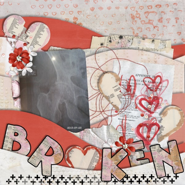
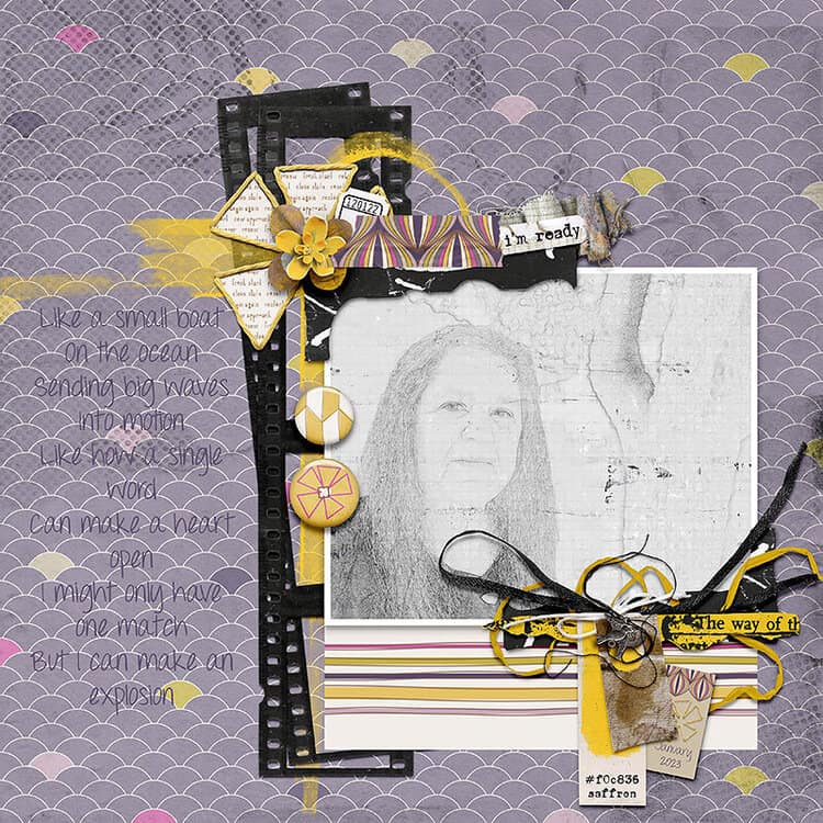
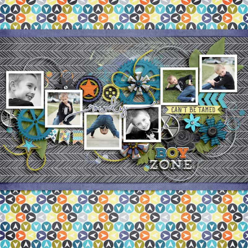
Thank you, Carole. This type of instruction brings the Campus to a whole new level! The example layouts are also truly inspiring.