When adding text that replicates handwriting or printing, it can look like it is not really part of the project. If you write or print on something that has a texture, the inked area will still show that texture. How can you do that using PaintShop Pro?
What it looks on its own
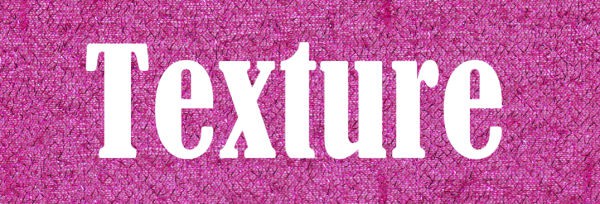
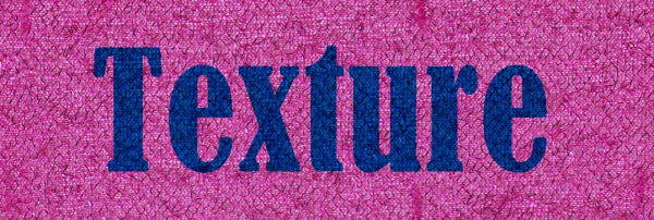
If you have any design that should look like it is printed or written on a textured surface, the first step will be to add that text on its own layer. At that point, no texture appears.
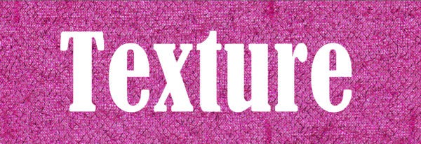
The text is solid in color and looks like it was just added on top of the previous layer. If that is the style you are going for, you can add a drop shadow and it will look good. However, you might want a different look; one where the text is part of the textured background. Here are ways to go about it.
Adjusting the opacity
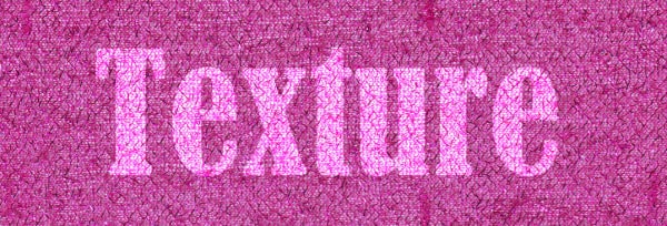
Changing the opacity of the text layer is the simplest method and it might work. However, it will also lose some color for the text layer. Here is the result with an 80% opacity on the text. You can see the texture through the text, however, the text is fainter.
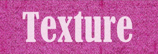
This might look like a worn print and might work for your style. It is easy and you can adjust the opacity to anything, and it could depend on the colors of the text and the background.
Choosing a Blend mode
The Blend modes will combine the colors of the text and the layer below. Depending on which Blend mode you choose, some darker pixels from the bottom layer might stand out more through the text, giving it a more textured look. Let's see what different Blend modes will give.
The Multiply mode will make the lightest color of the two layers disappear. In this case, it means that the pure white text will completely vanish. That is obviously not great.
The Screen mode will make the darker color disappear, and in our example, that would leave the white text unchanged.
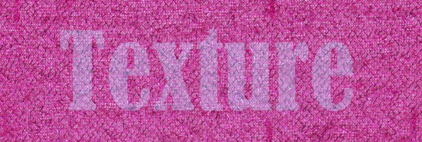
The Overlay mode will combine the Multiply and Screen and show something more "textured".
This is definitely showing more texture.
Different colors, different results
The three blend modes illustrated above would yield very different results if the text was a different color. Let's try with a dark blue text.

Changing the Blend mode to Multiply, I get a very different result than white as there is some "darker" pixels to show. You can already see the texture through the text.
Now, the Screen mode will show some texture but will mostly lose the initial color.
The Overlay mode that yielded a good result above can be useful here too as you can definitely see the texture. However, the color is a bit faded.
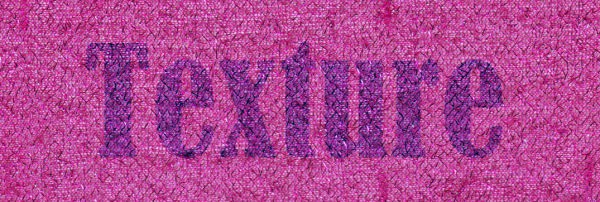
With this color, I tried the Hard Light mode and the result seems to be very interesting as it shows the texture yet it keeps a well-defined text color.
As you can see, the colors of the text and the underneath layer will determine which Blend mode will yield what result. And then, it is up to you to decide which one suits you.
If you want to learn more about various Blend modes, you can check out the Master class called Blending Through, where we look at how they behave and how you can use them.


1 thought on “Keeping texture on text”
Like these ideas.