Are you always on the lookout for new kits and scrapbooking supplies? Are you new to digital scrapbooking and would like to build your stash quickly to get started? This resource is just what you need.
Le blog clean et simple
This blog site is in French (sorry if you can't understand that language). You can access it here. It used to have a "regular" blog display but since a few years, they changed the format, making it a little more convoluted to search, but it is still feasible and worth your time.
Kits
This blog includes monthly kits created by several designers, on various themes. Those kits are completely free to download. Each kit will typically include around 40-50 papers and as many elements. The style of elements on this site is generally flat. Of course, you can add shadows yourself, or add elements from different sources if you want. Each kit is downloadable in just a few files.
Templates
Almost every month, designers will create a set of 12 templates. Each month, there is a theme to the templates. Sometimes it could be surrounding a shape (templates with triangles), or a style (artsy). Unlike the kits, you will have to visit each designer's site to download those templates.
Journaling cards
Journaling cards are often associated with Project Life scrapbooking and pocket scrapbooking. However, they can also be used as wordart or decorative elements for your project. Since the designers are all French-speaking, all the journaling cards that have wording on them will be in French. This might be great news for our French-speaking members who might have a hard time finding material in their language!
You can also use many of those journaling cards as the front part of a greeting card.
And more
Occasionally, there will also be some additional resources, like brushes, wordarts, .
How to navigate the site?
I find that the format of this site (which has changed in the last few years) is a little convoluted to use. If you simply want to browse, everything is displayed chronologically, so that is easy. However, if you want to go through several pages to see what you would like to download, there is no real simple way to keep your spot. By default, your will view the site in the "Classique" mode.

If you have scrolled a bit and decide to download something, you might be directed to another site, or to Mediafire, and it can be inconvenient to return where you were (especially if you have more downloads to get). One way I found to not lose my place is to right-click on the links and open them in a new tab. This way, you can easily repeat the process without having to use the Back button and possibly have to scroll back where you were.
Another issue is if you have browsed the site up to a certain date, and you want to come back to it another day, you lose your spot.
You can, however, use their Archive button that is hiding on the side.
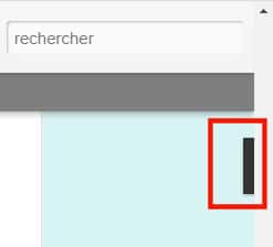

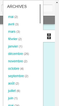
With this list, you can get back to where you left off.
Another way to browse would be with the Carte format, where you can filter by Date.
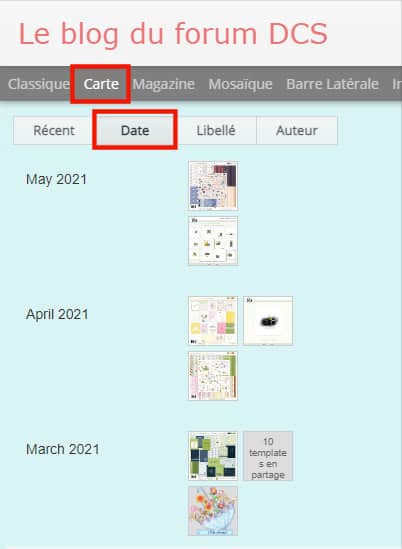
The thumbnails will allow you to quickly see if the resources are templates or kits or journaling cards, or something else. So, if you are specifically looking for templates, you can click on them directly without having to scroll indifinitely.



2 thoughts on “Featured Resource – Digiscrap Clean et Simple”
Just to update: If you are using Edge browser, it has translation coded in and you can get the pages translated to your language. When I went there, it auto-translated the pages for me. If your browser doesn’t have translation coded in, there may be a browser extension, or do it the hard way by using Google/Bing Translator pages.
Suggestion to open pages in a new tab has always been good advice. Edge does have options for vertical tabs and to be either pinned or not. Other browsers seem to require an extension be installed.
Great tip Ron!