Whether you need glasses or you are just getting older, you might find your display looks smaller and smaller. There are simple ways to customize your PaintShop Pro to see better despite those challenges. Let's look at a few ways.
Icon size
As early as PSP9 (from JASC), there was an option to use "regular" or "large" icons. By default, the icons were small, but there was an option under the View > Customize to choose "large icons".
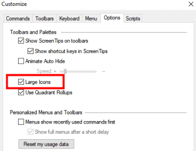
Interestingly, in version X4, this option was removed. Did it end up displaying the "large" icons by default? I am not sure, but the option came back with version X5, where the default was the large icons, and you had the option for smaller ones.
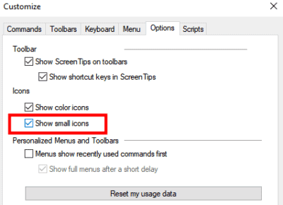
However, starting with PSP2018, you have three options for size: small, medium, and large. Furthermore, the option is now available directly in a new location: the User Interface menu.

The difference in size is as follow:
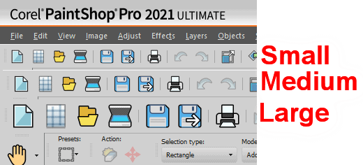
Of course, the larger the icons, the more room they will take on your toolbars, but if it makes it easier for you to see them, it will be worth it.
Scroll bar size
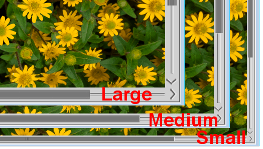
Once Corel added the User Interface, they also added the option to have larger scroll bars.

And right from the start, we are given three sizes. Do you have a hard time seeing and grabbing that scroll bar when working on large images (or zoomed-in images)? this is what you might need. Here is the comparison between the different sizes for the scroll bar:
Node size
Along with the new options for changing the size of the Scroll Bar, the User Interface also added the option to enlarge the nodes. You know, those tiny little squares that are visible when working on vector objects? Or the nodes around an element when you activate the Pick tool and might be hard to grab? Now, you also have three options for those nodes.

And here is the comparison between the size of those nodes:
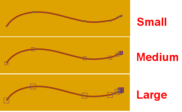
Although the size of the nodes makes them easier to see, the area you can click is still as small which means you still have to aim in the center of them. But now that you can see them better, it should be easier, right?
Text size
Although the Scroll bar and the Node size were added in version 2018, we had to wait until the next year to get the option to have larger text. Of course, with larger monitors and higher resolution, that "standard" text that was sufficient in the past is now looking very small, so it is a good option to enlarge that text.

Unlike the other options, you have only two choices for the text size, but the difference is significant.
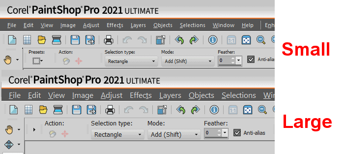
This text size change applies to the menus, the commands, the toolbars, etc. However, you might notice a few places where the text stays as small as before, like the numbers on various toolbar settings but overall, almost everything is larger and easier to read.
Although those options for larger displays are quite obvious, there are other options, well hidden, that you might want to consider if you either have low vision or just feel more comfortable with larger displays.
Layers Palette previews
The Layers palette includes a preview of what is on individual layers, plus, when you hover over the thumbnail, you get a tooltip thumbnail. Both of those images are set at default dimensions but can be adjusted to suit your needs. You can go to File > Preferences > General Program Preferences and under the Palettes tab, on the left, you then get some options on the far right to adjust those sizes.

The default display for the Layers palette looks like this:
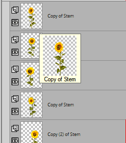
But if you change the value of the Palette thumbnails from 50 to 100, the Layers palette will look like this:
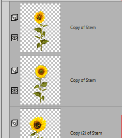
Of course, larger thumbnails mean that you will see fewer layers in the palette.
If you want to still see as many layers as before, you can change the size of the Tooltip thumbnails.

The image that will display when you hover over the layer will be larger.

If you have a low vision, have you adjusted those displays on your PaintShop Pro?





8 thoughts on “Customizing PSP for low vision”
I also have macular degeneration. And, I do use a 55″ tv as a monitor. I did manage to get everything configured but the icons were so small I had to use a magnifying glass. I am very happy to hear about the larger sizes. I’m off to try the adjustments now.
Thank you,
Linda
I have been using a 28″ 4K monitor for some time now. Excellent picture etc. but, my vision seemed to be going blurry quicker each day before I would need to shut it all down. Then I tried using the ‘Night Light’ setting. It decreases the blue light. Colours are not as correct, with white looking a bit on the yellow side (Crest won’t help) but my eyes last longer before the blur sets in. I prefer a dark background so that I am not staring at a big rectangular light.
I just got a new 27″ monitor which is advertised to be easier on the eyes because they have different settings to relieve the eye strain. This one is intended for use in creating graphics as opposed to being a gaming monitor. I set the 2560×1440 display to 125%. It has perhaps an extremely slight texture to it compared to the 4K monitor but I prefer it already. I will now relegate the 4K to 2nd. monitor status or get rid of it.
Corel have not designed their programs yet for 4K screens. As an example, the ‘Scale’ displays very small across the left and top with the numbers to small for me to read and size is not adjustable like icons are. Text and icons are smaller too. I just opened an architectural drawing in CorelCAD and the text and icons look far better than when using the 4K monitor.
Sorry for being long winded on the keyboard but I think that I just spent almost $450.00 with taxes, wisely.
What version of PSP are you using?
2021
Oh. I don’t have such a monitor, but I thought it was configured for those monitors. When I do change some of the adjustments, I get a warning about 4K monitor (since mine isn’t).
Oh, I definitely made things as large as I could long ago. I have a 22-inch monitor along with macular degeneration so really happy those size options are there. Just wish text size had more options, or, better, a slider to adjust text size. I had to read the blog to make sure I didn’t miss anything as I’m still not familiar with PSP 2021. Thank you.
Having indeed a rather low vision, I already found and use most of the above mentioned. But it would have been handy to have these tips on an easy to find place when starting with PSP.
Thats excellent to know. Might need it in the future.