When adding text, designs, or even brush strokes on a digital layout, there is no difference in whether your element overlaps more than one surface. However, in real traditional paper craft, that would not be the case. First, you would be unlikely to write from one surface onto another one, and second, if you did, the result would show something very characteristic: a disruption in the continuity of the element. Here is how you can recreate that detail in digital projects.
Let's get started
Let's assume we want to add a hand-drawn design of a flower to the edge of a photo, and it will extend on the background paper. We have two different surfaces: the photo and the paper. Let's add that design on its own layer (of course).
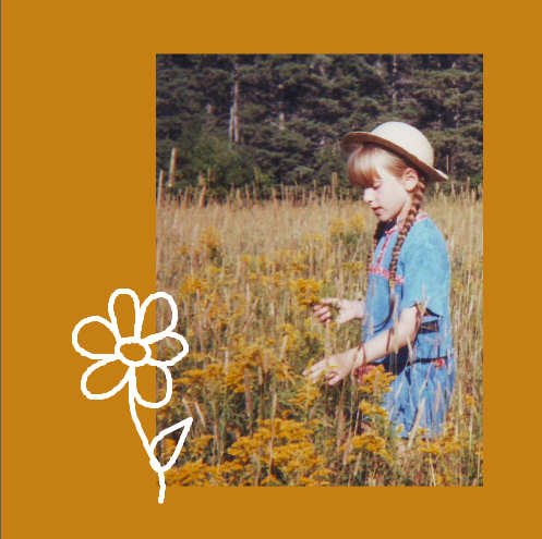
This is probably how most people would layer those elements in their layouts, but we can do better.
Link them
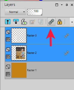
This technique will require the top surface and the design to be linked together so their respective position will not change.
In the Layers palette, select both layers, holding the Ctrl key, and then click the Link icon.
Let's create a gap
If you ever tried to write on a surface and you suddenly continue on a lower surface, there will be a small gap created at the edge of the top surface. This is what we will recreate.
Activate the top surface layer. With the Magic Wand selected, choose Opacity for the Match Mode.

Select any area of that top surface (in this case, it will be the photo), and you should see the selection appear all around it.
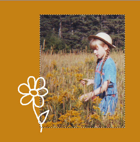
Go to Selection > Modify > Feather and set the value to about 25 (the exact value might depend on the size of your project, the thickness of the top surface, and the look you want to achieve).
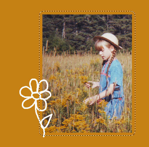
Now, holding the Ctrl key (and the Mode for the Magic Wand will change to Remove), click on the top surface again. This will remove that are from the expanded selection you had just created and you will be left with only an outline around your top surface.

Activate the layer that has the drawing (or the text) and hit the DELETE key once or twice.
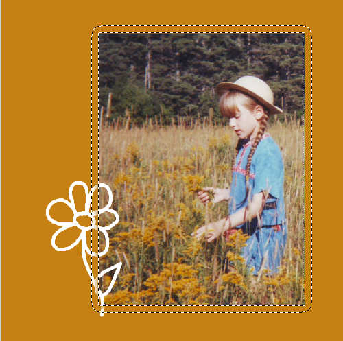
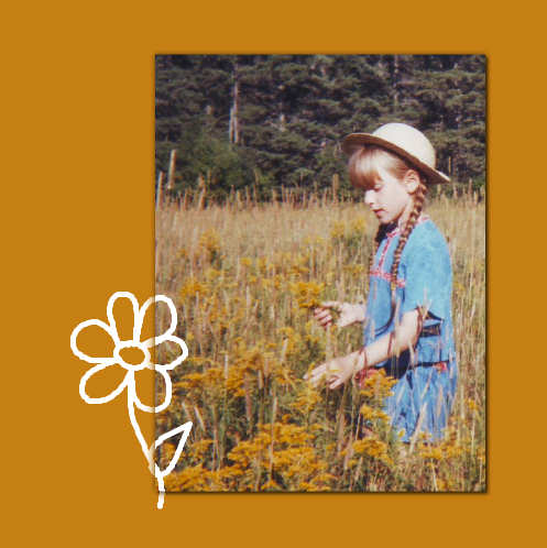
Deselect with Ctrl-D and you see the end result.

And this will not be affected by shadows you will need to add to the top surface.
Adding text
Using this technique, you can apply the same effect on text (journaling or title); however, there is one major difference: you can only apply this effect on a raster layer so you will want to either convert your text object into a raster layer OR you can duplicate that vector layer, hide the initial layer and convert the duplicate to a raster in order to apply the effect.
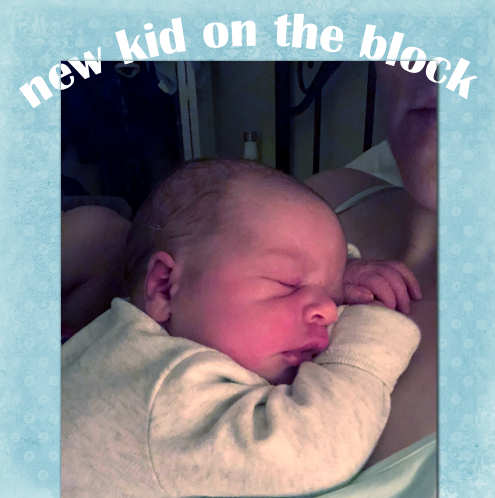
In this example, I only feathered by 10 pixels because I wanted a smaller "gap" as to not affect the legibility of the text too much.
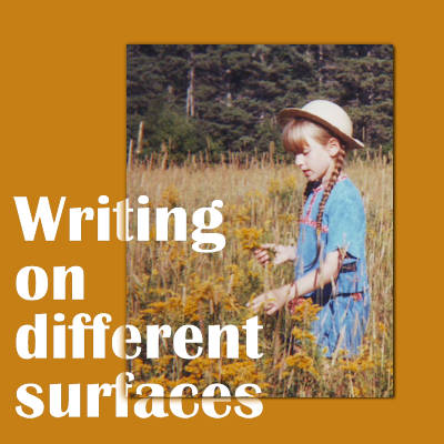
With this technique at your fingertips, you can add various written elements (which have no thickness) while overlapping different surfaces with a more realistic look.






8 thoughts on “Writing on different surfaces”
Great effect. I shall have to have a go at this on my next project. Thank you Cassel.
Thank You!
Always amazes me what can be done with PSP. Thank you for another very informative tutorial.
Very nice, thank you for the tutorial, and to be able to download it as pdf.
Very nice to know!
That’s a very useful technique, plus it adds that little extra to any project. When I read this, it reminded me of the shadow technique, for say an ink splatter overflowing a paper, which you demonstrated in Template temptations masterclass. I use that technique.
Very helpful. You are a great teacher. And I love the baby pics!!
Very cool, Carole