When you have a photo, sometimes, you would like to add a little something that was not in the photo. It could be for a laugh or something more serious but adding a new element to a photo can be used in many contexts. Let's see how we can add a simple element to an ordinary photo.
Choose the element
One important factor to consider when choosing the element to add is the perspective. If the person (or animal) in the photo is looking to one side, the element you want to add should also be rotated toward the side. It is possible to flip an element that is facing the other direction, but you also have to consider the lighting so realism is better on the final project.
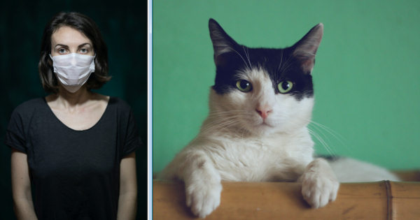
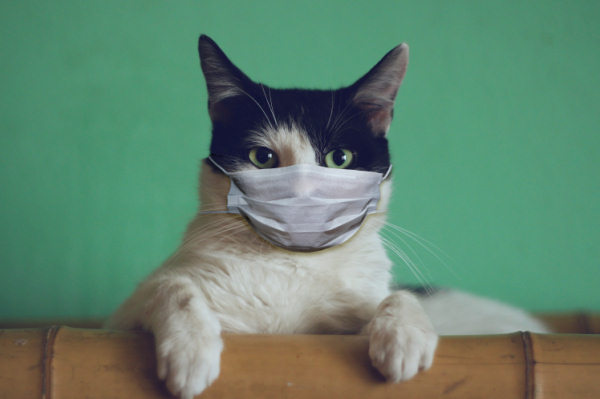
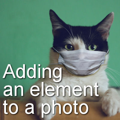
I will be using these two images in order to add the mask onto the cat's face. Notice that both are facing straight so they would match (photos from Unsplash).
Cut out the element
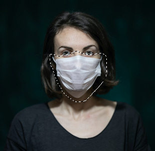
The first step will be to cut out the element you want to isolate to add to the other photo. Here, using the Freehand selection tool, I selected roughly around the mask, making sure I was grabbing everything, including the strings on the sides.
Then, copy it and paste it onto the target photo. You can use the Pick tool to resize it. At this point, you might not need to have it perfectly sized as there are other steps before that but make it so you have a good idea what you will be working with.
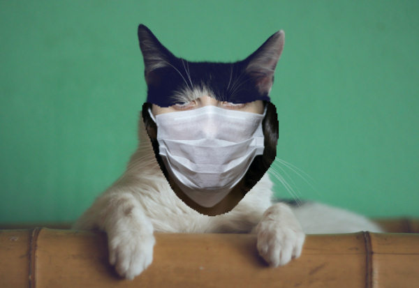
Now is time to do the correct extraction. In this example, I used the Eraser tool to delete everything but the mask itself.
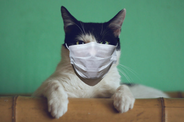
Although all that area left is really part of the mask, I think that the bottom part could be removed as it does seem out of place (and makes it quite long too).
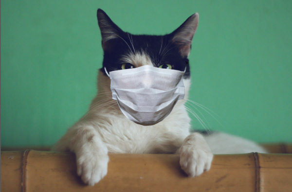
Although I have removed some area, it feels like it is a little high for the head of the cat so I'll use the Pick tool to distort it a bit and reduce the height a bit. Considering the shape of this mask and the horizontal folds, it should not be a problem.
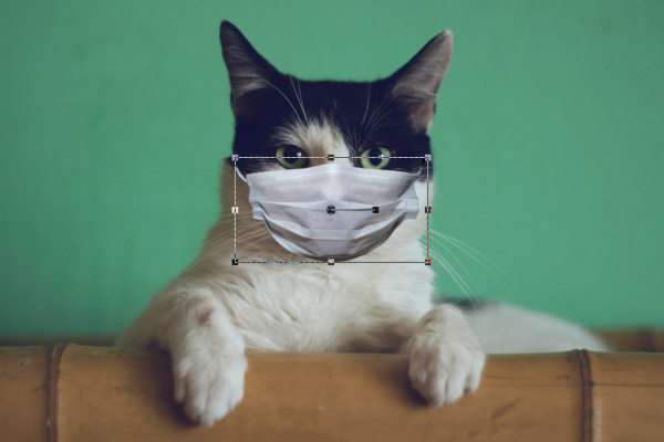
So now, the shape is better for this combination. I also noticed that the right side of the mask is a little darker than the left side and since the lighting on the cat seems to come from the right side, I decided to flip it horizontally. Since the mask does not have any design on it, flipping it won't cause any issue.
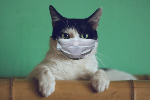
Taking care of the details
Although the mask itself seems well-sized and fitting, the strings on the sides are too short for this head. I can use the Warp Brush, set to Push mode to grab and drag the ends of each string. This technique might not always be a good solution for other elements but for a string or another thin element without any design, it should do.
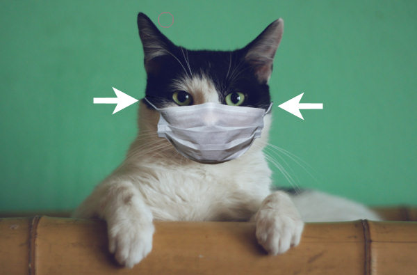
On the initial subject, we could not see the bottom string as it was hidden, but on our cat, we need some. Since the string is an element without any design, we can make a selection around one of the string, and then, in the Layers palette, right-click and choose Promote selection to a layer. Of course, you can also copy and paste it. That would also work.

With the Pick tool, rotate the string as needed.
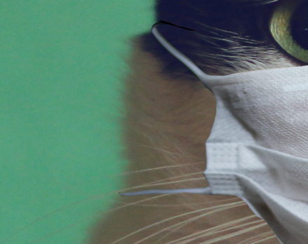
And repeat with the string on the other side.
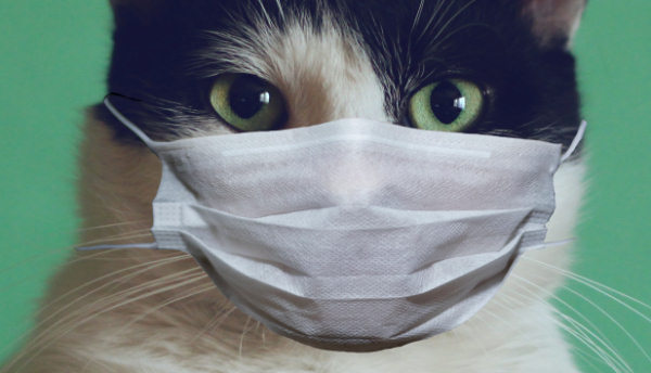
Adding shadows
Shadowing is a detail that can tell a viewer that this element is just pasted there, but we can tweak that. Here, I added a shadow using a color from the dark side of the fur, instead of the usual black. That way, the shadows will blend in more. I also used only a vertical offset. The Opacity was set to 60% and the Blur set to 25. I also played with the Blend modes to see if any of them would blend this shadow better into the fur. I found that Hard Light worked better than leaving it at Normal.
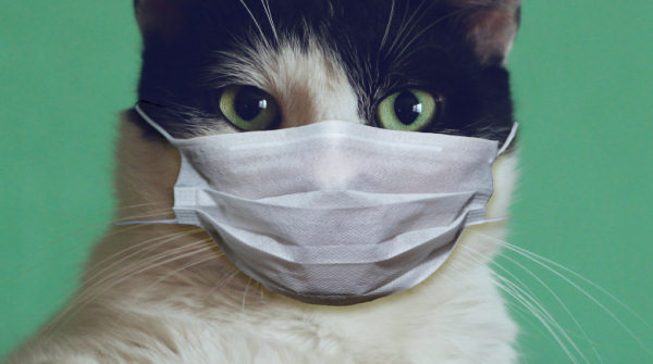
Here, I also added a little bit of shadowing on the left side, using a very soft brush and the Darken/Lighten tool. I darkened the left side of the head and a little bit on the left side of the nose. It is subtle but it is there. And here is the result of the cat with an added mask.
Other elements
Using these steps, you can add other elements. For example, I added some reading glasses to the cat.
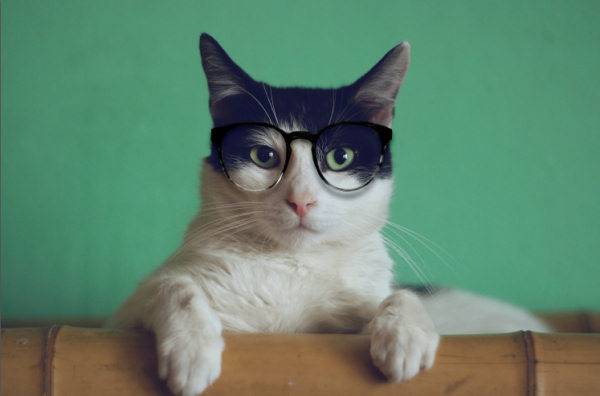
And why not combine both?

You can add various elements to a person or a pet, whether it is a hat, glasses, something in their hands like a glass of wine, a magic wand or a stirring spoon. Those elements could be meaningful to the person or just be added for fun. What will you add to your photo?






4 thoughts on “Adding an element to a photo”
Thank you, I will have to play with this!
With the mask, the glasses should be fogged 😉
Ha! Ha! I had the “foggy glasses” problem too but solved it with masks that have an inner metallic band at the top so you can shape it to your nose. Voila! No fog.
Brilliant!
I absolutely love this!