
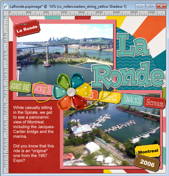
We are getting close to the end of our scrapbook project. We have all the elements we wanted, and they are placed pretty much at their final location. Of course, you can still tweak your project, as long as you keep a .pspimage version of it. The beauty of digital scrapbooking.
Adding shadows
So far, our project looks pretty flat and unrealistically digital. Of course, it IS digital, but we want to give it the 3D effects that will make the whole project look like a traditional paper project.
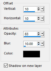
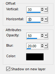
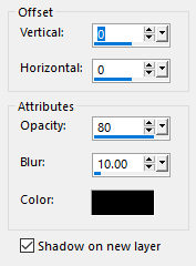
The first thing I did was add a simple shadow to all the "paper-thick" elements. That includes the title, which looks like cut-out papers, the photos, the papers themselves, and the tickets. I used these settings:
The result is the following.
That is pretty good, but other elements need their shadows too. The string is pretty thin, but I will add a different shadow. I reduced the Opacity because, since a string is thin, light can come from all around and won't create a very well-defined shadow. I will replicate that effect, along with a larger Blur.
Here is the result.
The next element that needs a shadow is the big flower in the center. It is obviously thicker than anything else in the project, so its shadow will reflect that.
Here is the flower with its shadow.

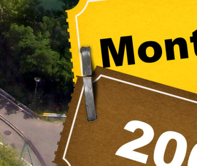
Finally, we have the staples to take care of. If I was to use any offset value, the shadow would be created away from the staples. Considering that they are VERY close to the surface, their shadows have to be minimal where they touch the paper.
So here, the shadow is appearing quite minimal, but that is the start.
One element that does NOT need a shadow is the text for the journaling. This is meant to be "printed" or "written" directly onto the paper so it would not have any thickness. Also, if you have some paint splashes or grunge somewhere on your project, those would not need shadows either.
Tweaking the shadows
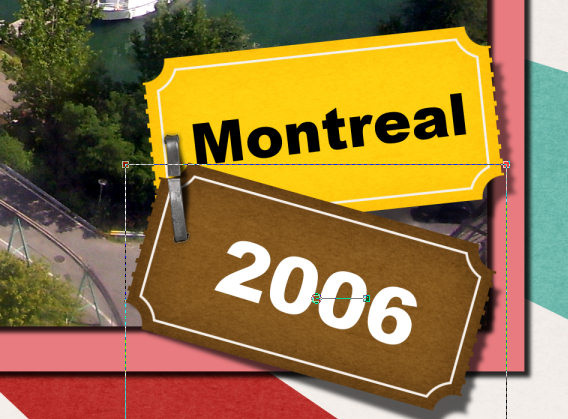
Although the shadows, by themselves, will give a good 3D effect, we need some tweaking in some places and can play with them in some others. The staple is the first one to tweak. As said above, the shadow should not be offset where it touches the paper, but the rest probably could. So here, I used the Warp Brush, set to Push mode. The size is just about the width between the ends of the staple. And I will just push the center of the shadow downward a bit.

Doesn't that look more realistic? I did the same thing on the other staple, in the bottom right corner of my page.
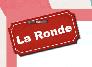
Another tweak to consider in this project is the fact that if the tickets are held by staples on one end, they MIGHT naturally flip up a little bit away from the staple. For that, I used the Pick tool, set to Shear (or hold the Shift key) and slightly lowered the corner and move it toward the right. I choose that direction as it will be consistent with the light source coming from the top left.
The other element that might benefit from a shadow tweak is the string. Although you might consider that it is flat on the page, unless you would glue it along the whole length, it might raise a little from the paper. For that, I used the Warp Brush again and pulled the shadow toward the bottom right. I did it in three locations: the end and the two loops.

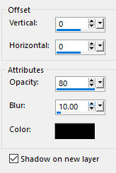
Reverse shadow
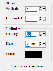
Although all the shadows indicate the direction of the light source, in some instances, you can use the Drop Shadow command to create an edge in some locations where it still does look too "digital". A reverse shadow should be subtle and not something one will perceive as an actual shadow. Here are the settings I used for this project.
I applied it to the photos to create some sort of separation from the mat. It is not large enough to be considered an actual shadow but it seems to almost be part of the photo.

Another place where this reverse shadow is particularly useful is when two elements of the exact same color will overlap. Notice on the corner, the pink mat is exactly the same color as one of those in the paper, so it looks like there is no definition. Adding a reverse shadow will make each element look independent.

You don't need to add a reverse shadow to all your elements. You will need them only on thin elements like papers and photos, or some that are of the same colors.
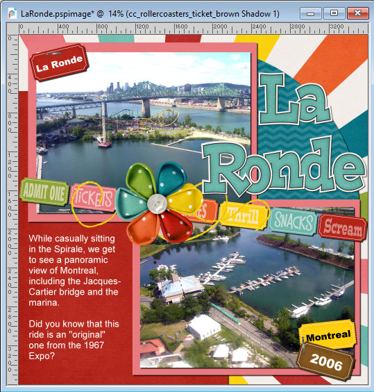
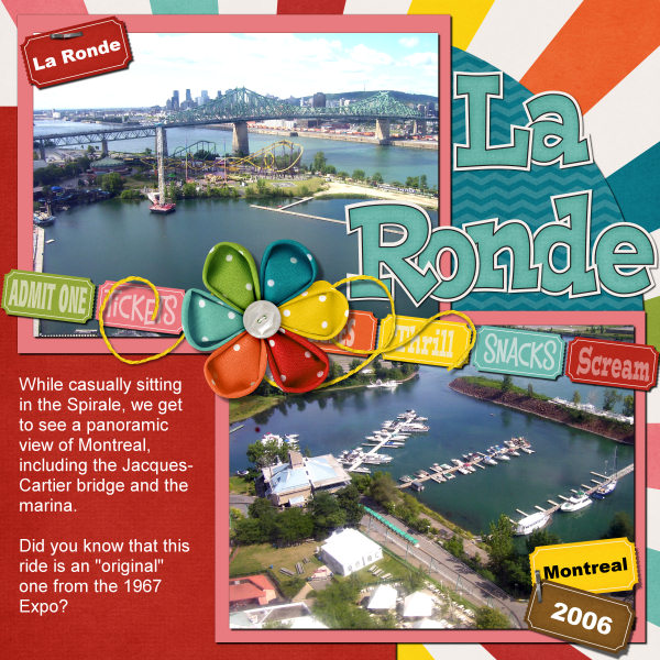
The final look
And now, this page has been completed.
Don't be intimidated by all the work that goes into completing a project. You don't need to do it all in one sitting. In fact, sometimes, it is better to do it in small steps, stop and come back a bit later. It will clear your mind and you will have a different perception the next day.
You might find typo to correct, more information you want to add, you might feel there is one area that needs an additional element, or that maybe one element feels out of place. You can also alternate working with different projects almost at the same time. Ten minutes at a time is fine. And with each "10 minutes", you will get closer to the completion of your project.


4 thoughts on “10 minutes to scrap – Finishing touches”
So what would you use for greenery such as leaves under flowers? Also, I tend to use the mesh warp instead of the warp brush on strings and ribbons. Personally I have more control with that tool than I do the brush.
I did learn a few other things that might help me though!
First, I tend to use the Pick tool and rotate the shadow a little. If that is not enough, then I will also use the Warp Brush.
What shadow settings for greenery?
It all depends on the effect you want, if you want it lifted or flat. How much off the surface you want it. It also depends on the size of the leaf and the shadows of the surrounding elements as it has to also be consistent.