We all know that digital scrapbooking can be pretty "flat" if one does not use some additional effects on the elements. The most common way to add some dimension is to apply a correct drop shadow. You can read the blog post about Everything needs a shadow, almost. However, there are other little details that can add to the realism of your digital project.
Reverse shadow
This is not an official terminology, but simply something that will describe a very particular type of shadow. We know that a normal shadow will be in the direct opposite direction from the light source, wherever it is. However, it leaves the other side with absolutely no shadow or no distinction at all, between the two elements. Since working with digital images, the overlap of the two will look... flat, and digital. This is what we would like to avoid.
A reverse shadow is a shadow that will be facing the light source. But, how can that be? No shadow will exist on the light source side! If that is what you think, you are correct. Even though it is called a "shadow", it won't actually be one. That is why, sometimes, I call those also "fake shadows".

In the above image, you can see an element cut out of paper of the exact same color as the background. Without a shadow, the element would be invisible. Adding a normal shadow shows us that it is there, but the top left parts of the star just blend in with the background as it has the same color. Let's add a "reverse shadow".

See the difference? I added a shadow with an offset of 0, an opacity of 30, and a blur of 2. That is a tiny shadow, but it creates an obvious separation with the background. You might say that it is more necessary because it is the same solid color, so let's see if we have different colors.
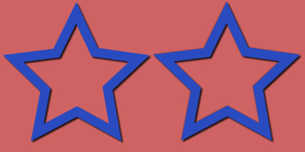
Although the distinction between the pink background and the blue of the element is obvious enough, adding the shadow makes it more "separate" and the colors don't blend like in a single layer element.
Brightness
If you have elements that should be the same color, like on a tone on tone project, you can assume that the elements are made of different material. In that case, it is likely that the colors will have a slightly different shade or brightness.

Looking at the image above, both butterflies are made into a sticker, with white outline. On the left, I added both the regular shadow and the "reverse" shadow. On the right, I also adjusted the brightness to -10 (I could not increase the brightness on white). This very slight difference is visible and also gives the impression of a different type of paper that, although is white, is not the same white as the base white.
Bevel
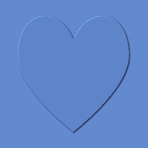
We are used to apply bevel to thick elements, like buttons, brads or other decorative elements. When you think of it, every element has some degree of bevel, even a piece of paper. Of course, the thinner the element the smallest the bevel will be. To the point where the that degree of bevel is almost invisible, but it is still there.

There are two heart shapes on this image. Obviously, on the left, there is no dimension effect, while on the right, there is a tiny bevel of 2 pixels. It does not make for a thick element, but you can see an definite distinction between it and the background.
Let's combine them
Although one does not need to use all three tips, here is what we get when using the regular shadow, a reverse shadow, a brightness adjustment, and an tiny bevel.
Do you see how those small, almost invisible details can add a touch of realism to an otherwise boring and flat graphic design? You can play with those tips, and the settings to suit your projects, depending on the size, the color (or pattern) and the end result you want to obtain.
Now, have a look at your current project. Are you able to add those details? Would they make a difference?





5 thoughts on “3 details to add dimension to your elements”
This is as useful now as it was in 2016!
Thanks Cassel, this will be very useful.
Useful info! Since you told me about the reverse shadow trick, I’ve applied it to several projects. I’ve also adopted a system which I have written down, when applying details not always necessarily in the order I’ve written them down, but usually. That way I don’t over look adding an important detail, which can easily happen to the best of us.
thank you Cassel for this info…. it will be of great help in this area of my learning PSP.
Great tips! I get tripped up on this all the time. Really appreciate the information.