When you create layouts traditionally, you are mostly limited by the size of the printed photos you have on hand. It is quite unusual for a paper scrapper to have a photo that will cover all or most of their 12x12 layout, but if you are a digital scrapbooker, you have that option as many digital photos are now quite large, or if that is not the case, you can always enlarge them (but that will require some extra steps). Why or when would you want to use a very large photo on your layout? Let's have a look at a few such reasons.
Backgrounds
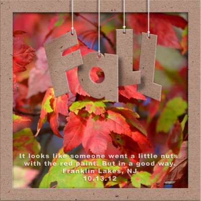
Some photos are great as a background. They are pretty, they are colorful. They might or might not have a particular focus or subject. They can be general landscape photos, or texture photos. They might set the tone for other photos, for journaling or various decorative elements you will want to add to the project. This is one way you can use photos that don't seem to be "that interesting" on their own: they make the perfect support for a layout.
Accents
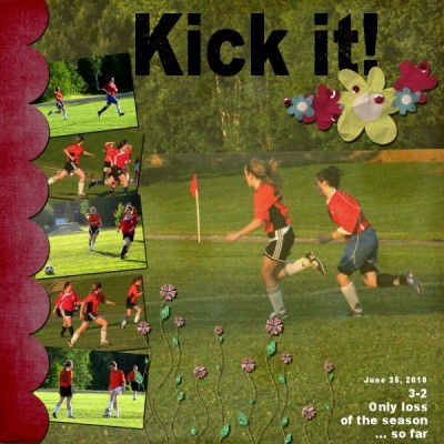
Sometimes, you can use one photo of a subject, a location, a sign which will be perfect for setting up the story of your layout. Whether you have the photo of a golf course to then feature your favorite golfer, or a long road to explain that you are starting a trip and want to tell the story of that trip, you can use one photo in that way. But it does not have to be a "boring" photo: one good enough photo can still be used to accompany other smaller ones on the same theme.
Bad photos
Sometimes, you might have a photo that is very meaningful to you, but it is either a bad quality as far as color, sharpness and such. Blending those photos in the background can still showcase them without focusing on the defects. Using Paintshop Pro, you have the option to use various blend modes depending on what end result you want, or the colors you have to blend your photo with.
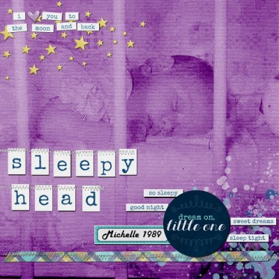
For more tips on using bad photos, you can get our FREE ebook "8 ways to use bad photos in a scrapbook project" illustrating other ways you can salvage and use "bad" photos.
The star
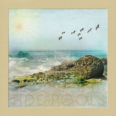
Once in a while, you will have a photo that is particularly pretty or a photo that tells the whole story, and you want to showcase that photo as the star of your layout. Why not? You don't have to hide it under a ton of embellishments. You don't have to frame it. You just show it. Minimal text and decorations is all that photo needs.
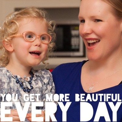
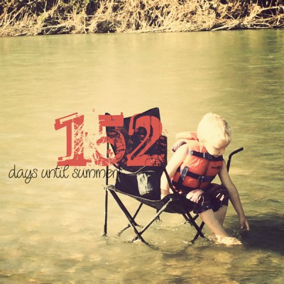
There might be other ways or reasons you can use a large photo. Maybe you just like to use big photos. And that is quite ok too. But remember that with digital scrapbooking, you have a great advantage over traditional paper scrappers, in that you can use photos as large as your whole layout, and if you have the photo for it, why not take advantage of it. Minimal decorations will just let the photo speak, and if a photo is worth a thousand words, you might have a great story on your page!
Did you ever use a very large photo in a layout? What is your reason behind that choice? Tell us in the comments below and don't hesitate to link to one such layout from a gallery or your blog.





1 thought on “4 reasons to use BIG photos”
is THE most powerful feature of the picture tubes tool— Typo mistake