With easy access to digital photos from cameras and phones, we have the opportunity to collect a large number of images on our memory cards or hard drive. It can be fun to have so many photos of the same scene, taken within minutes and seconds, capturing various facial expressions or movements. We probably don't want to use them all, but sometimes, we still want to use more than just one or two. Using many photos in a single layout can be a great way to showcase those photos without having to spend days and weeks creating multiple layouts.
Do you feel a bit overwhelmed with that many photos and you can't figure out how to display them? Let's have a look at a few ways of using many photos in a single layout, and see which one seems to suit your style, your need and the photos.
Random placement
One of the obvious ways to place many photos is to arrange them somewhat randomly. Of course, they are not really random as you will make sure to show enough of the images to be identifiable, but they can have varying sizes, shapes, grouping, and rotation.
Random placement of photos can be a way to convey a feeling of dynamism, movement, and fun. The images are not placed in any particular order and although they could be all about the same subject, in a short time period, it could also be used as a summary of an event over a longer period of time, like a whole vacation showcasing only a "few" of the hundreds of photos taken over time.
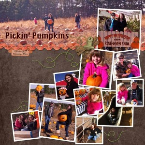
In this layout from Kristie, all the photos were taken at a single event, within a period of just a few hours. Obviously, to fit that many photos in a single layout, you have to size them down, but that is so easy with digital photos and digital layouts!
Here is another example of random placement for multiple photos.
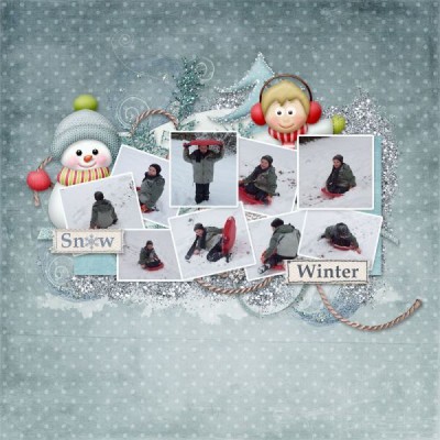
Although random placement is commonly seen with rotated photos, it does not always have to be the case. See this example from Jen.
Mosaic
The mosaic style of layout will showcase many photos, usually without any defining borders, in a way to cover a surface or a specific area. The images used are small and can either overlap each other or fit within defined sections. The absence of borders prevents the assumption that the photos are really layered, unlike the Random placement style. Although the photos can be rotated, they will tend to be straight, and rely on the shapes and sizes to add variations.

Just like for the Random placement, the photos can be similar, related to a specific subject, or be from various subjects in a single theme, or a single subject, with various themes.
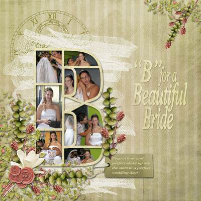
Another fun way to use a mosaic is to have photos inside a monogram. Although the photos have a frame around them, that frame is more part of the support than around the photos themselves, a bit like stained glass has edges to hold all the pieces together.
Blocking
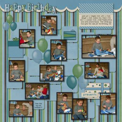
Blocking differs from the Mosaic style in that it has more regularity in the shape and size of the photos. Each photo will rarely overlap another one. In fact, those photos will be carefully sized to fit a bit like a puzzle alongside each other. Although it is not always the case, those layouts will often have the photos separated by either a border, or an obvious gap that is quite regular throughout the layout.
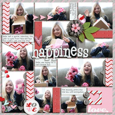
As you can see in Jenn's layout, each photo is a rectangle and there is no overlap of any of them. Even though very few of the photos are exactly the same size and shape, they all fit perfectly together, like a puzzle. Even additional "blocks" made of decorative papers, follow the same principle.
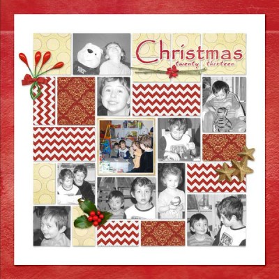
Here is another example of blocking where all the photos and papers are arranged like a big puzzle that fits perfectly.
Pockets
This new style has gained in popularity for its ease of use in the traditional paper scrapbooking world and has been also replicated in digital scrapbooking. The name comes from the initial set of plastic pages that included pockets and cards of matching size. The individual pockets were of a limited shape and size. Most pockets were of the same size since they were meant to use the same size cards.
In digital scrapbooking, although there is no real limitation in the sizes, the layouts will still tend to replicate that regularity. Any empty space can be replaced by decorative papers or journaling cards where text is often added. This style of scrapbooking is quite common for summarizing a week in pictures.
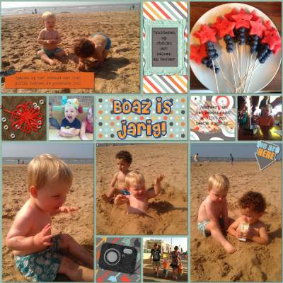
In this example from Lynn's layout, you can see that the shapes, although not identical all the way, are quite limited and repeated. There is also a common gap between the photos.
***Download your own Pocket Page Template. CLICK HERE ***
Grid
The grid style of arranging photos in a layout will assume a very regular and even placement of the individual photos and in their size and shape which will be almost identical throughout the layout. Although the whole layout might not be covered with the photos, it is fairly common.
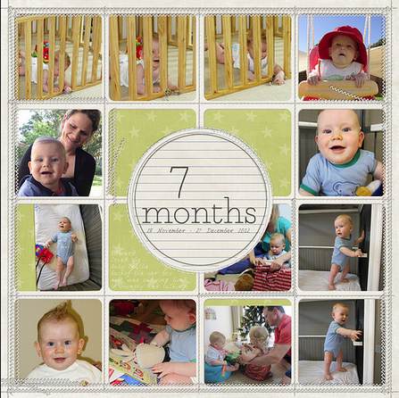
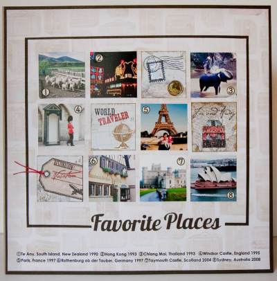
This is an easy arrangement of Instagram photos since they are all square. The grid format is a fantastic way to display lists of people, places, objects too, like in Alice's layout.
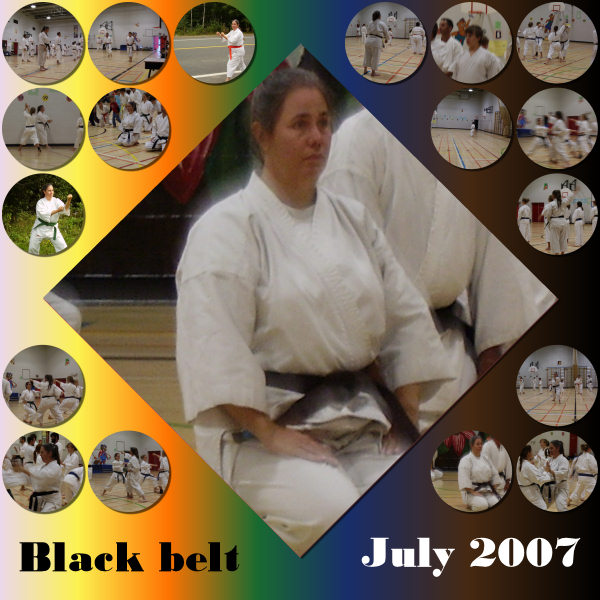
And since everything is so regular, why not use another shape? Circles also work very well in a grid.
*** Get a stamp sheet template to showcase many photos. Click HERE to request it, for free.***
Strips
Placing several photos along a single line, in a series will create photo strips. Those could be simply aligned side by side, but will often show regularity in height or width, depending on their respective placement. Photos can be placed as if they were part of a filmstrip or those photos from photo booths.
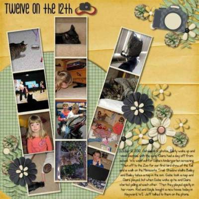
Here is another example of using the same setup that you would see from a photo booth. If one can use film strips, that is another way to display several photos, often of a single subject, or a sequential series of photos of a single action.
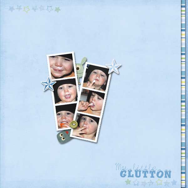
***Download your own Photobooth Frame. CLICK HERE ***
Although a strip is expected to be straight, I would tend to add the viewmaster in the strip category as it is the same principle of a sequence of images in a standard format, except that it is on a wheel instead of a "strip". Check out this layout from Alquafea.
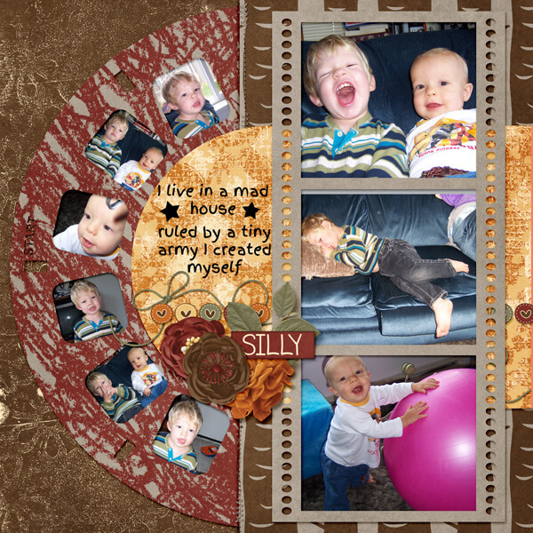
***Download your own Film Strip Frame. CLICK HERE ***
Not only we can use supports like film strips and frames, but how about a strip of stamps? Here is a cool example from Laramie.
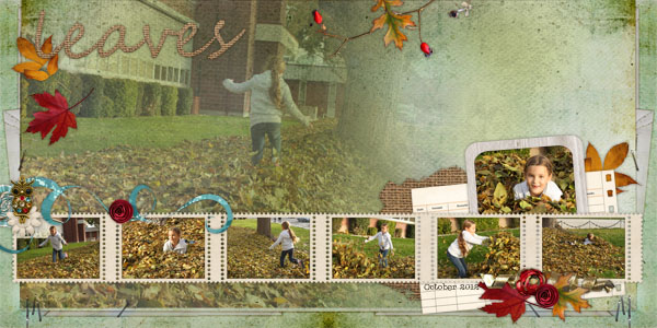
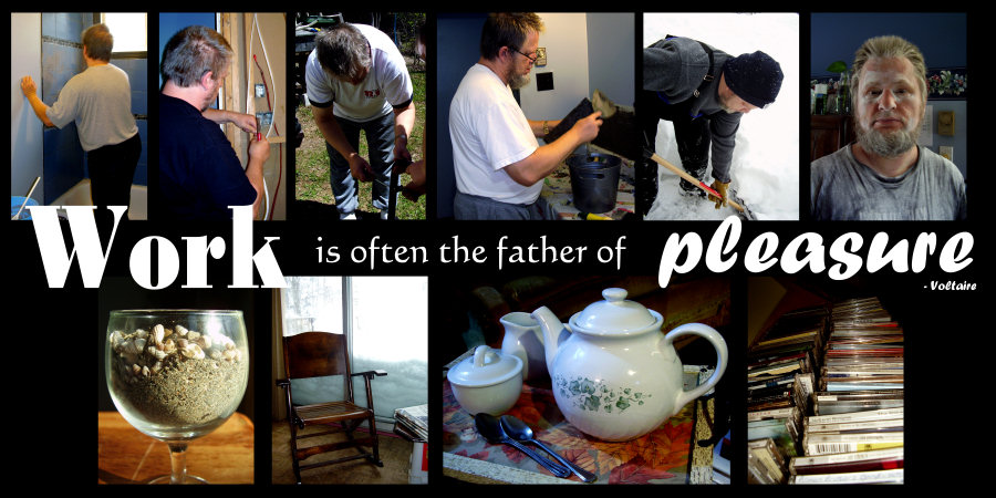
We might expect all the strips to be displayed within a frame, but they don't have to; it can also be done without any "support" or border like this layout.
Double layouts
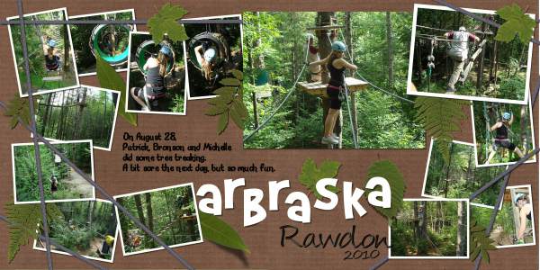
Obviously, there are times when you have so many photos that they won't fit into a layout. What can you do? You double down! Having a double-page layout will definitely allow you to use either more photos or larger photos than if you used a single-page layout. All those methods of displaying multiple photos on a layout still apply, whether you are doing a single or double.
Combination
Of course, each layout does not have to comply with a single style or arranging photos. You might see some strips with other random placement. There are no hard rules, only preferred style. Some scrappers will mostly use one type of photo arrangement while others prefer a different style. The layout will also be based on the theme, the subject, the time, and more. You might want to use a consistent style throughout an album but even that is not absolutely necessary either.
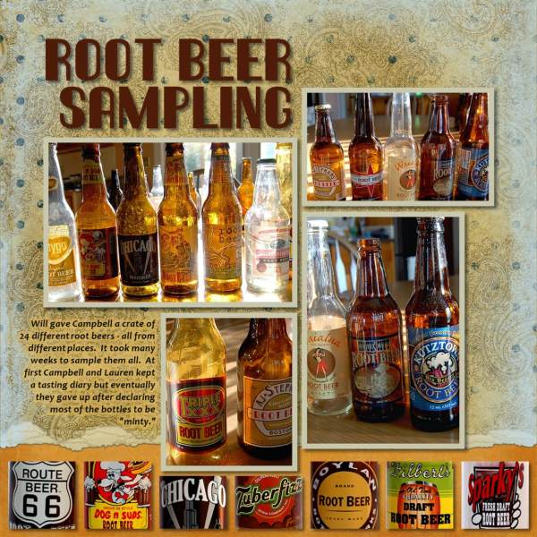
See how Diane is using both a strip arrangement and a blocking arrangement. And it is still eye-pleasing. Don't limit yourself to only one style if your photos or your heart are leading you in a different direction. Experiment. Play with the photos.
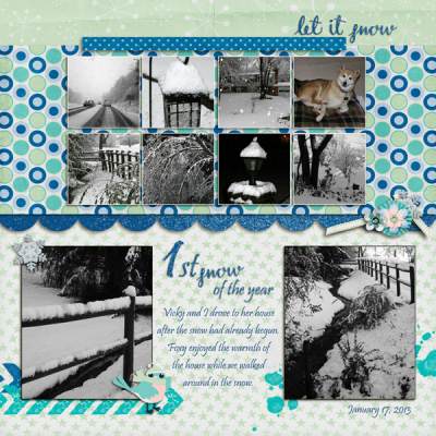
Similarly, Elynnia is using one style (the grid) on only a part of the layout. Nobody ever said it had to cover the whole page either!
What style do you tend to use when you have many photos to display? Is there one style that you might consider trying in your next projects? Can you think of another way to display multiple photos in a layout? Share in the comments below. And if you like the information in this article, please share it so more people can benefit from it.
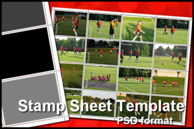 Do you have many photos you want to showcase in a page? You can use this layered template in the form of a full sheet of stamps. Replace each rectangle with your photos. You can repeat the photos if you want. Once done, merge everything and you can even separate some stamps from the sheet, just like the real thing.
If you want to get started with creating your own scrapbook pages, check out our Starter tutorials.






6 thoughts on “How to use multiple photos on a layout”
This post is very helpful, evem more for beginners like me. Thanks.
Great ideas, thanks for sharing!
I’m not sure which category it fits into but I have used the hexagon format a few times – there are a lot of options for the final shape and it can also be used as a “quilted” layout.
Absolutely. The hexagon would probably fit in the “grid” category even if it is not a series of horizontal and vertical arrangement, but it can still be very regular.
Do you have a layout you would like to link to?
What a lot of ideas for layouts. I like the idea of trying different shapes. I have noticed (and this is a personal bias that I don’t expect anyone else to share) that some layouts have so many elements on them that the photographs are lost in all the cute text and clip art. The focus seems lost in all the doodads. What is nice about what you showed is that the photographs are still the stars of the layouts, which is what I would expect them to be for the sake of keeping memories and telling a clear story. Thank you!
I agree with you Diane, because that is a style of scrapbooking we have in common and our purpose is to keep and share memories, however, some scrappers are more into a “craft” and “art” mode and maybe the memory-keeping is not their focus. There is no right or wrong way to do scrapbooking, but just our own preference. I just happen to share yours. 🙂