Alphas can sometimes be included in a kit, but they would generally follow the color and theme of the kit. Will you use it? Will you need it? If your photo does not fit in the same exact theme as the kit, it might not be of much use to you. Could you use something better? Of course you can, and to do so, you can do it with your own photo.
Not a full alpha
If you are using your own photo, and you need an alpha, it probably is only for a few letters, maybe to write a title or a date, or something minimal. There is no need to create a full set of uppercase and lowercase, digits and symbols. Only use what you need. After all, it is unlikely that someone else will need a similar alpha to match their photo!
Using a wide surface
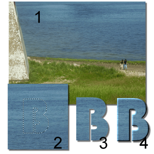
Depending on your photo, you might already have a fairly large area that displays a specific pattern or texture that will be obviously coordinating with the theme of the photo. You can easily create your alpha by cutting out the letters from that area. Here are the basic steps:
- with the text tool, set it to create as a Selection
- set a large enough size, so you can always size down if needed later
- type in the character you want in the area you want to use
- when the selection is created, you will see those “marching ants”; if you want to tweak the placement, activate the Move tool (M) and with the right mouse button, move the selection where you want it (see #2)
- when you are happy with where the character is, copy (Ctrl-C) and paste as a new image (Ctrl-V or Ctrl-Shift-V) (see #3)
- apply a bevel or any other effect you want (see #4)
You can now create all the letters you need from the same area (like all from the water, or all from the grass) and you would get something like this:
Or you can go a little wild and create each letter from a different area of the photo so you can end up with a title like this one:
Which one will you use? That is entirely up to you.
Using straight elements
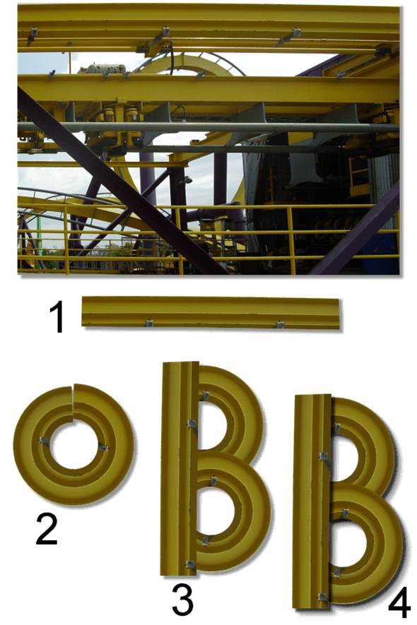
Some photos will include elements that are fairly straight, whether they are telephone poles, door frames, trees, etc. Using an extracted element like those will give you the basics to create various letters, as long as you are not expecting to have fancy lettering. If you have a photo with those elements, here are the steps you can follow:
- extract the element; if it is slightly distorted due to perspective, you can use the Perspective correction tool in PSP (see #1)
- if you need some curves, copy and paste this straight element and run the Circular Element script; it will give you a round object with the same proportions as the straight one (see #2)
- duplicate, rotate and arrange the straight pieces and the round ones to create the characters you need (see #3)
- add some inside shadows if you want to give the look of those elements being layered (see #4). Of course, if you want, you can also have all the pieces soldered together, so they won’t need any inside shadows
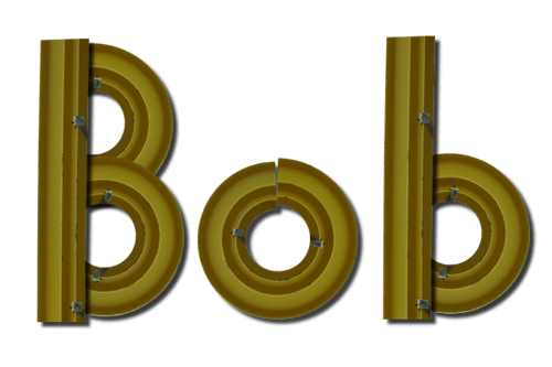
With a little patience, you can create your own title:
Do you see the “mismatch” on the “o”? It is only because my straight element was not perfectly matching on the ends when i ran the Circular Element script, but i didn’t worry because i actually liked that uneven look. I also find that the additional fasteners on the straight piece was giving a fun effect instead of only using a plain beam.
Also, if you happen to have a matching round element (like a tire, or a wheel or anything else that is round) you could use those in addition to the straight pieces. In this case, you don’t need to roll a straight element.
Using individual elements
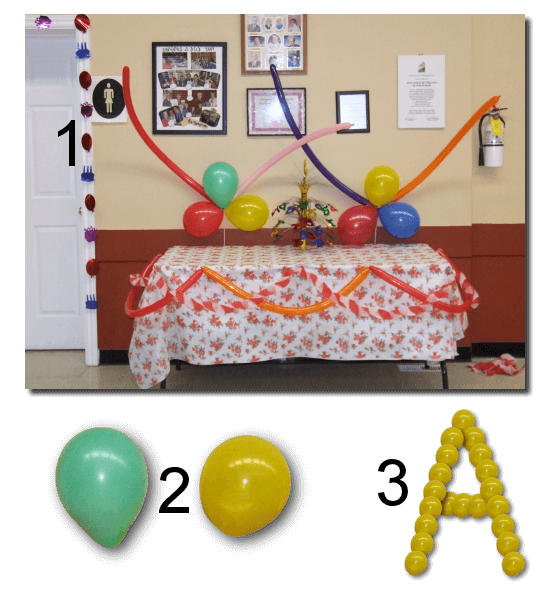
In some photos, you might have individual elements that you can use separately. They could be rocks, pebbles, bricks, nail heads, buttons, etc. By using the elements from the photo, you are sure to get something that will match in color and in style with the photo.
The steps are very simple (although they can be tedious):
- extract an element from the photo; if you have several elements of the same type, it could be useful to extract more than one (see #2). If you need help in extracting elements, you can always check out the Master Class on Extractions
- resize the elements to a size that you can manipulate: if they are left too big, your work image will be huge; if they are too small, you will need too many to create the letters
- on a new image, large enough for the text you want (or the letter, if you want to work one character at the time), copy and paste the element as a new layer
- duplicate the layer several times, or if you have just copied the element, you can simply paste as a new layer
- with the Move tool, align the elements to create the characters you want; you can either place the elements side by side, or slightly overlapping. If you choose to overlap the elements beware of the order of the layers as in some cases, it would look odd if they are sometimes over and sometimes under (see #3)
- add a drop shadow to each individual element; this is particularly important if they overlap as you need shadows that will appear onto other elements of the montage. Since you might end up with a LOT of layers, you can speed up the process by using a script like the Shadow Placer. Or you can repeat the command for each layer, manually
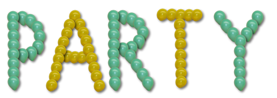
Although it is very easy to create letters and numbers with this method, it is tedious, but don’t you think it is worth it? See how a single word would perfectly match the photo and the event:
These are only three ways to use the actual photo you want to scrap, or maybe use other photos of the same event but which could be less interesting. You will never be able to find any kit that will include alpha as closely coordinated as those you can make yourself.
Do you want to try out one of those types of creations? Show us what you can do by linking in the comment below, to where you post your project.
Can you think of other ways to use a photo to create an alpha for a title? Share with us.








7 thoughts on “3 ways to create an alpha from a photo”
Love these ideas! For the last one, the balloon you used, could you extract the balloon and make it a picture tube and then create the alpha? Could it then be done on one layer?
Thanks for the tutorials! I love playing with this stuff!
Oh Cassel, this is so helpful and creative! Your tutorials are always so inspiring and helpful.
Glad you like them. Remember to show us how you use those tutorials!
How clever. I don’t think I have your patience but I certainly love your results. Great tutorial.
That is why i would not expect to do a whole alpha, but for a title with just a few words, it is feasible. The first one is the fastest, and the last one is the longest, but it might be worth it to be unique!
Thank you for the tut. What Font did you use for BEACH?
The font used is Bauhaus 93. I am not sure where i got that font since i have had that for the longest time.