Digital scrapbooking projects will often include text of some kind, whether it is for a title, a date, a poem or some journaling. To complete your layout, you can always use the Text tool from your graphic program. It has many advantages over the use of fancy alphas, but also some draw back. When is it a good time to use fonts?
Using Fonts for more flexibility
The Text tool is present in just about all graphic programs, so the user has the possibility to use their own text displayed in their favorite font. If the text you want to write does not require a fancy look, simply typing it can be enough. If you want to be a little fancier, you can go through similar steps taken to create an alpha, but apply them to your words after you have written them.
Write the way you want
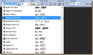 Using your own text tool and font will allow you to write just about anything, using letters, numbers, punctuation, accented characters or even some other types of symbols available in the particular font you want to use. Your graphic program probably has the option to choose a fill color and an outline color which will allow you to match your text to the project you are working on. Sometimes, you can even use gradients and patterns instead of solid colors as fill or stroke.
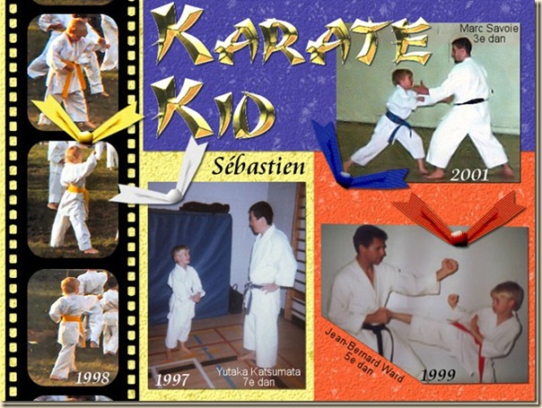
Once you have your text, you can apply various effects to match your scrapbook layout. Here is an example of a title made using the regular text tool with a font called Karate. The gold effect was added afterward.
Writing and printing
Fonts are the best choice when you want to add journaling, dates on photos or caption underneath. This is obvious as you need something smaller and often simpler so it is easy to read. Considering that journaling or caption is often written with text about 1/8th of an inch, you can imagine that you would likely loose all the fancy details of alphas. Also, if you want to use text that is supposed to be handwritten or printed, you don’t need the fancy textured and 3D alphas (although some alphas are made to look like flat ink or paint).
Blending
Another situation where using fonts is advantageous over alphas is if you want to use a blend mode to show something through (like a texture). You might want to add a title, a date or any other kinds of text pretending it is dyed, stained or printed onto a particular surface. In those instances, you need something simple so the layers below are easily seen.
Engraving
If you want to engrave some text, give it depth, you will need to use a simple font since the idea is not even to see the text, but only the edges of it. Whether you need engraving on wood, metal or stone, a simple font will be enough to then apply a few chosen commands in your graphic program to give the look you want to achieve. Engraving is often used for shorter text, like dates, or names although you can still write a whole phrase and engrave it if you use a font that is easy to read and possibly a bit larger.
Pros and cons of using fonts
Fonts are easy and quick to use. No copying and pasting letter after letter. This is a great advantage for anyone rushed by time. You can also choose to resize your text as you wish without any distortion. However, fonts usually do not have all the texture and fancy effects that you will find in alphas, although you could conceivably do it yourself. Another inconvenience of using fonts is that you need to go through several extra steps to make them “creatively uneven”, slightly different sizes, slightly rotated and maybe not perfectly aligned.
Where can I find new fonts?
You can find many fonts on the net and several sites specialize in free fonts. You might have a lot of choices of simple, traditional or fancy fonts. You can find a list of sites in the Resources section of the Campus. Some stores and sites also offer some fonts for sale with a very wide price range.
How do I use fonts?
Fonts are basic parts of your graphic program, whatever it is. If you want to learn more about using fonts, you can view the recorded workshop available in the Master Classes.
What is your favorite font to use in your project? Have you used a font in a creative way? Show us some examples.
