When you start a project on a scrapbook layout, how do you choose the colors you will be using? Do you look for the overall color of the photos? Do you look for accents in the photo? Do you just choose a kit with a similar theme as the photo, no matter what the colors are? There are many ways to pick colors, and it will most often depend on your style of scrapping, your style of creating, and maybe the purpose of your scrapbook page.
Working hard on a layout and ending up with a result that seems to “miss” something, is an awful feeling. Although other issues can cause that feeling, color choice is often one to consider. Sometimes, we thought we did it all correctly, picking the colors directly into the photo but it still does not make an automatic cohesion, although it should help.
1- Choose a color by theme
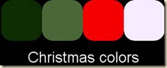
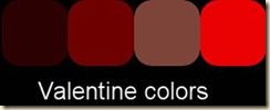
This is kind of an obvious way to choose colors for a scrapbook page. If you want to display a Valentine Day photo, chances you will be going for reds. If you want to scrap a page about a fall outing, you might be drawn to oranges. Of course, it is not a strict rule, far from it, but many themes tend to generate an automatic “color imagery”.
2- Choose a color from the photo
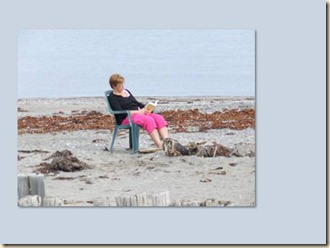
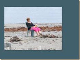
This is also a given. When you have a photo you want to use to make a scrapbook layout, it will almost be a reflex to use the colors directly from the photo. You might want to find a major color of the photo, but you might also want to focus on a specific detail of it. As an example, in this photo, I could use the general bluish color that was made from a blend of the blue of the sky and the grey of the sand.
Since much of the photo is close in color to what was picked for a background, it definitely does not make the photo stand out, Of course, this is not meant to be a complete layout. Using such a “bland” color for a background does give a great option of adding contrasting embellishments.
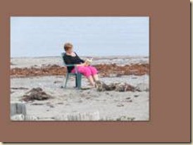
If, on the opposite, I wanted to use some of the colors from the photo to create a background, I could use the turquoise from the chair, the dark blue from her shirt, the bright pink from the pant, or maybe the brown from the seaweeds.
Which one is better? You tell me. It will all depend on what else you will add to your layout. Will you be adding mats, ribbons, brads, paper piecing, etc.? Those are basically four ways to start the layout. Another variable to consider is the supplies you have. Although in these examples, the background is made of solid non-textured layers, maybe you want to use a specific kit you have. That might contribute in determining your final choice of color for your particular layout.
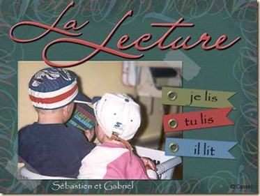
Here is an old layout I made from scratch and used only the colors of the book (do you recognize that book by any chance?), both in the background and the details.
3- Choose an overall color from multiple photos
If you want to create a multi-photo layout, focusing on the specific colors of only one photo might not give such a cohesive look. Put your photos together, side by side. Do you see some repeat colors? Do you see a consistent color across all the photos? Do you see a focus subject in all the photos? It could be the shirt of one person in all the photos; it could be the color of the pool, the beach, or… the lobster! Do you see a repeat color in those three pictures?
I think, in this case, I could choose the blue of the wall, which is repeated in all the photos but it is fair to think that oranges will definitely be colors in the layout, whether it is as a main color or an accent, I don’t think I could scrap those photos without oranges! What do you think?
4- Choose a color by mood
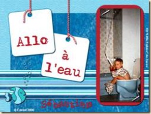
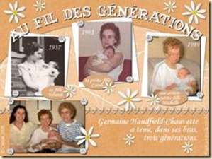
There are times when you might not really want or need to pick a color directly from the photos you want to use, maybe because the mood and story are more important than the photo itself. Maybe you want to use a calm mood, a sad one, a happy one, even a crazy feel. This might dictate what kind of colors you will use, whether they are bright or pastel, vibrant or neutral, rich or muted. A sleeping baby will probably require a soft color, while children at the park will need something brighter. A child will probably look “happier” in a bright cheerful colored layout, while an older person would fit better in a softer environment. Have a look at these:
Would you imagine grandma with the bright blue and red colors of the left layout? Do you think the peach colors would suit the funny picture of the child on the left? And if you end up choosing a color from the photo, you can also adjust the saturation to convey the mood also if the color itself seems to be a bad match with the general feel of the layout.
5- Choose no color
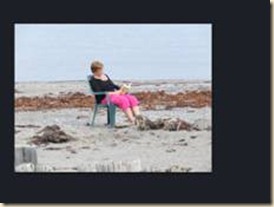
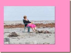
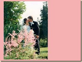
Black and white layouts can give a very elegant look to a scrapbook layout, and would definitely give much focus to a color photo. See how this photo looks a bit lost in the pink background, even though the pink is taken directly from the picture. I guess the pink does match the photo, but not really the mood for it. In contrast, see how it seems to jump out in a solid black environment.
Using “no color” does not mean you will use nothing other than black and white. Of course, you can still add a touch of color, but you can still stick with “no color” and still end up with a gorgeous montage.
6- Choose your favourite colors
Some scrappers have their own favourite colors, or types of colors. Whether you are regularly attracted to bright vivid colors, or pastel colors, or neutral ones, it is quite ok to follow your own preferences. After all, you are scrapping for pleasure, right? So if those colors please you, there is no rule against it. Even if a particular photo or subject on your scrap page might usually be associated with a particular type of color palette, you can be bold, you can be different, you can be totally breaking the “rules” and still produce a fantastic layout, probably for the very reason that you did NOT follow the expected color choice.
Choosing a color scheme for a scrapbook layout is about a general plan for colors. You will probably want to use variations of the same color, in lighter or darker version. You can also consider adding a touch of totally contrasting color here and there either to break the monotony of a main color or to accent details of the photos that might be too bright to be a major part of the layout. In order to choose some complimentary colors you can use various tools but the most useful would be the color wheel. You can find many similar tools online and our next article will cover some of those fantastic tools I found recently (I wish I had known about them a long time ago!)
How do you tend to choose the colors of your layout? Tell us in the comments below. Share a link to your favorite layout and tell us how you picked the colors for it.










2 thoughts on “6 ways to choose colors for your layout”
Thanks for all the tips! I generally make cards and only scrapbook a little but the tips apply to cards too!
LeAnn
Glad to see it can apply to other areas of crafting. Next week, you will surely like the other article!