MoniqueN.
-
Posts
926 -
Joined
-
Last visited
-
Days Won
16
Content Type
Profiles
Gallery
Forums
Everything posted by MoniqueN.
-
Oh wow! Love the colours and the background fits fine with this card, on my lesson 3 card it didn't work out.
-
Sweet girls! 🙂
- 356 replies
-
- 11
-

-

-
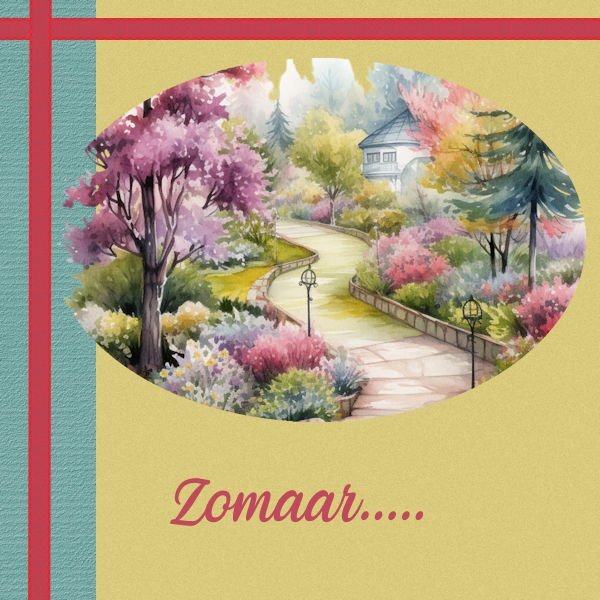
Day 6 Watercolur picture is from Creative fabrica Veni is the font I liked the "out of bound"(?) effect of the ellips.

- 356 replies
-
- 16
-
-
-
Day 5 The stack toy is from Creative fabrica Font veni
- 356 replies
-
- 15
-
-
-
Day 4 Picture is from Creative fabrica Font Victorian parlor By accident the ellips was more blurred then I wanted, but it came out just fine 🙂
- 356 replies
-
- 14
-
-
-
Day 3 Font is Victorian parlor The animals are from Creative fabrica
- 356 replies
-
- 16
-
-
-
Day 2 I love vintage cards 🙂 Font is Victorian parlor
- 356 replies
-
- 15
-
-
-
I'm more outside these days, not much at the computer, but here are some of my projects............Day 1 If I would use them as actual cards, I would use my cutting machine's print& cut function, Font is Fiolex girls, this font I also used for the birth announcement card for my grandaughter 2 years ago.
- 356 replies
-
- 14
-
-
-

© Monique
-

© Monique
-

© Monique
-

© Monique
-

© Monique
-

© Monique
-
Z- Zantedeschia
-
633! That much! Wow!🙂
-
It was fun to do. And what a lot of blog posts there are written over the years! 🙂
-
Snow? e didn't have any, we had some hail . I'm so fed up with the rain, I wanna go outside in the sun!