-
Posts
305 -
Joined
-
Last visited
-
Days Won
7
Content Type
Profiles
Gallery
Forums
Everything posted by Daniel Hess
-
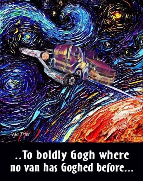
Just reminded me of a "photoshop" I did several years ago to make a pun meme even MORE "punny". I actually used one of the PSP plugins, can't remember exactly which one. I applied the effects to a van, then inserted and blended it in and changed the caption.
- 339 replies
-
- 11
-

-

-

-
@Jannette Nieuwboer Thanks. I wasn't thinking about the existing shadow or the sun in the original picture. Although...the statue was cut out of another photo just pasted into the middle of that one and as such I just wanted it to "stand" out from the rest. I'm going to leave it for now and try to remember in future projects.
-
Here is my day 5 submission.
- 339 replies
-
- 14
-

-

-
Day 4. I did these for the October Tourist Spot challenge. Used Text on Path, Reverse Contour, and adjustments in Leading, Kerning, and Offset to get the effects. Also showing the project.
- 339 replies
-
- 12
-

-

-
Select the face using freehand, then apply Gausian Blur to it in whatever strength is sufficient for you.
-
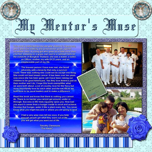
That backdrop for the text on the Mentor's Muse project was from the below photo, taken while we cruised rapidly through the "Red Sea" near Egypt on our way to the position from which we launched 23 Tomahawk missiles at the start of Operation Iraqi Freedom. I did some cropping, duplicating, mirroring, and flipping along with some blending to achieve the result in the project. I guess it was "sort of" lights but actually a reflection off the waves in almost perfectly calm water as the ship sliced through it.
-
For the day 3 project, I am going to resurrect my day 3 project from the Scrap Bootcamp. I did some serious selection area shaping using the add/delete selection functions. I think I've got that technique down pretty well at this point.
- 339 replies
-
- 11
-

-

-
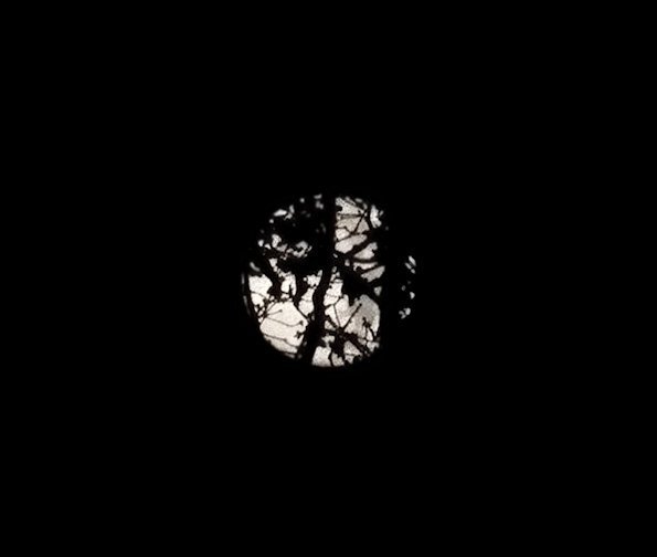
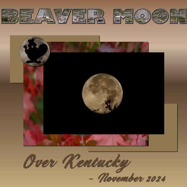
The moon photo with the "beaver" silhouette was taken by myself and I added the beaver for this project (that one was "actually" the October Super Moon). The main November moon photo with the branch was the original photo that I took in early morning with the moon behind some very tall trees in my back yard. I had to keep moving around to get one that wasn't overwhelmed with the tree silhouettes. (See below). These photos were actually taken with my Samsung Galaxy S22 Ultra cellphone. The camera on that thing is amazing for a lot of things.
- 339 replies
-
- 10
-

-

-
Hello everyone. Here is the first day's project. Hard to spot the "wave" in the title at this resolution but it's there.
- 339 replies
-
- 13
-

-

-
I think what James was saying is applying to my situation. I'm running an inspiron 3650 (OLD) from Dell and don't have the extra robust graphics processing that Vision FX apparently requires. I don't even think I can upgrade my motherboard or circuitry to bring it up to snuff with this PC.
-
It's a plug in. Shows up in the list for my 2022 after I did the installation. However it doesn't work. Gives me some kind of error whenever I try to load up the plugin with an image.
-
I got the Vision FX with the Humble Bundle but it gives me some kind of insufficient resources error whenever I try to use it with PSP 2022. I don't have 2023 (yet) although I have a license now for the "plain jane" version (not ultimate). I've been waiting to get 2024 or 2025 Ultimate when and if it ever comes out.
-
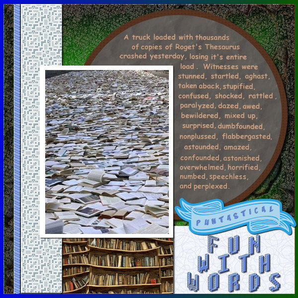
Just a little "yuck yuck" humor...
-
LOL. I guess I'll fix it, especially after it has generated that much conversation. I had copied and pasted it from another source and didn't get around to parsing it or looking at it closely. For everybody who has gotten in on this conversation....enjoy this music video. Worth watching/listening to the end. https://youtu.be/8Gv0H-vPoDc?si=YEhMbX2Ohq9bY14s For what it is worth, I think I did pretty good on the actual SKETCH challenge part of it.
-
I was 14 when we lost my sister (who had recently turned 15). At the time we lived in California. In 2005, my mother passed away. Her cremains are buried in Arlington National Cemetery, where she will be joined by my father when he passes on, (hopefully not any time soon, though he turned 82 this past February).
-
When we lived in Virginia Beach, not long after we got married, my wife went to melt some chocolate for something using the microwave. I can't remember actual times but where she meant to set it for something like 1 minute, she typoed her keypad entry and set it for 10 minutes. Of course, she walked off and got busy with something else until the smoke detector went off. Needless to say, the house didn't smell nice for awhile. We put the microwave outside in back yard on a picnic table. It sat out there for close to a month before I went to work on it and cleaned all the burnt residue from the insides and the bottom circular glass tray. I was positive it wouldn't work after being outside, being rained on, snowed on, etc. We used that thing for another 7 years LOL.
-
Almost forgot the "cover". Here it is.
- 430 replies
-
- 10
-

-

-

-
Here is my submission for this new challenge.
- 39 replies
-
- 11
-

-


