Rene Marker
-
Posts
1,054 -
Joined
-
Last visited
-
Days Won
18
Content Type
Profiles
Gallery
Forums
Everything posted by Rene Marker
-
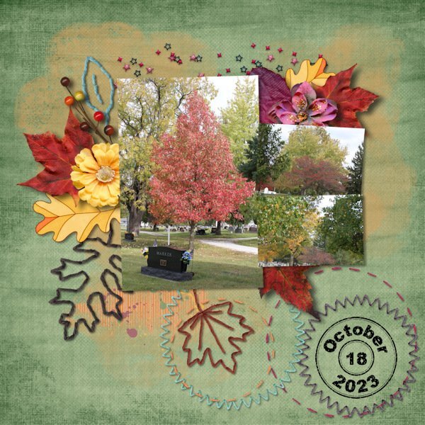
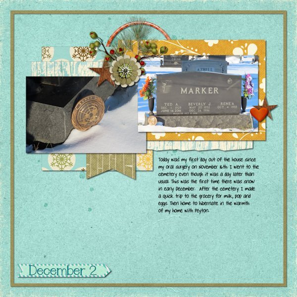
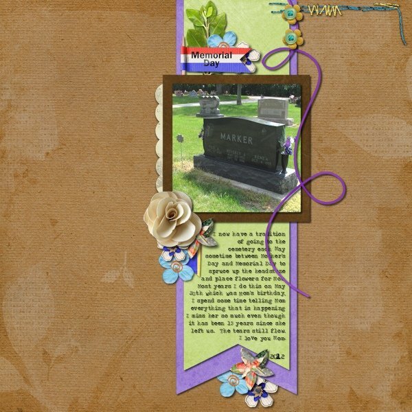
The cemetery my parents are buried in is right here in town. I've gone there for many years multiple times during the year. For quite a few years I would go 3 times in May -- Mother's Day, May 20 which was my mother's birthday and Memorial Day. Then I would go on Dec 26 which was her date of death. After Dad passed away 8 years ago, I would go once in May, June 14 (his date of death), Oct 15 (their anniversary), Dec 1 (his birthday) and Dec 26. So I pretty much saw all the seasons of the trees in the cemetery. I always take photos when I go. Since a couple of the dates fall in the months that I do a layout for each day of the month, I have scrapped a lot of layouts of the cemetery. I will share a few. My October layout in 2023 was a few days late because I wasn't feeling good after my surgery. In December 2020 we had a snowstorm on the 1st so I went on the 2nd. The last layout is one I did in 2012.

-
I've never done a calendar but I've used Shutterfly for books and I believe they have calendars as well. Then I use Persnickety Prints for my 12x12 prints and they also have calendars available in various sizes. Both Shutterfly and Persnickety Prints print from jpg files (never tried png) and I can't complain about the quality. Both are great in my opinion. One thing about Shutterfly, if you get on their email list, they send out coupon codes all the time for various things, some as high as 50% off. Like others I create everything I do in 300dpi.
-
We have early voting in Ohio and I went today to cast my ballot. I had to give them my ID, they verified that all information was still the same which I had to sign that it was on an electronic tablet. Then my ballot was sent to be printed on a printer across the room. I went there and was given my ballot to fill out (both sides). When done I was to put it in the counting machine where it showed on screen that my vote was counted. There was no line to sign in and several people were at the voting tables when I got there. I had 19 positions to vote for which included the 3 federal level government. The rest were state and county level positions. 12 of the state positions had no opponent, made it easy to choose! I also had a couple of local tax levies. It didn't take me long to make these choices. There was one state issue to make a change to the state constitution that I read through very carefully before making my choice. It took me maybe 10 minutes for the whole process. Glad I went when I did, there were people coming in the door when I left and a line was starting. Then I came home and got my mail which was election propaganda... which is every day! My recycle bin is getting full. I have voted early for quite a few years. The County Board of Elections is in my town and about a 5 minute drive to get there. Since I'm retired I can go anytime during the day and avoid the rush. I always hated standing in line on election day. At one time the election place for my precinct was in a township building which didn't have a large area for the poll workers and the line was always outside. Miserable if the weather was bad. It has been moved to another location which has more space but I've never voted there since I do the early voting. I honestly don't know how the signing in works on election day anymore. They used to have a great big book with computer printouts that they would mark your name off. You also had to go to a specific table (my township had several different precincts at that time, now it is 2) where they would have the specific ballot you needed.
-
I haven't scrapped for over a month. Got deep into my genealogy and counted cross stitch then was on vacation for 8 days. There were some awesome photos posted on FB of the northern lights in Ohio (which I missed again!) so I borrowed them and made a layout. It will be inserted in my vacation album since I reference missing them again! I did note that the photos were not mine on the layout. Template is Photo Palooza #430 by Cindy Schneider and the kit used was Stargazer Aurora by Meagan's Creations both available at Sweet Shoppe Designs. The font is Freehand591 BT. The word art was actually a sticker in the kit that I used a bevel on it.
-
I missed the aurora on Thursday night! All my friends in Ohio were posting photos they took but I was in Massachusetts on Cape Cod with lots of light pollution. My friend and I decided not to go outside and see if we could see anything. We were both tired from our sightseeing that day on Martha's Vineyard. The museum here in town got some awesome shots with it in the background. And, the NWS (national weather service) office in Wilmington, Ohio (located not too far from Cincinnati) got some awesome shots as well. I follow a guy that does the weather on a Dayton TV station (will graduate with a degree in meteorology in December) on Facebook and he always lets people know when they might be viewable in our area. Hopefully there will be another time when I'm home that it happens! Trip was a great time and I have lots of photos to scrap!
-
Mom did the same with dad's worn t-shirts. Most were stained because he worked construction so when the holes got too big, they became rags. I have in my stack of rags, washcloths that no longer have towels to go with them. I have flat sheets that no longer have fitted mates that I will put in the dog crate or even cover my bedspread (dog sleeps on the bed). My former employer supplied several small hospitals with linen items like bedsheets and blankets. They were taken out of inventory when they got ragged edges. I grabbed a bunch of them for my first 2 dogs. I still have them and again use them in the dog crates. I also have several old blankets in the pile of stuff to use for the dog. If they get ruined, they then get tossed. My city has had a recycling program since the 1980's. We have bins provided by the city that we can put some plastics and cardboard/paper in to sit out for pickup on garbage day. Years ago they also collected aluminum and tin cans curbside but no longer do that. However, there are big bins located in town where people can drop those items off. Dad actually made a can crusher that he put on the wall in the garage to crush the beer and pop cans before putting them in the bin. It is still on the wall but I no longer drink out of cans so it doesn't get used.
-
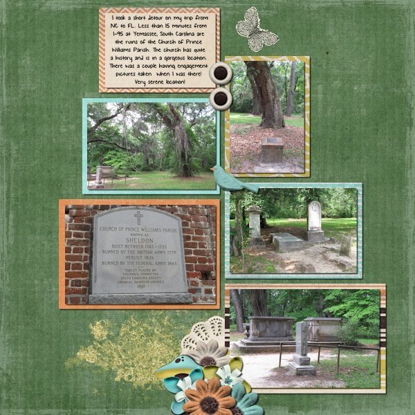
In 2013 I took a 2 week vacation where I spent a week in North Carolina with my dad then went to Orlando and spent a week with a cousin's family. It was a driving trip. On my way from NC to FL, I took a side trip to see the Old Sheldon Church in Yemassee, South Carolina. I found out about it on a website dedicated to lesser known tourist attractions. Edit to add my journaling: I took a short detour on my trip from NC to FL. Less than 15 minutes from I-95 at Yemassee, South Carolina are the ruins of the Church of Prince Williams Parish. The church has quite a history and is in a gorgeous location. There was a couple having engagement pictures taken when I was there! Very serene location!
-
Well, it does look like the center of circulation is now moving east and the rain is moving that direction as well. Eastern Ohio is getting the rain now.
-
Are you waterlogged yet? Radar now show all the rain bands in Ohio but the center of circulation is still over Kentucky.
-
I just looked at the radar again and the "eye" is pretty much still sitting and spinning in the same area as this morning. After no rain earlier today, I'm at 90% chance for the rest of the day but it does seem to be light rains and not heavy downpours.
-
What a difference a few days and the remnants of a hurricane can make! My grass is a lot greener than it was due to the rain we've gotten in the last 36 hours. Rain is still forecast off and on throughout Monday. We are not out of drought conditions though, we didn't get enough rain for that. The "eye" of the hurricane is settled over western Kentucky and the outer bands to the northeast are over southwestern Ohio sometimes coming as far north as me. I know it is not as bad as those who have suffered much worse in Florida, Georgia, South Carolina, eastern Tennessee and North Carolina but southeastern Ohio had extremely high winds yesterday and a lot of power outages. Over 320,000 last night is down to around 200,000 today. A lot of power companies in Ohio actually sent units to FL to help (we had one go from my town), never expecting that there would be outages here from the storm! Most of the outages are because of trees coming down from the winds. But, some areas in western North Carolina and eastern Tennessee are actually cut off from the rest of the world. Roads have caved and floods have wiped out whole towns. The town of Ashville NC can only be reached by air, no roads are passable to get in or out. Mother Nature must have really been upset about something!
-
Where I am is finally back to seasonal temperatures for the month of September. In the first 21 days of the month, 19 of them set new temp records. We had quite a few days in the high 80's and low 90's. That is August temps, not September. We've also had very little rain and went into drought declarations. My grass is brown but the weeds are as green as can be. The last time my neighbor mowed was my lawn was August 23rd. We did have about an inch of rain Monday night locally but some of the drought areas of Ohio didn't even get that. However, due to the tropical storm that is predicted to become a hurricane overnight we could have rain all weekend. As for the foliage, there have been trees in town that were turning in late August. My neighbor's tree that I love to watch in the fall is already changing colors. Extremely early! Even the leaf pickup in my neighborhood is going to start in mid-October due to leaves possibly falling early. I started doing an October daily album of fall colors in Ohio several years ago. I took photos of the leaves changing throughout the month. My neighbor's tree was still green at the beginning of the month and had changed and was losing the leaves at the end of the month. Last year it was already half changed by the 1st. That could possibly happen again this year and it might not have any leaves by the end of the month. So much for documenting the changes throughout the month... However, I will be out of state for a week and could see fall foliage on my trip.
-
Very nice layout but the text on top of the post card is not very realistic IMO. You can fix it by having the text go around the postcard or resizing the postcard a bit smaller.
-
My main hobby back in the 1980's was doing needle work projects like counted cross stitch or using plastic canvas and yarn. I did mostly counted cross stitch. I did a lot of birth samplers for the births of cousins' children or wedding samplers for friends. I got a magazine with patterns every month and they were usually quick and simple projects in series that were released over the span of several months. One of those series was for the 50 states. I made 3 of the Ohio (one for Mom, one for me, one for Grandpa). I made a Florida for Grandpa. Other states I made for gifts included Texas, Pennsylvania, Illinois and Michigan. Then I got the bright idea to make each state and have a quilt made from them. My step-grandmother had done quilting and was willing to do it. So I started making the states in 1990 and got 13 of them done. Then I left the job I had (it was a 2nd shift secretarial job in a hospital and during slow times the tech and I would cross-stitch). Then I went back to school and got a different job. No more time for this hobby. Then my step-grandmother passed away. So I left the idea of the quilt behind. A couple weeks ago a scrapbooking designer friend kept posting about a cross stitch project she was doing and it got me interested in it again. So I dug my stuff out and found a sampler that was about half completed so I started working on it again. I also found that I had actually started my 14th state for the quilt and will work on it next. I do want to finish all 50 states and will have to figure out how to display them since I don't know anyone local that quilts. I was thinking of a wall hanging but I saw an idea yesterday in a cross stitch sub-reddit that really intrigues me. That person showcases projects they don't frame in a portfolio. So now I'm thinking of using a scrapbook for this project! As for DIY stuff like your project, I don't do things like that!!!
-
15/15 for me. Did have to think a little more on 2 of them. Glad I signed up for it, learned a few tricks. Who says you can't teach an old dog new tricks? LOL
-
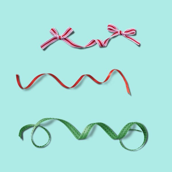
Thanks @Michele and @Corrie Kinkel for mentioning going top to bottom for drawing the ribbon shadows. I tried it this afternoon and it went a lot better than going bottom to top. And, that was with a mouse. Now I at least I can do it if needed but I'll probably still hide curly ribbons inside a cluster.
-
Had a heck of a time at first. For some unknown reason, the Gaussian Blur was showing on the settings preview and the Overview Pane but not on the actual canvas. Kept undoing and starting over and it never changed. Finally closed the canvas (which actually closed the program), then restarted PSP and pulled the canvas onto the workspace. Then it worked. I did do the 2nd pin and did the shadow to the left for practice. Since it is practice, I didn't consider light source. I wanted to get to know the steps. Now off to think of other items this would be used for...
-
Exactly! Just looking around my office I have shadows coming in from all directions. Some are harder than others. And they go all directions since some are from windows and others are from lights. One item on a wall actually has shadows on both the left side and right side. Window is to its left and a lamp is to its right. As one scrapper told me once shadowing is subjective and to develop a personal shadowing style. She also said that there isn't always one single light source... unless you are in a controlled environment (like a studio). Also coming from a paper scrapbooking background, there were differences in shadows when looking at the page depending on something as simple as how you are holding the page as well as what time of day or whether you are inside or outside which have different light sources. She uses PS to scrap and always starts with the same basic settings but tweaks them as she builds her layout. I always used to stick to the top left light source on my layouts but as I've progressed and learned from those I admire over the last 15 years, I've become more subjective about shadowing. Funny thing is, when I give the books to my cousin that I do for them, the layouts that get the most compliments are my more recent layouts where I've experimented with shadowing. That makes my heart happy. This workshop though has taught me some new tricks that I can use to further refine the shadows on my layouts. I used the warp trick today on a butterfly on a layout. It looks like it is flying!
-
Yeah, I know that but once it is on a layout, it won't be as noticeable.
-
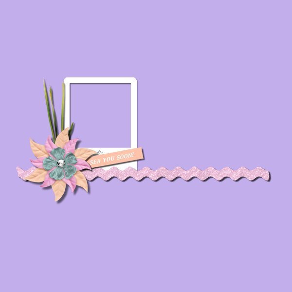
I first did it the way I used to shadow (but am not posting it) because I wanted to see if there was any difference in how the shadows worked. To my eye, I saw no difference on the elements so all the extra deleting above elements was just extra work. On the practice I used pretty much the same shadows as Carole for this posted version. The only difference between her version and my other was the shadow on the flower and the frame was a different opacity than Carole's settings. The second image is a cluster I made using elements from a Christmas kit. The shadows used on it were the shadow settings given to me by Jill with some tweaking as I felt needed. As you can see I had a base of a journal card then started layering above it and even included a curly ribbon. This is how I use curly ribbons on my layouts... hide most of it in a cluster. One piece of advice I got about clusters was to always have an odd number of elements in the cluster. Carole's has 5, mine has 11. My cluster will be used on a cover page layout for a series of layouts I do every December called "Document Your December". A layout for each day of the month. I've done this every year since 2017. I also spent some time looking at layouts with clustering in a gallery and I could not see that any of them went the extra steps of deleting parts of shadows. And, they all look realistic to me! However, I can see that it could be useful in some clusters so won't rule out never using it in the future.
- 262 replies
-
- 11
-

-

-
I don't usually have a problem figuring out which drop shadow in the edit history is for which element. I do all shadows as the last thing. And, I always go from the bottom to the top of the layers palette. So when looking at the edit history, if I scroll all the way to the bottom then scroll back up slowly, I can tell what shadows (or bevel settings if I used a bevel) that I used on each item... last drop shadow = top layer of layers palette. Thanks for the compliment on the shadows... I still don't like them!
-
Well, I have found something that I don't like. My hand is just not steady enough to draw a shadow. IMO, mine look like crap and this is not my first try at it! I did also try just using the push brush on those areas (not shown here) and I can live with how they look. When I use curly ribbons on a layout, they usually are encompassed within a cluster or as a base for a flower/foliage so only the end shadows are what need to be tweaked. I'm sticking with that from now on!
- 262 replies
-
- 10
-
-
-
This is a good idea. Another way to find the settings that works only if you save the file as a pspimage... check the edit history in the image information. Yes, it is a little overwhelming to see all that stuff at first but once you know what you are looking for, it is easy. I just wish that the edit history had a search function! I prefer using that easier than the history palette.
-
Thank you about the cluster! I've struggled for years to get them to look right. Jill, the gal that I got the shadow settings from said she never uses a warp on her shadows. Another scrapper that does fantastic clustering does (she uses PS). Both look great so I think it is a personal choice.
-
I used settings very close to the video for the 6 flowers in the tutorial. For the extra 4 flowers, I used the settings shared with me by a creative team member of a popular store that uses PSP. She does a lot of flower/foliage clusters and I asked her how she shadowed them. She also does not use any warp on the shadows but you wouldn't know it because of her settings. She has a basic setting that she tweaks as she scraps each element. Her cluster (flower/foliage/etc) is 25-42-61-66. I started with this setting then tweaked if needed. I then positioned the 4 flowers into a cluster and used the warp brush on each of them. I used to use settings much like Carole's but was never satisfied with my clusters (and I like to cluster although not as elaborate as many creative team scrappers). Once I started using Jill's settings, I loved how my clusters looked. Clustering is not for everyone though. I'm just sharing what works for me and the way I scrap.
- 262 replies
-
- 11
-
-