-
Posts
3,098 -
Joined
-
Last visited
-
Days Won
44
Content Type
Profiles
Gallery
Forums
Everything posted by Corrie Kinkel
-
V = Van Houte this is a legendary coffee company that has been a big part of the history of Canada
-
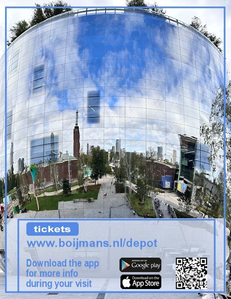
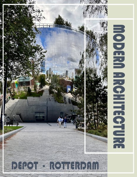
I did a backpage too and used partly the same layout of the cover, although I rotated the small frame to fit my page and I have a photo covering the whole page. The website address of the museum is the real website!!! If anyone will more information you can go there. When visiting the depot next to all the showcases is a QR code that you can scan with the app that you can download and that gives more info on what you are seeing. My QR code is not the real one of course; the google play and appstore logos I found on the net, as long as I don't sell this "Magazine" for real that isn't a problem I think. I have many more photos so I will make additional pages, if I'm going to print this for my friend's birthday later this year. Carole, thank you for this Workshop, it was a pleasure to make another magazine!
- 374 replies
-
- 13
-

-

-
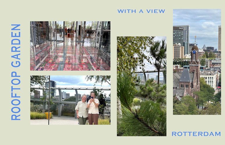
Day 7 and the last one of this workshop and of my visit to Het Depot. I used the tutorial of this day but with a twist and it features the rooftop where the garden restaurant is and you can see now the context of that glass floor too. Outside the restaurant there is a real garden with trees and a lot of greenery. It is possible to walk around full circle and a lot of the solid walls around the kitchen of the restaurant and the restrooms are of course mirrors. That gave the opportunity to take a photo a bit different from a selfie! The views of the city and beyond a fantastic, we were lucky with the weather. Same fon and colors as all the other pages for some consistency.
- 374 replies
-
- 13
-

-

-
Nice touch with the ON SALE NOW page!
-
I like this lighter version better than the darker one. On this one the cameras get more attention, at least that's what I think. Oh and I recognize the Pentax camera on the right which was my dad's and when he died it came to us. We (hubby and I) used it until it was beyond repair. It had a long life and all the lenses we sold at some point because we went digital.
-
Day 6 of my trip to Het Depot and this page features the glass floor on which you can walk, although not everyone dared to! I saw people very hesitating set a step on that glass flooring! It was difficult to get a photo of the floor because of all the reflection from the glass everywhere. In the end I put my phone on the floor and was able to take a photo of a part of it. I have other photos where you can see the floor and the entrance to the restaurant but those didn't show the colors of the floor very well. Those show more the context of it all, but didn't look good in this page, even if I changed the templates to other dimensions. I'm planning to use these Magazine pages to print an album for the friend I was taking this little trip with. She will be 75 later this year and as she doesn't take much photos I think it will provide a nice gift. Of course I have much more photos of the museum visit and will make more magazine pages for that album. Luckily her birthday is to the end of November, so I have hopefully time enough to do so.
- 374 replies
-
- 13
-

-

-

-
It seems we all have to get comfortable with the changes that come with getting older. I always say: "As long as I don't look in the mirror I can still feel my younger self"
-
Nice! I recognized a lot of those a accessories from my youth. My dad was a hobby photographer and had his own darkroom which was in fact our bathroom that he could make 100% dark. I liked to be there with him and see the magic happening. In those days it was all black and white of course; he stopped when color photography came and switched to slides.
-
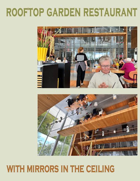
Day 5 features the rooftop garden restaurant were we had a lovely lunch and some much needed "sit down time". Like the whole building it had glass windows everywhere and mirrors in the ceiling. A bit unsettling at least that's what we thought at the time, but maybe we were just tired. Same font, other colors.
- 374 replies
-
- 13
-

-

-

-
Maybe I will put the it all together on another page, don't know yet, you'll see it
-
Sue I do more or less the same, I had my pages made rectangles in the first Magazine I did, and I have some extras too like a barcode and QR code, ready to use. I just adapted the fonts to this magazine because it has a completely other topic. I'm so glad it takes little time, I have such crazy weeks at the moment. As always your pages are stunning and informative!
-
@ Cassel: Wait for a later page where I will add that QR code (I have used it before and it is ready in my stash) and the website to book tickets!
-
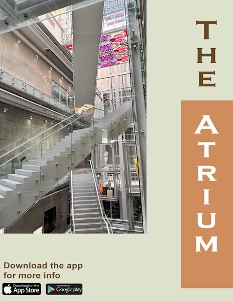
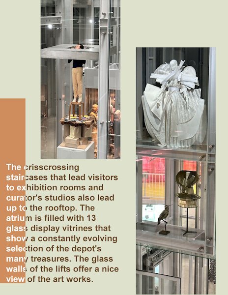
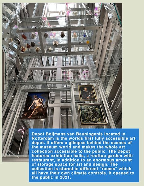
Day 4 the, double page, and it shows more of the artwork on display and the structure of the atrium. In the whole building there is glass almost everywhere and that makes it very transparent. You can see through the lifts and there are even a couple of corridors where there is a glass floor; although not everybody likes to walk on those floors. I use the same font on all the titles, but again in another color to go with this page's colors. Changed the blue mats to a more fitting color which I took from the photos. It really is a fascinating structure!
- 374 replies
-
- 15
-

-

-
We were there for a whole day and it is lucky or a pity that it is not allowed to enter the rooms which have their own climates and you can't sneak inside because they are locked with alarms and all. It is possible however to follow a guided tour and then you get access with the guide and after 10 minutes everyone has to be outside otherwise the climate in that room gets upset. There is a gard pressent when you are in such a room and he/she oversees it all and unlocks and locks the doors. I would like to go there for a second time! Maybe some day....
-
@Marie-Claire Love the photos of Poncho, he is such a great model and your photos show your love for him!
-
Day 3 and we are still in Het Depot at a floor with different areas for restauration, conserving and packaging for transport of the divers art works. At some point there was a cabinet filled with all kinds of pigments and paint tubes. It was a pity that I couldn't take a shot of it due to all the reflections in the glass doors. The whole building, if you can call it that, is full of glass inside and out. The elevators have glass walls, the stairs have glass panels and there are even glass floors, which will be in another photo. I kept the same font Copperplate Gothic but with colors from the photo. I added an artist impression of the building with some statistics.
- 374 replies
-
- 12
-

-

-
Day 2 and I changed the template for my photo and put the blue mat to the bottom. I kept the blue color because in my cover the text had that color too. I have a bit of text and I used Arial so all that text is easier to read. I will probably keep the light green color as a background for all my pages, it goes well with most of the photos I plan to use.
- 374 replies
-
- 13
-

-

-
It is a reflection, the whole of the building is covered in glass tiles which give this surrealistic effect. You can finish the page if you want, but when I remember well it is mentioned to the end of the week.
-
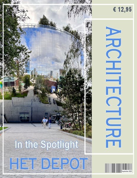
Yesterday I wasn't all too happy with what I did and this morning I had a bit of spare time (half an hour or so). I changed the font for a more readable one (Copperplate) and changed the color too and put the barcode and price on the page, after all it is suppoost to be a magazine. Now my cover is ready!
- 374 replies
-
- 10
-

-

-
Here is the start of my cover page, but there will be more on it. I have done this workshop (called a challenge 2 years ago) , so I have the templates already resized to rectangular. A magazine to me is rectangular, I looked in the shops where they sell magazines and they are all rectangular; a brochure can be any size though. Last week I visited the "Depot" of a very well known museum called Boijmans van Beuningen in Rotterdam. Because their storage department became way to small for everything a museum has in storage (or depot), a new depot was being build. A took a lot of photos which I can use, therefore my magazine is called Modern Architecture. In the following pages you will see this Depot is very futuristic. On my first page I have gone a little bit further then the tutorial, but I'll try not to go to far ahead. The font I chose is Bauhaus.
- 374 replies
-
- 14
-

-

-
K = Koffiejongens or "Coffeeboys" a small Dutch company that produces coffeecups that are biobased and can be put in the recycle bin for organic materials.
-
I like to make something, but I think I don't have enough time between the Magazine Workshop, the Scripting Course and all my normal day to day activities. But I will take a peek and enjoy the layouts to come.
-
F = Frappuccino which has the following ingredients: Coffee (espresso), milk, ice cubes, sugar and whipped creme with a little bit of a coffee sirup.
-
Besides scrapbooking and scripting I get once in a while an English lesson or explanation too. WOW ?


