Sue Thomas
Members-
Posts
2,652 -
Joined
-
Last visited
-
Days Won
80
Content Type
Profiles
Gallery
Forums
Everything posted by Sue Thomas
-
Assuming the elements are all the same shape and size, you could even flip, rotate, or even mirror them once the texture had been applied.
-
Marc is a renowned British actor, I remember him as a child in Grange Hill. Van Der Valk, is an excellent program.
-
I love it. Interesting background pattern.
-
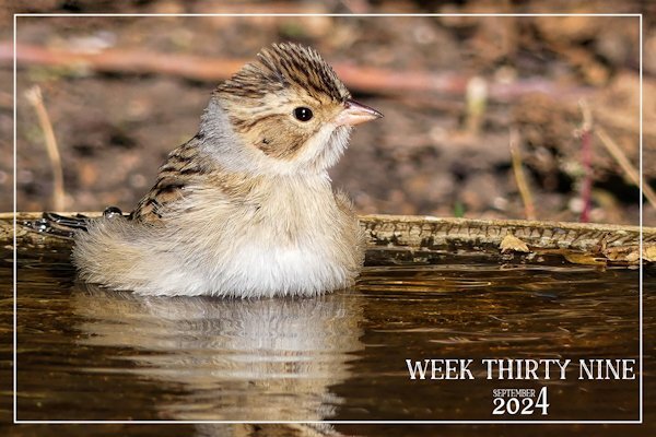
It was enjoying itself sitting in the water. Having the bird bath to itself. It was quite happy to sit there, posing for many shots. Which gave me immense pleasure, for a short while.
-
You know even as flowers fade and decline as summer draws to a close, and enters Autumn, their organic pigment diminishes. Yet, even those diminishing pigments have a beauty all of their own, when you look closely, just like the flower in the image. A laudable shot Corrie!
-
I believe, I have posted 12 non wildlife pages in this challenge alone. Only the other week, week 35 was a photo of an old local red barn. I had to check myslef, as I created the pages, and yet doubted my memory of what I had and hadn't posted. Lol !!!
-
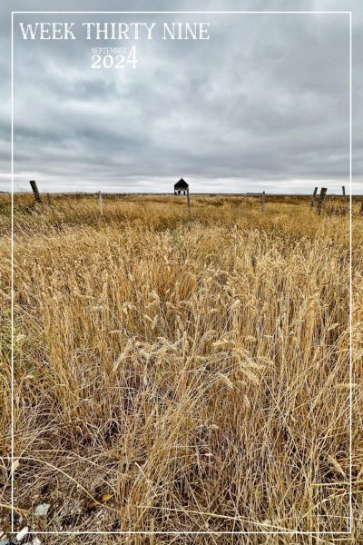
Week 39, I do two per week, one wildlife and the other landscapes. Seeing as we are now into Autumn I thought I'd post a shot taken the other day. I love earth tone colours.
-
-
September 2024 - RANDOM Challenge - Back and front
Sue Thomas replied to Cassel's topic in Challenges
I am much obliged. Please do scraplift it. I'd love to see how you'd use the technique. -
September 2024 - RANDOM Challenge - Back and front
Sue Thomas replied to Cassel's topic in Challenges
I am most appreciative of your mind blowing words! The photo I used, although I love it for it's simplicity and plainness, it isn't really a wow shot. Saying that I could see it had potential for this challenge. The 2 juxtaposed images after editing shows the contrast between the bright colours of the robin and the light shades of the other. Thanks to the power of PSP editing. -
September 2024 - RANDOM Challenge - Back and front
Sue Thomas replied to Cassel's topic in Challenges
I decided to do another one, something quite different, but a layout I like to do, as many may know. Hopefully, whilst abiding within the rules of this challenge. Duplicated the photo, promoted a selection, in this case the Robin. Created the frame using a heart font, extracted the head to give that out of bounds efffect. All I did for the background was to lower the brightness and contrast, Keeping the framed Robin colours as they were taken by the camera. Male Robin taking a blueberry back to the nest. After he had, had his fill. -
Well done you! Now I see how you used it, it looks better untitled.
-
September 2024 - RANDOM Challenge - Back and front
Sue Thomas replied to Cassel's topic in Challenges
You know, it happens to the best of us. Myself included. I find when I'm working on a page, for some time, it's easy to overlook obvious errors. As I become so absorbed on something else. It is a good idea to walk away for a distraction and come back with fresh eyes. -
September 2024 - RANDOM Challenge - Back and front
Sue Thomas replied to Cassel's topic in Challenges
Perfect! Simplicity at its best! -
September 2024 - RANDOM Challenge - Back and front
Sue Thomas replied to Cassel's topic in Challenges
I agree, in this case you didn't even need to put a postage stamp. It's almost out on a limb. The pencil sketch and title is all it requires. It's nicely balanced. -
September 2024 - RANDOM Challenge - Back and front
Sue Thomas replied to Cassel's topic in Challenges
I appreciate that! By converting it to black and white, and tweaking it to maintain clarity and detail, which is my preffered way. As I couldn't bear the thought of loosing details. Especially when I go to great lengths to get the best shot possible. I'm almost certain you take the same approach too. Actually in this case, the background black and white image, draws the eye to it, and not the framed coloured photo. -
September 2024 - RANDOM Challenge - Back and front
Sue Thomas replied to Cassel's topic in Challenges
Your sunflower is positively regal, standing tall. May I be as bold as to make a couple of suggestions, as after all you are the creator. I think you may have muddled the letters on what I think should read beauty. Also check the kerning, as the letters aren't joined. I like the background effect, but it does drown out the Sunflower and the text. Try lowering the opacity, and add a little blur. These are only suggestions, as I'm not critiquing your work. As we all have our own styles and personal preferences. -
September 2024 - RANDOM Challenge - Back and front
Sue Thomas replied to Cassel's topic in Challenges
Challenge, using the same photo twice. I simply changed the photo to black and white, with some minor tweaking. The other background paper was created using the blend mode, HSL on two papers. I did mirror the original photo to give the page balance.- 46 replies
-
- 13
-

-

-
It certainly was a puzzling paperclip. When you get around to using yours in a layout, just look at mine, even though, to me they still don't look right. 😉
-
That is an impressive structure.
-
Mine too! I walked away twice, going back thinking that I would approach it and work on it in a way that would make it look realistic. 😆
-
This paperclip has really made me think. Am I correct in saying that it can be used in one way only. I even got out a paperclip and a piece of paper. Lol
-
I hope so, perhaps between us we can come up with a solution. Just to let you know, I tried removing over and under. My brain is telling me that what I am seeing doesn't like right.
-
Arrow paper clip from the recent masterclass. I have made several different ones. When I went to use these to attach several pieces of paper my mind went blank. I can't for the life me work out what goes behind to get the realistic effect. Surely there has to be 2 options. I don't have any problem with conventional paper clips or different shaped one. Any ideas!!!! I'm going to look very foolish if its a case of either erasing, or using the promote to selection tool on selected areas. But what selected areas I ask myself!!!!!
-
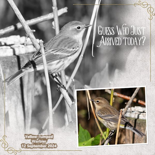
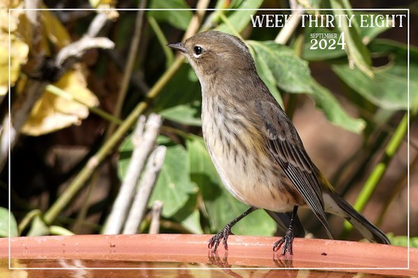
Another week has simply flown by. For this week I decided, after much deliberation to showcase the Yellow -rumped Warbler. As they have been the most numerous of all the migratory birds.


.jpg.6a3d56a5a88f925eac65549fb66f89b8.jpg)
