Forum Replies Created
-
AuthorPosts
-
Lab 11 Module 3
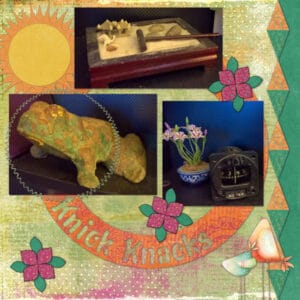
Lesson 2: stylized flowers
Lesson 3: sun shape
Experiment 3: color/pattern/texture – two-toned diamonds
Experiment 4: sketch – Scrappin Dee Dee
Kit: Be Yourself ©Kimeric KreationsAnne: What a darling ornament.
Ann: Lovely layout. I like how you offset the pictures the framed the birds with their frozen breath.
Laurie: You’re beach layout is gorgeous. The pictures are perfect and the colors of the background set the scene. Love the quote. I live less than five miles from the beach and it has been 20+ years since I have gone. Awesome “Summer Fun” layouts. Both are wonderful. To change the background you can use the colorize (under adjust>hue and saturation) or the flood fill color changer.
Minka: Thank you so much. I love listening to Roger Whittaker, my favorite song being “Darcy the Dragon.”
Annie: What great mandalas. Australian Summer has such a Native Indian look. Awesome colors that are bright and vibrant. Australian Winter has lovely muted colors and I really like the addition of the hearts.
Bonnie: Great layout and I really like how the colors in the background are so similar to Michelle’s shirt. Your title is perfect with the pickleball in the “P”. It looks like she had a lovely time on her birthday.
Michele: Thank you and yes, that is my daughter. It’s hard to believe that she will be 41 in a couple of weeks, LOL. And she still looks the same.
Cristina: Thank you. Your comments always make my day.
Shirley: Beautiful layout. Using the photo background as a pattern paper and the kilt pattern to make the buttons and frames ties everything together so well. This will definitely be something she will cherish. Day 10 is so cute. Interesting perspective on the photos.
Ann: Fabulous is what came to mind when I saw your flower mandala.
Lynda: Great job with the Lab 11-03 lessons. Love the face on your sun. Using other vector shapes made for some really interesting results. Fantastic shadowing on your happy day flags. They do look like they are blowing in the wind.
Michele: Your pages are awesome and the sketches are perfect with the titles. Glam Glitters is stunning. I like how you used bokeh for the background.
Minka: Lovely layout. And Michele is right, if it works for you, then you should continue.
Lab 11 Module 3
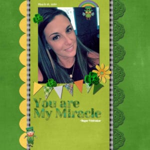
Lesson 1: colored banners
Experiment 1: title work – song title
Experiment 2: element – crochet
Experiment 5: fun font find – Yeseva One; Merriweather
Song: You are My Miracle ~Roger Whittaker
Kit: Irish Shenanigans ©Clever Monkey GraphicsMary: you did a wonderful job on the Lab 5 Module 10 experiments. I really like how you used the staff, music notes and symbols across the page.
Anne and Ann: both mandala designs are delightful and so colorful.
Minka: great idea to use the mandala as part of your layout. The colors are definitely reminiscent of the sea and interesting to use photos behind it. Dividing it and putting the title between the two halves is a stroke of genius. Definitely got a chuckle out of the computer chip.
Lynda: fantastic to make a stained glass out of the mandala. It would look lovely hanging in front of a window. After seeing what you have done in making flower “mandalas” I may have to give it a try.
Annie: I “Loved” Latin. I had an awesome teacher who made it fun.
Ann: Your layout on the black vulture is wonderful. Those birds are so underestimated. I watched a documentary on them and learned that they don’t have feathers on their heads to make sure that bacteria and such cannot hide within. I enjoyed seeing how the plaid paper you made mades the photos stand out.
Annie: Beautiful blending work on “Love.” I really like how you used the frame to really emphasize the photo and the use of the different ways to say Love. And, of course, it brings back memories… amo (I love), amas (you love), amat (he/she loves). At least 4 years of Latin accounted for something, LOL
Minka: your layout using the overlays is stunning. Love the addition of the gulls and starfish. The pictures remind me of places on the beach in Destin.
Bonnie: Both of your layouts are outstanding; but I really like how you opted to use the entire letter for the pictures for the nature pics. Using the large letters to hold the pictures are perfect for your pickleball photos. The colors on both are so dynamic and make the photos shine.
Anne: Beautiful photos and and nice layout. You did a wonderful job using the paperclips.
Ann: Great layout of daddy and son. Hard to tell at this point who he really looks like, but still a very handsome young man. Cool idea to add the shadowy bears and enjoyed reading why you added them.
Sue: Lucky you to have been able to watch the filming of Dr. Who. 🙂
Lynda: What an awesome corkboard layout. And absolutely perfect for the pictures of your local market.
Annie: I had forgotten about Georgia being the 5th doctor’s real daughter. Nice reminder.
Bonnie: Never get tired of seeing your pickleball pics. Love what you did with it this time showcasing a number of pictures and a title too.
Michele: Good for you. I had not seen the ones with William Hartnell (the first Doctor) until a couple of years ago when, I believe it was, Hulu aired all the originals except the missing episodes. I was excited when Chris Eccleston brought him back. And on to a little trivia. For those who watched Gotham, Jon Pertwee’s (3rd Dr.) son played Alfred and David Tennent’s (10th) wife played is daughter in the episode “The Doctor’s Daughter”.
Annie: I’ll keep my fingers crossed for you. The anime started in England back in January; but then BBC America is always late in getting the BBC shows. At least we get them.
Mary: Nicely done layout. I really like how the colors are reflected in her pants.
Annie: then you will get the reference made in the layout, LOL. I have seen the first two seasons of Dr. Who with Jodie Whitaker. She does a good job but I am old school and like my doctors as men. I just got email that they will be releasing the lost episodes from the original Dr. Who has anime next month in the BBC America. I am so excited.
Minka: Way cool with your layout. You used the freebie to the best advantage.
Ann: yes, I did the lab and I got the one with the diamonds. If you need, let me know and I will send you what I got.
Annie: loving the green haired turtle. Is that algae which is growing on it? Your fish outlines are awesome; especially the one giving the turtles a look over. Great job on the cutouts.
Lab 11 Module 2
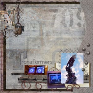
Lesson 2: stitched shape
Experiment 3: color/pattern/texture – steel diamond plate texture
Experiment 5: fun font find – Sketch Block, Print Clearly
Kit: Industrious ©Laitha’s Designs & Studio VivarantSo who all are Dr. Who fans?
Lab 11 Module 2
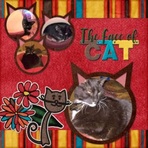
Lesson 1: banner letters
Experiment 2: element – stickers
Experiment 4: sketch idea – by Kattcom999
Kit: miaaow ©mel hainsLab 11 Module 2
Lesson 3: word in letter
Experiment 1: title work – name inside an initial
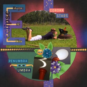
Kit: Eclipse ©Kristin AagardNice…Love the flowers.
LOL….Cute.
Lynda: love what you did with the watercolor background. My oldest son use to the a member of the Society for Creative Anachronism. In fact, he and his wife held a medieval wedding, which was very interesting. The picture of the hawk and his handler (in full costume) is great.
Anne: awesome layout and what a great idea incorporating the dream and the reality.
-
AuthorPosts


