Forum Replies Created
-
AuthorPosts
-
Lab 11 Module 4
Lesson 1: rope text
Lesson 2: wrapped rope
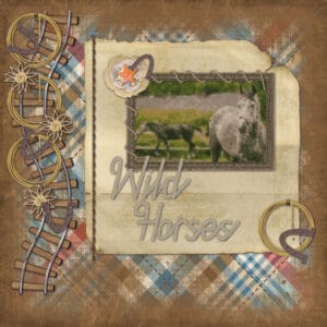
Lesson 3: horseshoe
kit: Frontier ©Magical Scraps Galore
font: Lucky StationSue: As expected your bird pages fabulous. Wonderful weaving of the rope on the Meadowlark layout. Your ground squirrel layout is really nice. I really like how you also intertwined with the rope on the frame.
Lynda: Thanks so much. Zoe was thrilled to have gotten the book, but then she and her friends spent hours to try and find the spider on each page, LOL. Wow, your overlay pictures are stunning. I am stunned with your Days of Remembrance layout. This should be placed in every school in the nation. You did fabulously.
Annie: Great Kookaburra layout. The colors are spot on and, of course, the blending perfect too. I really like the touch of color that the flowers pull in at the bottom. Lat 11 Mod 3 was a perfect fit for the colorful rainbow bee-eater pics. It is all so cheery. Loving those cutouts. Got a chuckle out the names you picked…an unholy mess and a holy mess. They look great.
Michele: Awesome Athletes is fantastic. Using a motion blur on the background is a great idea.
Ann: What sweet pictures using the spring frame. And while you are attending their wedding on the 11th; we will be driving up to attend our granddaughter’s wedding on the 12th 🙂 Nicely done Zoo page. Using a more neutral background and elements (except the parrot) really makes the pictures stand out.
Minka: Welcome back girl. Glad to see you and your awesome work. Loved reading about your garden escapades. I tried tomatoes one year. DH even built me a “greenhouse” to keep the caties out; they still found a way in and I never got any. My sister on the other has beautiful gardens at her place (but I can’t seem to get her to grow tomatoes).
Mary: Your two cards are delightful. The Christmas rose photo is stunning and the birthday card is happy and vibrant.
Laurie: You and my sister would get along famously. Your layout reminds me of her and it is just perfect for this spring weather.
If I have not included you on the list, please don’t despair, I was running out of things to say. And everyone has done such great work. Thank you all for your inspiration. Had to work all day and am not use to it, lol.
Awesome Lynn.
Thanks Annie: I love blends as well. Guess I should have specified that I used about a dozen kits and mask overlays per page, LOL.
Although I have not worked on these in April (but in 2016); they are a small snippet of my favorite blending layouts.
I used more than a dozen kits and mask overlays to make them; most notably from Creative Victoria, Lathia’s Designs and Designs from Helly. Hope you enjoy.
Happy Easter all. Hope your day has been filled with blessings.
Sheila: Your paper flowers and rose are simply gorgeous.
Annie: Loving your Pharomachrus layout. Definitely festive and worthy of the beautiful bird being displayed.
Lynda: Tony is a great layout and a wonderful tribute to your son. You have done really well with the lessons from the newest lab. Cute Easter rabbit.
Lynda: Your play with balls and bubbles is awesome. Great layout of the moon. I was so disappointed that our skies were overcast as I really wanted to use my new telescope to get pictures of it.
Michele: By this time I hope your headache has subsided. Even with a headache you did a beautiful job on the layout for your gaming group.
Connie: Lovely layout and a great way to show off all that snow.
Sue: Fantastic robin layout and quote. The neutral colors of it really make the robin stand out. What a darling Easter card. Great job on the mallard layout. I like how you used the edge punch brushes to make the frame. Nicely done on the coyote page. Love how you strung the beads and thanks for the tip. I think your photo of the dark eyed Junco is stunning and the layout is just perfect. Loving your Easter card and always enjoy finding out how you did it. Meadowlark is another fantastic layout and I love how you always seem to pick the perfect colors to compliment your photos. You definitely have brilliant bird photos and your last two layouts are great.
Annie: As always your pages are amazing and I really am in awe of Blue and Yellow Macaw. Victorian elegance is priceless and your have done a great job on it (or should I say on both of them). Wow, stunning layout of the protea and making the mask. Loving the festive alpha.
Lynn: Awesome gradient paper using your dots template.
Cristina: Lab 10 layout is so sweet and festive.
Sheila: You are vert talented with your art. Beautiful flowers.
Anne: Fabulous layout Honoring Good Friday.
thanks Annie. You are an inspiration to me.
Ah Lynda: It is getting to be closer to summer here. And your layout is making me wish it was spring.
Annie: What an outstanding page on the waterfall. Your picture? I’m loving how you include blending of items that relate the topici in the background.
Cristina: Glad to see you back scrapping again. Awesome hot air balloon layout. Marking the globe was a great idea and I love how you fastened the photos to the page and used torn photos “Olivia” (the layout and her) is adorable. The colors used for the background really bring out the reds, blues and greens of the photo. Using the mushroom as part of the photo is so cute.
Ann: Rockin’ Robins is a fabulous page. I really like the neutral background which really makes the plaids and photos pop.
Mary: Fantastic job on altering the photo.
Corrie: Great Easter card. Using the screen blend on the Easter eggs makes for a lovely background.
Betsy: Thank you kindly. Your flower bag is beautiful and would make a lovely card.
Corrie: Many thanks.
Gerry: Love what you did with the sketch. River is absolutely adorable and probably pretty smart and clever (I know that my tux, i.e. Cat, was).
Annie: Your “birds” layout is outstanding. The photos are gorgeous and the background and elements are just perfect. And thank you, friend. I just wish that I had gotten a picture with Tom and I at one of Universal’s newer attractions. Have a video of the dino reaching over the fence.
Had to get on the bandwagon myself, LOL.
Sketch from Carole
Kit: adventure lion ©Studio Flerg (which includes the alpha used)Corrie: Very nice use of the sketch and I love how you did it in Dutch.
Val: Nicely done with the treasure map. And I think I agree with Michele about putting the replies all in one post. I have tried it both ways and have come back to this.
Annie: Loving your Avenue of Baobab trees layout. Very nice coloring and blending the trees, plants and animals that are in the vacinity into the background makes is all the more interesting. I always like reading the information you provide.
Ann: Commented on yours in the Showroom. But I still smiled when I saw it again. Lucky girl.
Lynda: Great use of a mandala on the background. You have some lovely views from your deck; but I am partial to the gnome with the glass of wine. Looks as if he may have drank too much, LOL. You have taken making mandalas to the extreme and they are all awesome.
Anne: I also commented on yours in the Showroom. The photos are beautiful and the background is perfect.
Bonnie: Made a comment about yours in the Showroom. But is so nicely done that it is still worth another look.
Val: I really like how you used one photo within all the photo slots.
Minka: Love your mice layout. The picture of the mouse using the mousetrap as a weight machine is sooo cute. Makes me think I should do a layout of my mousecapades. Yellow boots is adorable and I like the gradient background.
Annie: Beautiful layout for the mossy frog. He is definitely quirky and I wonder how many people he startles when he jumps.
Cristina: Thank you very much.
Ann: Great way to use the sketch challenge and commemorate a lasting memory. How exciting for your daughter.
Annie: Just read your comment to Cristina and got such a chuckle. That is so me. I actually do purge every 5-10 years or so, LOL. But I have set up folders for just papers and another for elements so that when I do purge I go through and pick out the ones I know I will use. Change the names on them to include the kit and the designer.
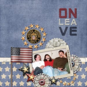
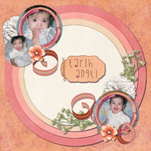
Lynda: Thank you for your comments. They are much appreciated. The “earth angel” is the my granddaughter who graduated from university with two degrees and is getting married in June. Congrats to your grandson. “A” school is not easy to get through so he must be very special. My oldest son (the one on the right as you look at the photo) was a nuclear technician on the Greenville. Has your grandson passed the international dateline and gotten his dolphin wings yet? When son got his, they also sent me a miniature pair. Hopefully your grandson is luckier than the crew of the Greenville, LOL. He can probably tell you all about it. Oldest now works as a nuclear technician at a nuclear power plant.
Lab 6 Module 8
Experiment 1: split words
Experiment 2: element – mustache
Experiment 4: sketch template – jakrn
Kit: Land that I Love ©Kimeric KreationsLab 6 Module 8
Lesson 1: stripe ribbon
Lesson 2: custom label
Lesson 3: cross stitch
Experiment 3: color/pattern – rainbow (mine is off somewhat in color, LOL)
Experiment 5: fun font find – Weekend Summer Fun
Kit: Ain’t She Sweet ©Kimeric KreationsLynda: Beautiful mandalas. Nice flowers layout and I loved how you used the sky as the background and concrete as the frames (which to me look like marble). Wonderful dragon layout. I like how you used FilterForge on the fonts; then applying a 3D effect and the bolts. Peacock is beautiful. The colors are so vibrant. You did a fabulous job with the cutout of the peacock. You have really taking blending to heart and your Sunset layouts are a perfect use of it.
Anne: Love the Hawaii Dreaming layout. Your hibiscus photo is gorgeous. Adore the Osprey layout with the April showers background and the osprey taking front and center. I like how you adjusted the bubble in your Beauty and the Beast layout to highlight some of the flowers. Great job on the sketch challenge. The photos are lovely and the background is a perfect chose for the theme.
Michele: I think you did a fantastic job on the First Class Flyers for your game group. It was interesting to see that the game picks the prompts. Glam Gallery, Promposal Day and Puzzle Night are all so well done. And it was awesome that you were able to use a specific script for each.
Bonnie: Your pickleball layouts are always a joy to see. Had to chuckle at “burning off the crazy.” I really like how you how you used the photo in your Spring layout as the background then framed the individual flowers. How cool to teach your cats tricks, they are so adorable. And what a wonderful Thanksgiving layout. The colors your chose for the backgrounds really make the pictures stand out. 10 pounds of bacon is a great layout (sadly it would not last as long in my house with the grand is here, LOL). As always I love your cat layouts. They are definitely smart cats. It is not unusual for Tux’s to be extremely smart which may account why she is faster than Poppy at learning. Have a special place in my heart for Tux’s as ours was one as well.
Minka: Good for you on getting the shot. I still have to get mine. Mustangs are definitely a breed to themselves, much like the horse. I’ve never owned one; but have worked on them. Am fasinated with how you did the layout. When gone we are always “Ready to Go Home,” and you expressed that perfectly in your layout. I really like how your wavy elements are so reminiscent of clouds and water. The photos are so vibrant and colorful and stand out well against the darker backgrounds. The chickens layout is so lively great colors that definitely remind one of a farm. Loved hearing about your childhood and all the things you did.
Ann: Your daughter is certainly talented and I think you did a beautiful job on showing them off in your layout. Wow, I like how you used the same layout for each of the Family. By changing out the colors, photos and elements, it has created a totally new look. It will be interesting to see if you continue to use this layout to document Magic’s growth. Logan is such a cutie and your layout with the soft pastel colors of blue and yellow are perfect.
Val: You did good kid. Gypsy definitely likes having her picture taken (but then so does Champ, lol). Great layouts.
Annie: Your Broken Dreams layout is perfection. You did a wonderful job combining the various elements to make a cohesive “photo” and the quote is so perfect. This would make a great poster for teenage girls to hang in their rooms. Love your Silver Dollar page. I have never heard of (or seen them). They are beautiful just like your layout. I also enjoyed reading the information on them. Seeing Bush Babies sure made me wish I had one. Lesley Davis is certainly a talented artist. I love how you blending the background to include watercolors and the quote.
Corrie: You did a great job on making your own supplies for the Daisy layout. It definitely makes the entire page work together as a whole.
Betsy: Your St. Pat’s layout is simply adorable. How cute to add a leprechaun hat to the chipmunk and provide him with gold and a beer.
Very cool sis.
Lynda: Love the aged map.
Lynda: Both of your layouts are lovely. The patterned background on the sailboat is perfect and Carlos is such a cutie.
Julia: A darling layout. So colorful and well put together.
Annie: Thank you so much.
Thanks Michele. 🙂
Annie: Thank you. She was born on March 18 so we still consider her a St. Paddy’s baby. Now my husband’s mother was full-blooded Irish.
Shirley: Thank you very much. I have really enjoyed learning the stuff in the labs.
-
AuthorPosts


