Forum Replies Created
-
AuthorPosts
-
Ann: gorgeous 2 page layout of Maya Lin’s Ghost Forest. Something we should all think about. Awww what a lovely sight to see through a “Summer Window”. Beautiful laid out.
Michele: Stunning Aquamarine layout for your group. Loved seeing your avatar included. And Summer Beach Wear is a perfect layout for the lazy summer days on the beach. Stylish is perfect and so reminiscent of the 40’s style. Oh my, Majestic Women is stupendous. Thanks your sharing your progress on it.
Annie: Thank you so much. So much to get caught up on these days, lol.
Shirley: You did a wonderful job on the photo of Charlie and the layout is great. Your grandson is so lucky to have you detail a day in his life. Great layout and I would love to see more about him.
Mary: Thank you so much. It is one of my favorites. Page 9 of your travel challenge turned out so wonderful. Love the addition of the postcard. Page 10 is a great addition to the travel challenge and soon you will have a trove of travel pages to scroll through. What can I say but “wow” on page 11. Awesome job on the clustering and I really like how you are keeping the color theme going through all the pages. Another great page (12) from your travel log. The oval framing of the golden bull really makes it stand out. Page 13 is great. I really liked reading about “Bear” country.
Anne: Fabulous framing job on the the Hawaiian beach. Never would have noticed the feet if you hadn’t said anything 🙂
Corrie: Pieris is a lovely layout and a beautiful photo. Blurring the image as the background makes the photo spectacular.
Lab 7 Module 2
Experiment 1: title work – numbers
Experiment 2: element – paint spatter
Experiment 3: color/pattern – folded edges
Kit: Oh, the Places ©Connie PrinceLab 7 Module 2
Lesson 2: scratch paper
Lesson 3: grungy edge 2
Kit: What’s Cookin’ ©Kimeric KreationsLab 7 Module 2
Lesson 1: loopy frame (with Cassel’s Christmas lights tube and Barton’s VectorTube script)
Experiment 4: sketch template – AlainaE
Experiment 5: fun font find – frosty
Kit: Christmas in the Country ©Kimeric KreationsBonnie: Wonderful use of the template for your photo of the geese. Rumble in the Park is nicely laid out with the colors really highlighing the photos. Daffodils is absolutely beautiful. Andy and Fran are going to end up with awesome book with the layouts you have been doing of them. Sorry to hear about the rain delaying your second Rumble; but it appears that is did not dampen anyone’s spirit. Such a fun layout.
Corrie: As usual your cards are so stunning. Fantastic colors and photo.
Sue: Thank you so much for your kind words. Hard to believe that it is going to be July tomorrow…where did the time go?
Connie: Your lesson 1 layout is amazing. Love the clustering and the colors you chose as they really highlight the picture.
Lab 7 Module 1
Lesson 1: concentric rectangles
Lesson 2: filled text
Experiment 2: element – doilies
Experiment 4: sketch template – Doreena
Kit: Antiquities ©Kimeric KreationsLab 7 Module 1
Lesson 3: photo mosaic
Experiment 1: title work – various patterns
Experiment 3: color/pattern – maps
Experiment 5: fun font find – things we said
Kit: Wizard School ©Magical Scraps GaloreSue: Wow, your magazine covers are so professional looking. Very lovely. I enjoyed hearing what you did to put them together. Your quote layout is so inspirational and great looking. Great Monday layout. Something beautiful to look at and think about.
Sue: lovely frame for the fushia flowers. Your bee layout is gorgeous. My sister raises bees so I have an affinity for them.
Annie: Thank you so much. With everything that has gone on in the last couple of months, I’m trying to use working on the lessons as therapy :).
Michele: so sorry to hear about your back. Take care of yourself first and foremost. Love the vintage era gaming pic you did.
Lab 6 Module 12
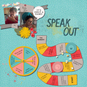
Lesson 1: spinner template
Lesson 2: path template
Lesson 3: token
Experiment 1: scribbles
Kit: Family Game Night ©Meagan’s CreationsStill trying to catch up on the Labs.
Lab 6 Module 12
Experiment 2: element – tiny bows
Experiment 3: color/pattern – red/green
Experiment 4: sketch template – Alice Boll
Experiment 5: fun font find – candy cane
Kit: A Winter Wonderland ©Kimeric KreationsThank you, Annie. Your comments mean a lot to me.
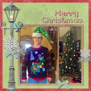
Lab 6 Module 11
Lesson 2: diamond shape paper
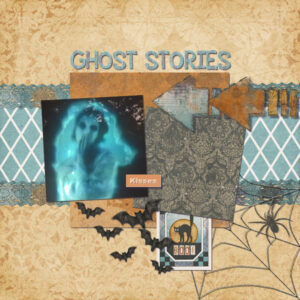
Lesson 3: spiderweb
Experiment 2: element – dymo tape
Experiment 3: color/pattern – arrows
Experiment 4: sketch template – Alice Boll
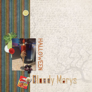
Kit: Hallowtide ©Kimeric KreationsLab 6 Module 11
Lesson 1: rainbow stripe paper
Experiment 1: filled in letters
Experiment 5: fun font find – appleberry
Kit: 13 Rue de Toussaint ©Kimeric Kreations
Kit: The Everyday Chef ©Creative VictorianThanks Annie. You are an inspiration to me as well. 🙂
Shirley: you layout is so beautiful. What a wonderful memory of the fishing buddies.
Ann: a lovely tribute to your amazing father.
Lab 6 Module 10
Lesson 1: hand drawn chevron
Experiment 3: color/pattern – triangles
Experiment 4: sketch template – AuntyT
Experiment 5: fun font find – DK Innuendo
Kit: Autumn Antics ©Boomers Girl DesignLab 6 Module 10
Lesson 2: laser cut doilies
Lesson 3: parquet
Experiment 1: single cut paper letters
Experiment 2: element – slide frames
Kit: What Happens at Grandma’s ©Kimeric KreationsAnne: very cool palette challenge. This will make a great background.
Been a hectic couple of weeks, as just two weeks after my dil passed, my granddaughter got married and we had to head up to northern Georgia.
Bonnie: thank you for your kind words. Son lives in Hartsville, near Florence. Fantastic Here Comes the Summer layout. Andy and Fran certainly are lucky to have such a lovely page devoted to them.
Annie: as always your words are such inspiration. Thank you. Summer Days reminds me of Hawaii (and if I am honest, Florida, LOL). The picture is so vibrant and the paper elements draw your eye in. Your mask layouts are always a delight to see, Major Mitchell’s cockatoo and Mandarin duck are both great.
Sue: many thanks. I have been talking to him everyday, sometimes several times. Your foxy birthday ecard is adorable. Loved your bobtail layout. My dil loved rabbits and she would have loved to have seen what you did with the picture. Asters are such beautiful flowers and I really like how you have used the photo in your layout. Wow, what a gorgeous pic of the hover fly and lovely layout. You did a great job on the frame.
Sheila: thank you so much.
Corrie: thank you for the condolences. Your poppy layout is lovely and the picture is so colorful. Great use of a bad photo for the background.
Lynda: great job on the family tree mock-up. I really need to do something with the class. Loving your Life layout. Perfect for framing.
Cristina: your kindness is much appreciated. Homeschooling is a perfect layout to document the crazy year we have had. I always like the pocket style layouts and have done a whole year of them. And I agree with Annie, you are definitely creative. There is nothing wrong with using templates as you always put your own spin on them.
Ann: by this time your wedding and mine will be over. My granddaughter got married on the 12th. Your dress is stunning. Fantastic layout of the wedding pictures. Awesome ad for your drive-in. I’m sure you will be getting a lot of comments
Michele: your Bubblegum Pink layout it so darling, while Sun and Vanilla is so fun and warm. Awesome. Great job on the science fest layout and using the chalk texture script.
Susanne: what a wonderful layout using the jumping out of frames lesson. Devil Inside is perfect just the way it is. Using a “boring” frame just makes the layout stand out even better.
Ann: great job on the song challenge. I really like how you have it layed out.
Sawnie: so sorry to hear about the loss of your plants. Your layouts to them are great.
Minka: glad to hear you made it back to Maine safe and sound. Looking forward to seeing what you come up with.
Shirley: loving the vintage look to your layout. Your daughter is going to so thrilled with her scrapbook.
Hi all. I will probably not be on much for a while as my son’s wife died recently unexpectedly. I have been in SC the last two weeks and on the phone with him every day since getting back. I will try to pop in and look at all the wonderful layouts you all have done.
Anne: Now you have a beautiful copy of your quote to hang up somewhere special. Nice job on the places you would like to see.
Sue: Loving the White Tail Deer layout.
Bonnie: Wonderful pictures of the red shouldered hawk. Down by the riverside is fantastic, the addition of the music notes is great. Interesting information about the cicadas and great pictures.
Anita: Awesome foliage frame to showcase your furbaby.
Lynda: Fantastic job on the lab lessons. Fabulous mushroom layout and really like how you used a photo of mushrooms as the background.
Corrie: Lovely layout of your stone jar. The soft pastel colors of the background really make the picture standout.
Awesome job on the frame challenge Ann. They look like they should belong there.
Very nice layout, Ann. I really enjoyed reading how you did each of the layers. The plaid is wonderful.
Lab 6 Module 9 (above is from the same)
Experiment 1: multiple fonts
Experiment 2: element – gears
Experiment 3: color/pattern – newspaper
Experiment 4: sketch template – Rochelle
Kit: Capture Life ©Kimeric Kreations
background scan of local newspaperFound time to do some of the older labs.
Lesson 1: wire clip
Lesson 2: flower (2)
Lesson 3: overlapped string
Experiment 5: fun font find – DK Carte Blanche
Kit: Baroque Carousel ©LouCee CreationsOkay, sorry I have been a bit absent, as has Val. We have both been working 40+ hours a week and now I am finally back on my regular schedule. Now on to ….
Annie: Loving the books you have made from the scripts. I think I bought the notebook script; but I don’t recall the open book script. Going to have to check it out. You are really knocking the scripts out of the park…Great grab bag and now I’m thinking I need it.
Corrie: Your layout is awesome. I really like how you used various pictures of the flowers, made the clipart of tulips in the national colors and sthe smae with the country name. “Lente” is a gorgeous layout and useing the colors in your photo for the background papers is a great idea. You did an outstanding job using your “birthday” goodies. Your Mother’s Day layout is stunning. The colors are beautiful and really make the photo stand out. Thank you for the information about the flowers being the symbol of Alzheimers. My MIL died from its effects and I miss her sorely. Great job on the Switzerland layout. You really did well on making your own country template.
Bonnie: Never tire of seeing your pickleball layouts. One of these days you are going to have more than enough to make a large tabletop book out of them. You have really made good use of the Florida template, love the background photo. Virginia, wow, you did an amazing job on your own state template. Who needs to buy when we can call on Bonnie, LOL. Both your MFish template and the starburst script template are awesome. Love, love, love the wren layout and the title is stupendous. The background on “nearest and dearest” is perfect for the pictures.
Mary: What a delightful layout you made for the Lab 5 Module 12 lesson. The gradient background is really nice and I love how you “hung” the pictures.
Sue: The slipped in polaroid photo on the Great Horned Owl layout is awesome. The quotes you used were perfect with it as was the colors of the papers. I got tickled as I read the title of the squirrel layout. It is beautifully done and your bead scatters work so well on it. Your book is just great. I really like how you changed the color of the binding to match the book and the addition of the eyeglasses. Lovely picture of the Brown Thrushers. Swallows is a wonderful layout with beautiful colors and interesting information. Your art gallery is adorable. Enjoyed seeing the pics of your birdhouses.
Anne: Great job on altering the frame. Lovely tribute to your mother on the Mother’s Day layout. You did a great job on the backgrounds.
Lynda: Fantastic job on making the Illinois mask. Loving the layout. Illinois is one of those states near and dear to my heart. I graduated from Mascoutah Community High eons ago, LOL. Both of your Mother’s Day layouts are gorgeous (I just saw what Ann wrote and had to chuckle. I like the rose colored one best because it made the photos and the flowers pop out more. This just goes to show how we all see things differently.) Buttons is fantastic. You should definitely have it printed out, glue it to thin foam board and cut it out. What a great gift it would make. Pretty Woman is a delightful layout with great coloring to the eyes and lips.
Ann: Fabulous job on using the art media. I need to go rewatch the Master Class. Seems I missed a bit. Oh my, Ann, the photo you chose to go with your art media background couldn’t be any more perfect. Then using the curved photo script really made it stand out. Outstanding layout on the “Preaching to the Choir”. The plaid you made is superb and I really like the “punch outs”. (And, can I say, the title is absolutely perfect.) Nicely done on the trees layout. Lovebirds is so cute. The looks on their faces make for a perfect layout. Congrats to the lovely couple. Waves is a stunning layout from the stripped background to the offset photo from the frame. Great job. Second edition of the wood duck is beautiful.
Cristina: What can I say but, WOW, your lab layout is stupendous. The pictures are so perfect and the googly eyes really draw your eyes to them. “Then & Now” is so fantastic. Love the tree word art and the pictures…
Minka: Love your heading home layout. The rope frames work so well with the layout and the vignette on some of the photos really make them pop. Upbeat is a very excellent layout which should be used throughout media as a reminder that we need to keep vigilant about the mental health of our children.
Shelia: You did an amazing job on the painted rose.
Michelle: Your Mother’s Day layout is so beautiful. I love the watercolor flowers on the background and how you framed the mask of your mother. As usual, I so enjoy seeing what you come up with for your gaming group. At the court is so perfect in all ways. Surfers Paradise is absolutely lovely and you did a great job on the masking.
Thanks Cristina. Been awhile as I have been tagged to work full-time (as has Val) so haven’t had any time to look around the forums.
-
AuthorPosts


