Forum Replies Created
-
AuthorPosts
-
Amazing work you did Sawnie.
Thank you Dawn, Michele and Libera.
Experiment 4: sketch/template – layout by Henri Jean as downloaded
Experiment 5: fun font find – Centaur
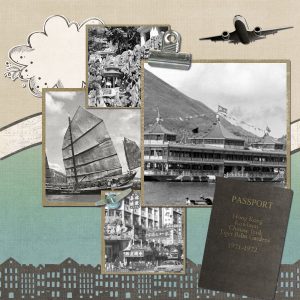
Kit used: By Plane, By Train, By Automobile ©Kimeric KreationsExperiment 3: color/pattern/texture – honeycomb
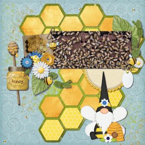
Kits used : Just Bee You ©Heather Z Scraps, My Honey ©KristmessLab 10 Module 8 Lesson 3: diamond template
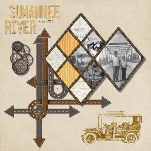
Experiment 2: element – gears
Experiment 4: sketch/template – as in notebook
Kit used: A Great Adventure ©Kimeric KreationsLab 10 Module 8 Lesson 1: split photo
Lab 10 Module 8 Lesson 2: simple blocking
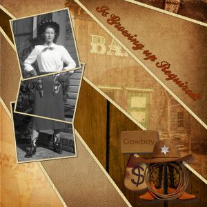
Experiment 1: title work – question
Experiment 5: fun font find – Ballpark Weiner
Kit used: Wild West ©Indigo DesignsBonnie, what wonderful layouts and I do love hearing about pickle ball. It is so special that you created a page using Dayana’s chalk drawing. We all need to take a step back and enjoy the Simple Pleasures. Fabulous title work. Sweet Summer Days also has great title work and I really like how the colors of the kit are picked up in the layout. Thank you for the sweet words.
Lynda, Love the background you used with your heart mask. Great job. You did wonderfully with the shoe present. Guess I need to go get it. And then I see the sneakers. Don’t know which I like best, so I’ll take one pair of each. Thank you for your kind words.
Betty, I didn’t stay awake either, but I must say your layout is awesome. I like how you mixed different kits for the final product.
Thank you so much Cristina. I probably would have never looked beyond the lab if it wasn’t for you. And would have missed so many lovely creations.
Shirley: Shirley’s Garden and Margaret River layouts are beautiful. The colors you used for each are perfect.
Royanne: I LOVE Tammy is Bored layout. Great way to record what happened and how we were all feeling.
Dorothy: Great way to commemorate Flag Day. I so agree with you on how our history is being trashed.
Sawnie: Lovely book of flowers. Wonderful use of PSP. Very professional.
Cristina: Awesome combination of tutorials to make your layout. Great pictures. Your Lab8-M10 layout is stunning. Like how you managed to incorporate so many photos and still have room for elements and title. Having a hard time choosing between the two layouts. Both are great.
Trish: Love the Road Trip page. Great use of the picture and elements. An awesome job on Time for a Nap. Really liked you included what you had done. Invitation would be a beautiful card to use for a wedding or anniversary. The Kennedy Space Center layout is amazing. Loved the information that you included as well.
Minka: Two Lights is a beautiful layout. The colors are spot on and I adore the addition of the birds to the frame. Beautiful layout to commemorate you husband. He did take stunning pictures and you put them together well.
Michele aka micfin: I think you did a FAB job on the polo layout. Lovely Layered Dresses Collection. Sometimes it is the small mistakes that make it standout. Fantastic birthday card for Angie and Izabela. You are certainly the master of punches.
Bonnie: Len and Marilyn & Judy layouts are a wonderful use of the templates. Great colors, so vibrant. Ditto for the Michelle and Wayne layouts. You are the master of templates. Marily and Len layouts are great. Again love the vibrant colors chosen. How cute is your Template 8. Took me a minute to figure out the title (awesome way to do it). The colors from the challenge were perfect for the layout. Both of your Bonnie layouts have great color combinations that totally match it. Thanks for including the information as well. Sweet layouts of your neighbor’s grandchild. Your hairdresser’s garden layouts are great. I’m particularly drawn to the blended one. How We Do Family is wonderful. Like how you used a large photo as the background. Title is perfect.
Lynda: You really embraced the template class with stunning Elkhorn layouts. Such a sweet memory for your sister-in-law. You did a great job on the picture, I never would have known that it was fixed up. Nice frames. Did you use a tutorial? I am in awe of Boulder City. What a great idea.
Last two I did in May, then off to see what you all did in June.
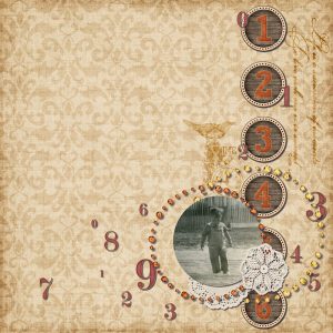
Time
Experiment 3: Color/Pattern/Texture: numbers as decoration
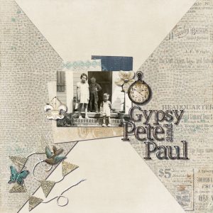
Kit used: Bounti Fall ©Just So ScrappyGypsy Pete Paul
Experiment 4: Sketch/Template: happy memories template by Giorgia Rossini
kit used: As Time Goes By ©Kimeric KreationsWill slowly get caught up here.
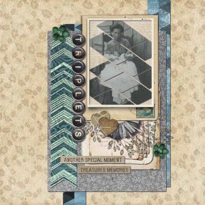
Triplets
Lab 10 Module 5: photo cutout, triangle pattern, uneven arrows.
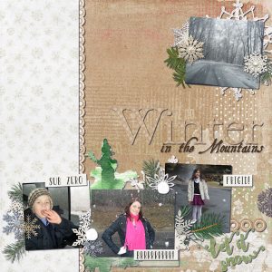
Kit used: Memorykeeping – Vintage ©Kimeric KreationsWinter in the Mountains
Experiment 1: Title work: season
Experiment 5: Fun Font Find: Aquiline Two; EB Garamond
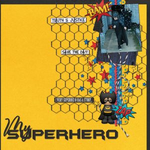
Kit used: A Winter Wonderland ©Kimeric Kreations; Wintertide ©Kimeric KreationsMy Superhero
Experiment 2: Element: superhero logo
Boy Power ©Boomers Girl DesignsI started individually, but this was going to take me all day, so to all you awesome creators:
Michele aka mcfin: your birthday card is delightful. Taiwan Festival is so inspiring and got a big kit out of the Let off some steam. That’s right up my alley, LOL. Both of your stained glass flowers are amazing, though I think I am more partial to the vibrant one. You are definitely the one to turn to when looking for birthday ideas. I really like how you did Dan’s birthday wishes; then the one of Adri Ana. Summer is Here is such a fun layout. Your Art Fairs page is perfection, what a great idea (I may have to use it document my husband’s granmother’s painting). Great use of Carole’s edge punches.
Minka: off to the space station what a great idea, wish I had thought of it. I never had to chance to go to camp as a kid; but your layout makes me wish I had.
Libra: pizza lady is so cute. Taken away with the cat in retropop and the watercolor egg. Oh wow, what beautiful “paintings” you did using the pic-to-paint.
Lynda DiGregor: Totally blown away by your stained glass mandalas and tulips. Tulips would make great earrings. I have an in-law that collects rooster ceramics and he would be estatic over your stained glass one. You are really making me jealous..stained glass and then digital marquetry, pic-to-painting (I have a hard time finding a picture that works, but you have it down pat). Fabulous job on the out of bounds technique.
Annie Tobin: Amazed with what you did on your gothic amsterdam page. Papers, tubes, layout, oh wow. Adore your kimmi doll…Did you keep in layers so your could change her outfit with the seasons? Great alpha tags.
Bonnie Ballentine: Birthdays are always better when shared. Nice layout. Love how you arranged the photos on your fun tree layout. I would love to see your yard, it reminds me of my sister’s. Stunning pictures, especially of the titmouse. You did a great job using Carole’s scattered photos script on the Blue Angels and the addition of drawn planes is a wonderful idea. I think you did a great job on the template and just remember that’s all they are. Using them is just a springboard to your creativity.
Royanne Hewko: Great pictures of birthday boy…really liked how you spread them out from no smile to great big smile.
Cyndi Roether: Awesome use of the generator challenge of triangle. Must be so scary to be close to the fires they have been having out west.
Corrie Kinkel: random challenge generator page is well put together; your pic-to-painting project is awesome. Perfect picture for it. Great job on the quick page with the flowers. Time to party especially after seeing your party time layout. What a lovely tribute to your uncle. Both the page and naming your daughter after him.
Dorothy Dunn: Always a delight to see what you come up with. Backdoor is stunnning. Great job on the random generator. I think my favorite is Haircut. Memory of a Rainy Night in Georgia is really close to my heart (my daughter lives there), and I think the Tokyo style Pic-to-Paint was a wonderful chose. You are really getting into the random generator challenge and doing a fantastic job. A lovely tribute to your honey’s family.
Trish, what beautiful work you do. Love that you make your own papers and how you manage to put everything together so cohesively
Just wanted to say that I have been looking at the wonderful elements and pages you all have been doing. They are so impressive and I really wanted to leave messages on all; but read on as to why I didn’t. I started the Lab just before the pandemic hit and while I was technically just a part time employee, I discovered that the newspaper business is considered essential so was upped to full time. Can’t wait to get back to just 2 days a week 🙂
Experiment 4-5: Sketch and fonts (Return to Sender; Sunshine in my Soul)
By the Sea ©Kimeric KreationsExperiment 1-2: Title work and Rain
Kit used: Come Rain, Come Shine ©Kimeric KreationsExperiment 3: Color/Pattern/Texture: circles in circles
Blue Jeans Kinda Girl ©Kimeric Kreations; various elements from Project Life kits by Connie PrinceBit late but just saw Cristina’s post in the Lab forum.
Lab 10 Module 4: scalloped paper, overlapping text, glitters.
Kits used: In Limbo ©Creative Victorian; Natural Beauty ©Creative Victorian; Neverending ©Creative Victorian; Zephyr ©Creative VictorianGreat job
Carole,
They are on MyMemories. And they have them available to download for use in other programs than just MyMemories.
-
AuthorPosts


