Forum Replies Created
-
AuthorPosts
-
Thank you Sandra
I know you will do well. Can’t wait to see it.
Colin, great job on the lab. It’s nice to see others posting here and I am sure we will see many more from you.
Monique, quite a lovely job you did on your first lab. I look forward to see many more.
Just wanted to say it is amazing to see what everyone has done. Definitely need to go back and try some of the techniques and lessons. Great Job everyone.
A big thanks to all of you.
Cindy, lovely scallops.
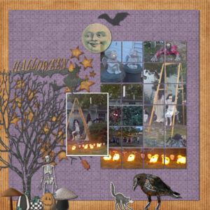
Coming in late; but here is one showing one of my favorite lab lessons:
Lab 10 Module 10
Lesson 1: cross pattern on paper
Lesson 2: mushroom element
Experiment 2: element – chain
Experiment 4: sketch idea – CoolbreezewendyFabulous Cristina.
Day 7. Times New Roman
I just want to say how enchanted I am with all the various magazines being produced. They all are so well done and I have enjoyed reading what everyone has to say.
Carole, Thank you for the encouragement. I did notice the justification problem, but decided for the exercise just to go with it. Should I decide to have the “magazine” printed out, I will rectify that by doing the text in a different program and importing it in.
Day 6. Times New Roman; Kimeric’s A Day at the Beach
Day 5. Times New Roman
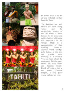
Day 4. Times New Roman; Kimeric’s A Day at the Beach.
Day 3 completed. Still using Times New Roman. Off to get Day 4 done (crossing fingers)
Everyone has done such a wonderful job. Maybe today I will get through the rest.
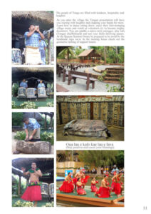
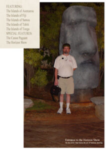
Finally finished up with Day 2. Still using paper from Kimeric’s A Day at the Beach and Times New Roman font. I did 2 pages; a full page of ads and then a kind of table of contents. I did use the Starlight Luau’s logo. But trying to keep the magazine simple.
Nadine: Your Day 3 layout is sweetness itself. What a lovely picture of the young family.
Hank: Your Day 4 pages are awesome. I really liked learning about the album.
Hank: Loving Day 3 layout and the artwork of Robert Yonke.
Minka: All of the photos are so fantastic. You did a great job with the layout and I loved reading about the water trough. This is going to be a very special “magazine” for your friend.
Laurie: Beautiful Day 2 layout. Your photo is wonderful and your provided some interesting information.
Lynda: Totally superb Day 2 page. You and Fiona have me in awe of your gardening skills. I look at a plant and it dies.
Annie: Your photos are so stunning and I love the sky behind the opera house. So beautiful. Maybe one day I will manage a trip to Australia.
Fiona: Loving the photos of the veggies from your garden. You are definitely a master gardener. And Connie looks so at peace among the carrots.
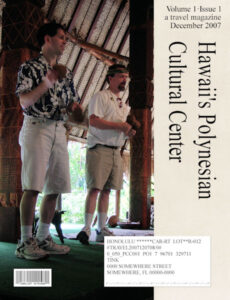
Carole, Thanks for the comment. One is a barcode and the other is an address label. There is data in both of them. Just small.
Cristina: Awesome magazine cover, can’t wait to open it. And I wasn’t disappointed. The photos on Day 2 and 3 are spot on and the information was entertaining to read.
Ann: Loving the “Birds of the Hudson Valley” cover. It will be interesting to read all about them. Day 2 page is perfect. I really like how you added their scientific names as well as general information about them. Day 3 has a fantastic picture of the blue jay and brown thrasher.
Monique: The magazine cover is so gorgeous and what a lovely garden park. Both of your cover pages are lovely. The next page is so relaxing to look at. Beautiful. Day 3 is just a beautiful and I really like how you are consistantly using the gradient to tie all together.
Anne: Looks like we had something similar in mind. Great cover. Day 2 layout is wonderful. It is definitely a long trip huh? How lovely is the flower and lava rocks of the Big Island. We didn’t get a chance to go over as we were there for vow renewals for our son & dil.
Art: Fantastic cover. Will be waiting on bated breath to read about all the projects. Next page is great. And a fantastic idea to lead in with safety tips. Liking Day 3 page. Cute and informative.
Lynda: Both covers are gorgeous. Will be looking forward to seeing more.
Fiona: Stunning cover. I am hoping that we will be seeing recipes within the magazine? You did a great job on merging the photos on your Day 2 layout. The photos are great as well. Day 3 has a fabulous photo of the broad beans. Are they as tasty as they look?
Sue: Charming cover. Looks so professional. Day 2 is so nice. I like how you included an “ad” for the Sheep Shop. The pictures are lovely and the information well worth the read. I really enjoyed reading about he Atlantic grey seals and looking at the mischevious looks upon their faces. Enjoyed the advertisement as well.
Minka: All three covers are darling. What a great title for your magazine. Oh my, what a brood of birds. Great picture and layout. The blue jays photo is breathtaking. The blues are so vibrant and I like that you used them as a gradient in the title.
Gerry: Love the sepia look you used for your cover and the pets are adorable. Just got to your revisit. It is lovely; but both are so well done. Loved the story about River and like how you put the page together. Ashton is adorable and I loved reading about him.
Corrie: Spectacular cover. I really like the gradient you used under the title. Really makes it pop. Day 2 has an exceptionally lovely photo and very interesting information about the Eupatorium. Nicely done Day 3. Got a kick out of the ad.
Paul: Wonderful cover to the magazine. I look forward to seeing more pictures of Arizona. Great job.
Marie-Claire: Wow, that is fabulous and how lucky you live so close to such great art. Your second page layout is so vibrant and lively. I am in awe of the art you have around you and your layouts.
Val: You magazine is going to be full of information about scouting and I like how you used their colors in your cover. Yep the cover looks better and I just knew we were going to see more of your family scouting get togethers. Great Day 2 and really liked how you added a cutline. You just keep getting better and better. Like the addition of the badges to the cover. The boys look just like I remember them, LOL
Annie: As always you know how to make an entrance. What a fantastic cover for “Touring Australia”. Either way you do it, the covers are gorgeous. Day 2 is another stunning page with the beautiful blues.
Hank: Fantastic photo and great name for your magazine. Can’t wait to see more. And you didn’t disappoint with your next page. Great read.
Diane: Your covers and page 1 are very nice. I really enjoyed reading about your adventures. Garden of Rocks is a lovely page and the information was very interesting.
Nadine: Great cover and looking forward to reading all about your granddaughter. Day is a perfect start to the magazine.
Euka: You’re not the only one, lol. I just got my cover uploaded. I really like the look of your cover page.
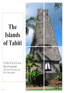
Finally, got the cover done. Will be using Kimeric’s At Day at the Beach for paper and extras (if needed) and the font is Times New Roman. Went for paper size A4 as that is a standard magazine size.
Lab 7 Module 3
Lesson 1: multi-design pattern (Cassel’s shoes preset)
Experiment 1: title work – onomatopoeia (whoa)
Experiment 5: fun font find – candy store (whoa)
Kit: Heels ©Kathryn EstryWent from having 3 pair of shoes for the past 20 years to having more than doubled that.
Lab 7 Module 3
Lesson 3: fabric tag
Experiment 2: element – paper blocks
Experiment 4: sketch template –
Kit: Bohemian Bazaar ©Kimeric KreationsNote: Quote from the “Space Between Us”. Grandson was nearly 6′ tall by this time. It is areference from the movie. The lead character also could not jump which grandson cannot do either.
-
This reply was modified 3 years, 5 months ago by
Karon Dey.
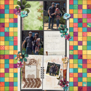
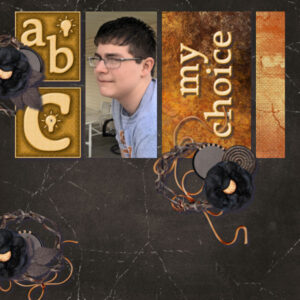
Lab 7 Module 3
Lesson 2: metallic element 2
Experiment 3: color/pattern – black
Kit: various from Designs by HellySide Note: Grandson’s initials are ABC which is why they are on the layout. His uncle use to call him alphabet because of it.
-
This reply was modified 3 years, 5 months ago by
Karon Dey.
-
This reply was modified 3 years, 5 months ago by
-
AuthorPosts


