Forum Replies Created
-
AuthorPosts
-
Ann and James. In my very first post of this challenge, I gave a tip for printing, don’t make your pages to dark, as when you go to print, they will always print darker. You could use the brightness contrast on you jpegs, or go back and on a new layer flood fill white and change the opacity of the background paper etc. There are other ways, here are two suggestions.
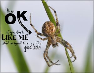
I’m not a fan, at all, of Halloween. But this is my contribution. So many people are far more terrified of creepy crawlies like spiders or mice than they are of Zombies’, and horror movies. Played around with vectors this evening. Word art. Used several tools, warp mesh for the LIKE ME words. The pen tool for the letter K, and text on a curve for the words it is.
Jnet, I love the colours of the background papers. Particularly the cover page. I see you have a moth featured in one of the photos. Perfect!
Jnet, play with the twirl settings, in distortion effects, for wavy lines, and other effects for cool effects. You’ve done a lovely job on your pages.
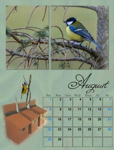
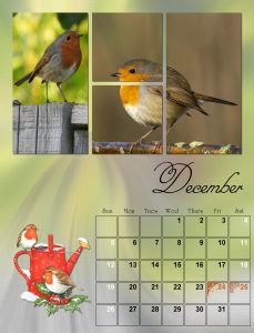
These are the last pages. I dare say I’ll be tweaking them before printing. Tom made some Tit houses, and sent me a photo of them. The tit in the main image is a Great Tit, the one I extracted is a Blue Tit. Thank you ever so much Carole for the challenge. I’ve enjoyed the different layouts. Now I will have to take photos with these layouts in mind. Again, thank you! I hope everyone has enjoyed the views of the West Wales coast and countryside.
Karon, thank you ever so much for your kind words on my pages. As always, all comments are greatly appreciated, and mean a great deal to me. With regards to the gradients. I didn’t use gradients this year to create the backgrounds. I used one of the photos displayed in the page, starting with radial blur, and then distortion effects, to achieve a wavy effect, which is consistent throughout the months, to depict the skies, sand and water. Settings and effects varied, depending on the photo.
Jnet, thank you for your kind comment on my background paper. I used the photos to create the backgrounds. Starting with radial blur, from there it was using other effects to achieve similar patters throughout the months.
Cristina, your pages are gorgeous, you always such beautiful pages.
Carole, thank you very much for your kind comment on my photos. This calendar is for my daughter and son in law. They feature in each month, so it’s very personal to me.
Thank you Lynda, You must have a beautiful garden, all those flowers. Everyone has created superb pages.
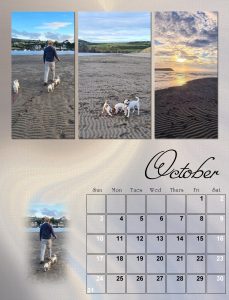
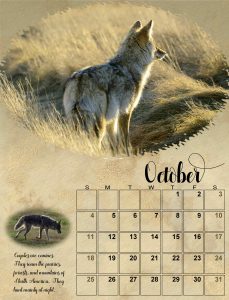
October.
Making headway now. Still some tweaking to do. The calendar won’t be won’t be finished until I go to print it off.
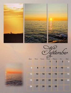
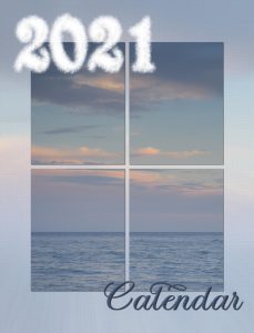
I had previously chosen the photo for the cover, and in keeping with the layout of the months, I kept it simple. I created clouds for the year, not quite sure if I like it or not. The word Calendar matches the colour of the water. Hence the reason for placing the text where I did, as I used a lot of photos which included stunning skies, and ocean scenes.
I’ve had a busy few days, fetching cows home for the winter for ranchers. Meg and I are having a rest today. This morning I got up early, and worked on some pages. Not in any particular order. I like simple, always trying to maintain focus on the photos. I also like consistency, so the background papers, although they have different colours the patterns are very similar. The pages posted are fabulous, each and every one beautiful created. So much love and thought resonates through every page.
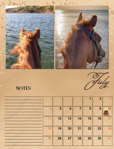
This chap, Hadley was 30 this year, we bought him for Rachael as a 2yr old, and he’s still going strong. His birthday is on the 10th July, as is mine. Once I have completed all the months, I will go back and shadow the photos, and add some text. I find the bulk of the work is matching and placing photos, then matching colours for the background paper etc. Also double checking, to make sure everything is as it should be before printing.
<p style=”text-align: left;”>Thank you for the comment Carole. I’m enjoying the new layouts. I agree, it depends on what effect the creator is looking for, I must admit I like shadows, they give perspective, and not a flat page, again it’s down to personal preference, either is OK.</p>
I whole heartedly endorse Lynda’s last comment! The West Wales coastline is renowned for it’s outstanding beauty and wildlife, not only in the UK, but throughout the world. For this page I created a background paper using as many colours that I could pick out of the photos, even the purple from the Thrift flowers in the top right photo.
Many of the family and friends that receive one of my calendars, don’t like to write on them. They have them hung up on display than use them as a functional calendar, so this layout works well, I think I will go back and take the note section out and replace it with something similar to what I did in the page.
A busy day today, for now here is June’s page. After seeing Jnet’s pages I opted for putting a slight shadow on the photos. Thinking back I can remember trying the drop shadow, but undid the shadows, simply because I have never seen a calendar with shadows before. Now that doesn’t mean that shadows are not accepted as the norm for calendars, as these calendars we create are very unique and personal, to the creator and the persons receiving them. OI created a background paper using the brown in the photos. Used the photo of Tinks, and placed her inside the date boxes. Overlay, and opacity. I may go back and dispense with the note section, and place a masked photo, fitting for each month, as I have loads of photos. At least I have plenty of time to fine tune the months, before printing and posting it.
Hi Monique, I’m sure you are going to have fun in the campus, while learning and creating beautiful pages. I live in Canada now, but my homeland is Wales. When I go home, I fly to Amsterdam and take one of the sky hopper planes for the short half hour flight to Cardiff Airport.
Very nice work Ann, I’m looking forward to seeing your finished pages.
Ooops! forgot to attach page.
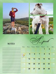
Here is April, I chose these two photos, as there was yellow in them. Son in law Tom has Smudge and Bramble on leads, their mother Tinks is the one in the other photo. They are Parson terriers.
Cristina, I’m pleased to hear you have made a full recovery. The font is called Bickham Script fancy. I haven’t checked to see if there are any other glyphs in character map, as it’s pretty fancy as it is.
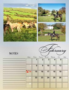
I notice that the background on my Feb 2021 layout there a distinct beak, from the gradient, I think it’s because I had to compress to 600pixcels from over 4 MB. It’s ok on the page to be printed.
I have only just stumbled across this colour challenge, once the calendar challenge has been done, I’ll certainly be up for this challenge, as I don’t have a shortage of photos brimming with autumnal colours.
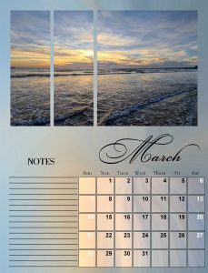
Here is the month of March. I will leave until I have finished all 12 months, before I write comments, on where and when the photos were taken. I used an adjustment layer to lighten the date boxes. As for the text I will write it under the photos, and above the word notes. I used one photos instead of three.
How are you Cristina? weren’t you having some problem with your eyes? Anyway, I hope you are well, and look forward to seeing your pages. Take care, my friend.
Carole. I am enjoying the different layouts, thank you. I did debate whether or not to post finished pages, but I agree with you, I’m sure they will inspire, and encourage some to see how simple it is to create a page. I’m looking forward to seeing completed pages by participants.
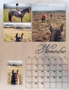
My daughter riding one of her point to pointers. She is a very talented horsewoman, and can turn out a horse immaculately, she can even get a grey horse to shine. I miss that life I once had.
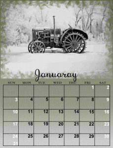
Farm equipment calendar, old and new.
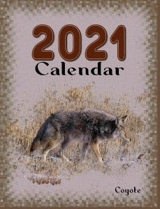
Native Canadian mammals.
-
AuthorPosts


