Forum Replies Created
-
AuthorPosts
-
Bravo Ann, Bravo! And who knew there was a U?
U – U forgot to do U. ?
It is very sad and tragic. Safe thoughts to you Pirkko and to anyone affected by this madness.
It is very appreciated by everyone! Truly above and beyond service. thank you.
Thank you very much Carole. What a fast reply. I have downloaded it and will put it in my customizing files so I dont lose it again.
What ever changes are made, I will happily navigate them.
If you are doing a list for all the tutorials is there a way to show (maybe in brackets beside the title) whether it is a master class, creative scrap or a lab. I like looking for those items in their respective locations. I’m happy with an alphabetical list at the top of each of those lists. or would be be getting rid of separation between those three and have one big tutorial section?
Carole, I think ad hoc means “when necessary”. Joining only when the need to learn a certain technique is needed (example: wanting to learn all there is to know about vectors because you want to make something and vectors is the only way to do it- you would join, do all the vector classes and un-join).
Fiona, I am a diamond member and thought I’d just do it for a couple months at time, pay for a month or two, then not be a member for 3-4 months, then join again. that might work for you. You get 10 free downloads every 6 days I believe. You could download the stuff you want right away and still have 3 more times in your month to choose to download of 10 more items each…techniques you think you might want to learn. Also you can watch the masterclasses (and the labs tutorials and the Creative Scrap ones too!) online to see if you want to download them. It’s really a win-win. the best way to decide on the Diamond membership is the do it for a month and see what you think. that is what I did. It’s really worth it. I am a beginner and need all the help I can get.
I liked it all. It’s new to me so I wouldn’t know what I would have wished we had. It is a most giving/helping online community that I’ve belonged to so far. the one really big thing is how quickly you answer people. You are very involved and I really like that. Currently I belong to another art type group and the teacher has been MIA for 2 months. I can see where I am going to put my priorities this year as you are so attentive to everyone and everyone else is there for each other. It makes me feel like I belong and I matter. thank you.
-
This reply was modified 3 years, 1 month ago by
Susan Ewart. Reason: used the wrong tense word (being instead of been)
I was using the Creative scrap also as a place to find everything(except the master classes). And those techniques lead me to looking closer at the labs. I like being able to look by technique. I would download the lab for the technique I wanted and got bonus techniques too. I do like video downloads too. There is something to video as it’s been played and you are talking that gives you the full picture of how to do the technique. It comes down to how we all personally find information. I am happy with the way it is, once I understood the layout of the website I was able to navigate fine.
I would love to see the Quick Pages one(called Busy something-sorry I forget the actual title), I didnt realize there was so much you can do with a quick page. And the magazine challenge looked fabulous, that would be my 1st choice. I really liked that format. I also like picking from the Creative Scrap when I want something specific to learn or if i have a short amount of time. Trying the quick techniques gives quick results and boosts confidence. I have been eyeing the projects too. I was planning on picking one in the new year as a way to keep me accountable from start to finish.
I had to think about this, and what has made me feel the most success with PSP. There is a lot of content for the diamond members and after taking the Basic Scrap course I didn’t know what to do next. I do admit I was overwhelmed, wondering where I should start (I didn’t know enough to know what I needed to learn and that kind of stopped me for awhile). Taking courses like the basic scrap course, bootcamps the challenges (Calendar, quick pages, magazine) are the type of format that I find works for how I learn. Those style of classes have an end goal to achieve, by teaching a workflow (where to start and follow through to the end). Being guided from start to finish takes the stress out of “where do I start” and teaches me how to use techniques at the same time. I wish the challenges were available for purchase because I couldn’t take some of them since the time lines were too tight or stressful (ie. a page a day). I felt I couldn’t keep up or the techniques would be too hard to be able to keep up. I know that I need to make many layouts before I am able “go it on my own”.
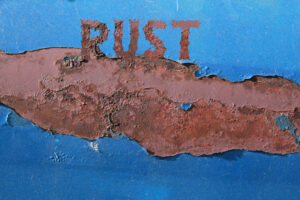
Just had a few minutes when I got home from work to try this technique. Page 64/65 in the “Tips & Tricks for PaintShop Pro” . This tip is called “Paper Filled Text” and it’s about creating your text as a selection instead of a vector. I had seen it in various layouts and thought it was really nice looking. But I wondered how do they do that. I have been reviewing the book when I get home from work to settle my mind before I head off to bed and too my surprise there it was, the answer. I moved the text a bit into the rust to make it look like the text was growing out of the rust. I love the layouts I’m seeing. thank you all for the wonder gifts we are getting. Now that the Christmas rush is over (at work) I might actually get to play a bit.
J= Jingle..for all the Jingle Bells I can never resist buying in the stores.
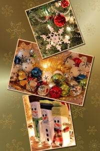
Beautiful layouts from everyone! Like presents for my eyes when I open up the forum. I have been working on my Christmas cards. Which usually have a photo on the front with hand cut mats placed on the folded card that has a deckled edge. This year I choose to do a layout to be sized to 4×6 format and here are the two colors I’ve chosen for this year. I printed test prints and they are a bit darker as expected (even with sending the lighter versions of these) but will do in the time crunch I have now. I tried two different shadows and liked the bigger shadow (thicker paper shadow) as it printed out better than the normal “paper” shadow. My photo’s of decorations, PSP gradients used, varied opacity, snowflakes from Brooke Gazarek (Digital Scrapbook.com). One the red version I had to put a shadow so there was more definition in them. Otherwise I wanted it to look somewhat like it was part of the background.
Thank you for comments on the picture Cassel. I will look for the “What are you working on?” thread for my next postings. There is so many tutorials to choose from. I appreciate the emails with suggetions too. I just downloaded “Selection Everywhere”. I probably would have missed it if it hadnt been for your email.
-
This reply was modified 3 years, 1 month ago by
-
AuthorPosts
