Forum Replies Created
-
AuthorPosts
-
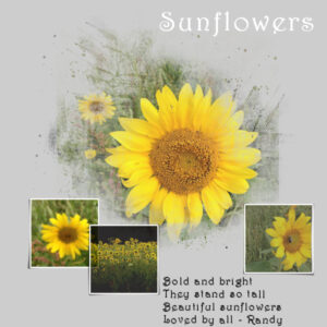
Masks project 1 – Here goes. I really like the effect that the mask had on the flower that is in the centre. That is something I will want to do again. I think that I will try to capture the steps in a script and see how that works.
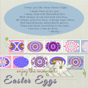
QP7 – I finally got here. It is strange that sometimes when I am sick, I get some of those things done that I had not gotten to. It was nice to have these Quick pages to work on to pass the time. I decided to do an Easter Egg theme. I started out with an ellipse as the starting point for my eggs and went from there. Once I got my egg done with multiple layers of decreasing size and colour, I used that as a base for some Kaleidoscope effects. I also used blend effects and merge layers. In one case, I moved a copy of the egg to the left, leaving the original underneath and then mirrored a copy of the egg moved to the left to the right – and because I did everything after the first egg was created with a selection around the original egg, I was able to merge visible layers to new layer and copy the selection and paste as a new layer and remove the background.
When I was playing around with the Kaleidoscope, I noticed that some hearts began to appear so I spent some time tweaking to get them to a point that I really liked. Playing around with the tools can be very helpful.
Speaking of backgrounds, I decided to put a background behind the quick page because I had a transparent area outside of my eggs. Then I decided to copy and paste the background I created and change the colour. That caused a surprise for me because I had not noticed that in moving things around I had moved a background to the right. So I had two different colours for background. And I liked that so i did something similar for the right side of the background.
I even decided to create a video of my screen while I created the eggs so that I could review again if I have any questions about what I did to get through each stage.
I might make more eggs. 🙂
I HAD FUN and am thankful for this workshop. Thank you, Carole.
QP6 – People don’t like me sharing their pictures so I just went with this. Even when I don’t have anything that I can use, the use of PaintShop Pro and the tips that Carole drops in are helpful. Thank you, Carole, for these workshops. I thought I had put some text here but it may be one of those disappearing text within a selection problems. 🙂
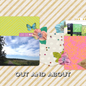
QP5 – Before Covid, I used to do a lot of walking outside. Now not so much but am hoping that this summer will be better. Anyway, this reminds me of the beauty I would see along the trail (and birds in the sky that you might not be able to see) and one of the distance markers.
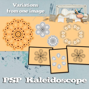
QP4 – I decided to take an image of a snowflake that I created in InkScape, flip it and then apply kaleidoscope effects.
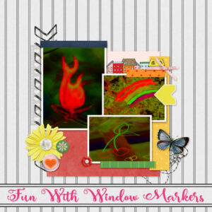
Quick Pages 3 – I wanted to add add a title but the font I chose did not look good crossing the lines and I did not think I could make it work with an individual letter between each vertical stripe. My solution was to copy the area of two vertical strips, rotate 90 degrees, stretch it out and use as a background for my text. I cropped area that went beyond the stripes so that the vertical lines touched the lines from what I had copied and pasted.
I tried other colours for the text and this one seemed to stand out the best so I decided on it.
I know this is about quick pages but I really did not feel it was complete until I did this.
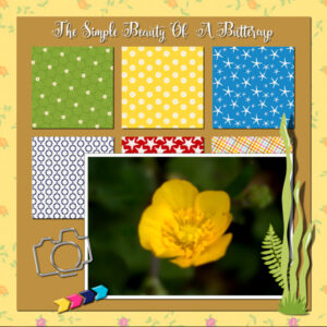
Here is my QP2 – a simple buttercup with text.
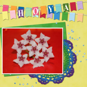
For Quick Page 1, I added the picture of the Hoya and chose to put the name of the flower on the flags.
I did not realize that there was a separate place to share the Quick Pages. So I had entered in the February forum for pages 1,2 and 3.
Quick Pages 3 – I wanted to add add a title but the font I chose did not look good crossing the lines and I did not think I could make it work with an individual letter between each vertical stripe. My solution was to copy the area of two vertical strips, rotate 90 degrees, stretch it out and use as a background for my text. I cropped area that went beyond the stripes so that the vertical lines touched the lines from what I had copied and pasted.
I tried other colours for the text and this one seemed to stand out the best so I decided on it.
I know this is about quick pages but I really did not feel it was complete until I did this.
Here is my Quick Page 2
Here is my submission for Basics Workshop Module 2
Here is my submission for Module 1 of Basics Workshop
Basic Workship Projects 1 and 2 and a valentine
Here is my QP1 page. I decided to use the flags to give the name of the flower that this bloom is from.
There is one thing in particular that I learned that I will be using, going forward.
1. Opening the Scrapbook page that items will be added to. Keeping this page open.
2. Opening an image to add. (Making sure that there is room for at least part of the Scrapbook page to be visible.) Selecting the layer of the item to add and dragging it to the Scrapbook page.
Many times I have copied and pasted, but I like the dragging much better.
>>> And I probably should have know this, but found sometime during the Bootcamp, that when I have a folder open with something that I want to use in PSP, I can just drag a picture from the folder into PSP (Edit) – rather than open or open with.
There are other things too, but this one stands out.
Mary,
Thank you for the suggestion on addressing the rounded corners.
I will definitely check it out.
Here is my submission for Project 4.
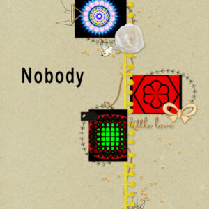
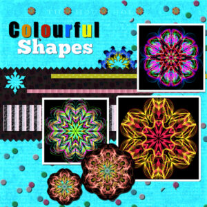
The pictures were created by me using another software — however, I frequently use the Kaleidoscope in PaintShop Pro.
Once again, I am concerned about whether the colours go together well.
The “snowflake” that is cut into the black was actually taken from a selection of the centre of one of the shapes, placed over the background, copied and then pasted. There is probably a better way to actually cut through the paper using the selected shape.
I tried to put shadows on everything but may have missed something.
I did notice for the picture on the right, the bottom one, I added outside instead of inside and it rounded the corners. I did not want to infringe on the image. Not sure why the corners ended up being rounded.
It has been fun to try this.
Thank you to Carole for setting this up for us.
Thank you for all who participated and shared your masterpieces.
This has been a great experience. I started project 4 but not ready yet. I appreciate the things I have learned.
Thank you.
Here is my submission for project 3.
I am definitely learning. Even little touches like adding a shadow make a difference.
Thank you for providing this instruction.
Thank you also for all who are participating. The projects shared are done very well.
Project 2
My adventure often is just a stroll. On a beautiful summer day, I took this picture. The clouds were really beautiful but for this project, I decided to focus more on the water. The items I added are mostly from digitalscrapbook.com
I used a blur against the darker blue background which left the rightmost part transparent. When I tried to add a drop shadow, it cut across the Location / Date. So I removed the drop shadow for that layer.
I would like to better understand how to determine which colours look best when used with each other.
I know that within PaintShop Pro you can see Complimentary, Triad, Tetrad, Analogic and Accented (and Mono). But I don’t understand how these work.
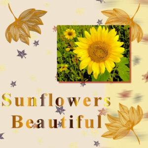
Here is my submission for Project 1. I wanted to have the words stand out better but this was the best I could seem to do.
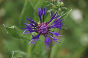
The picture is one I took sometime in the past. I tried the one with the cornflower but the green seemed to overpower the blue so I tried this instead.
I used the Fall In Love item.
Thank you.
Any suggestions for improvement are welcome.
P. S. I have seen some very beautiful projects from others. Thank you for sharing these works of art.
I am very impressed by the beautiful work that I see for Day 3 Project 1. It both encourages and scares me.
MOVING THE MATERIALS PALLET BESIDE LAYERS PALLET.
After a few tries, I understood what you meant.
It took me awhile to actually place the mouse pointer over the arrow pointing right.
I had been double-clicking and that only made it jump back to where it was before.
I now have setup exactly as I want.
Thank you.
I am definitely learning.
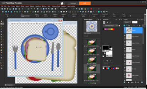
I was wondering if there was a way to move all of the parts of the sandwich at once.
I did a search and found information on grouping layers on the online Corel PaintShop Pro Help.
So I was able to select all of the sandwich layers, click on the NEW LAYER GROUP icon at the bottom of the LAYERS panel. Then I just dragged the group to the Table. Then I ungrouped. And I had what I wanted.
If this is not okay, please just delete this entry, and notify me to do it individually. I did try to drag individual items first.
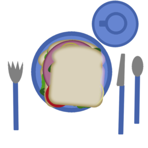
Here is my new table with the Sandwich. I chose to export as .png to retain the transparent background.
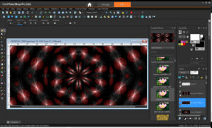
I prefer the dark gray workspace — for my eyes, it is the best.
I use Instant Effects, mostly for the Kaleidoscope tool so keep that visible along with the Materials and Layers. I don’t use organizer. I did decide to decrease the width of the instant effects and materials and layers.
I would prefer to have the Instant Effects, Materials, and Layers side by side by cannot get Materials to dock anywhere other than above Layers.
Here is a photo that is a possibility for this.
I have had Paintshop Pro for quite a few years – currently have X9, 2018 and 2021 on my computer (and did have prior to X9, but cannot remember version(s) – but I have not used it a lot. I am looking forward to working with this project – learning some new things. I do find that sometimes I “learn” how to do something but then go onto the next thing. So I will want to try and retry to add these to things I can use every day. Thank you so much for providing this resource and the other things you do.
-
AuthorPosts
