Forum Replies Created
-
AuthorPosts
-
Mary – I like the snow layout. It looks just like a Christmas card.
Bonnie – I like how you made a circle with the balls and included the pictures in that circle. Great idea.
Michele – what a great idea on how to use gradients and repeats on the heart. Very unique.
Ann S – Your grandson has an eye for taking beautiful photos. I really like your layout with the circles and how they match the colors in the photo. OHHHH I love the ‘Oh Boy!’ layout. It’s gorgeous and congratulations.
Minka – I really like your piano layout. My son plays and is still taking lessons and playing at 16. I am hoping to have more time in the future to learn it myself. And now I want to go to Duck, NC … I love really good donuts. I like how you used the colors of the umbrellas and the roof as part of your colors in your elements.
Annie T – Your kingfisher layout is wonderful. I really like how you overlayed one with orange and then put a ‘circle’ around him. What a way to draw your eye to the center. I have never seen a yellow billed kingfisher. I like how you put them in different rays.
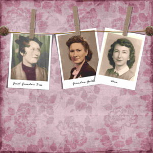
Annie T, Lynda, Karon, Corrie, Raymond, Mary S, Ann S, Sheila, Michele, Sue T, Minka, and I’m sorry if I forgot anyone. I am excited as this year progresses to see what I can learn from all of you! It has been awesome coming here with this group. You post such beautiful layouts and I learn so much. I can’t wait to see what February brings. And my last one for this month is… Clothespins. I made my own. Here is my layout with Yin Template 16 and Linda Cumberland – A Sweet Devotion kit.
Annie T: you always do such beautiful layouts. I like how you just barely highlighted in color the tea and the Alice in Wonderland group on the page. Makes it so much more interesting.
Karon: I like your Teacher layout. It was cool how you put the Graduation March music as the background paper. What a neat way to do the Volleyball layout with the pictures hanging on string with clips.
Annie T: I love your Cool Cat. I had to laugh at the cat with the bird on his head. That is how I feel this morning as I am getting ready to start my labs. Being a bird lover, I love your Rock Parrot layout. It’s great how you put text about the bird on the page. And I read you changed your photo. You are beautiful. Guess I need to find a picture and upload it! Though I will not use my dog’s photo this time. I’ll be good.
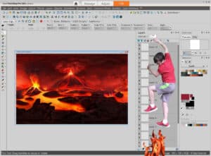
In January… I’m still working on labs. I have to post my ugly button. I laughed so hard when I finished. I had the right idea, just not the right dimensions and didn’t catch it until the end. I just have to share it so you can smile as well.
Karon – What a cool page with Kings Cross. I love your layout of Universal Studio photos with the Harry Potter elements.
Bonnie – The photo shoot pictures look great on your page. I like how you did the inset photos.
Corrie – Your Words are powerful is fun! I like how you used different fonts and ways to make the words stand out on the page.
Michele – I like how you emphasized the picture with the multiple frames.
Raymond – Thank you for your service. My father was in the Air Force and I have many relatives in the military. Please continue to post your layouts. I think this is a great place for me to learn about scrapbooking and PSP from others.
Annie T – I like your transparency use. I tried to install the plug-in but I can’t get it work. Of course being a bird lover, your cockatoo is great. You really bring out the colors of the bird in your blocks. Your word art is unique. I love how you were able to use different sized fonts. Beautiful pink and white flower layout. I have never seen a flower like that before. Thanks for posting the layout.
Ann S – Your Bootcamp memories are great. I like your computer with the scrapbook logo on it. Wow – your new bridge layout is a neat way to show the bridge off. YAAAA an Owl! Your page works well with the limbs coming out and the colors. Your family one makes me smile. Great granddaughter? No way. You are too young for that. I’m sure they will love your layout and I can’t wait to see the ones you do of your great grandson.
I like how you are looking thru a window and it gives the feeling of being in a beach house.
I really like you choice of papers for this as well as the hanging date.
Minka: Beautiful HOME layout. I would not have thought of doing the four photos around like that with the hearts.
Annie T: I am definitely a bird lover so I am enjoying all your scrapbook pages. I like how you used the birds colors in the papers.
Sue T: Your cards are amazing. Great idea to make them at the beginning of the year and having them ready.Karon: Batman is awesome! Love the way you put Robin in there with Batman., Your Phone Tech is so crisp and clear. Is that you as a teenager on the beach? I like how you made it look like you are looking thru a window.
Minka: Love the circle with the snow and the birds. I couldn’t get the Laplacien to download, but I love what you did! Your year in review is perfect. Love the old ship!
Annie: Love how you put together the layout so the Tawny Frogmouths are the center of attention. Your clusters rock. OMGoodness!!! I love love love the Fairy-wren. Your layout is gorgeous and really brings out the blue on his head and cheeks.
Raymond: Very cool. Love how you added your animated Happy Val’s Day.
Ann S: Please give a big virtual hug to your granddaughter. It is awesome that she is helping out. Your layout is a great tribute to her.
Corrie: Thanks for the head’s up about using Edge… I use Chrome and I bet that is why I couldn’t get it downloaded correctly!Cristina: Interesting way to get a new look with changing paper blends and opacity
Minka: I like how you used stars the same color as Henri to bring out he was a star in your life.Ann S: I like how you added a worm and the tree with the blue birds flying over it.
Michele: Now I want to hunt down the winter wonderland master class vs doing the labs! Your layouts are inspiring.
Cristina: I love how you did the around the world. Connecting the pictures with arrows, planes, cars. Great idea!Finally stopped doing labs and went over to the Playing with Paint Shop class. I took a picture of my son and didn’t realize until I got it on the pc that he had leaves over his arms and part of his back. It took hours to try and get rid of those suckers. Had a lot of fun doing this… Will be trying a couple more with the other ones she showed…
All – thank you for the kind comments on my layouts
Lynda – I love how you did the photo lift and the photo splits.
Sue T – Awesome Bird layouts… you could make a coffee table book with these
Ann S – Love how you did the cherry tree.
Raymond – Your Happy Val’s Day is doing animation quite well. Nice job!Bonnie – I love how you have all of them connected on your bonnie elf 600 layout. So creative… I would never have thought of doing that.
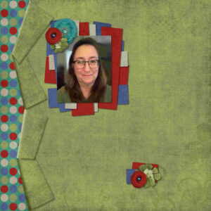
Been busy with labs… From 7-02 I decided to put in a picture of myself as I worked the curled edges. Thought I would throw this one over here to show what I’m doing in January.
JFF QTJ Template
Art Gal Kiss the CookAnnie T – Love your Jan 2021 QLD license plate layout. The combination of photos and objects is well done. Your Imagine and the reflection are gorgeous.
Lynda – wow. Now I have to go watch Playing with your Paintshop… I’m never going to get thru the labs. And I am fascinated with your amazing spill over. Your doodles are cool. I really like the heart one.
Karon – Love your Lab 11 Module 1 with the crossstitched birds.
Bonnie – how cool with the hot dogs and hamburgers in the cookout layout. I really like how you put the state in the South Carolina layout. Really enjoyed how you did BEST DAY in Apple house layout. You have so many wonderful layouts!
Raymond – I had no clue how to help you, but I do like the end result. And your Christmas layout is festive and makes me smile.
Sheila – What a fun layout with the cartoon image in it.
Corrie – Your 2020 in Bloom layout is gorgeous.
Michele – Your snow surfers layout is beautiful.
Anne L – May not be scrapbook page but it is gorgeous and I am amazed at your Osprey photo.
Minka – What a neat layout. I like how you did the photos and the screws in the corners. And your lists … particularly the one with the cat is so cool.
Ann S – I enjoy our Oriole vs Osprey layout. Great pictures and shown well in the layout
Sue T – Beautiful flower layouts. -
AuthorPosts


