Forum Replies Created
-
AuthorPosts
-
Michele – I like your bokeh and I keep thinking about how to do it with my camera. I think seeing how it really turned out so well with your layout, I’ll leave it to PSP and skip the camera part.
Minka – I like your beautiful layout with the stitched letters. Very relaxing.
Shirley – Your module 1 layouts are awesome and I love how you did the cat and hearts.
Lynda – You flowers with vector shapes turned out great.
Michele – They are gorgeous pages and I have to say I like the calm indoors is my favorite.
Lynda – Your sun sure did make me smile and I like your flowers and banners.
Ann S – Wow. What a cool mandalas. Love the flowers.
Shirley – beautiful colors and layout of your daughter dancing
Close to West Palm Beach, FL
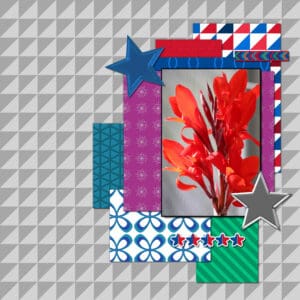
Ok, this was a lab exercise that I really enjoyed and wanted to share… mainly because I am so happy with how it turned out. You were to use the papers you have been creating in the labs. I have been trying to follow a color palette that I made up as I do these exercises and … I think it works! Cassel’s template, my elements and papers.
Ann S – What a great dream. Enjoying your layouts. Ohhhhh What sweetness. You did a great job showing him off in the layout.
Bonnie – I love your heart meter with the pickleball paddles! Great photos! Love the “I play like a girl.” Bet most boys couldn’t keep up! Great layout. Wow. I would love to hike the Rio Grande. Beautiful layout. Your latest pickleball is neat in the fact you used the purple of his shirt in your background.
Anne L – I love your trail of hearts and snow flakes to each window. Great layout.
Lynda D – Your colors for the renaissanace faire layout is beautiful. Goes so well with the woman’s clothing and head dress.
Michele – Your cupid ball layout made me smile. It is just so fun. Your wine from one cup to the other is fantastic. I love the look.
Annie T – This Fishy layout is great. I love tea but most of my teapots are cow related. Very pretty. I love your bird layouts and this one is so much fun. Your use of arrows for the labeling is awesome. Your green haired turtle made me laugh. I am now interesting in the cutouts/tracing… I will get there I hope. On lab 7-12!!! Only 36+ to go.
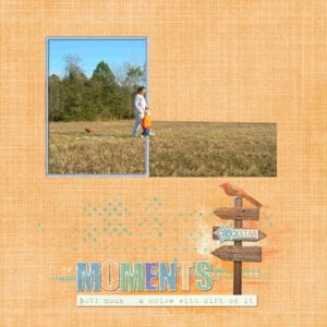
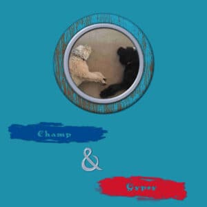
Had so much fun with Lab 7, module 8… two in particular – I created a frame using the painted wood effect she showed and I used the walking out of the frame from the Using PSP she put out in her Master Classes for my ‘grassy’ assignment.
Ampersand: Template, Paper and elements – val, font – AnAkronism, & – black Chancery
Grass: No template, Kimeric Kreations Snips & Snails
Bonnie: I like how you put a frame around the whole page. And the map over the top. What a great idea. Your best friends layout of bright and beautiful. I like how you put quotes around their photos. Your pickleball layout is so fun with all the action shots.
James: I think your bears with the guitars are cool in your layout. Also hope it is not cancelled next year!
Karon: I like your scalloped paper and the muted beach colors to go with the old photo. I alos liked your Baseball layout and the font with the baseballs on it. Your photos of the Monkey tree are cool with the paper and tree you used.
Ann S: Beautiful layout of the black vulture. Your plaid paper really went well with the colors of the bird. Your psychedelic coloring page is so much fun! And now I learned something new about skunks. I really like this page!
Annie T: Your mask and then putting the frame around their faces was amazing.
Minka: Wow. Cool overlay page.
I like how you ’embossed’ the wood with relax and the sun. I also like how you used the lighthouse and had it go up and beyond the initial center piece.
I like your use of the papers. Particularly how you made the dark blue look like clouds with a sun popping out.
I love how you overlayed the flower drawings on the photo and the paper. Beautiful.
This is beautiful. I like how you got all the elements in and then did the song in the background. Awesome.
Your volleyball net in the background with the girl spiking is a great idea. I like how you hung the pictures up as well.
Wow. This looks great. I like how you used the Universal Studios objects in with the scrapbook elements.
Lynda – WOW. Those are beautiful letters and banners. I love how did the colors for hot stuff and the chat room.
-
AuthorPosts


