Forum Replies Created
-
AuthorPosts
-
Gorgeous. Great job Brian!
H = Hugs
B – Buckskin I don’t have a picture of the Buckskin I use to ride. But he was a wonderful horse.
Mary S – I admire your Fishing Buddies. The way you did Happy and the paper is awesome.
Wanda (Sue) – Your sting shamrock is gorgeous.
Nadine – What a fabulous job of shadowing in your B57 Shadow Challenge
Lyn Lou – What a great page on your Isle of Wight holiday
Sue T – Your Xmas Globe looks so wonderful. And your snowman makes me smile.
Susan E – What a neat project with the table set. Now I want a sandwich and some pickles.
Bonnie B – I thought your Queens of the Court was so much fun! I may do that with some of my friends.
Ann S – Your speech bubble makes me laugh out loud. I could see the BlueJay saying that.
Sheila H – What a beautiful dog. Sweet layout.
Rene M – What a great layout of ‘She Said Yes’.
Corrie – I think your September calendar page is so unique with the way you included the spider and pinecones and berries.
Monique – The calendar cover is great with how you included each season.
Shirley – Great job on making the photo into sepia with serrated edges.
Anita W – Your Adventure Park pages look like they could be the front of book.
Cristina – 2017 July challenge is great in how you laid out the photos. So unusual and beautiful.
Euka – It really looks like your D is folded inward
Helen – Glad everyone was ok. You made an amazing page from the photos.
Everyone is showing me so many ideas!!! I went and started my first String Theory project. And it is all so creative and beautiful.
Carole, your 2006 project is still awesome!
Nadine: Thank you for the kind words.
Carole: They are pawprints in a tube. I did it for one of your lessons, I just can’t remember which one.
Happy 10th! Huge congratulations. In lab 5-11, I learned about cut out words and creating my own chevron pattern. The link is: https://scrapbookcampus.com/the-lab/lab-5-module-11/
Carole – Hope you like my last page! I had it in mind from the beginning.
Fione – YUM on the carrot cake. Thanks for sharing.
Everyone – I am so amazed at how different the layouts are for each person. I really have learned so much just looking at them. Thank you all!
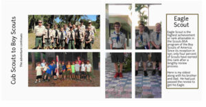
I decided to lay out my magazine. Now I have posted the double pages here… understanding that my Page 1 would be more like a table of contents and not part of this challenge. Though I am going to take this and continue with it filling in the gaps as it is easy and quick. So glad I joined this as I am always one to use embellishments and this is certainly just as wonderful and tells the story.
And I have also included my Day 7 Layout. Variation of day 3.
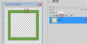
Fiona – there are a couple of different ways to change the color of the frame. The one I use most is I use the ‘lock’ on the layer and then fill it with the color paint I want to use. Hope that made sense. See attached picture.
I was going to reply on each person’s own post then remembered it would make a ton of posts… so instead, I put everyone in alphabetical order. Hope I got everyone as there are just so many gorgeous pages to view! Here you go:
Ann S – I love the way you did the cover. Having the date range was a great idea. Thank you for writing about the Brown Thrashers. I really enjoyed your day 2 and learning more about the bird. Day 3 is a great picture and I really like how you did the title in two different colors. I like how you did the gradient across the two pages. Day 6 looks delightful! Your pages with the background of a photo really works.
Anne L – I love how you put in the surfboard. I certainly think of surfing and Hawaii together. Great day 2 with the picture of you both on the plane. I like how you did the background and the lava/flower photo. I like your day 4 with the colors and photos. Day 5 turned out really charming with the rainbow, the change in color of the fonts and the pretty background.
Annie T – Your cover is beautiful. I like how you did the title and the photo you used. Your day 2 made me long to go by the beach and put my toes in the sand. Day 3 sun set is with the lovely background just makes it stand out. Day 4 is so amazing. Day 5, I had never thought about stretching the text like that. It really works for this page you did.
Art K – Your stand is gorgeous. And I really like how you used the wood text. Really enjoyed your day 2 with the tips & techniques. Day 3, the bear is amazing. I like how you continue using the wood text font. Day 4 skateboarder was very interesting. I like how you showed how you got from a picture to the actual wood project. You are multi-talented with the ability to carve as well. I like how you labeled the photos.
Corrie – You really made your cover flow well. I like how you did the barcode and the gradient. Your flowers are beautiful. I will have to see if it grows here in Florida as I would love to attract more bees and butterflies. Your day three is charming and I like the advertisement. Day 4 with the bees is delightful. My sister has 3 hives that she keeps, so this really hit home for me. Day 5 is pretty with the colors you used and the interesting flower.
Cristina – Your Cover was so interesting! Your treat looks yummy and the photo fits in so well for day 2. Your day 3 was a great idea with the background of the place done with low opacity. Day 4 was so unique. I like how you used the photo sections to highlight parts of a photo that went across both pages. Day 5 made me hungry. Yum!
Diane – Your cover if neat with the black and white photos. I also like how you continued with the colors for the fonts and the stories on day 2. Like your day 4 layout of the local parks as it shows not only something personal but the overall view. I really enjoyed how you laid out the photos and included the title.
Euka – I like how you did the cover with the labeling of the cover photo.
Fiona – Love how you used the colors in your title in the cover. Day 2 made me want to build a green house. I have about 15 plants out on my porch, but they don’t look as great as yours. Day 3 is yummy. I like how you did the colors for the title. Day 4 is more yummy stuff but I has to look twice to make sure that was a cat I saw! Day 5 is so much fun with the colors. I really like the hand painted tiles.
Gerry L – I like how you did the colors on your cover. And how you did redid it with the date and the quote. Day 2 made me laugh. I love your story about your cat. Day 3 with the handsome dog and the beautiful story made it special. Rudy is such a camera hound! Great photos and layout. Day 5 with Spyder is fun!
Hank – Your photo really brings it to life on your cover. The day 2 using a painting from a friend makes me smile. The colors you used for the background and font really make the painting snap in day 3. Day 4 makes me want to come out and join the crowd to listen to the music. Day 5 really show cases the whole crew making music.
Karon – I like the address label and the volume information as well as the colors and the photo. I think how you did the text in opposite corners was a neat idea. I also like the advertisement on the one page.
Laurie S – Wow. That looks just like an RV magazine cover. Your photo is fantastic and the dark blue you used around it made it stand out. Day 4 of Wyoming and the snow was splendid. Your redo makes so much sense and looks really good.
Lynda – I really liked how you used the gate for the The Garden and how you showed the season for the 4 Seasons. I like how you label your pots with tape and write on it. I had not thought of that. Like your day 2.
Marie-Clarie – I love the street art you choose and the way you laid out your cover. Your day 2 looks so awesome with how you did the photos of the street art. I liked how you included a link for more information as well. The way you did the ‘A tale of two foxes’ and how the colors go well with the photo is really nice.
Minka – All three of your covers are so cool. Your quote on day 2 made me laugh. Your Bit of Blue is so pretty. The heron and turkey pictures are inspiring. Mine never come out that nice. I really like your layouts. I really enjoyed the squirrel photos and how you keep ‘The View’ on every page. I like how your looking out the window looks like a window.
MoniqueN – That photo is lovely. What a great way to start the pages. Your gradient and new layout on the cover is beautiful. Day 2 makes me want to come visit you. I would love to sit in the chair and relax with a good book. Day 3 is relaxing. Thank you for the link. Thank you for the translation of day 4. I would love to see the garden. I really like how you laid it out. Day 5 showing the two seasons and the hidden chair… I really like it.
Nadine – Your colors being off the photo really made the cover pop. I really like how you did the weight, height, date, and time of the newborn. Really like how you did day three with the text up top. I like how you did some of the text on the top of the left page and then the rest on the bottom of the right page. Great idea.
Paul – Gorgeous photo and I like how you did the font for the title in the cover.
Sue T – Wow. Your cover looks like it really is a magazine cover. And the photo is beautiful. Looks like you had a wonderful trip. I like how you added a page number! Day 3 with the ad on the bottom was a good idea and really fits into the page. Day 4 shows such a beautiful trail to walk. And I would love some of those fresh blackberries! I like how you labeled the photos in day 5.
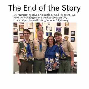
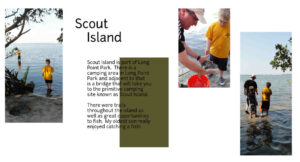
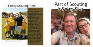
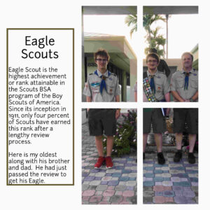
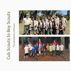
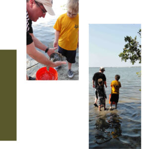
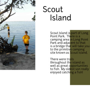
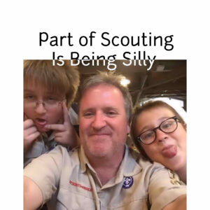
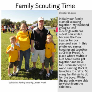
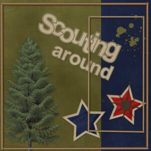
Pages 5 and 6. Though 6 is likely to one of the last two pages if I decide to do all 6 years the two were together with their dad in Scouts. This has been so much fun so far…
Day 4 is here along with … yep, a new front cover. 3rd times a charm – right?
This is so much fun. I am so glad I joined this because I get to see so many different beautiful pages. I redid my cover and here is page 3.
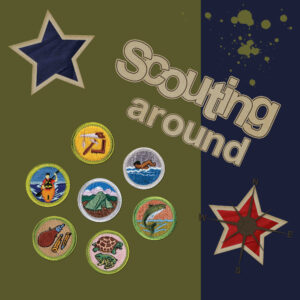
Carole – Yes the green is significant in scouts… so I took out the tree.
So amazed at what everyone has done. Gives me so many awesome ideas! Ok, tried to change the cover some. Still need to do some more to it. And here is the new cover as well as my first page with text.
Cassel, Thank you for the feedback. I keep forgetting we are doing a Magazine. Thanks again!
So many beautiful covers! Still playing with mine but this is the latest…
Sue T – Thanks for posting that mask on Facebook. I haven’t used it yet but wanted to say thank you know before I forget. Your Quote Robin layout is lovely. Your Easter Greeting with the chick in it is so much fun. You did a knockout job on bringing it all together. The Male Mallard is unique. I love the quote and the feathers you added. I appreciate what you told Christina about the beads on threads… I would never have thought of that and what a difference it makes. I learn so much on this forum looking at layouts and reading comments. Your Dark-eye Junco is exquisite. The frame you did fits so well and I would love to buy one in the store. I like the whole layout and the fact you did it again just as beautiful in your Easter Greeting layout.
Betsy – Looks very Victorian. Beautiful.
Lynda – Your balls and bubbles look great.
Michele – I like how you u sed the bubble with your Prom Fashion. Just gorgeous. Hope you feel better now.
Connie – Beautiful wintershed layout. The colors bring out that winter feeling.
Lynn – Great job on your dot template!Ok, breaking this into two since there is so much I want to say… in the order I saw the layouts…
Annie T – The Curragurrong falls is beautiful and the colors you use in your layout really bring it out. Your Blue and Yellow Macaw page with them flying out of the photo is delightful. I like how you did the flowers / leaves in the background like stamped images. Your Positive Thoughts is splendid. You did a great job in coming up with the same effect. Thank you for the idea on how to use masks like you did in your Protea layout. That is beautiful and I love the extra touch with the bea and the dragonfly.
Christina – Your balloon one looks like yuo had fun. And the one of olivaia and how you had her coming out of the photo is unique and really makes me smile.
Ann S – Your Rockin’ Robin page – ROCKS! Grin. I like your writeup and the burst of colors that go with the Robins.
Mary S – Wow. You did a fantastic job on getting rid of the hand and glass as well as the whole finished look. I like how you added the corner punches.
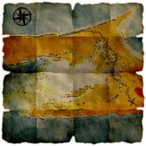
Corrie – Your easter card is beautiful. What a great use of the mask.Phew. I am still deciding if hitting reply so you can see it in your inbox or just putting everyone down in one post is easier. Still out for debate. In the meantime, I took the Filter Forge master class and finally did something with it. I made a treasure map. Oddly enough it was the footprints that drove me the craziest. This is some island off of Florida with no civilization on it. I have to say, I had fun.
Karon – Earth Angel is the cutest! I like the spirals and circles.
I had not seen the 3 Mustacheers photo before. Awesome. I like how you did the red, white, and blue theme with it.
Minka – Your photos are beautiful and your layout with the background colors complementing them is gorgeous.
Your story about your dad was wonderful. It is great you got to do so much with him. Though the end of your story with the disconnect smoke alarm has me worried. I can see that happening to me!
Betsy, You made my day. I am grinning from ear to ear looking at your chipmunk celebrating St. Patrick’s day. Love it.
Corrie – Your plaid and background paper is perfect for this layout. Well done!
Bonnie – I am enjoying seeing your layouts with your cats and their tricks. I am amazed you got Penny to press the bell.
Anne L – I like your balls and bubbles effect. I played with that but mine did not come out nearly as nice (hence I have not posted it). Beautiful.
Ann – Your family layouts are so special. It’s great you were able to get pictures with similar poses.
Your ‘new kid on the block’ is precious. What a cutie and what a cute layout.
Claws n paws is wonderful.
Michele,
You get some great layouts from your gaming group. Your puzzle night one is unique and magnificent. I can’t wait to see what you come up with next!
Lynda – Your peacock layout is pretty. I like how you did the border and I think your font is very unique.
Neat how you did the cornfield layouts.
Your Happy Spring layout is perfect as I just saw a robin the other day.
Annie – Your broken dreams is beautiful.
And I appreciate you taking the time to give the steps to how you created the paper. That was a beautiful piece you completed.
Your silver dollar page is beautiful.
Squeee. Your bush babies look similar to an artist work I have of baby bluebirds. Your colors and font selection is gorgeous.
Ok, your frog is precious. I have never seen one like that before. I love your hearts that are like lily pads.
-
AuthorPosts


