Forum Replies Created
-
AuthorPosts
-
Mask Workshop Day 7: Just finished Day 7. I had a lot of fun learning all about using Masks, and creating my own masks and background papers. I will need to keep practicing so that I will not forget all the steps. Thank you Carole for this awesome workshop!
Sorry , it would not let me post my project and when I tried again it did not accept it because it was a duplicate. So I will just see if I can post my project for Day 6.
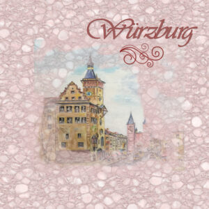
Masks Workshop-Day 6. For this lesson I used one of my hometown’s pictures showing City Hall and the Cathedral. A good friend had painted the picture for me years ago and I took a photograph of it to use for this project. I used the macbad watercolor brush and then Cassel’ s swirl brush. For the background I selected the monochrome version. The Font is Vivaldi. Thank you Carole! I liked the tip of adding a blur at the end which I did. I did not try the soft light blend mode. Will play with that another time.
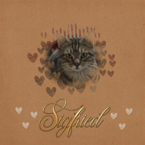
Mask Workshop-Day 5. I used a picture of our Siegfried as he was posing in front of his little playhouse, that he has outgrown. You can see parts of the red roof through the mask. For the brushes I used DC Heart brushes around Siegfried and then used some of them at the bottom next to the Chadiluna Font from Creative Fabrica. I added inner bevel and and a light shadow to the text. The background paper is from Digital Scrapbooking. This project was a lot of fun.
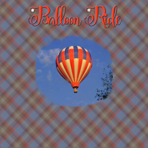
Mask Workshop – Day 4- I am having a hard time with the masks, but I plan to” master the masks” with lots of practice. I had fun however with the brush (mcbad watercolor 017) and added 2 small brushstrokes to the text. Font is:Carolina Script. The balloon graphic is from Art Explosion and I was trying to work the brush so the balloon picture would end up like a circle. Then I made a plaid background from what I learned in week 2 and turned up the opacity a bit more on the background.
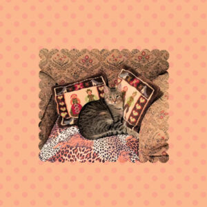
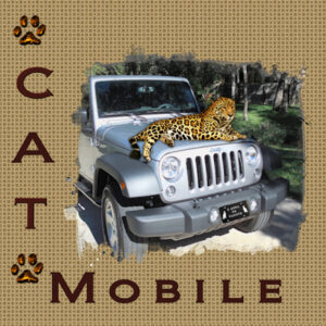
Masks Workshop Day 3: I took me a while for this one. The Mask did not turn out the way I wanted, but I finally finished it. I kept getting some small transparent areas that showed up and they were still visible after I added the background. Resizing did not help so I kept playing with it til I got tired. Any ideas where those came from? I checked all my steps and positions of the layers, and redid the steps a few times. I probably hit a wrong key at some time. By the way, do you remember the movie, Planes, Trains and Automobiles? Well, I covered 3 of them so far . Trains, Planes and the automobile (a.k.a. Cat Mobile) The pattern is from the leopard picture, part of my Jeep, trees in our backyard, and the light color is from from the driveway. Font I used is Biondi which I have in my Windows Fonts. The paw-prints I have had for years, I add different colors to them as needed. TheLeopard, well he just popped up in my graphics folder years ago and he id a keeper.
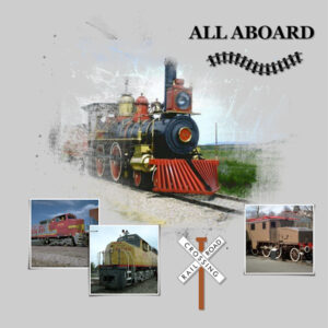
Here is my revised Mask Workshop Day 1 project. Thank you Carole for the tip to enlarge my photo so it will look better with the mask.
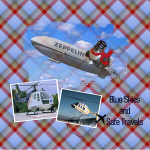
Mask Workshop Day 2; Continuing with the Theme of Transportation, I selected Air Travel for this project.. Graphics are from Art Explosion, and Creative Fabrica, Flying Ace Mr. Mooch has graciously volunteered to pilot the Zeppelin. The Font is a simple one called Bahnschrift Light. Thank you Carole for pointing out that by enlarging the photo the Mask will look better. I noticed that when I played with today’s project. I will re-do the other one using that very helpful tip.
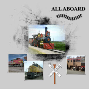
Masks Workshop Day 1. I will be using the theme Transportation throughout this workshop.Day 1 will be about trains. I used the Georgia Font that came with my Windows Fonts. Graphics are from Creative Fabrica and Art Explosion. I find masks not to be as easy as I thought. One really has to be sure where all those layers have to be placed. But in time, I know I will feel more comfortable with using masks. I like the effect one can get with them.
-
This reply was modified 2 years, 9 months ago by
Anita Wyatt.
I am starting a bit late, but looking forward to my second time with masks.
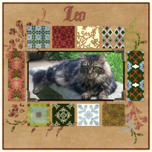
Here is one of the Quick Pages I downloaded from Digital Scrapbooking. Thank you Csrole for the link. I added a picture of our sweet and handsome Leo who crossed the Rainbow Bridge on January 22, 2022 The font I used is Ghosthey from Creative Fabrica. Leo was a very courageous Cat and this font fits him well. Leo will be forever in our hearts.
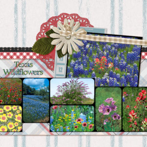
QP-7 Workshop: I used some 0f the Texas Wildflowers for this one. Font is was one of my regular Windows Fonts, Footlight MT Light and I filled the text with colors from one of the Wildflower pictures. This week went by quickly, and I had a lot of fun with all the QP pages. Thank you Carole for these inspiring workshops.
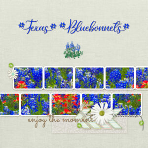
QP-Workshop-7: For this project I selected the Bluebonnet, the Texas State Flower, and filled all the frames with one picture. The Font I used is Spring Flowers. I ended up with a little extra space between the T and the e, so I played with the kerning a bit. Then I added a smaller bluebonnet graphic that I exported to my picture tubes a few years ago.
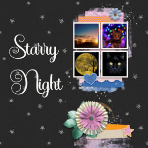
Revised QP-6Extra with adjusted kerning. Thank you for pointing this out. It took me a while but it finally seemed to make the “r” in Starry letters look a bit better. I used the text as is, could my kerning settings have been off somehow? What are the default settings in the kerning options, so it will not use the last settings I used on a new project? Also should the button automatic kerning be checked? Thank you, I appreciate any tips. Some of the tools in PSP are still a bit new to me.
-
This reply was modified 2 years, 9 months ago by
Anita Wyatt.
QP-Day 6Extra: Had fun looking for pictures for this one. Used the Star Bright font.
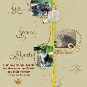
QP-Day 6: Here are some of my Rainbow Bridge Angels. Leo, Smokey, and Mooch. I used the Samantha Upright Font with Glyphs for the first letter of their name and also used one of their extra swashes on the bottom right (I love that font). Then I added a heart below the text.
-
This reply was modified 2 years, 9 months ago by
Anita Wyatt.
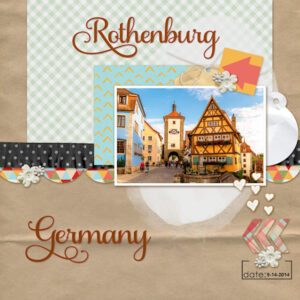
QP-5Extra: Used picture of the city of Rothenburg in Germany. Font is Samanta Upright.
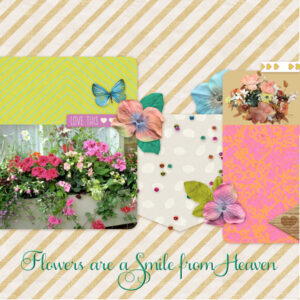
QP-5 Workshop: Larger Window box Flower picture is from Art Explosion. The smaller is a photo I took of my flower basket, made the background transparent and filled with color from template. Font is Samantha Upright.
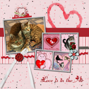
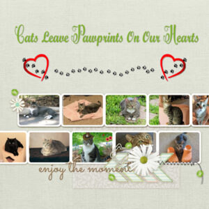
QP-4Extra I used a few of my Valentine projects, some of them showcasing the fur-kids, then added the Heart Cluster from KSD Designs. The font is Fiolex Girls. I had that for quite a few years and cannot recall where I found it. I am having a lot of fun during the workshop. Thank you Carole!
-
This reply was modified 2 years, 9 months ago by
Anita Wyatt.
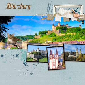
Quick Page Workshop 4. For this project I used pictures from my hometown Würzburg: Large picture shows he Fortress on the hill (Marienberg). The smaller pictures, show another view of the fortress, City Hall and the Chapel on the hill across from the fortress. Of course, one of the fur-kids insisted to be be part of it and is enjoying the view from the old river bridge. Font (ghosthey) is from Creative Fabrica.
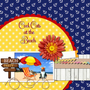
QO-3 Workshop 3 Extra – Mooch and YaPurr are the Cool Cats at the Beach
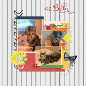
Quick Page Workshop 3. Bella wanted to be the Star of today’s project. Took me little while to find the right pictures, but Bella approved.
Carole, I just emailed you a screenshot.
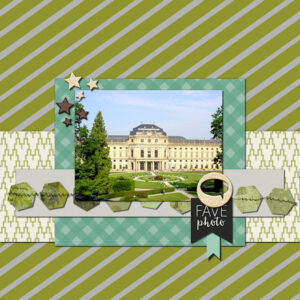
QP-Workshop 2 Extra: For this Quick Page I used one of my photographs of the “Residenz” Castle in my hometown Wuerzburg.
QP Workshop 2. This is a picture of our Mr. Mooch posing as Frosty the Snow Cat. Thank you Carole for the Frosty Frame!
-
This reply was modified 2 years, 9 months ago by
Anita Wyatt.
Quick Page Workshop 1-Extra: I used one of my garden pictures showing the Texas Star Hibiscus. Despite its name, Texas Star Hibiscus (Hibiscus coccineus) is not a Texas Native, though it is native to North America. A vigorous perennial hardy in Zones 6-11, it produces large, star-shaped, white, or bright red flowers that bloom from late spring into fall. It grows 4-6 feet tall x 3-4 feet wide on average but can get larger. Font is Chandiluna from Creative Fabrica, I duplicated vector layer converted to raster and added inner bevel.
Quick Page Workshop 1. I used the Valentine Cat graphic from Creative Fabrica, added pink background from Digital Scrapbooking (Janet Scott) . resized the scale to make the background lighter. Added Sheila font with glyphs from Creative Fabrica and applied drop shadow. Used Cassel’s confetti script to create heart scatters in top corners.. Then I changed Hue and Saturation (which I learned in an earlier workshop) to make graphic and template blend well. Happy Valentine’s Day Everyone!
J = J. C. Penney Coupons
My second QP-7. I loved what Pirkko did with using 1 photo, so I tried it and here is my result. Thank you Pirkko! I used Carolina Script for the A and H and Script MT Bold for the rest of the title and used the photograph as a pattern to fill the text. I love that we can learn from each other here. Thank you everyone! I am so glad to have found the Campus!
Here is my QP-7 Page. Thank you Carole for these awesome and very helpful Quick Page templates. I learned so much about resizing and improving my photos. It used to take me hours to fit a graphic inside a template. Now I have so many different ways to accomplish that. I really enjoyed this challenge. Thank you everyone here in the forum, you all inspire me to do more with PSP than before I joined the Campus.
-
This reply was modified 2 years, 9 months ago by
-
AuthorPosts


