Forum Replies Created
-
AuthorPosts
-
Here is card 6. I chose another Christmas card and after having a hard time with the warp brush, I decided to use a gold pattern from my PSP resource files. The picture showcases my feline friends our for a fun ride in Santa’s sled. The font is Elegans from Creative Fabrica, the star is a picture tube and the ribbon is from Digital Scrapbooking.Thank you Carole for another wonderful class packed with lots ot fun and new tips. I will be working on Lesson 7 tomorrow.


-
This reply was modified 2 years ago by
Cassel.

Here is my Card 5. This time the stork is delivering a different little bundle of fur. I used a different blue ribbon from Digital Scrapbooking and found the Cookie font Carole used on Font Squirrel. I learned so many new tricks like the free option to lift the stork’s wing and the one about placing some of the layers into a group. I am trying to catch up and will hopefully complete the other 2 in the next few days. Thank you Carole, for the great workshop!
-
This reply was modified 2 years ago by
Anita Wyatt.
-
This reply was modified 2 years ago by
Cassel.
-
This reply was modified 2 years ago by
Cassel.
Here is my Card 4. I selected Mr.Mooch to be the Star. The heart scatters and doodle are from Digital Scrapbooking and Pin Interest. The Font is Hesthia Austine from Creative Fabrica, the cutout is from Carole’s store. I love those brushes. It was fun learning how to create a diamond pattern. Thank you Carole!d-4-Valentine-scaleds

Here is my card 3. Flowers are from Digital Scrapbooking- Gina Jones and the font is Cardinal Alternate from Creative Fabrica, This was Fun, I learned new things and managed to send this one from the Gallery.

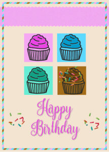
This was fun to do. I added a few sprinkles to the chocolate frosting and next to the Birthday Greeting. The font is Nouradilla from Creatfve Fabrica and the sprinkles are from Digital Scrapbooking.
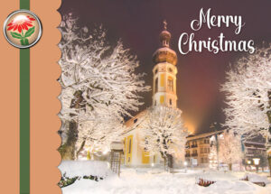
Here is my Card 1 and I picked Christmas as the theme.. The font is Bianca Romantic from Creative Fabrica, the element is from Marisa Lerin at Digital Scrapbooking. I reduced the opacity on the picture to 81 and used the tip from Carol about the leader option in the text tool menu. That really helped with the line spacing. Thank you Carole. This was a lot of fun to do. I enjoy looking at the beautiful cards here. You are all so talented.
I just found Carole’s Webinar titled “An Overview of the Text Tool” and that answered a lot of my questions. Thank you Carole for your excellent webinars. I would like to know a bit more about the miter and the warp option and how to go back to the default values, as PSP keeps the recent values.
Thanks,
Anita
I have a question too and it can wait until the next Q&A if there is not enough time.
I would like to know more about the text options, like line style, join, miter, warp, leading, auto kern, offset, kerning, tracking, customize . Also how to get back to the default values as it keeps the recently used ones.
Thank you.
Anita
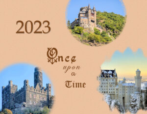
Finally I am done. Here is my Calendar 2023 Cover Page:
I used the castle pictures from January, March and May. Used color from pictures for background and applied texture “Asphalt” at Depth 1. Added Year and drop shadow Font: Book Antica. Aded Word Art: Fonts: Ornate Gothic, Chandiluna, Elegans O’Feat, and Old English.
This was a very fun-filled class. Thank you Carole for offering this awesome workshop and thanks to all who participated. I enjoyed looking at your beautiful calendars. I also loved using Word Art for the first time.
I will be there. I am looking forward to it.
I registered without any problems.
Thank you Marie-Claire!
Thank you Corrie, ! I am almost finished, just have to do the cover page. This has been a fun workshop.
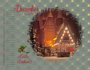
Her is my Calender Page for December with Castle Cochem all decorated fir Christmas.
Cochem is a picturesque town in the Moselle valley known for beautiful day hikes, excellent wine and cultural sights. The riverside town is overlooked by the charming castle of the same name which, in the weeks leading up to Christmas, opens its gates for a guided nativity play with actors in authentic costumes and live animals. At the end of each tour, you can stop at the small Christmas market in the courtyard. For more festive flair, head to the market square in the old town centers and end the day with a wine tasting and fresh waffles.
For the background I used a paper from Digital Scrapbooking and used a blend mode of Lighten, then used opacity of 82. The font is called Christmas from Creative Fabrica. The Holly is from Digital Scrapbooking.
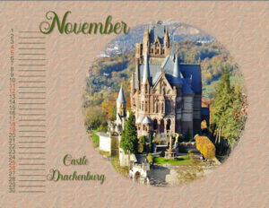
Here is my Calendar page for November. November showcases the Drachenburg Castle. I am trying hard to catch up, just Dec. and cover page to do.
Schloss Drachenburg, (Dragon Castle) built between 1882 and 1884, is one of the most important castle buildings of the late 19th century in Germany. The combination of nature and culture, of scenic romance and unique history has been attracting many thousands of visitors a year from all over the world since the beginning of the 20th century. They all experience the extraordinary castle architecture, roam through the historically significant landscape park and enjoy breathtaking panoramic views of the Rhine and the Siebengebirge (Seven Mountains) area.
I picked a color from the picture for the background and added the texture Blue Spruce. The font is Hesthia Austine from Creative Fabrica.
-
This reply was modified 2 years, 1 month ago by
Anita Wyatt.
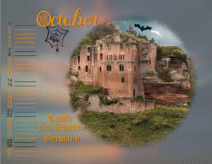
Here is my Calendar page for October.
Castle Frankenstein in Mühltal, Germany, the birthplace of an eccentric alchemist and possible inspiration for the fictional re- animator of monsters. The Castle Frankenstein is now in ruins, with only two towers, a restaurant with a vegan and kid-friendly menu, and a chapel remaining. However, the perhaps mythical connection to Mary Shelley’s novel “Frankenstein” keeps it a popular destination, especially for Halloween. In late October and early November, the Castle Frankenstein Halloween party gathers zombies, witches, werewolves, vampires, and regular visitors for scary dinners and creepy shows.
I adjusted brightness and contrast a bit on the castle picture, then I found a sunset background at Creative Fabrica, added Gausian Blur, and layer blend mode Dissolve, and reduced opacity to 40. Fonts are from Creative Fabrica , Spiderweb and Santika Font. I also used Old English Font on Windows 10.
Thank you Monique!
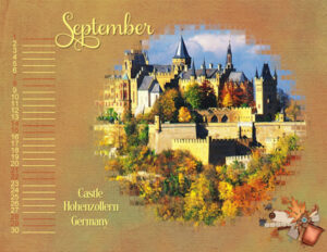
Here is my September Calendar page showcasing Castle Hohenzollern.
Hohenzollern Castle is the ancestral seat of the imperial House of Hohenzollern. The third of three hilltop castles built on the site, it is located atop Mount Hohenzollern, above and south of Hechingen, on the edge of the Swabian Jura of central Baden-Württemberg, Germany.
I used a background from Digital Scrapbooking – Gina Jones and reduced opacity to 79. The font for September is Samantha Upright and I used some kerning, so the glyph S (Samantha upright) was closer to the letter e.
The font for Castle Hohenzollern Germany is Gloucester MT Extra from Windows 10. Used drop shadows on both fonts. Added a cluster from Digital Scrapbooking – Jessica Dunn and added drop shadow. Colored dates, lines wiith same color as text and used different color on weekends. 3 more months to go plus the cover page. I will get this calendar done and I am having fund with it.
-
This reply was modified 2 years, 1 month ago by
Anita Wyatt.
Thank you Corrie, I love all your layouts too. The beautiful fonts you use go so well with each image.
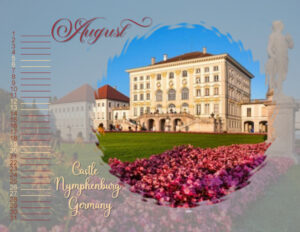
Here is my August Calendar.
The Nymphenburg Palace is a Baroque palace situated in Munich’s western district Neuhausen-Nymphenburg, in Bavaria, southern Germany. Combined with the adjacent Nymphenburg Palace Park it constitutes one of the premier royal palaces of Europe. Its frontal width of 632 meters even surpasses Versailles Palace.
I used the picture of the castle as a background as some of you have also done, and I liked the effect. Then I used layer blend mode Screen, and reduced opacity to 51%. The Font is Glamour for the month and no glyphs were needed. The text on bottom left is Baby Valentine – no glyphs needed. Changed colors for dates and lines to same color as font for August, except for weekends and text on bottom left where I used a different color. Picked all colors from the picture.
-
This reply was modified 2 years, 1 month ago by
Anita Wyatt.
Thank you Monique, I am glad you are enjoying my castle theme for the calendar. We do have a lot of castles and most of them have very interesting tales.
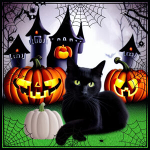
I played with Carole’s Halloween Spider Web Frame and thought it would be perfect to frame the black cat and spooky castle theme I worked on with the Spark program at Creative Fabrica.
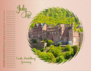
Here is my July 2023 calendar page.
Heidelberg Castle is a ruin in Germany and landmark of Heidelberg. The castle ruins are among the most important Renaissance structures north of the Alps. The castle has only been partially rebuilt since its demolition in the 17th and 18th centuries.
I used a gradient for the background and added the texture asphalt. The font is Samantha Upright with glyphs for J and y, plus the flower glyph that I added to the y, which is also Samantha upright.
I am busy at work, but I am trying to finish the calendar, so I can soon participate in other fun Campus projects.
Here is my Day 6– Calendar – June
I used a picture of Castle Mespelbrunn, in Germany. I saw where some of you used a picture as the background and I liked the effect, so I tried it with the picture of Mespelbrunn and it was fun to do.
I used regular Blur, Gausian Blue, blended mode of Color Legacy and opacity of 55%.
The fonts are Cralione and I kerned the J a bit (-25) to be closer to the e in June. The smaller font is Elegans.
I changed the dates and lines to dark green like the month, then changed the weekend dates to a lighter color like the castle tower. I tried changing the color on the weekend lines but it resulted in dashes , so I left them a dark green. Tomorrow, I will work on the July calendar page.
If possible, I would like to know a bit more about resizing an image in PSP 2023, how to use the different options, how to set the sharpness level and how to use AI Powered option. Thank you!
Here is my day 5 of the 2023 Calendar. I am a bit behind as I have been very busy at work. But I will be getting the calendar done one day at a time and having fun with it.
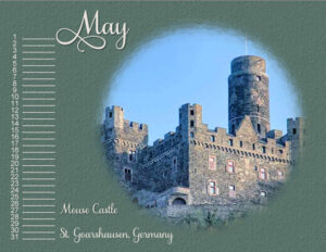
I used a picture of the Mouse Castle which is located near the Cat Castle. Font is Samantha Upright and the texture in the background is gravel. I used a light color for the font to make it stand out more. I tried to use the picture with Gausian Blur as some of you have done, but mine did not come as beautiful as yours, so I used a textured background.
Burg Maus (Fortress Mouse) resides on a mountain spur overlooking the Rhine River. Originally called St. Peterseck and later Burg Deuernburg (Thurnberg), the castle came to be known as Burg Maus due to the cat and mouse rivalry between the Church and the powerful counts of Katzenelnbogen who owned nearby Katz Castle (Burg Neukatzenelnbogen).
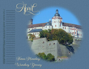
Here is my April Calendar page showcasing the Fortress Marienberg in my hometown Wuerzburg, Germany.The Fortress is a prominent landmark on the left bank of the Main river in Würzburg, in the Franconia region of Bavaria, Germany. The mighty Fortress Marienberg is a symbol of Würzburg and served as a home of the local prince-bishops for nearly five centuries. The original castle on the Marienberg, a hill which was first settled in the late Bronze Age, was probably a small fort built early in the 8th century by the Franconian-Thuringian dukes.
Font I used for April and description is Andalucia (Creative Fabrica)and I used a glyph for the last letter in April. I picked one of the colors from the picture for the background and added the texture “small stones” small stones. Then I removed number 31 and the line from the calendar. Added a dark green color like the tree leaves to dates and lines. I did not change the font for the date and numbers this time, will try it next time.
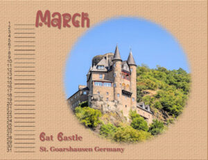
Here is my Calendar for March and as I love cats, I managed to insert a cat castle and paw into my theme. Katz (Cat) castle is located above the German town of St. Goarshausen along the River Rhine. There is also a Mouse Castle. The castle stands on a ledge looking downstream from the riverside at St. Goar.
It was first built around 1371 by Count William II of Katzenelnbogen. The castle was bombarded in 1806 by Napoleon and rebuilt in the late 19th century, in 1896–98. Katz Castle was used as bastion and military base to protect the Rheinfels Castle. (In German Rhine is Rhein). Together they formed a fortified bulwark with a barrier for levying of the Rhine toll
Fonts are Cat Paw (Creative Fabrica) and Georgia as in a smaller text size the font can be too busy. I used the brick texture for the background to look a bit like the stone castle. then used the blend mode “lighter”. I alsoadded a darker background layer and played with that, but liked the lighter one better. Thank you Carole for the tips about the dropper and the texture tool.
-
This reply was modified 2 years ago by
-
AuthorPosts


