Forum Replies Created
-
AuthorPosts
-
Day 7
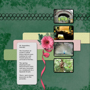
Here is the extra for day 6. The font is Matura MT Script Capitals, inner bevel and shadowed; the papers are my stash; the ribbons were simply colorized and texturized; leaf for the cluster is from PS Elif Sahin; the flowers are from my stash (created in a Lab).
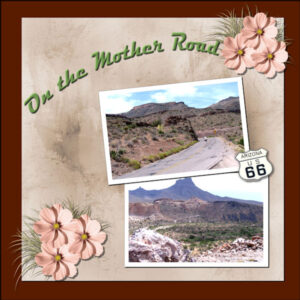
Finlly on Day 6. 1st one done. The papers and the route 66 element are from my stash. The cluster is made from flower and grass in PSBT-July 21-Nature-DBMagnolia. The font is Magneto. The pictures are from our 2008 Route 66 trip and are of the road as it winds its way to Oatman, AZ.
I’ve really enjoyed this workshop also. There were so many things to learn – from Carole always – but also from each of you – I have learned something new – it might be in the way you display your photos, it might be the shortcuts you have developed over time, it might be your take in using the particular template. Great stuff!!!
This is my Day 5 Extra. The font is Medieval Sharp. The elements and background paper (which was darkened) are from PBST-June 21-Summertime-DBMagnolia. The 3 template elements under the photos I simply colorized and texturized.Carole, you are so right. No shadows on the 1st one. I was really bleary last night and will have to go back and redo that one. I think I have put all the shadows on the one I’m posting tonight (almost morning again!).
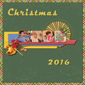
I used the teaching you did in the Quick Page Workshop on this one. It helped me to find something to put in those “little squares”. The cluster with the bell is one I created with one from PS. The hollys at the top right are also from PS. The papers I created and that ribbon under the cluster is one I created from one of the labs. fantastic that teaching on how to colorize stitching. Sure enjoy the Clip to it. Trust I won’t forget how to create a mask!!!IT’s now nearly 2am. I did finish the diamond layout and did use the pictures at the campground when we visited Alabama in 2020. So nothing new – just copied the title and page frame from the first one since these 2 layouts go together!
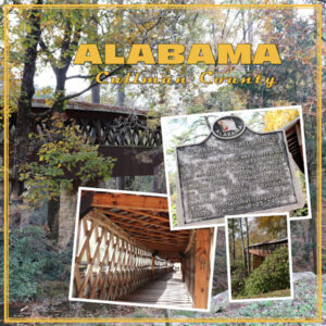
I can’t believe it’s almost midnight! Well, as you know I’m behind and only on day 4. I finally finished the layout. Had to watch the video multiple times for how to do that page border. Really interesting way to do it! I didn’t do the blur on the main picture, but that does work. Well, all the pictures are mine – no elements. Not sure what fonts I used. I think I’m going to use more of this Alabama trip for the Diamond layout.
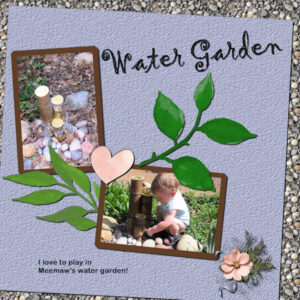
I love what everyone has been inspired to do. So many different takes on a simple template. Does the template inspire us or do we take it as a chance to showcase pictures we have been anxious to use. I know that this one is displaying pictures I took of my great grandson years ago – I was fascinated with his fascination with his grandmother’s little water garden. Now I have a chance to display them.
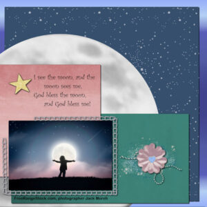
The font is Gigi for the title – inner beveled and shadowed. The background is filled from my gravel pattern. The blue paper was colored from the pic and texturized. The pink heart is from cpjess Cherish kit. The cluster is mine. Bought and used the ClipToIt script for the 1st time. Thanks, Carole – it really is a big time saver!OK, here is my Day 3 layout. Photo is from Freerangestock.com, photographer is Jack Moreh. The poetry is an old English nursery rhyme (part of it I remembered from the dim, dark past, and the last line to the rhyme was found on the web). Fonts: poetry is Curlz MT, the acknowledgment for the photo is Arial Rounded MT Bold. The background is a blue gradient; the starry sky paper is an overlay (ps-marisa lerin) on a flood fill; the green and pink papers are from the Today kit (cpjess-today) and colorized. Elements: the gold glitter star is mine; the flower cluster is made from elements in the cpjess-today kit.
Oh, yeah – the moon paper is a copy of the moon from the picture tube that I isolated and made a png from for a Halloween layout. This worked fine to display as a paper for this layout!-
This reply was modified 2 years, 8 months ago by
Mary Solaas.
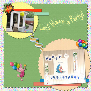
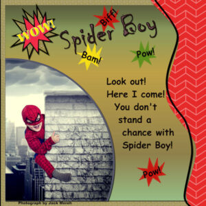
I haven’t gotten to day 3 yet! Just finished the Diamond template for Day 2. Finally got something I could use – I think my mojo has gone on vacation! Found a new site: FreeRangestock.com which has photos like Unsplash for free. So this photo is of a cute kid playing superhero and the photograper has him climbing a chimney in a busy city setting! So I have finally gotten to use splashes and the Wow! splash I made in one of the earlier labs (I think it was Lab 6 but I’m not sure of the module – it was one which stumped me and I didn’t make a layout for it. The papers are mine. The bursts are a brush I made in that lab. The title font is Chiller and the narrative font is Comic Sans MS. The photographer is Jack Moreh.
Ann – I’ve got to say it! Love your lion layout! I couldn’t imagine what in the world to use for a photo let alone the rest of the layout, but you have done great! Lions are one of my favorite cats – Aslan is a lion (I think C.S. Lewis was thinking of the title “Lion of Judah”). Disney did a great job with “The Lion, The Witch, and the Wardrobe”. All the Narnia books are wonderful reads.
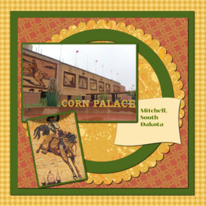
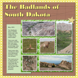
Love all the layouts shown! spent the day on this one and have learned new things. Thanks, Carole. Didn’t know about the way to get around a part of the rectangle hiding by using the ctrl key. Also, had never used the hue, saturation, lightness tool. So, 2 new things learned. I have spent the day playing with that. Changed up this layout several times, but this is my final take on it. I did use the suggested Jessica Dunn freebie (I like using her stuff). We always stop at the Corn Palace when we go to South Dakota, so the pics are from 2 different trips, but they go together with the theme of the main picture.
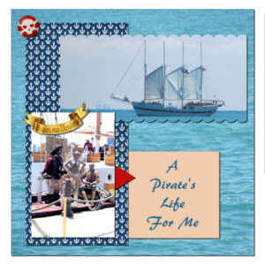
My Diamond extra template follows. The navy anchor paper, pirate brad and pirate foil element are from Pixel Scrapper – Melo Vrijhof. The rest is mine.
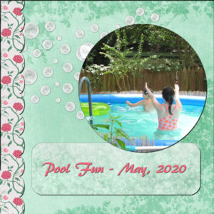
Found it interesting. Usually I make the place for the photo a mask, but this was interesting. I did follow the tutorial. Couldn’t make up my mind – I think the bubbles were my stumbling block. I tried doing a winter (Christmas) theme, but it really didn’t work. Finally decided to go with the bubbles and do a summer pool theme. So this is the result.
Brian – yes – I told my granddaughter I was addicted to PSP2022 and making the layouts and she told me I was really OCD (obsessive) – Maybe that’s why I identify with Monk! lol!
I redid the open down arrows small paper and this is one of the results. It works better and I made a bunch of them to go with various themes. The previous one was kind of rough!I’m lost! I can’t stop playing with PSP 2022 and now Filter Forge also!
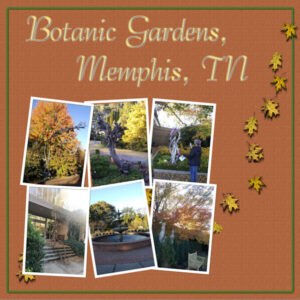
So I stayed up last night and came up with this using one of Carole’s masks, instead of using it for one picture, I decided to use it for 6 pictures and then had a time with the frames so that the pictures are shown as just slightly overlapping. Whew! The font is Bernhard Tango BT – chiseled and inner beveled with PSP and then Simple Emboss with Filter Forge. The frame on the background is mine which was chiseled. The fall leaves scatter are from a picture tube and all were recolored gold. The background paper is mine.F is for Francis – my favorite Franks! Grandfathers and Uncle and, of course, St. Francis. The papers and stitched alpha and heart are mine – made from labs (and from Carole’s teaching in one of the Challenges)! The font for the title is Brush script MT.
Trish – your E is beautiful; that lace looks like a bridal veil.
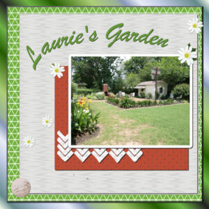
So I guess I’m on a roll. Usually it’s hard to determine what picture(s) to use when pursuing the labs. The colors I had used iin creating papers usually determines what I’m going to use. This is Lab 7 Mod 8. Learned to make a triangle pattern and I made several papers with it. I used green for this one. The pattern is with an open background, so I supplied a lighter green for this background; learned to make a random pattern (Carole chooses a heart to make the random pattern and so I did too) – one of the results is the small paper behind the picture; learned to make a circler wooden round into a painted wooden round (the paint does not completely cover the wooden object – it’s in the bottom left corner of the layout. Think I will go back and make a rectangle or square object also – could see using them more than a round one. Used the open background down arrow paper I made before and changed the background color of it to white. The font used was Brush Script MT. The daises and leaves are from picture tubes. The background which makes a frame for the triangle background paper is a gradient which I chose with a 45 degree angle to flood fill the layer. It’s fun learning in the labs. Sometimes I go back and redo things learned in an earlier version. I do enjoy the Diamond Membership!-
This reply was modified 2 years, 8 months ago by
Mary Solaas.
Lab 7 Mod 7. Used a photo mosaic template I had made in a previous lab and changed it to accomodate a vertical and 2 horizontal pictures; papers are my own as is the glitter star. Learned from Lab 7 Mod 7: quatrofoil pattern and chevron on the side (also this chevron negative) – they were used to produce the papers in the background of the layout and the background of the mosaic template of the pictures. The font for the title is Bodini MT Black and the font for the narrative is Arial Rounded MT Bold. This also was fun and I made several different papers for the quatrofoil and the chevron negative. There was a small paper used in the layout illustrating this module which I worked on and I will show here – it doesn’t have a background, but I saved the pspimage so that I could supply one if I wanted to later on.
Liz, you have posted some wonderful layouts! And Pinochio was one of my favorite stories – the book is better than the Disney version!
Anne Lamp, your layouts for Peace are beautiful – something we all need!
Marie-claire, you showcase pictures of your dog beautifully!
Susan, Ann and Trish – love your layouts!
Corrie, Sue, and Linda -great work as always.
Lynda – I did get Filter Forge this time round – it’s interesting what you can do with what they provide – and it is great that you just have to go to the store to search and get the something you’re looking for instead of having ALL that’s available on your hard drive.I posted my E layout on the other forum. But I guess I’ll post it here too.
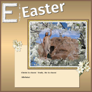
This is my E for Easter. Background of the picture is from a picture I took in Groom, TX of the Passion- this is the empty tomb. The picture of the Risen Christ is a picture I took in our Church and extracted to be placed on top of the mask layer. The picture of the flowers around the scene is a picture of a Bradford pear tree in our Church parking lot one spring a few years ago. I created the mask for this, added the bradford pear picture below the mask group; the frames around the scene are a layer of gold glitter from Pixel Scrapper; the Easter lillies are from Nice Png-1087268; the E is one of my stitched letters and I don’t remember the font name for Easter.
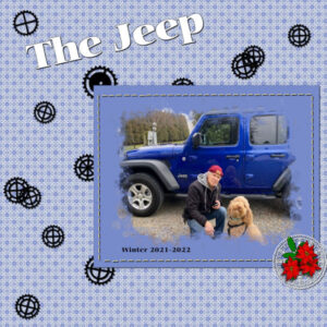
Wanted to display this one since we are going to devise templates. Made the mask; then slipped a paper under the group; stitched the paper with the stitch created in one of the more recent labs I was working on; used cogwheels that I created in a lab some time ago; used a doily I created in one of the labs – that was fun and I’ve created several doilies; the poinsettas are from a picture tube and the leaves I created some time ago. The paper was created with a pattern found in the patterns folder that came with PSP. The Jeep was purchased recently since it follows the camper much better than some other cars.
Well, I’m in too! Glad to see you Susan and Christiane. Have enjoyed seeing your work. Hi, Carole – as you know I still struggle with some of the tools. Also, sometimes my mind is just a blank and I can’t think of how to put some of the things we learn into a new layout and develop it from scratch! Sounds like this is what I need.
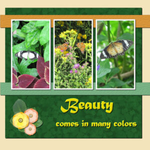
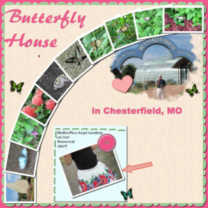
This is Lab 7 Mod 6. Papers are mine. Projects this time were: Create a thread? stitch so that it could be a continued line of stitching, a shape to fill with a created pattern (straight stick), a button. Did all three. Had fun making the arrow, and the heart. Was going to do a star too, but decided to flood fill it with a glitter pattern which I will use sometime later. The fanned pictures are from a script from Carole. I wanted something different this time to display multiple pictures, as I usually use a boxey kind of layout when there are multiple pictures. The additional butterflies are picture tube butterflies. Yes, the little girl was just standing there as there were a lot of butterflies that were attracted to the flowers on her skirt. Amazing. The only picture I got was of the one butterfly. My brother enjoyed the Butterfly House – I had been there before with my daughter and daughter-in-law, Laurie. The script for the title is Brush455 BT.
Didn’t notice the spot until I submitted the pic. Went back & changed PSPImage as well as the jpg and _600 jpg.
-
This reply was modified 2 years, 8 months ago by
Mary Solaas.
-
This reply was modified 2 years, 8 months ago by
Mary Solaas.
Brian – your site is really cool. I see that the 5 leaderboards fade in to reveal each one. Cool. A beautiful website!
And now on to Lab 7 Mod 5. Papers, mask, are my own. Requirements: paint splatter, paint streaks, doodle frame. I made the mask from various brushes on a rectangle; put a small paper behind the picture and put the doodle frame on it and colored it dark blue; merged the group (mask and picture), then merged the group with the small paper and the doodle frame so that I could maneuver them together. The font is Brush455BT.
Just a quickie. I did buy Filter Forge 11. That’s one of the textures for a background. layout is from one of the labs that I put in my stash. snowflakes from PSP paint brush. textured frames. That new font freebie from Creative Fabrica.
Christiane – I like your layout.
Susan Ewart: No, I didn’t get a messenger. There is another Mary Solaas on facebook (a relative), my FB is Mary Lou Solaas. However, my email address is mlsolaas0915@gmail.com if you want to send it there.
-
This reply was modified 2 years, 8 months ago by
-
AuthorPosts


