Forum Replies Created
-
AuthorPosts
-
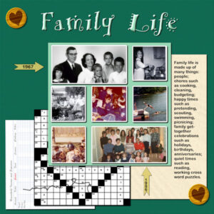
Wonderful stuff has been posted in all the forums! I’ve been recovering from bronchitis and so I have just finished Lab 8 Mod 5. Really scratched my head as to how to feature a bookkeeping spreadsheet, a crossword puzzle and a strange stitch length. I finally decided that bookkeeping is one of the chores in family life and decided to go with that theme. All the photos and elements are mine. The font for the title is AR HERMAN which I inner beveled so that it looks like I used a think paint to write it and then of course had to shadow it also.
Pirkko, again, I like the colors and the way you placed the ldtters in the title.
Sue, how unique in using the brick wall script. Might put that on my favorites list.
Betsy, I love that “up-arrow” paper in back of the ducks picture.
So many different takes on the initial challenge. Even though a new month has started, I downloaded the challenge as it seems to be a unique and interesting template. Minka, love what you did with Queen Elizabeth; Q in my alphabet challenge is going to be Queen Elizabeth.
Pirkko, I really like your Module 3. All the elements and the use of the flower picture, and even the frames, and the quote from 1 Corinthians is appropriate. Love your work.
Bonnie – haven’t said much to you, but I enjoy your layouts and the adventures of the pickleball team.
Susan – thanks for the kind remarks.
I overloaded the system – sorry. Now I will post the ribbon I made with it.
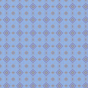
and these are my “mish mash” creations with the star pattern.
-
This reply was modified 2 years, 7 months ago by
Mary Solaas.
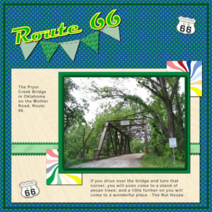
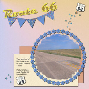
Again, I wasn’t going to do anything for Lab 8, Mod 4 – HOWEVER, once I got started on making the papers and elements, I had a lot of fun. First I will post the layout I came up with. Guess what! Another Route 66. The elements to create were: a new kind of star for a paper; adding a rick rack kind of border to a ribbon; creating a rainbow starburst and twirling it. Well, all are present in the layout. I will post it and then show you some of the fun I had with the star pattern. All the papers and elements are my own.
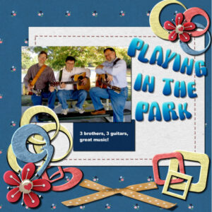
I’m going to post a layout I made in one of the workshops in 2020. This is of my 3 sons.
Corrie, may you have a marvelous trip. It will be wonderful to see family.
Pirkko – like what you are doing. Thanks, Carole, for describing those tools for us. It is hard to get hair, strands of grass, etc. extracted when you are extracting from a pic.
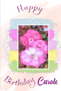
This is my take on Lab 8 Mod 3. I wasn’t going to do a layout for this module, but changed my mind. The tutorials were for making a stretch of thread to sew onto something (I decided to make a banner and thread the pieces together); a circle of elements and to, incidently, make a script (which I did); a word with a large outline. I did all of those and multiple copies of the circle: one with flowers (in several colors), and one with hearts (one in red, and one in pink). I used my gradient for the background and blurred it a couple of times and added noise and a texture and then reduced the opacity. The small papers and the elements are my own.Happy Birthday, Carole!
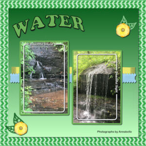
May your day be full of wonderful things and your year be filled with blessings.Lab 8 Mod 2. Shaped Text, Word Frame, and an interesting arrow patterned paper. Accomplished, but – oh, boy – troubles with the shaped text: I forgot to hide the ellipse shape and had to erase it when it appeared on my background! The word frame gave me trouble until I listened and watched the video – then it made sense. Anyway, done. The elements and papers are mine. The pictures were taken by my great granddaughter which she graciously shared with me.
Lab 8 Mod 1. Plaid – new, has a striped stripe; wood burned element, outlined leaves cut from a paper. All included. Don’t remember the font.
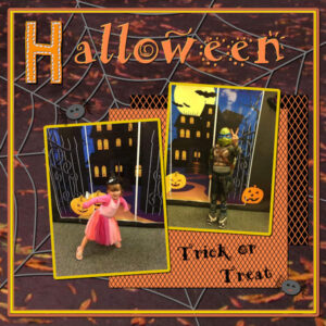
H is for Halloween.
I had a palette that I made from one of my pics called Road Trip. This is the gradient.
LAB 7 Mod 12. Streamer, right angle triangle paper, speech bubble. OK, they are all present in this layout. I played with the streamer and the mesh warp tool and will post this also – it just didn’t work with this layout. I also made several papers with different colors and played around with the previous papers in different colors. The Hue, Saturation, Lightness tool is CRAZY!!! It mage me several different colors of the paper with the multi lines at an angle. Would love to do something with the pink and purple papers I made.
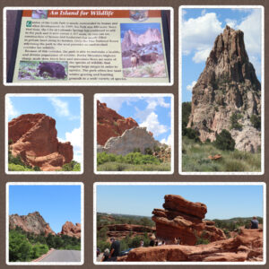
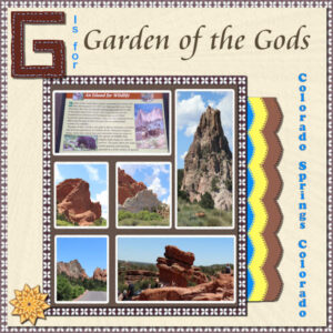
And here we are. G is for Garden of the Gods, Colorado Springs, Colorado. I have been here a number of times: 1st was in 1956 with some friends (pictures were in black and white) and we could get out and walk among and on the rock formations; 2nd time was in 2001 by myself and there were restrictions, but I could walk on designated walkways; this was the 3rd time (2021) and again very different from the other 2 times- we went in a tour vehicle with a guide that drove us all through the area. There were walkers and some were even allowed to climb on the rocks as shown in the bottom picture.
All the papers and elements are my own. The narrative on the sign tells some of the story of the Garden and of the area. It’s hard to read, so I’ll post the center layout which was done separately and maybe it will be easier to read.Think this is where I will work today. Had a hard time finding it. However, now I know where to look!!!
I didn’t join the bootcamp this time as I want to work through the Labs. However, I do enjoy seeing what everyone posts. Rookies are really not rookies – they, too, have beautiful layouts.
Love your post on the sandwich, Susan.
Pirkko, always love to see what you post – I like your perspective on things!
Nel and Susanne – beautiful layouts!Thanks for posting, Michele. I’ve really missed your Fabulous Divas!
-
This reply was modified 2 years, 7 months ago by
Mary Solaas.
I like it. I pretty well knew that I would start with the Labs, but this page would have helped if I had not decided where to start.
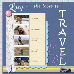
Lab 7 Mod 11. Create a photobooth strip for 5 pics; an arrow ribbon; and a cutout edge (kind of like a picot edge on a scallop). All the elements and ribbons are my own creation. The font for the title is Hesthia Austine; the word “Travel” is Kristen ITC; and the narrative is Arial Rounded MT Bold; I used the color scheme of the Palette Challenge for this month.
Trish – you have really been going to town! Love what you have been posting, but especially like this one with the gradient and so many textures. May I copy those images to give me an idea of playing around???
OK! Lab 7 Mod 10. Make a line pattern (overlay on the background); compass points (also made the compass and put the points in it); wavy paint splashes (ended up with 2); the anchor I attempted but ended up with a freebie from NicePng. I got stuck and couldn’t go any further; so Laurie helped with my perspective and pushed me beyond pause.
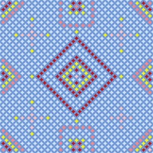
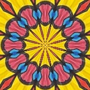
And earlier today I was just playing around with the Effects>Reflection Effects>Pattern (and Kaleidoscope). Here are some of the results. All from using one square!
-
This reply was modified 2 years, 7 months ago by
Mary Solaas.
Lab 7 Mod 9. Create confetti, marker, stripe paper (different than before!). All created and displayed. Font is Ambrogio for the title and Arial Rounded MT Bold for the journaling. Papers and elements are my own.
This layout is for the scraplift challenge april 2022 but I can’t find the forum so I’m posting it here. Pirkko did a beautiful layout for the March Template Workshop and inspired me to play with the kaleidoscope and create some patterns from the most colorful pic in this layout. Pirkko also took some of the kaleidoscope pattern to make an element and I tried to do the same. That was such a cool idea, Pirkko!
I researched how to make a gradient from a picture and so the gradient paper is mine, the kaleidoscope paper at the background is mine and so are the elements I gathered from the pattern. I also played with the hue map which you told us about in the last workshop, Carole. It is not simple, but now I know how to play with it. Don’t remember what font I used for the title, but I inner beveled it as well as giving it a shadow.Ann – you are a reader like me!
Corrie – Love your trip in a hot air balloon!, Ann – The Big Cats – WOW. Everyone – love what you have done in this workshop. Pirkko – the kaleidescope layout was just beautiful. Lynda – I see you made it from Chicago to LA. I have been on Route 66 at various times through the years – even made that short jog through Kansas, but stopped short of LA. Alan – like your layouts and I see that you do Video Studio too – so do I. Gerry – Always like what you show us. Lynn – that is beautiful – walking through life with the one you love. Marie-Claire – glad to see you are back in the game; hope you are feeling better. IT’s been great going through all the layouts posted. I sometimes go back from page 1 all the way through. Thanks, Carole, for working this up. It has really pushed me this time and that is good.
Here is my final one. Had a hard time deciding how to do this one as most of my pics are horizontal and my brain is tired!! -
This reply was modified 2 years, 7 months ago by
-
AuthorPosts


