Forum Replies Created
-
AuthorPosts
-
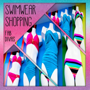
I don’t know who did the original fashion illustration, but I loved it. I used cass-PaintedBackground script to create the background. I ran it several times using the various options until I was satisfied with the result. I love that script! The font is DESIGNER.
If anyone ever wants to know where to get a font I use, just ask. I only have free ones since my last pc died.
I used a template from Lady22 with my own twist, of course. The background and flowers were from Digital Scrapbooking Studio. The original fashion illustrations are by Mona Jung and the font is Stanlley.
The cluster is from Denz Designz and I added the dove on the top left of it. The girl is my avatar from the game I play and the font is Billy Signature.
F = Freshwater Clams
It’s almost time for What Are You Working On In July 2021 and I must say I’ve totally enjoyed June’s work. I haven’t been commenting much, but I look almost every day. Thank you all for the lovely layouts and the inspiration. <3
LOL, Ann, Love the picture! I’m definitely going to be posting it in my group. The group is for a game called City Girl Life. It’s a simulation game that a bunch of us switched to after they closed down The Sims Social on Facebook. We have apartments that we decorate and the game gives us a different clothing theme every day, hence my daily pic. I probably would have stopped playing a long time ago, but I have made some great friends through the years. I love making my picture every day which is how I ended up using PSP. (I inherited the group so I didn’t name it, but we are Fabulous!)
Thank you for the hug and good wishes. <3
Sorry I haven’t been very vocal lately. I injured my back and still sorting it out. I haven’t done much more than making the daily pic for my gaming group. And they haven’t been particularly good. LOL But I liked this one.
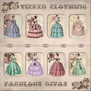
I love the Victorian era so I decided to go with that instead of any modern fashion.
Very creative, ladies.
I had less time than usual to do today’s daily pic, but I wanted to post this to show what the Cass-chalktexture-01 script can do. Since the script applies the effect to the entire image, not just the layer, I created the text; copied and pasted it to a new image before running the script; copied and pasted the result to my original image. There are a bunch of parameters you can choose so the possibilities are endless. When I have more time, I’m going to play with it so I can create more than just white chalk text.
The background and elements came from one of my favorite resources, PixelScrapper. The font is pouttu, free from 1001Fonts.
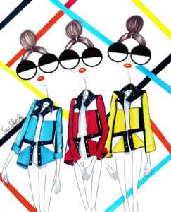
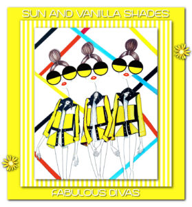
Nothing really special, but I loved the original pic by Sew Sketchy and thought it would be fun.
Thanks for all the kind words, ladies. <3
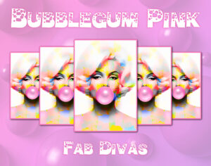
Found my inspiration for this one from Sue’s frame template. I created my own as I wanted them all to be in the same proportion (ratio?). I made the first image, then duplicated and reduced the size; duplicated and mirrored the new image. Lather, rinse, and repeat. LOL. The font is called Bubble Man and is free on 1001Fonts. Looking at it now, I think the shadows might have worked better with the light source being centered and the two left pics having a different shadow direction. Oh, well, live and learn. 🙂
I’ve been under the weather of late, but I finally was able to catch up. I love looking at everyone’s projects; all so unique and wonderful.
Karon, I’m so sorry to hear about your family’s loss. Wishing you strength and healing.
Bonnie, thanks for hooking us up with Lady22. I downloaded some of her templates and couldn’t wait to try one. Fiddled with it a little, of course, but as Annie said, they are a great starting point, especially with the limited time frame I have for my daily pics. They can make a boring theme the game gives us seem much more fun. The gradient background is from PixelScrapper and the font is Fitalia from Free Design Resources.
Since the month is almost over I just want to say how wonderful it’s been looking at everyone’s projects. We have far too many members now for me to comment on each one, but I’ve loved them all!
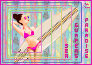
Thanks so very much, Ann. I use a bunch of different sources. If I don’t have an immediate idea, I do a lot of googling. Sometimes I get inspired by things I see on my searches; sometimes I look through my supplies and something hits me. The surfer girl came from pngtree and I found it by googling surfer clipart. I was looking for something that would enable me to use the nested frames and I thought she was perfect. I looked on PixelScrapper for the background paper. It distracted from the girl a bit so I put it over a white layer and lowered the opacity of the surfboards lighten them up a bit.
If I’m starting from scratch, I usually begin with a standard scrap page. More often than not it doesn’t end up staying that size. For instance, this project started full size with the background, but I cropped it to be more in line with the frames. As far as printing goes, I am clueless as I don’t print my projects. I’m sure there are other campus members who can help you with that.
I finally got on the bandwagon and used Carole’s nested frames freebie for my gaming group’s daily pic today. The script is going on my wish list in the store.
Fantastic, Sue!
I am really enjoying everything that’s being posted. What a creative bunch we are!
M = Matte
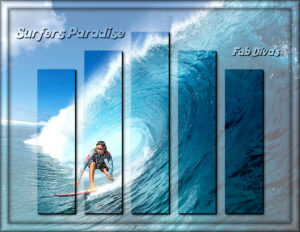
Thanks for all the surfer love, ladies. <3
Cristina, what a lovely page to show how they’ve grown.
Love your swallows and sparrow, Sue. I enjoy how you combine various elements and techniques in a single l/o.
That’s a great result you got, Lynda. You should show it to the person who made the tutorial.
Thanks so much for the kind words, Bonnie, Sue, Cristina, and Annie.
For today’s daily pic I took inspiration from a layout I did a few years ago. I made my own mask this time and, boy, did I have to do a lot of mathematical calculations (got it wrong several times). I tried doing it on the fly, but my OCD wouldn’t allow it. lol The font is kool beans and I have no idea where I got it.
Great stuff, everyone!
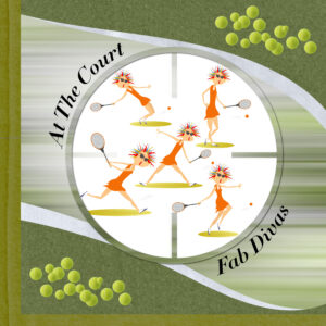
First “scrapbooky” pic I’ve done in a while for my gaming group’s daily pic. The original template is by AnnieC from the March 2021 ALFLT blog train. I made a picture tube from a tennis ball clipart to create the scatters. The font is Didot and the tennis player is by totmacher69 on Vectorstock (she really tickled me).
I’m blown away by all the wonderful things everyone is doing. I can hardly keep up with the all!
Made this several years ago during Cass’s Love Story Challenge. It seemed appropriate to share it for Mother’s Day.
B = Beaded frame
No need to tweak it at all, Minka. I think it’s perfect the way it is!
Outstanding layouts, ladies!
You did a great job, Shirley! She’s going to love them.
Great stuff, guys!
It came out totally good, Annie!
-
AuthorPosts


